


DSR Branding – Seq
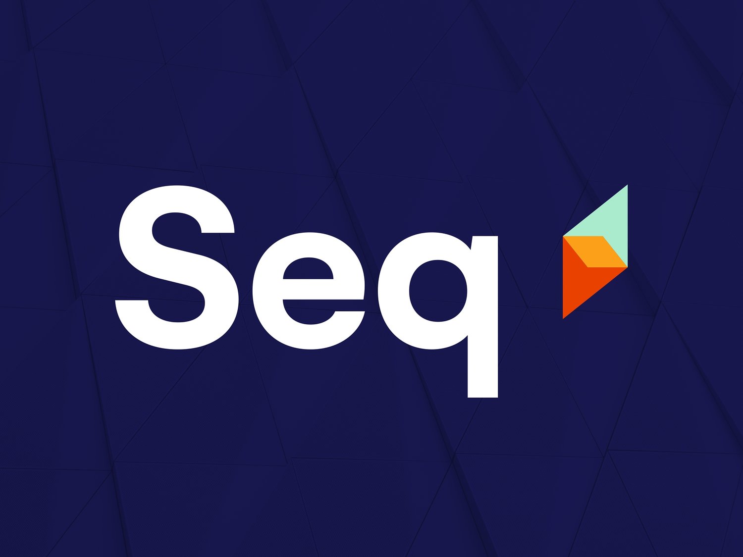
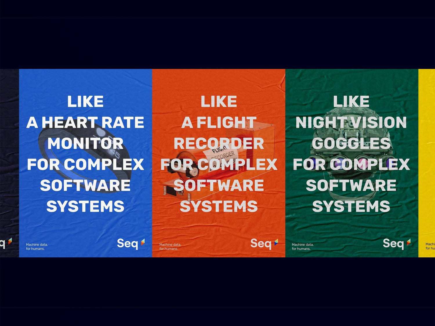
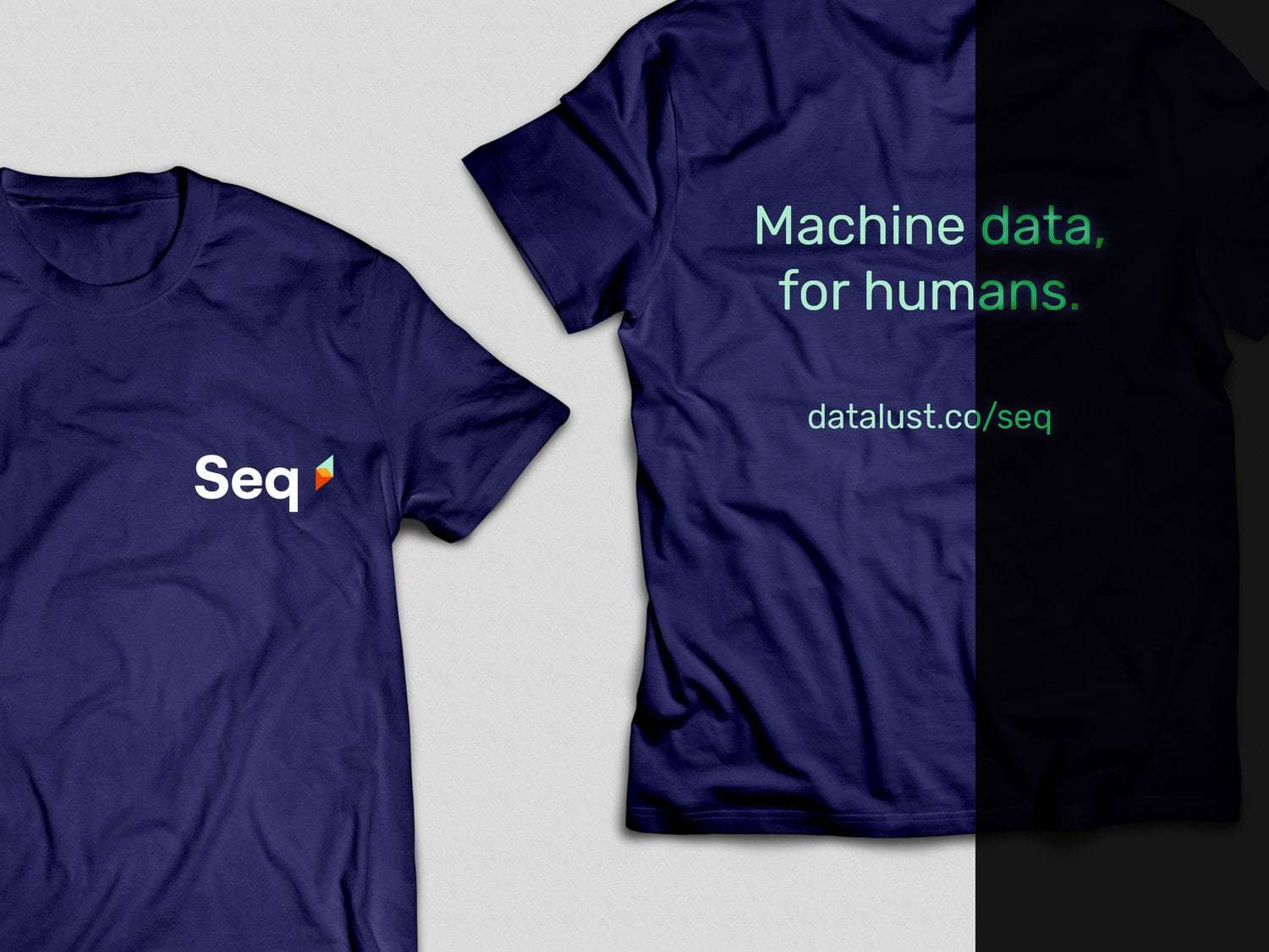
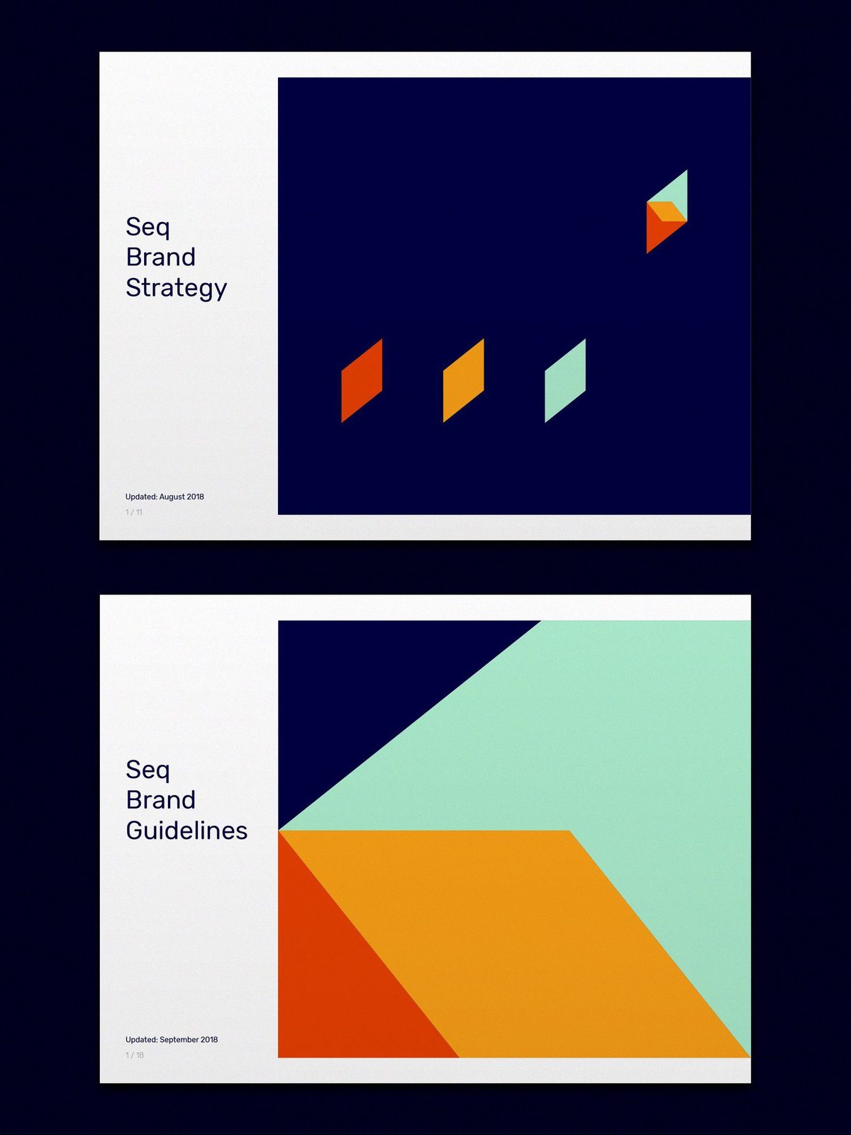
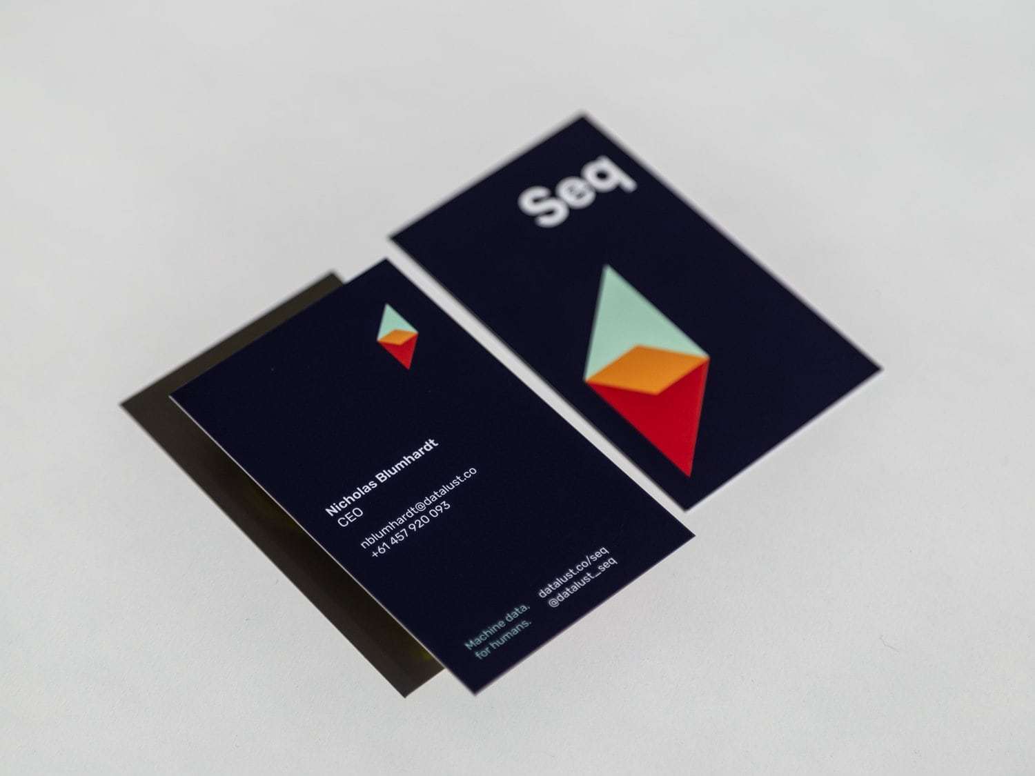
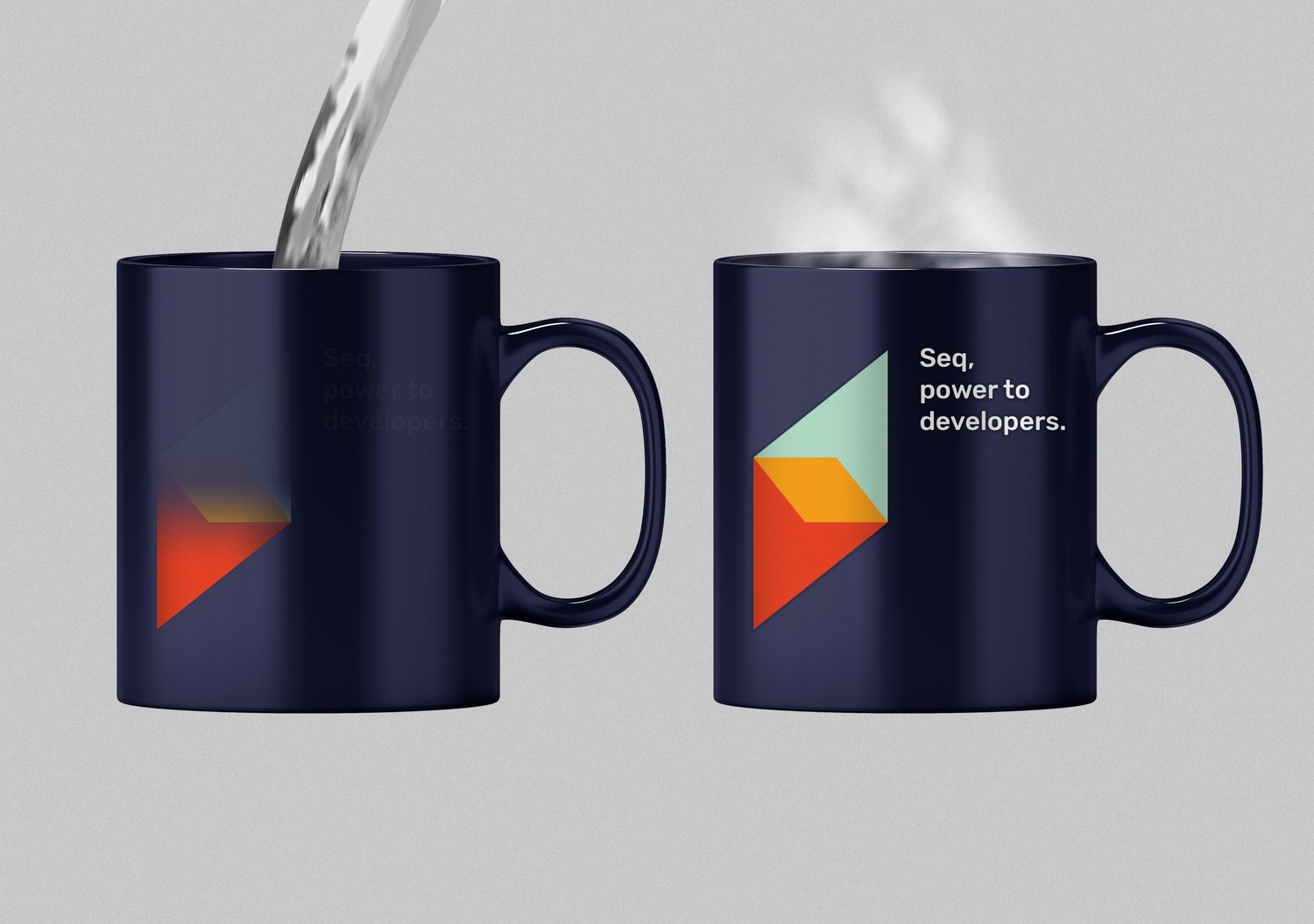
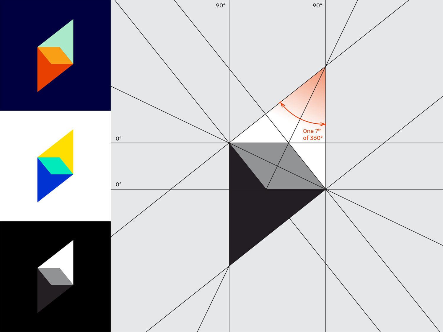
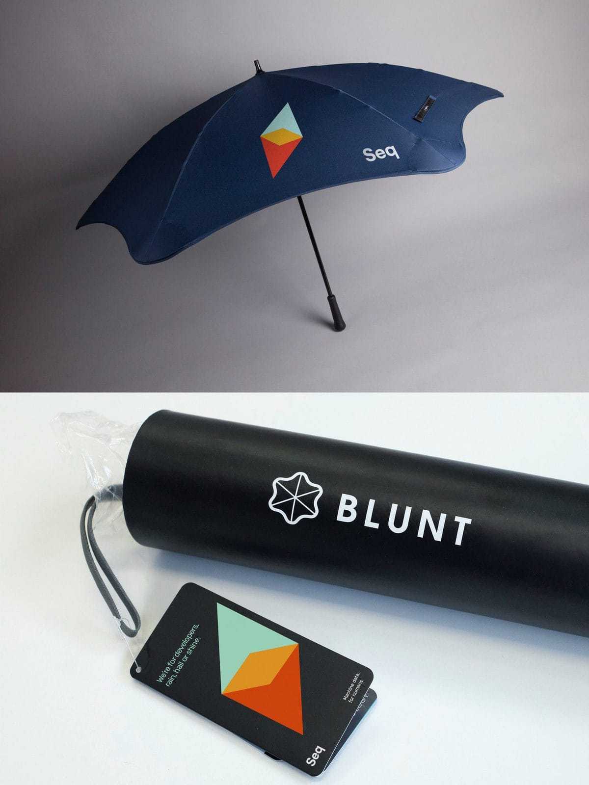
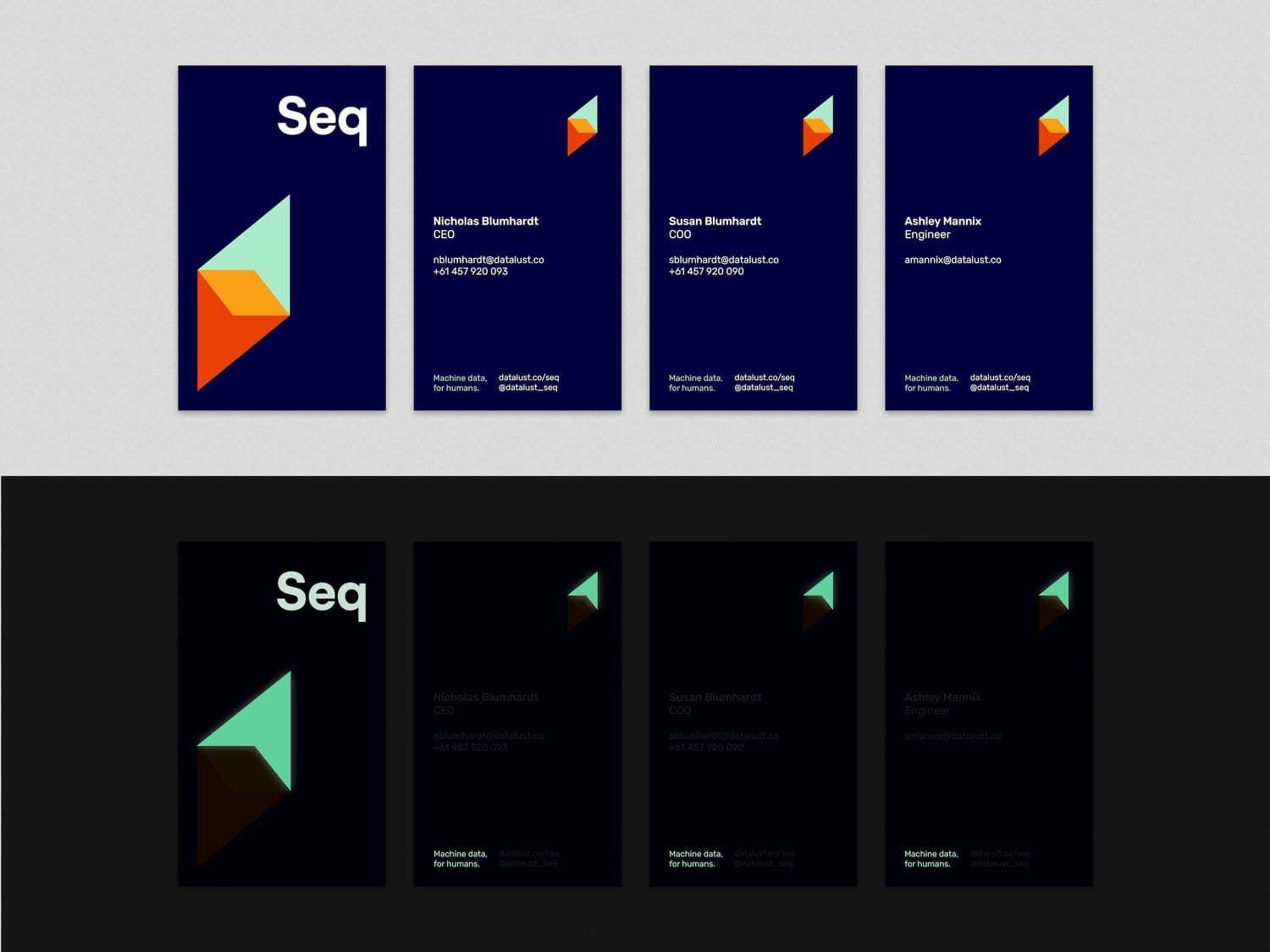
Seq (pronounced “seek”) is a diagnostics platform used by high-level software developers to confidently operate and manage the systems their businesses rely on. It materialises detailed information in real-time so developers can identify small issues before they become big problems.Seq’s creators approached us to refresh their brand in early 2018. They had a well loved product used by thousands of customers, and a brand that their product had outgrown. The issue was the actual user experience of using Seq far outweighed initial first impressions of the brand. Basically, Seq was a ‘diamond in the rough’. Our focus was to look at Seq through the eyes of their current customers – developers – and capture what they loved about the product, then reflect that in new creative which could attract new customers. We wanted to bring to life the excitement, curiosity, and empowerment enjoyed by Seq users. Seq empowers developers with insight, bringing the gift of clarity to technology, for which we created a visual identity. The diamond icon represents illumination, insight and new perspectives; the symbolic elements of Seq’s ability to crystallise the location of problems and gaze upwards in continual improvement. The colour palette is broad to accommodate a number of digital software requirements, its bright nature allowing for more joyful expression.For developers, Seq provides the ability to uncover what was once hidden – to ‘see in the dark’, so to speak. This presented production opportunities for the use of a luminous ink, a feature emblematic of the revelatory experience preserved for those ‘Eureka’ moments of the Seq user.Immediately upon launching the new logo – just the tip of the branding iceberg – positive feedback came in thick-and-fast from interested customers and supporters.
CREDIT
- Agency/Creative: DSR Branding
- Article Title: A Fresh New Look for a Diagnostics Platform Loved by Developers
- Organisation/Entity: Agency, Published Commercial Design
- Project Type: Packaging
- Agency/Creative Country: Australia
- Market Region: Global
- Industry: Information, Technology


