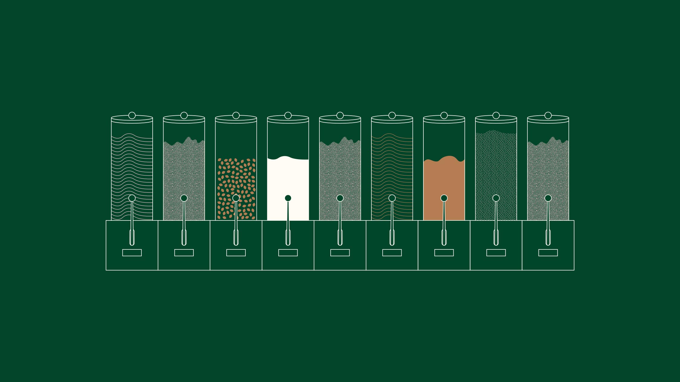
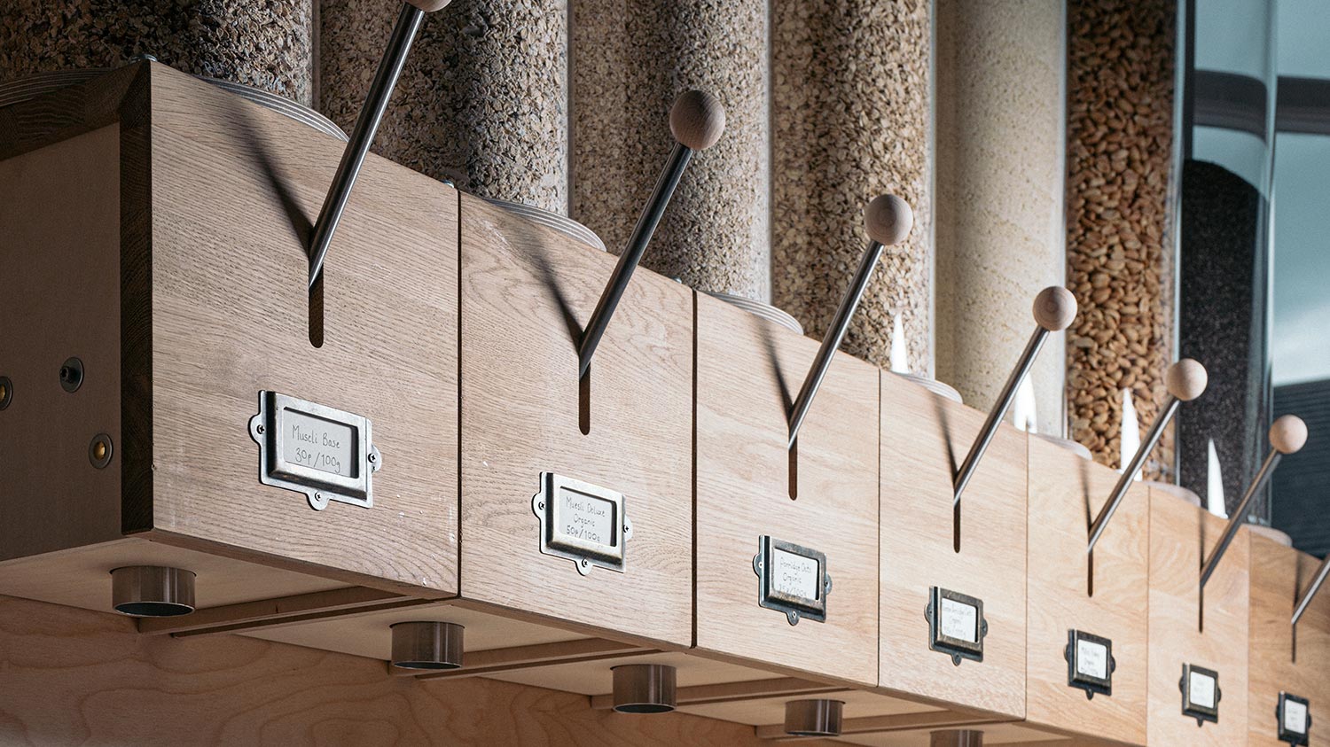
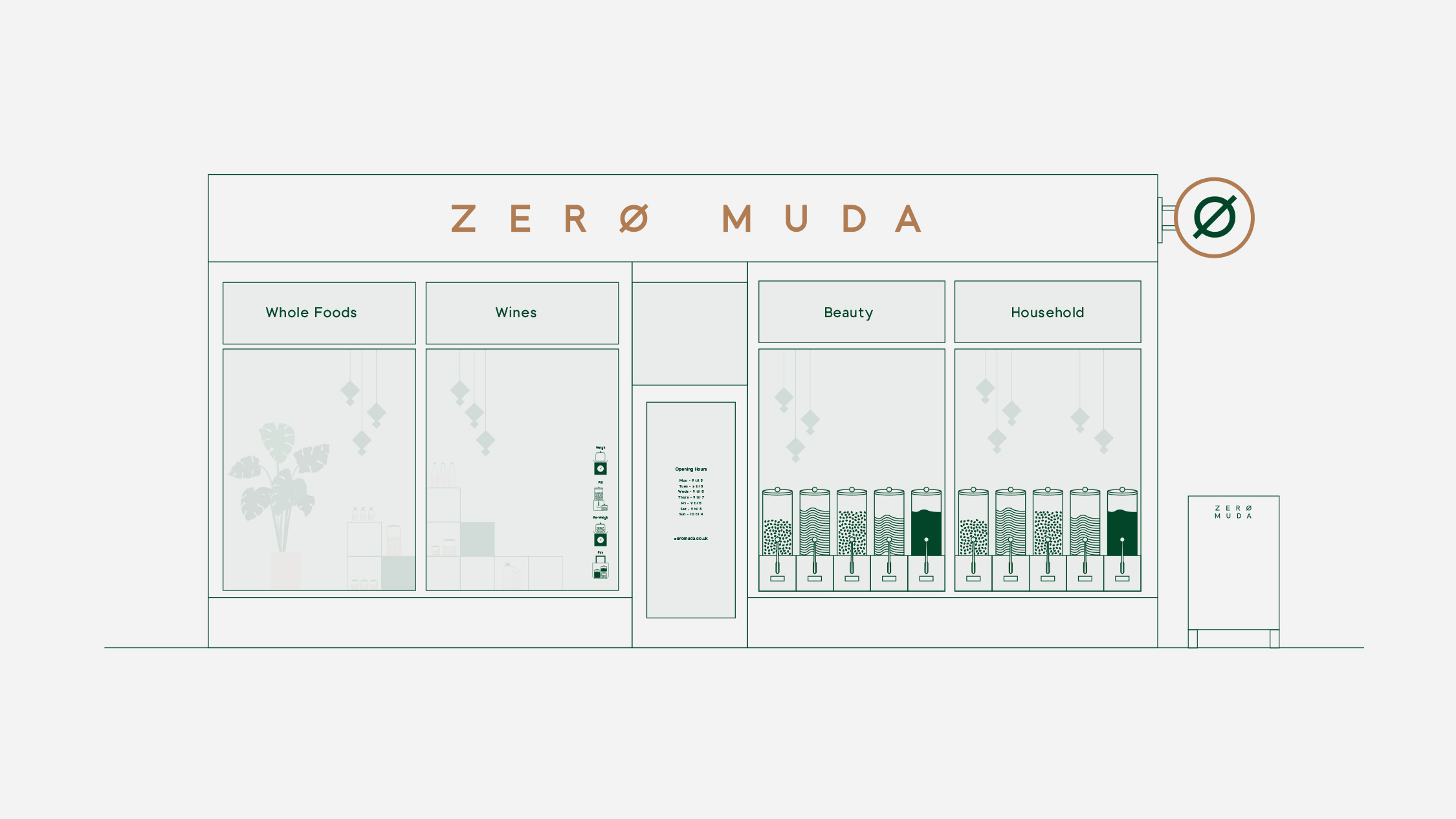
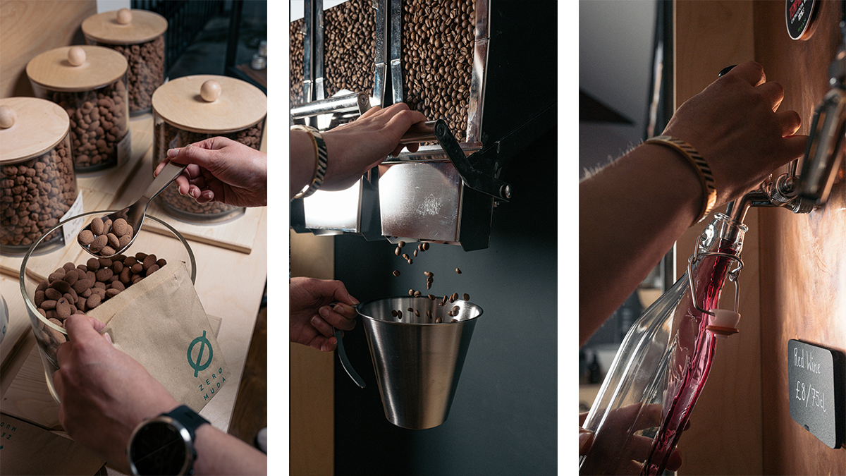
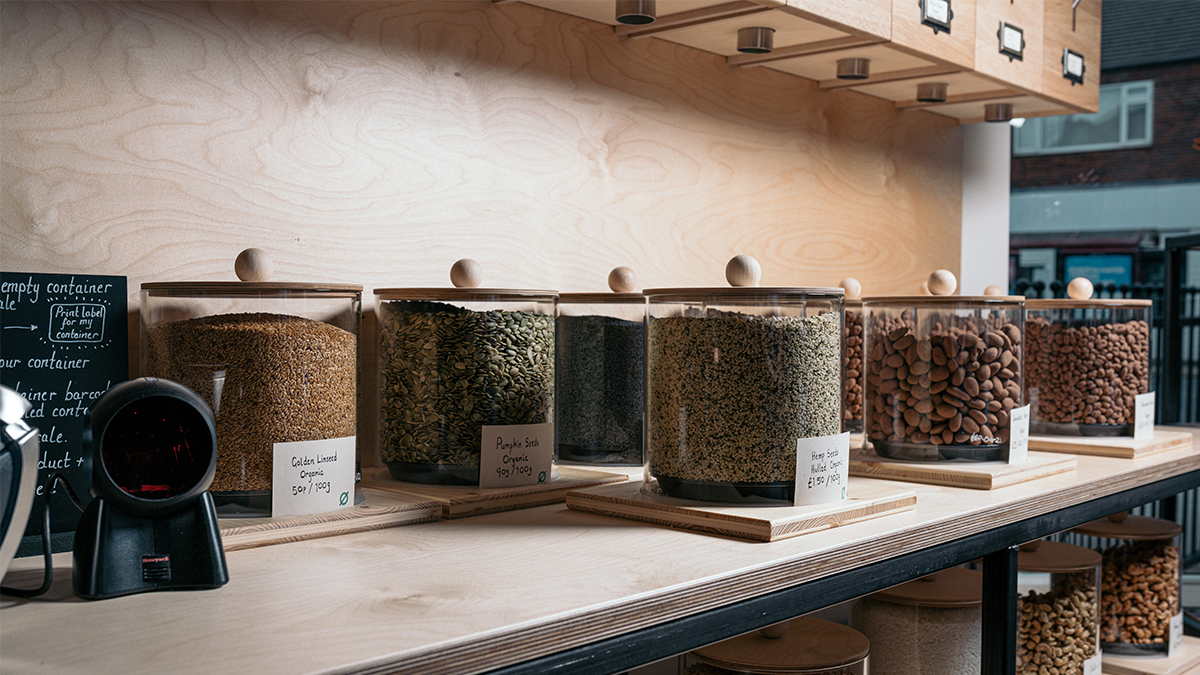
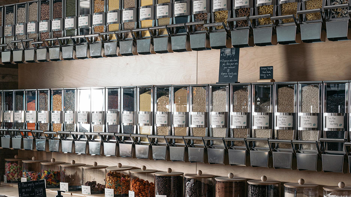
Cliches of the “eco-friendly” echo throughout many refill stores. Zero Muda made it a priority to avoid this DIY approach and aimed to incorporate the premium and the slick into the brand, an approach much more popular over in Europe and Australia.
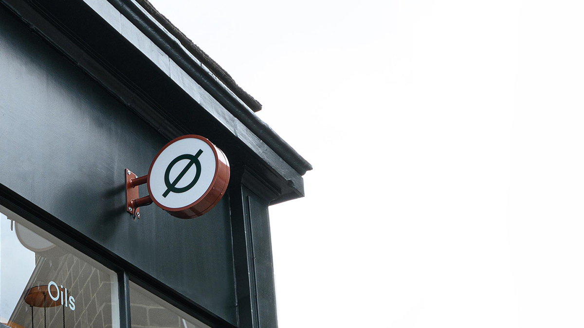
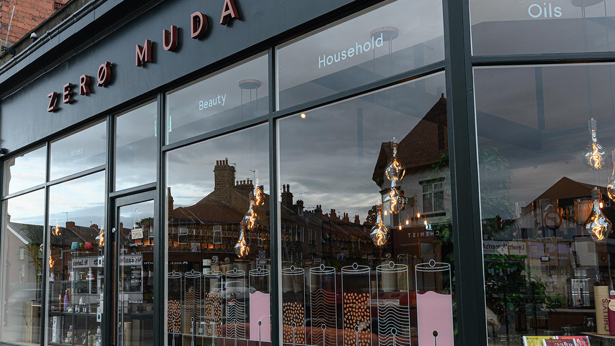
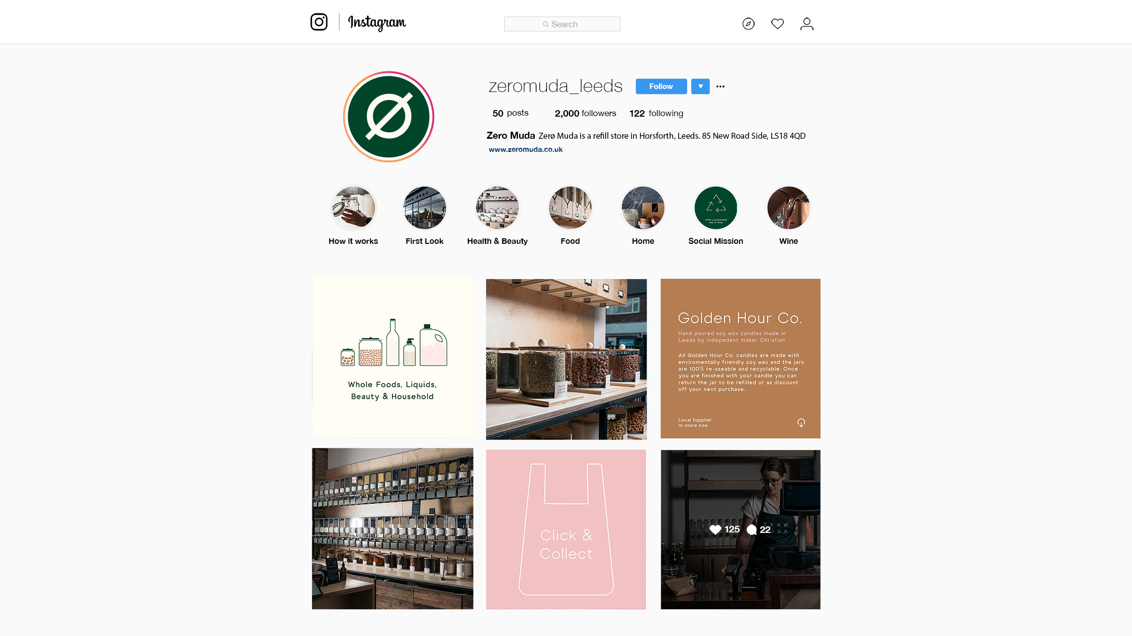
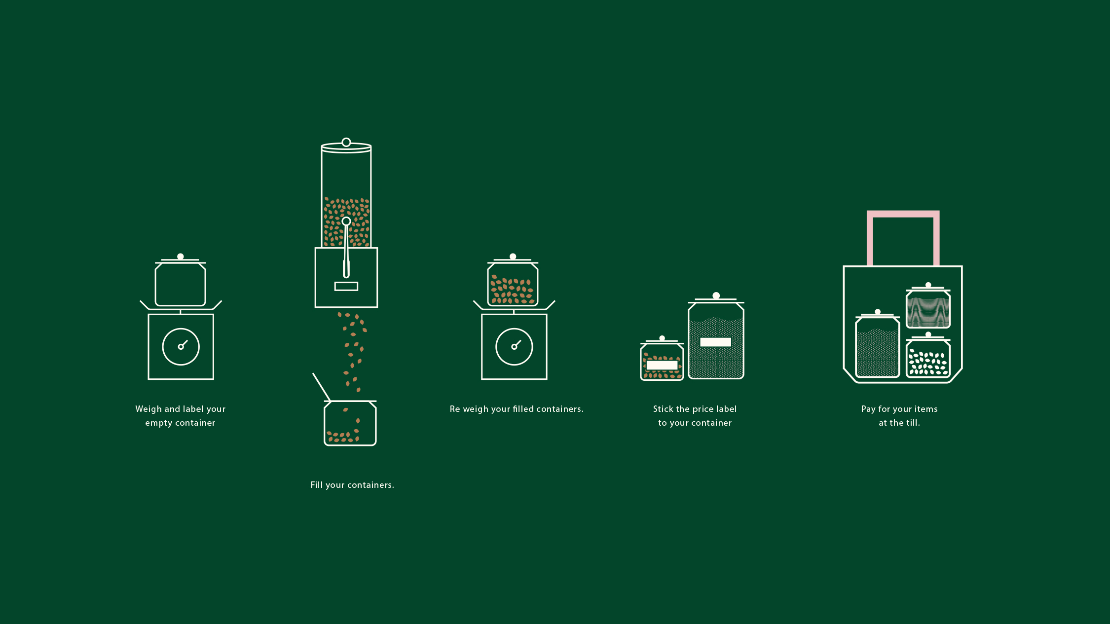
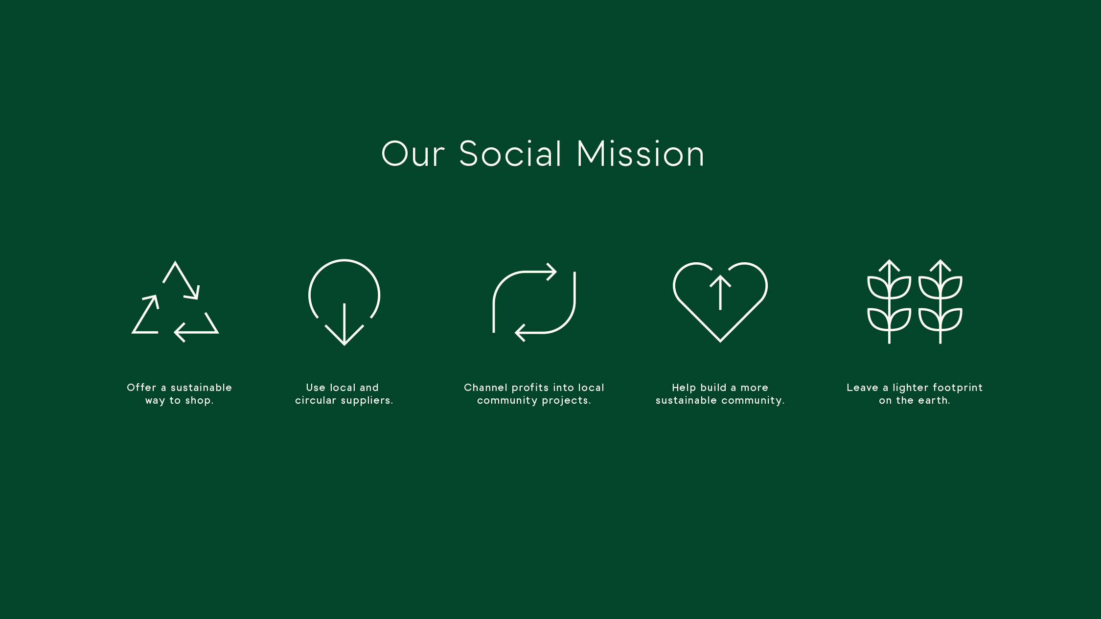
Our brief was to create a visual identity that would communicate the brand’s core messaging in a clear and desirous style. It was important for the client that it reflected the quality of the products on sale and echo the experience of zero ‘muda’: wastefulness. A fresh approach, minimal in all the right places without compromise, would create a contemporary brand that the local community could rely upon and grow around – the core of the client’s message.

CREDIT
- Agency/Creative: Turtle and Hare Studio
- Article Title: A Contemporary Approach to Zero Waste Re-fill Shops Designed by Turtle and Hare Studio
- Organisation/Entity: Agency, Published Commercial Design
- Project Type: Identity
- Agency/Creative Country: United Kingdom
- Market Region: Europe
- Project Deliverables: Brand Creation, Brand Experience, Brand Guidelines, Brand Identity, Brand Naming, Branding, Graphic Design, Identity System, Illustration, Photography, Research, Retail Brand Design
- Industry: Food/Beverage, Retail
- Keywords: refill, zero waste, sustainable, eco friendly, shop, branding, independent, small business, groceries, shopping, supermarket,
FEEDBACK
Relevance: Solution/idea in relation to brand, product or service
Implementation: Attention, detailing and finishing of final solution
Presentation: Text, visualisation and quality of the presentation


