Velis Vineyards have been presenting in my portfolio with their recognizable designs for a long time. The truth is that when we first met, they already had an existing design for their red wines, which for one reason or another we decided not to use now. However, later, after working together, we decided to go back to this design and transform it, using the new logo of the winery. The old design had its good and weak sides. My task was to use the good ones in the new design and do a complete makeover of the old label.
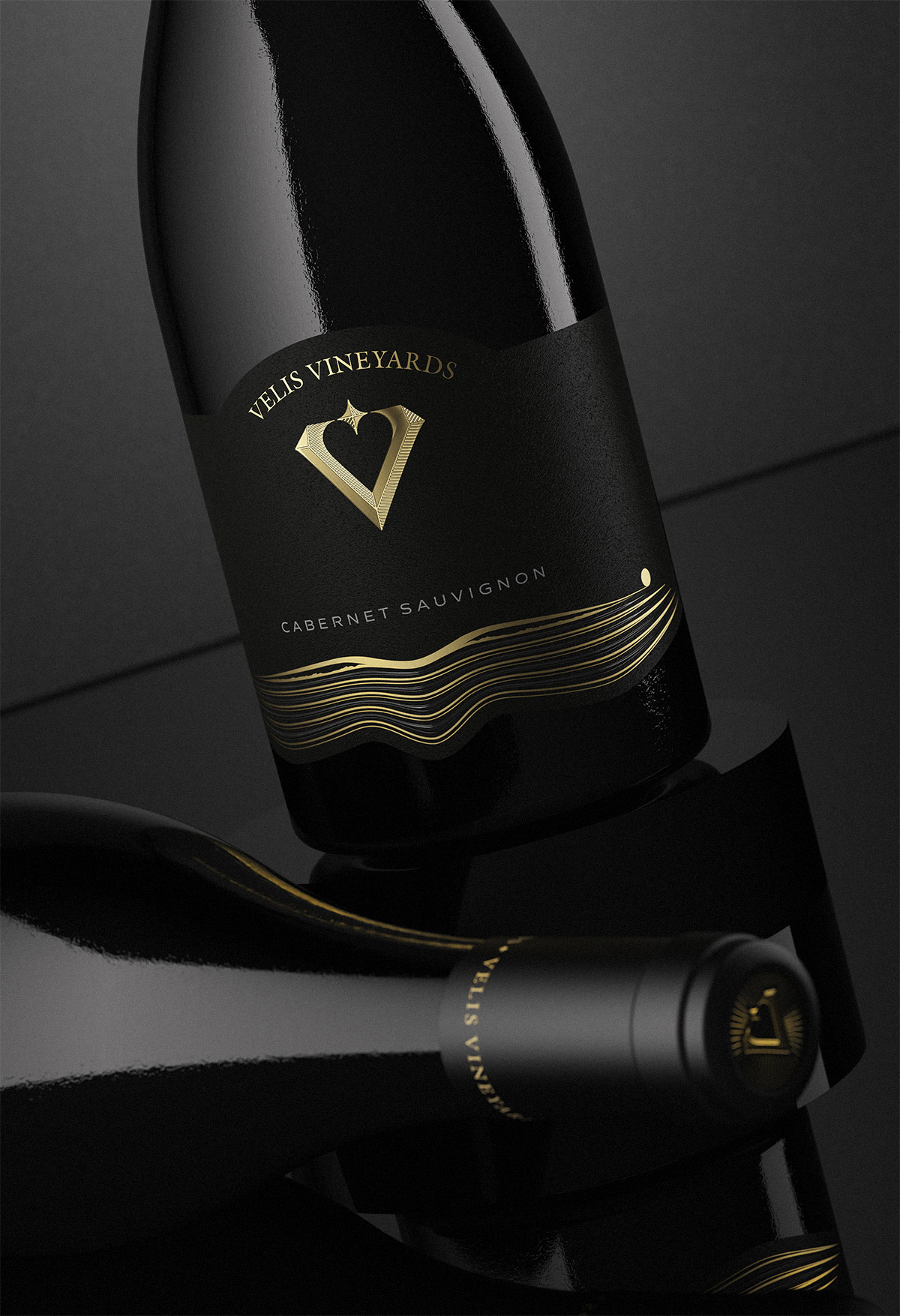
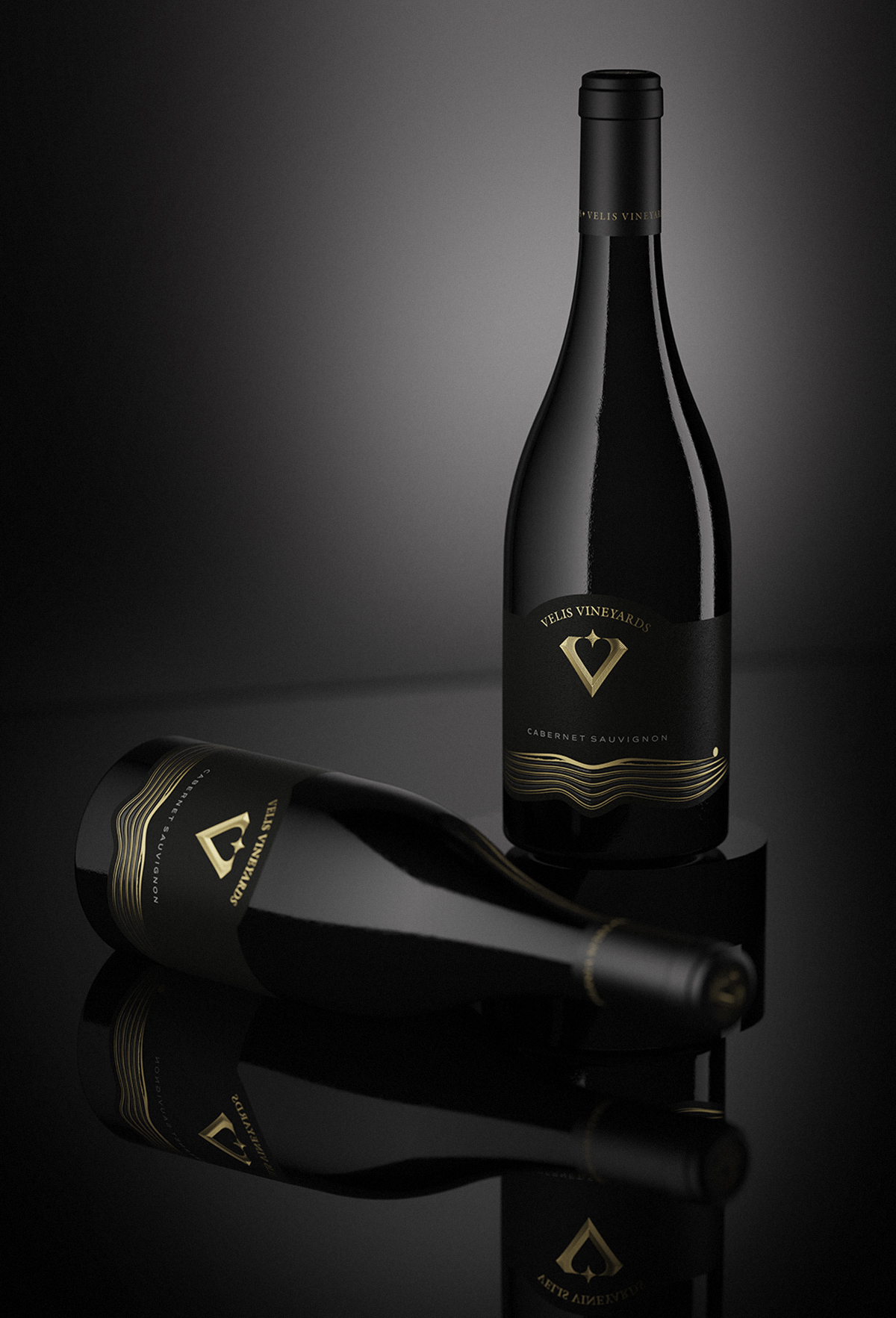
The main element that found a place in the new project was the stylized image of field & mountains. I have done almost no significant changes to it, except that I made it look a little more detailed and precise. I decided to stamp it as in the old design with gold foil. This time in the gaps between the lines, I added elements of transparent raised varnish improving the overall sensitivity of the image.
At the top of the label, I placed the new Velis Vineyards logo, which always provoked me to experiment on it. For this project I decided to use a special type of roof embossing, which emphasised the shape and volume of the sign itself. The print and all embellishments were precisely done by Dagaprint. The paper without any hesitation was Cotton Black by Avery Dennison – very solid heavy stock, great texture, perfect contrast with black glass.
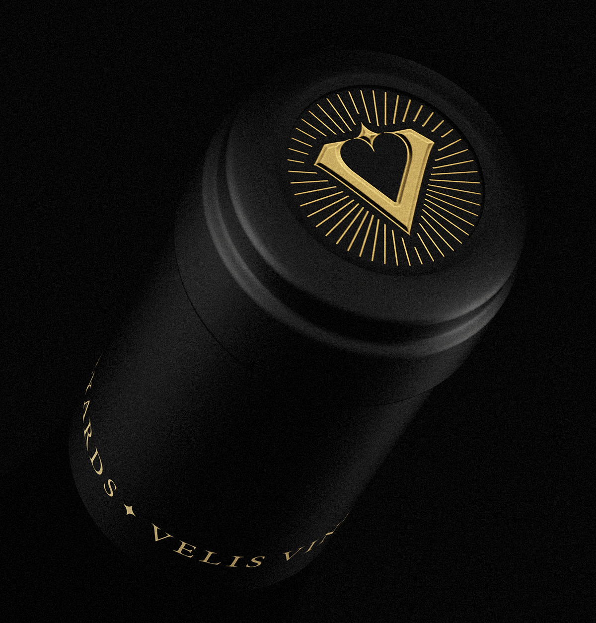
And of course in the end – we changed the bottle. The previous design used a very beautiful burgundy bottle, but I was worried that its diameter would not be wide enough to show the beauty of the new label. Therefore, to complete the full makeover, we used a burgundy bottle with a noticeably wider diameter, which allowed maximum visibility to the label itself. The capsule is made of tin with gold embossing on the logo on top. The whole design has a very big connection with the original, from which we started in the beginning. We took what we liked and changed everything else, trying not just to make a simple redesign, but to achieve a full makeover of the old label.


CREDIT
- Agency/Creative: the Labelmaker
- Article Title: A Complete Transformation for a Classy Wine Label for Velis Vineyards
- Organisation/Entity: Freelance
- Project Type: Packaging
- Project Status: Published
- Agency/Creative Country: Bulgaria
- Agency/Creative City: Sofia
- Market Region: Europe
- Project Deliverables: Brand Design, CGI, Graphic Design, Label Design, Packaging Design
- Format: Bottle
- Substrate: Glass Bottle
- Industry: Food/Beverage
- Keywords: the labelmaker, wine label art, wine label designer, wine label design, wine design, wine branding, wine label print, hot foil stamping, microembossing, gold hot foil, jordan jelev, velis vineyards
-
Credits:
Client: Velis Vineyards


