Carrousel Agency – Henley Oyster Co.
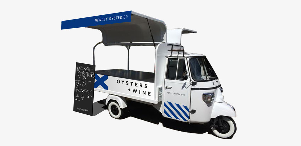
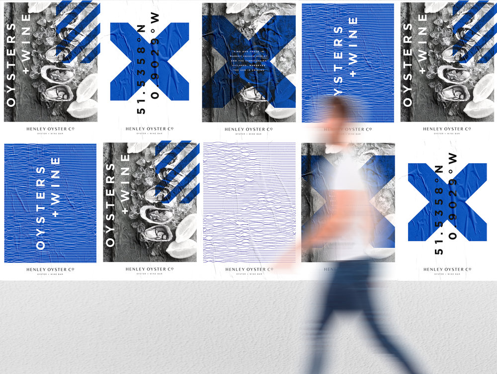
“ Designed for a 2018 summer launch, Henley Oyster Co. is a mobile oyster + wine cart set to tour Henley-on-Thames and the surrounding areas.
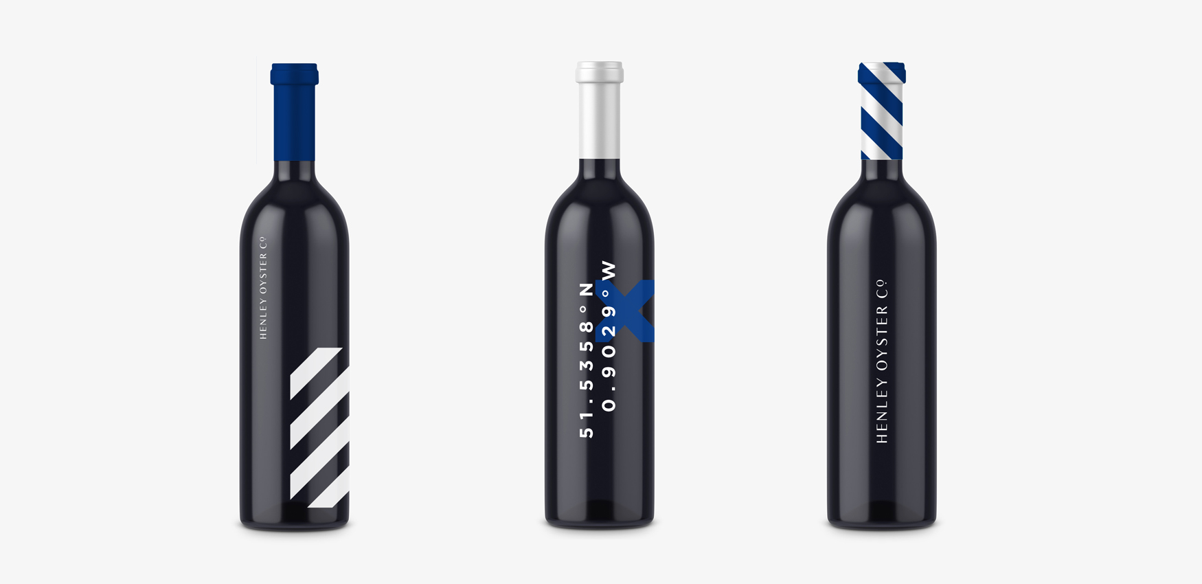
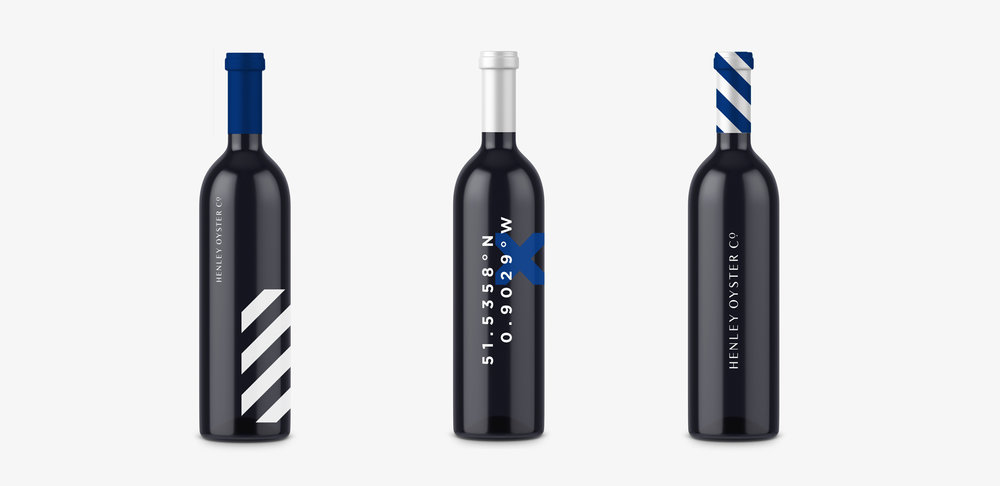
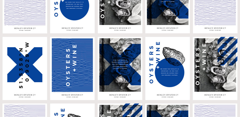
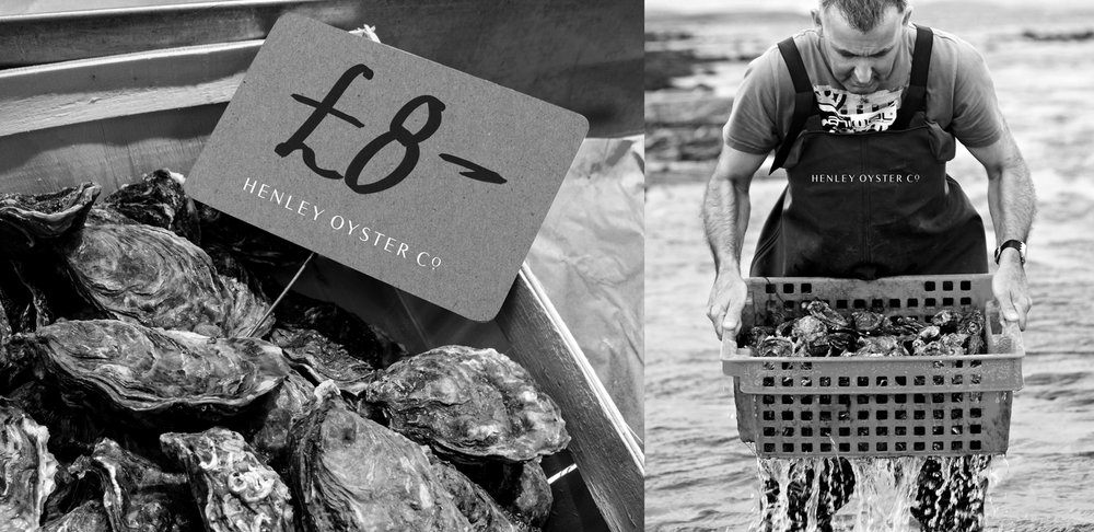
Prestigious but with a contemporary twist was the brief for the brand. Taking inspiration from the geometric nautical alphabet and naval flags, the longitude and latitude of the market square in Henley-on-Thames and photography which heroes the core offering; we created a flexible identity system which works across a variety of applications.
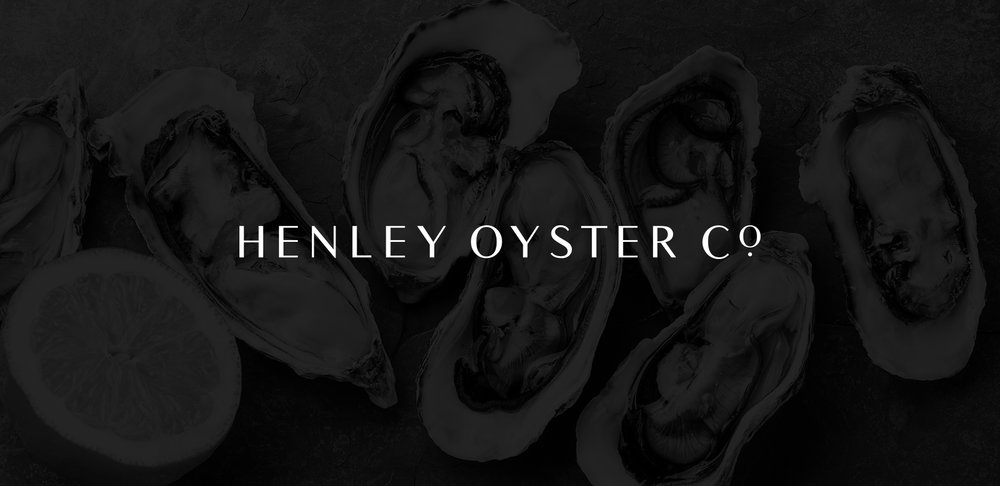
The logotype is crafted from the ubiquitous Times New Roman, a contemporary take on an old classic. The use of the small dot is a subtle nod to the precious pearls found within oysters.”

CREDIT
- Agency/Creative: Carrousel Agency
- Article Title: A classic contemporary identity for Henley Oyster Co.
- Organisation/Entity: Agency Concept / Non Published
- Project Type: Packaging
- Agency/Creative Country: United Kingdom
- Market Region: Europe
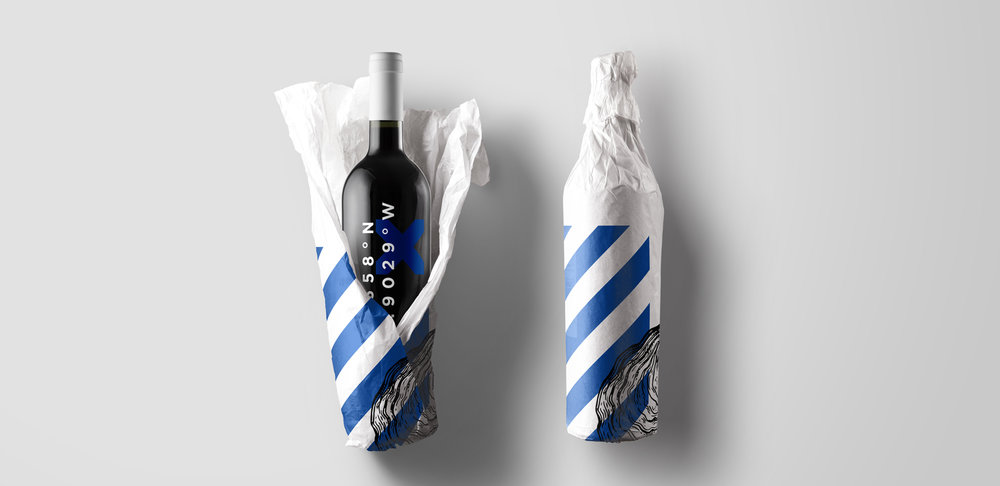
- Format: Bottle, Wrap
- Substrate: Glass, Pulp Paper
FEEDBACK
Relevance: Solution/idea in relation to brand, product or service
Implementation: Attention, detailing and finishing of final solution
Presentation: Text, visualisation and quality of the presentation


