


What if care didn’t end at the door but began at the table
Marklinica reimagined the café inside Royal Fertility Center not as an amenity but as an emotional extension of the clinic’s promise, a place where design becomes a quiet act of care. Because in a space defined by hope, patience, and human emotion, even a cup of coffee can become part of the healing language.
The café was never meant to be a separate entity. It was envisioned as a continuation of the clinic’s softness, its empathy, its rhythm. A physical manifestation of rest within a journey that is often filled with anticipation and fragility. This is not simply a story of interiors or branding. It’s a story of design as therapy of how visual silence can speak louder than words, and how hospitality, when designed with empathy, becomes a form of medicine.
The Challenge
Fertility care exists at a delicate intersection of science and emotion. Every detail, every tone, texture, and temperature carries weight. Designing a café in such a context meant designing for hearts as much as hands. The challenge was never about making the space beautiful; it was about making it belong. How do you create an environment that feels human, not sterile? Hopeful, not overly polished? How do you extend the integrity of medical care into the warmth of daily rituals without breaking the emotional tone that defines the Royal experience? Marklinica was tasked with creating more than a café. It was about designing a pause a place where care doesn’t feel clinical but continuous.
The Vision
The idea began with a simple belief: that healing doesn’t only happen in treatment rooms. It happens in the quiet moments when couples sit together with coffee, when light spills softly across a table, when the scent of something warm fills the air. From this philosophy, the café’s identity was imagined not as an extension of a brand, but as an extension of emotion. Every material, color, and line was chosen to whisper calm, to remind visitors that they are still being cared for, even outside the consultation room. This café had to feel like part of the same heartbeat as the clinic itself the same sense of trust, dignity, and grace that defines the Royal Fertility Center.
The Solution
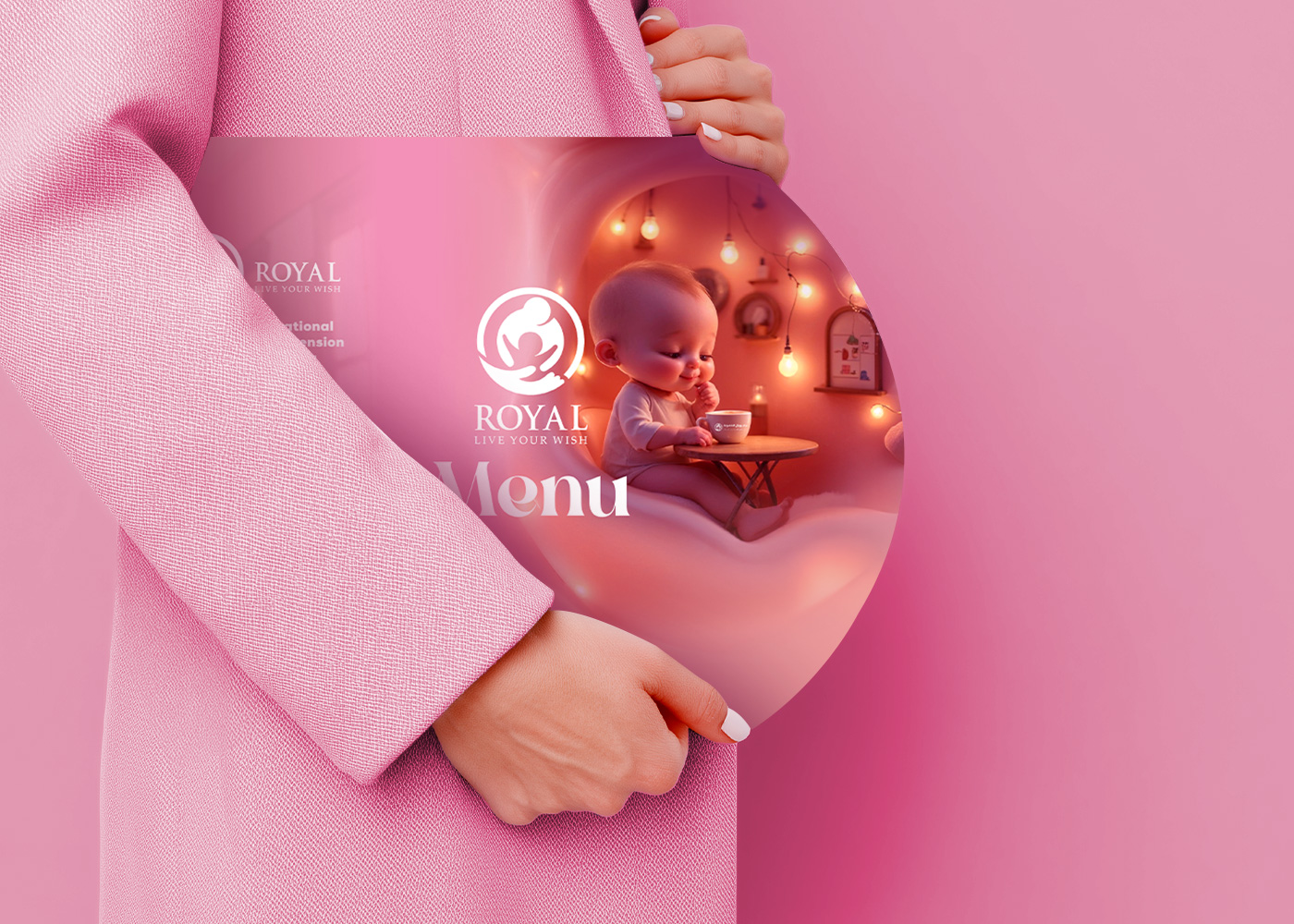
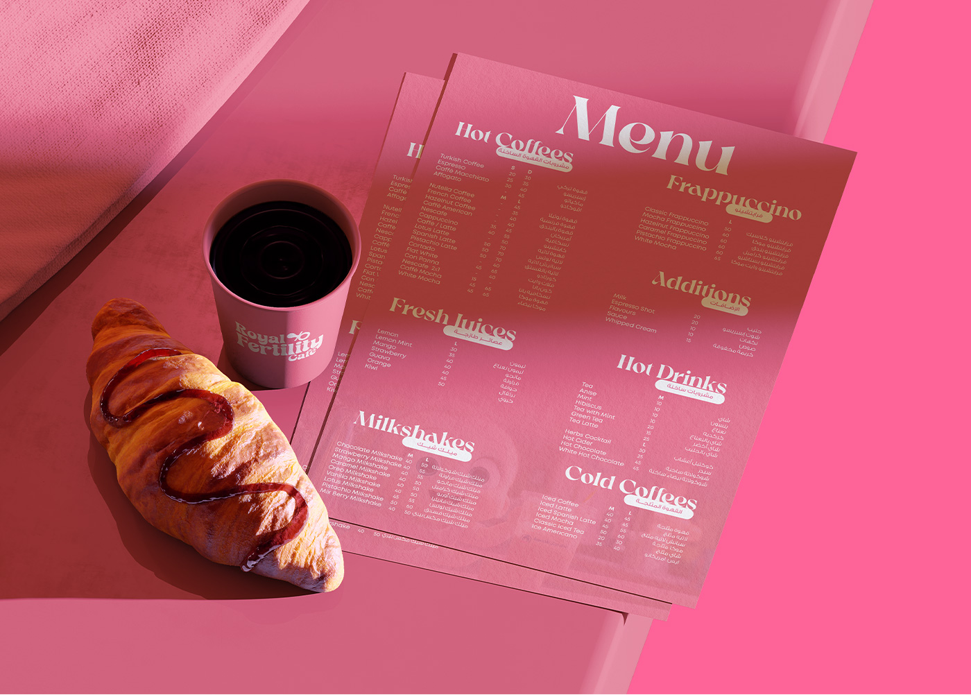
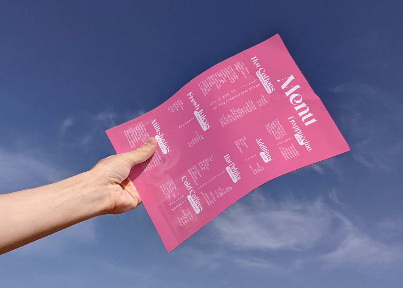
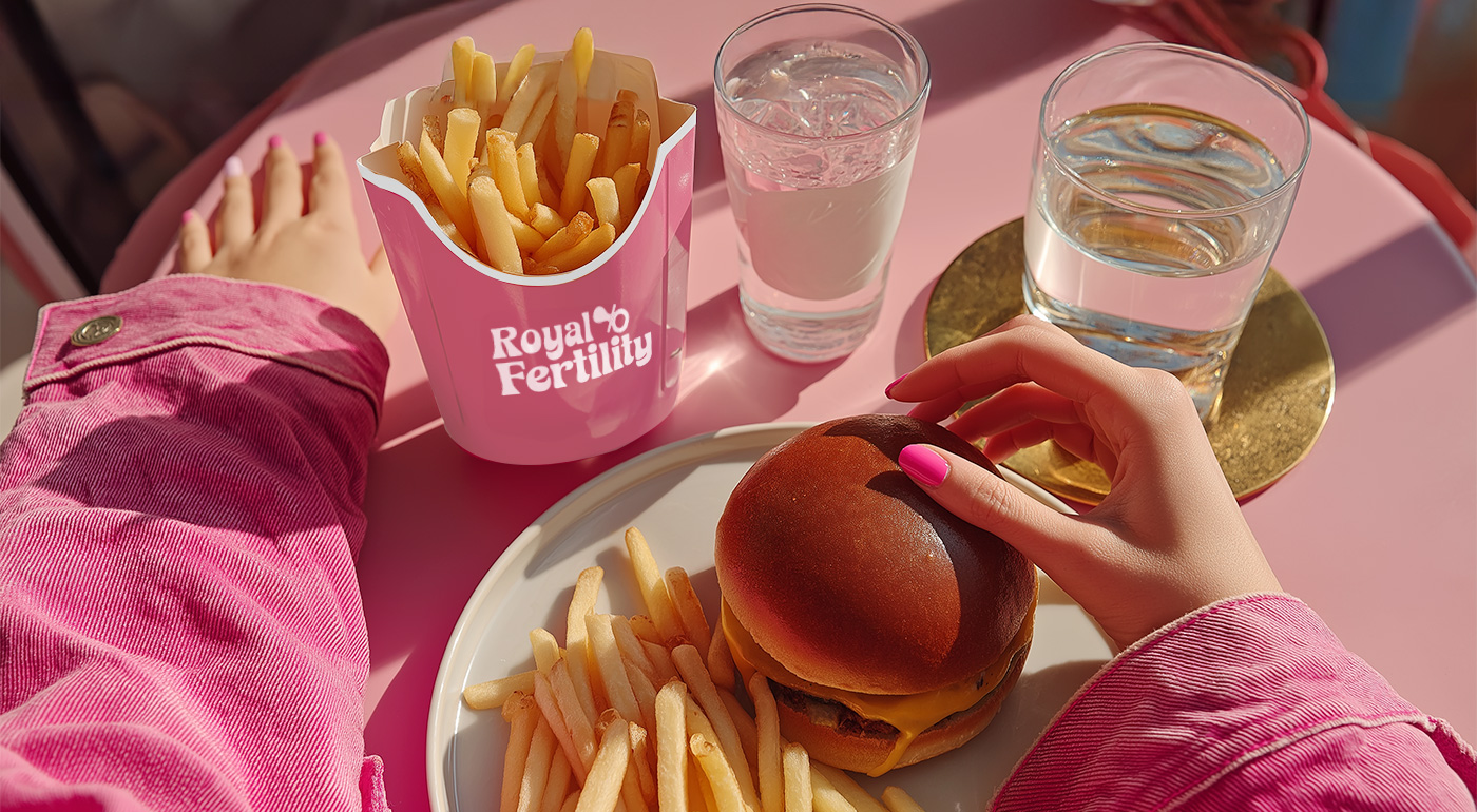
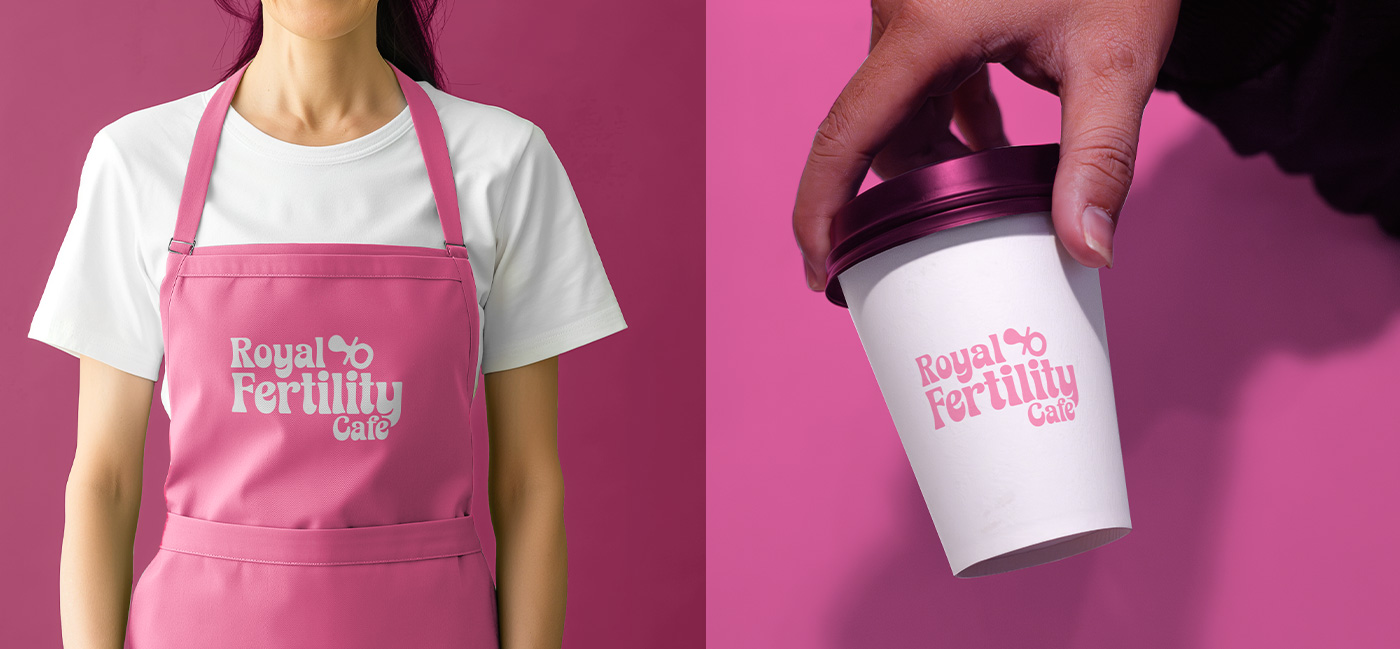
Marklinica’s solution unfolded through restraint, empathy, and balance. Every decision, from packaging to spatial graphics, revolved around a controlled palette of soft whites that speak of purity, botanical greens that symbolize growth and renewal, and metallic tones that add a quiet, modern sophistication. This palette wasn’t just aesthetic; it was symbolic. White evokes serenity and cleanliness, a sense of possibility. Green reflects fertility and life in its purest form. The metallic accents act as gentle reflections of hope, grounding the softness in reality. Typography carried dual purpose: clinical clarity balanced with emotional approachability. Sans-serifs chosen for readability and calm. Letter spacing widened to let each word breathe like a deep inhale before a moment of relief.
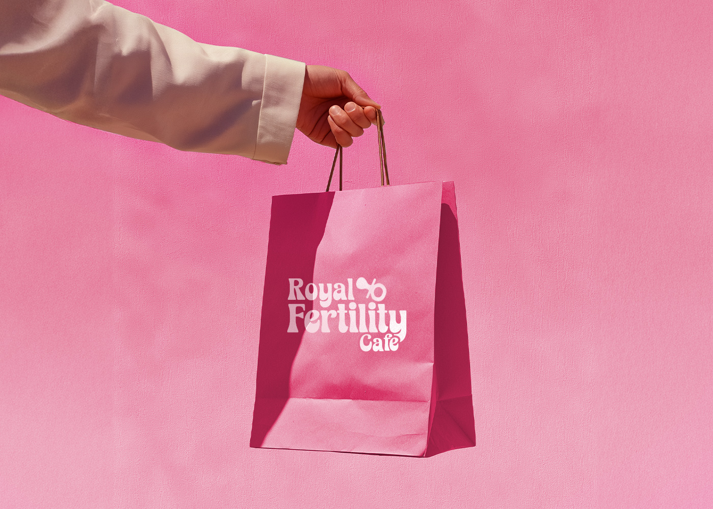
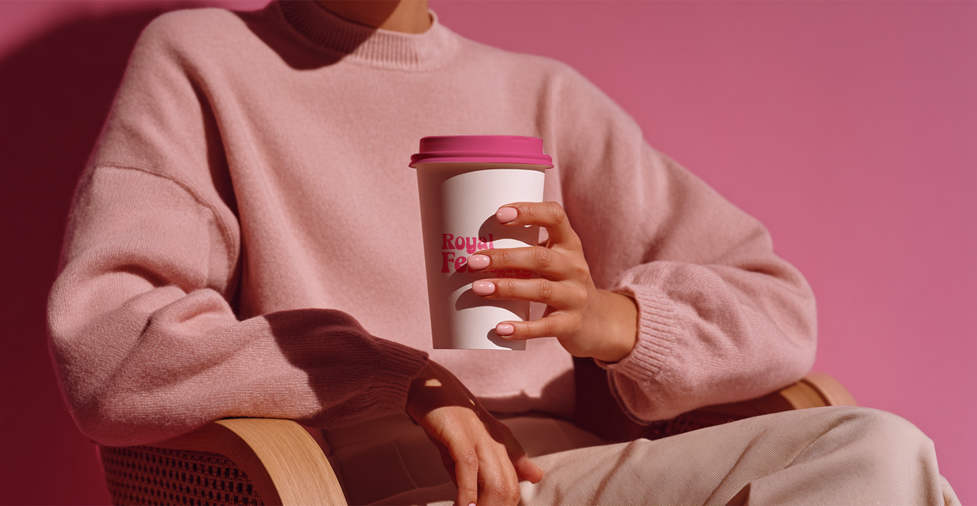
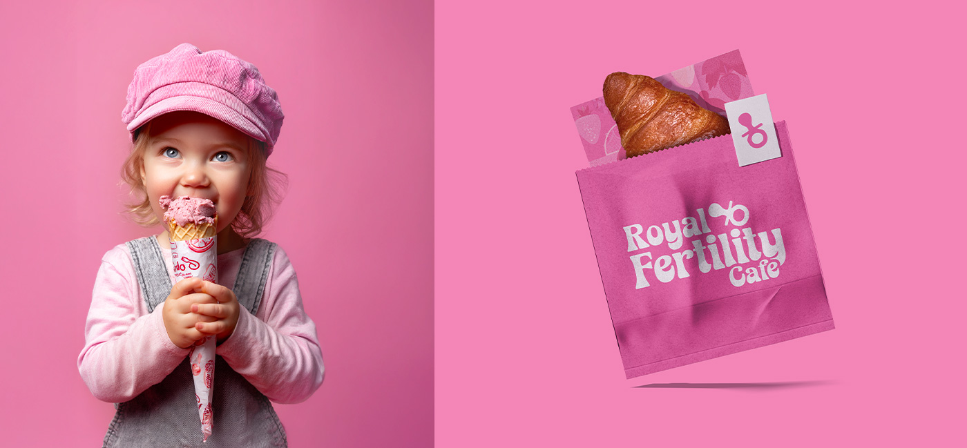
The iconography redefined nourishment. It wasn’t about calories, ingredients, or nutrition facts. It was about what care looks like when expressed through form nourishment as empathy. The smallest symbols, from coffee cup outlines to botanical hints, carried the same emotional intelligence as the clinic’s visual language. Even the packaging became part of the conversation. Paper felt soft to the touch. Cups invited holding, not grabbing. Textures were intentionally understated the kind that encourages you to slow down. In every sense, the café was designed not just to serve coffee but to serve calm.
Art Direction
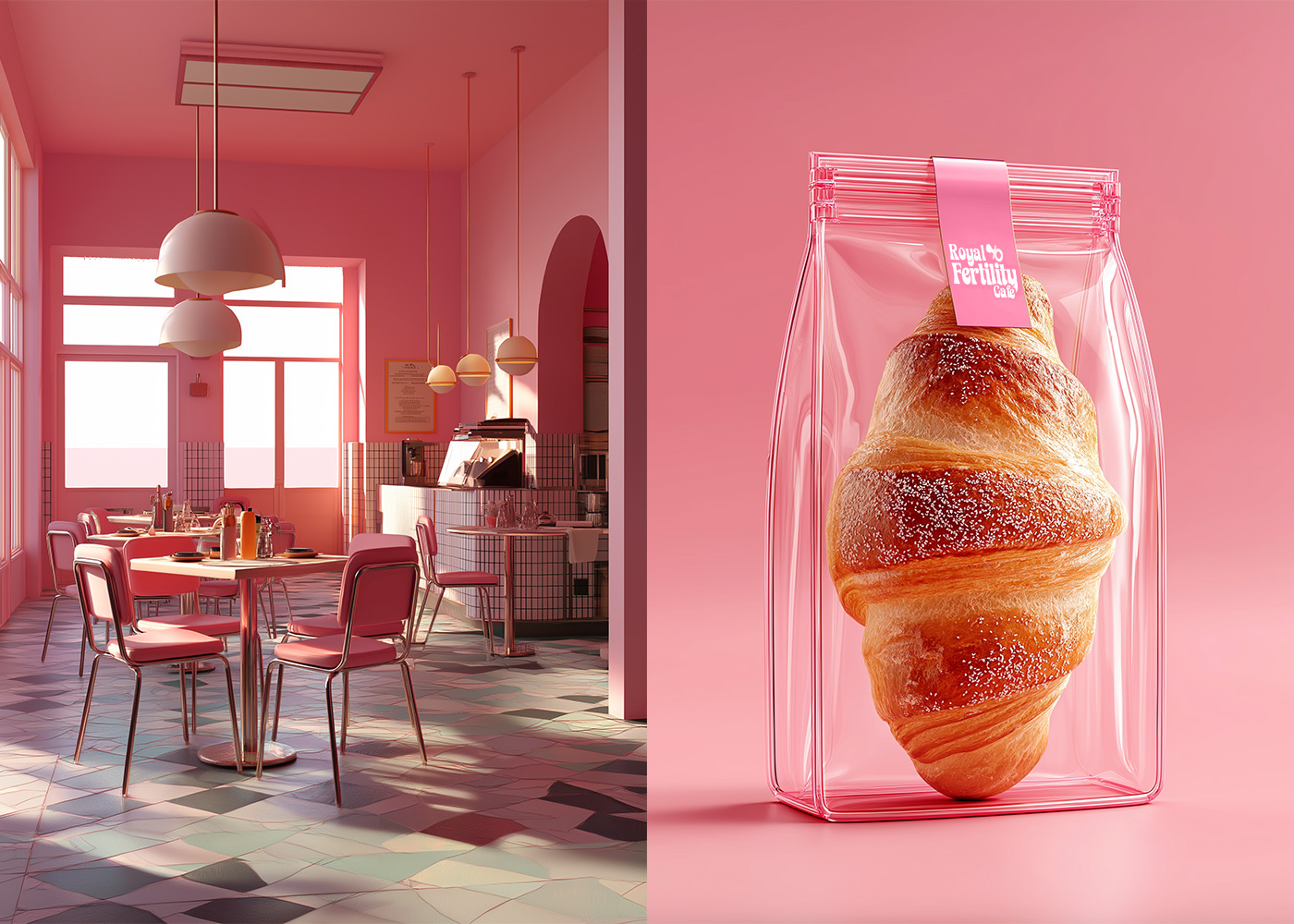
Art direction turned everyday gestures into rituals. The way a cup is lifted, the sound of a wooden board placed gently on a table, the light sliding across the wall every interaction was choreographed with intention. Lighting, in particular, became a key narrative tool. Diffused, not dramatic. It wasn’t meant to perform, but to embrace illuminating faces without glare, softening edges, and turning stillness into beauty. The textures of the materials followed the same principle. Wood, stone, fabric all chosen for warmth and tactility. Surfaces were soft to both eye and hand, grounding the sensory experience in gentleness. Every element carried dual meaning, functional and emotional. Cups weren’t just vessels; they were conversation starters. Menus weren’t lists; they were invitations to breathe. Even the placement of boards followed a gentle hierarchy, guiding attention without demanding it. The café thus became an architecture of empathy one that feels designed by people who understand silence, emotion, and time.
The Experience
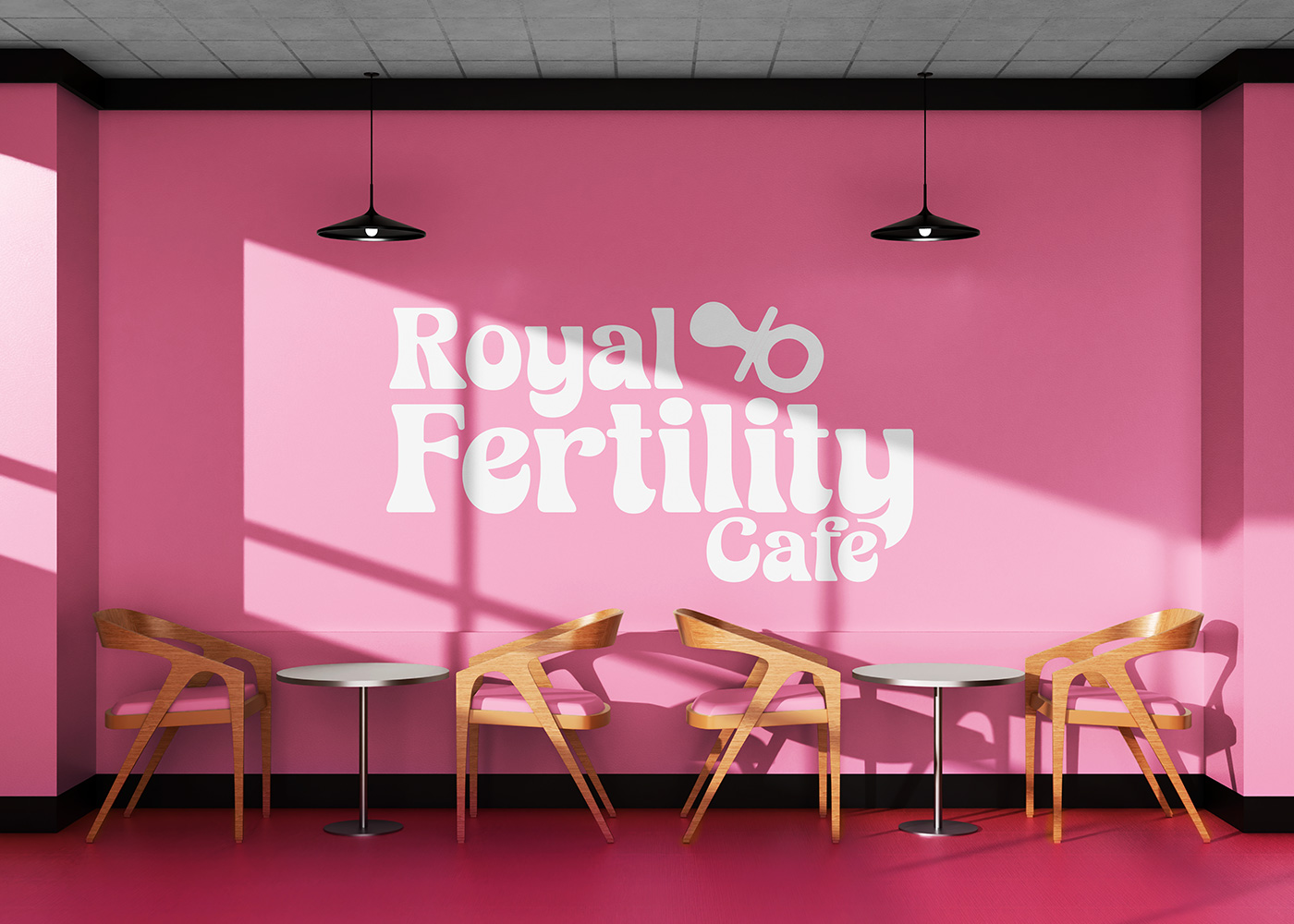
For visitors of the Royal Fertility Center, the café became more than a waiting area. It became a transition space where anticipation gives way to reflection, and where design quietly reinforces hope. Patients and families found comfort in its stillness. The aroma of coffee intertwined with the clinic’s sense of calm, blurring the boundaries between medical precision and human warmth. Here, care wasn’t a service it was a presence. Marklinica saw the café as a microcosm of the clinic’s philosophy. It embodies balance between science and soul, structure and spontaneity, privacy and connection. It invites people to inhabit care rather than merely receive it.
The Process
Behind this seamless calm was an intricate design process. The Marklinica team began by immersing themselves in the emotional landscape of fertility care observing how patients move, how they wait, how they look for reassurance in small details. Research revealed that waiting areas often amplify anxiety. The insight was clear: transform the act of waiting into an act of grounding. Spatial design responded to this by creating zones of gentle separation places that encourage stillness without isolation. Graphic systems were built with modular precision to ensure the identity remained coherent, whether on signage, takeaways, or uniforms. The result was a system that feels effortless but deeply thought through. Every curve, every margin, every tone speaks the same language of understated confidence.
Outcome
From interior signage to takeaway packaging, Marklinica crafted a design language that restores rhythm and redefines what care feels like in a clinical setting. The Royal Fertility Center Café doesn’t just offer refreshment; it offers reassurance. It turns waiting into warmth and hospitality into healing. It shows that design isn’t about decoration; it’s about emotion made visible. Today, when someone steps into the Royal Café, they don’t just see a logo or a color palette. They feel the Royal philosophy translated into experience one where care is not only delivered but designed. Every touchpoint, from the first glance at the menu to the last sip of coffee, echoes the same quiet promise: you are being cared for, even here.
Conclusion
In the end, Marklinica didn’t just design a café. They designed a continuation of trust, a space where the language of fertility care expands beyond consultation rooms into daily life. What if care didn’t end at the door but began at the table? At Royal Fertility Center, that question is no longer rhetorical. It’s reality designed, felt, and lived.
CREDIT
- Agency/Creative: Marklinica
- Article Title: A Cafe Belongs in a Royal Fertility Journey Designed by Marklinica
- Organisation/Entity: Agency
- Project Type: Identity
- Project Status: Published
- Agency/Creative Country: Egypt
- Agency/Creative City: Alexandria
- Market Region: Middle East
- Project Deliverables: Brand Creation, Brand Design, Brand Identity, Creative Direction, Digital Art, Digital Painting, Identity System, Packaging Design, Packaging Guidelines
- Industry: Health Care
- Keywords: Marklinica, Royal Fertility Center, Branding, Packaging, Brand Identity, Café Branding, Spatial Design, Wellness Design, Environmental Graphics, Interior Signage, Human-Centered Design, Emotional Branding, Healing Spaces, Hospitality in Healthcare, Warm Minimalism, Botanical Palette, Typography, Color Palette, Iconography, Materiality, Diffused Lighting, Tactile Surfaces, Modern Serif Typography, Modular Layout, Subtle Motion, Design, Visual Identity, Art Direction
-
Credits:
Art Director: Rana Mohsen
Brand Designer: Rowan Hamada


