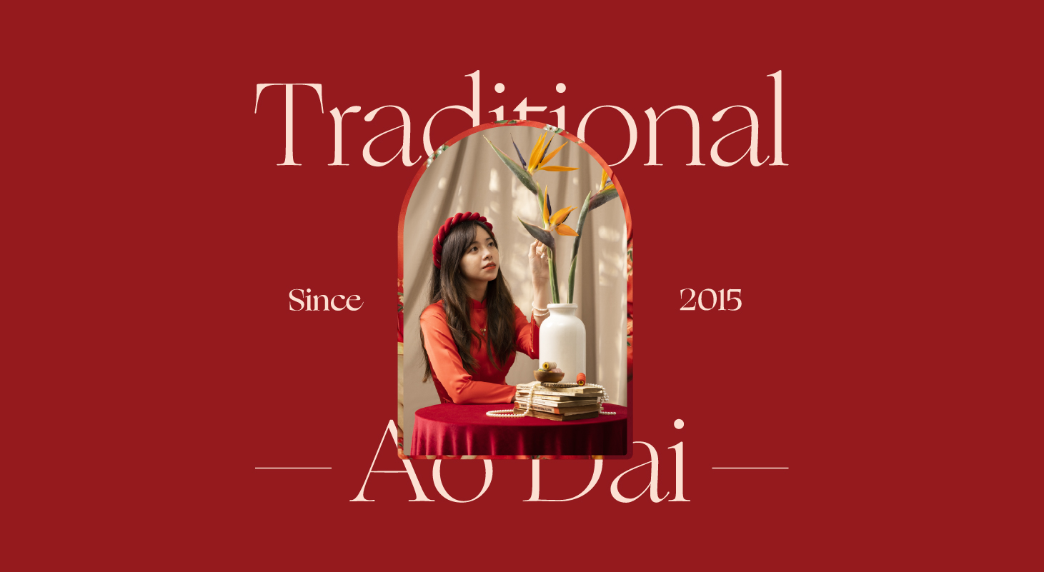
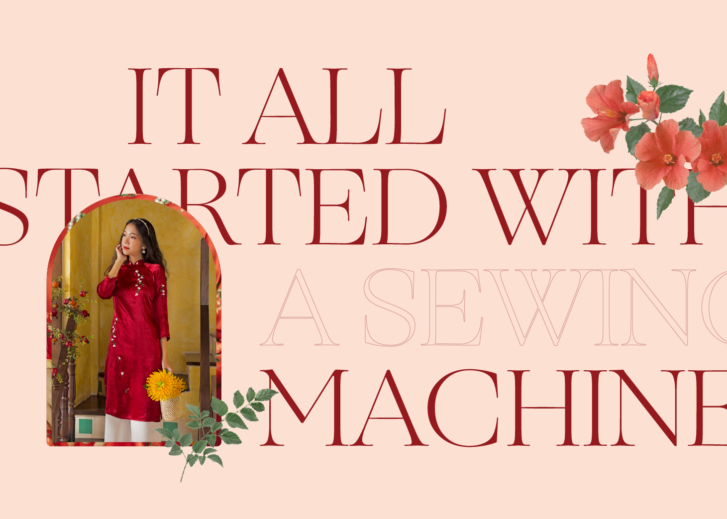
Sumire is a fashion brand founded in 2015, having roots in old Saigon as a tailor for over 30 years. They came to Taste on their mission to put the traditional values of Saigon girls into accord with modern life. We assisted Sumire in redesigning its brand identity, from logo to product packaging, assisting Sumire in establishing its brand in the conventional designer fashion industry.
The Challenges
Over the years, Sumire’s identity was first represented through a basic graphic of a feather, dark red hue, and distinctive calligraphy. Sumire’s goods are increasingly recognized by clients and the market due to their quality, uniqueness, and application, with the aim of bringing the feminine and delicate beauty of tradition into the lives of modern women. Sumire felt that there was a need for a shift in image standardization in a more contemporary and professional approach to reposition the image in the hearts of customers when confronted with numerous possibilities and difficulties to scale up.
The Brief – Rebranding Summer
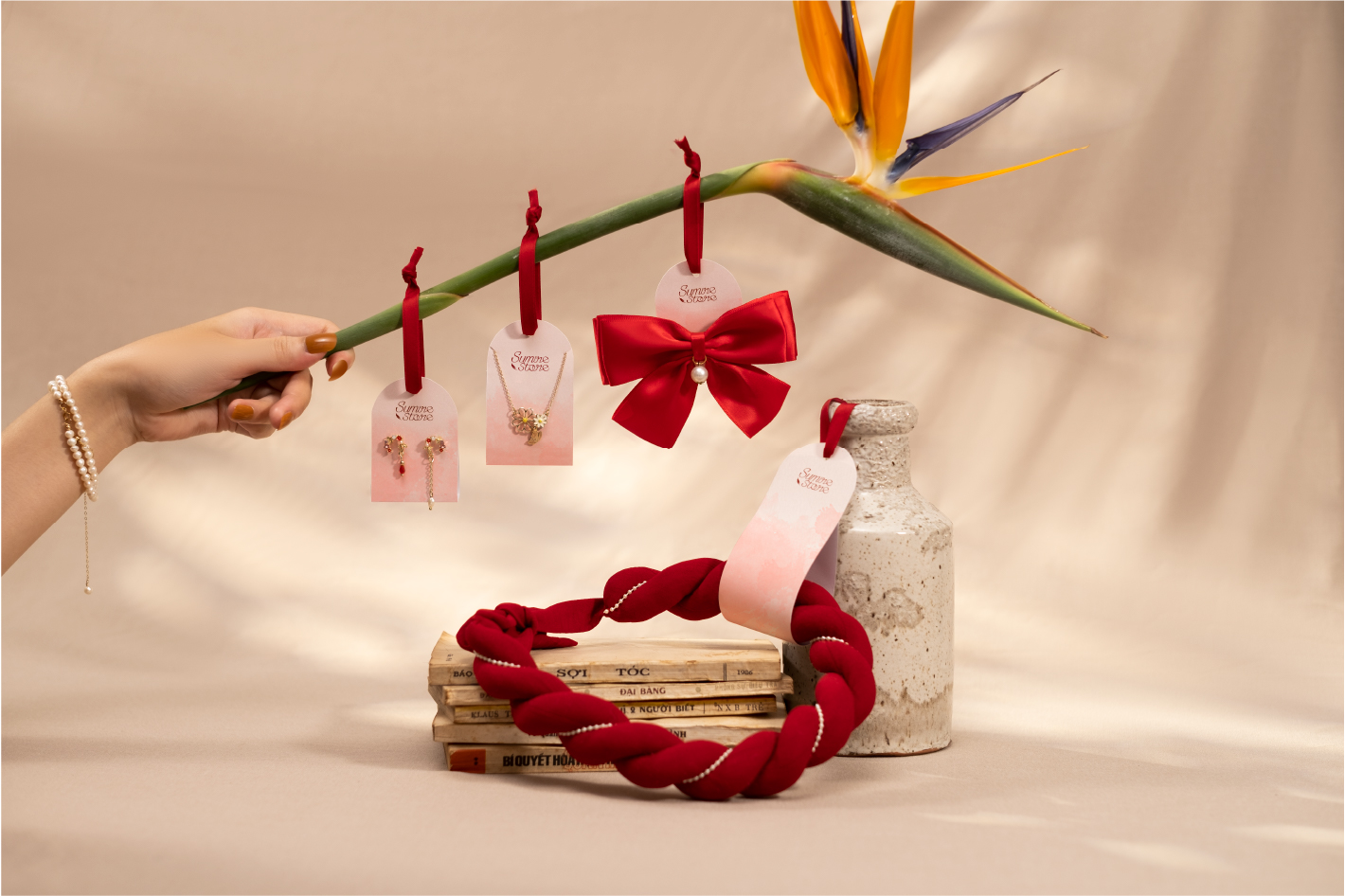
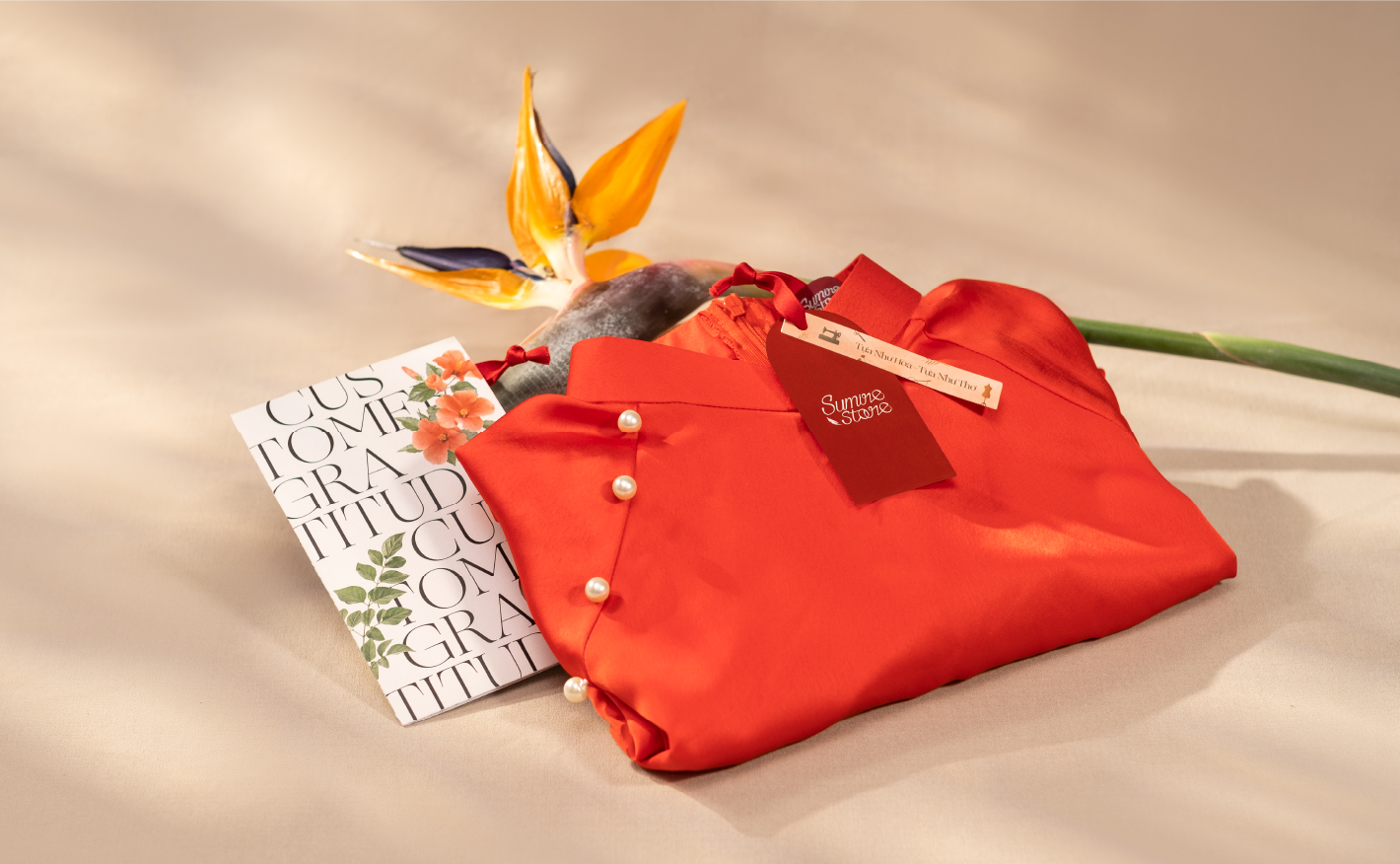
Sumire came to Taste Design looking for a more modern, intelligent approach to brand identity design. How to make the brand image consistent throughout publications, from fonts to colours, logos to product packaging, while retaining the brand’s regular materials.
The Solution
Research: According to market research, the bulk of traditional Ao Dai items are frequently produced by long-standing tailors using a manual tailoring technique, and the brand image recognition element is also less focused. Ao dai goods are frequently regarded as unique and difficult-to-obtain traditional outfits among the youth. Sumire approaches the market with creative goods with great applicability with the objective of changing market perspective by introducing bold traditional products that are widely utilized and can be worn as everyday wear. more and more contemporary Given the market differences, the Sumire brand identity may stand out by focusing on modernity.
Strategy: Sumire’s approach is to integrate image growth in conjunction with tradition and modernity, while still combining and harmonizing the two components. As a result, Taste Design progressively alters the brand aspects in order to preserve the brand’s essence while also incorporating a more current tone. The brand’s essential components, such as the feather, the distinctive dark red hue, or the handwriting of the elderly Saigon woman, are still used to establish a fresh identity.
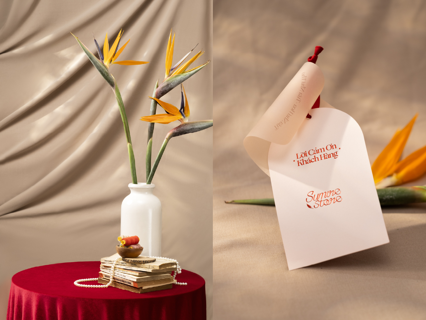
Design: To make the brand name more appealing, we examine the structure and dimensions of the Logo in order to stylize the typeface and feather designs in a softer, contemporary, and simpler approach while retaining the text’s identity. scribbled with care To modify the brand color using a more conventional color scheme, use the Pantone system. In addition, to establish a distinct identity, the icon set is constructed particularly from garment industry items such as needles, threads, sewing machines, and scissors, etc. Layout guidelines are updated in such a way that layout arrangements are handled correctly. We work hard to create subtlety and tenderness in every aspect so that the concept of “like flowers, like poetry” is strongly conveyed for a clothing brand.
The Results
Sumire Store grew its scope and produced various product lines imbued with traditional Vietnamese cultural elements once the new brand identity was finished and deployed. Not only does Sumire Store sell costumes like Ao Dai, Ao Yem, and Ao Ba Ba, but it also has many unique and historical pattern collections like Nhat Binh, Phap Lam, and so on. Sumire’s brand image is progressively gaining market recognition, allowing Sumire’s Mission to be carried out in accordance with the path that the small owner desires.


CREDIT
- Agency/Creative: Taste Design
- Article Title: A Branding Identity that Incorporates Traditional Values with the Modern Lives of Saigon Women
- Organisation/Entity: Agency
- Project Type: Identity
- Project Status: Published
- Agency/Creative Country: Vietnam
- Agency/Creative City: Ho Chi Minh city
- Market Region: Asia, North America, South America
- Project Deliverables: Brand Identity, Brand Redesign, Branding, Identity System, Packaging Design
- Industry: Fashion
- Keywords: #Sumire #AoDai #Vietnam #TraditionalCustomes
-
Credits:
Creative Director: MOJ
Account Executive: Dao T. Nguyen
Art Director: Thien Truong
Designer: Binh Nguyen
Designer: Nhu Truong
Illustrator: Binh Nguyen
Producer: Mai Anh Le
Lightning: Viet Thinh
Stylist & DI: Nhu Truong
Portfolio Photography: Taste Design Studio


