


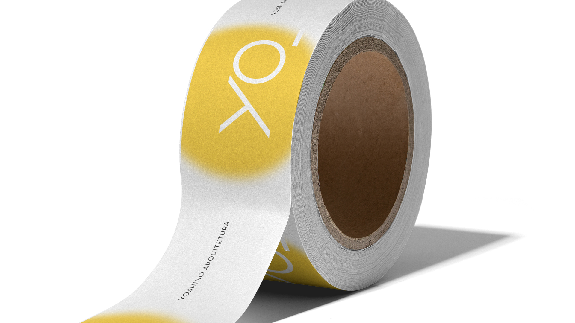
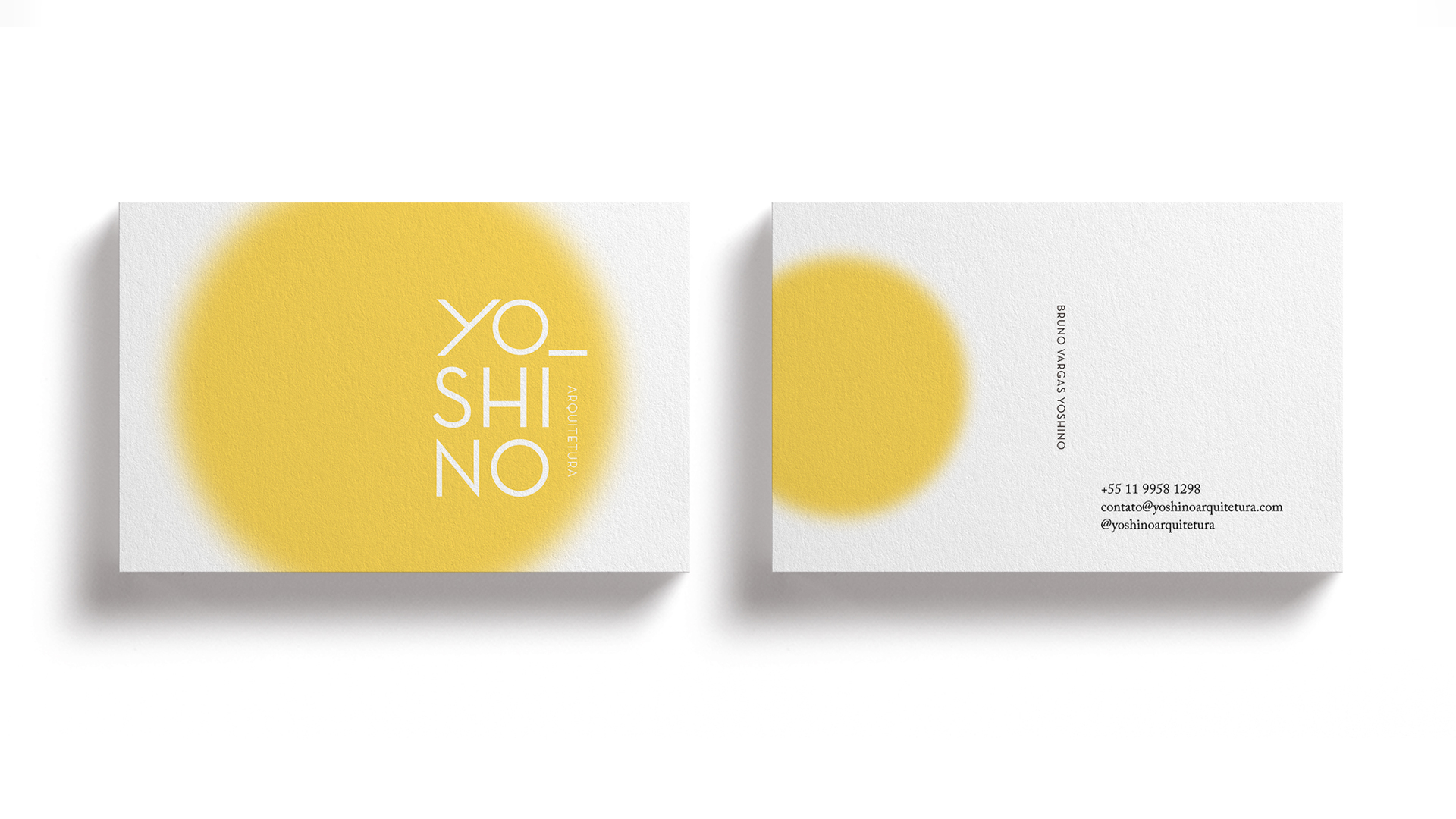
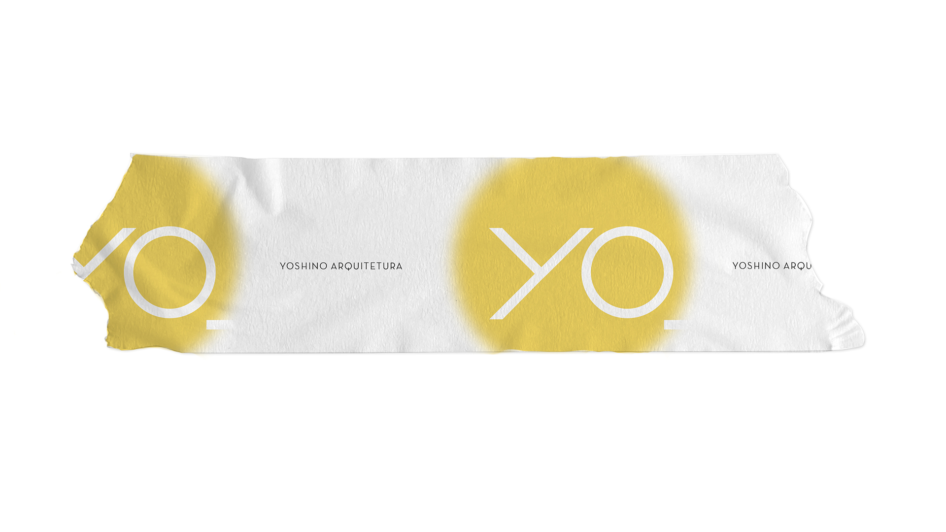
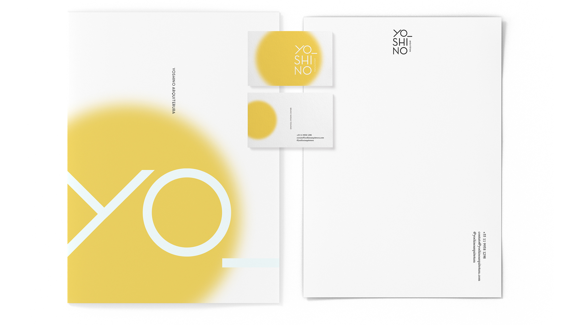
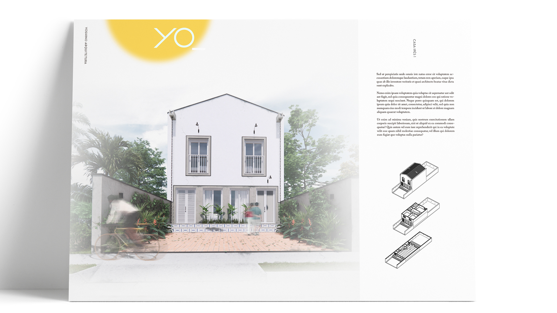
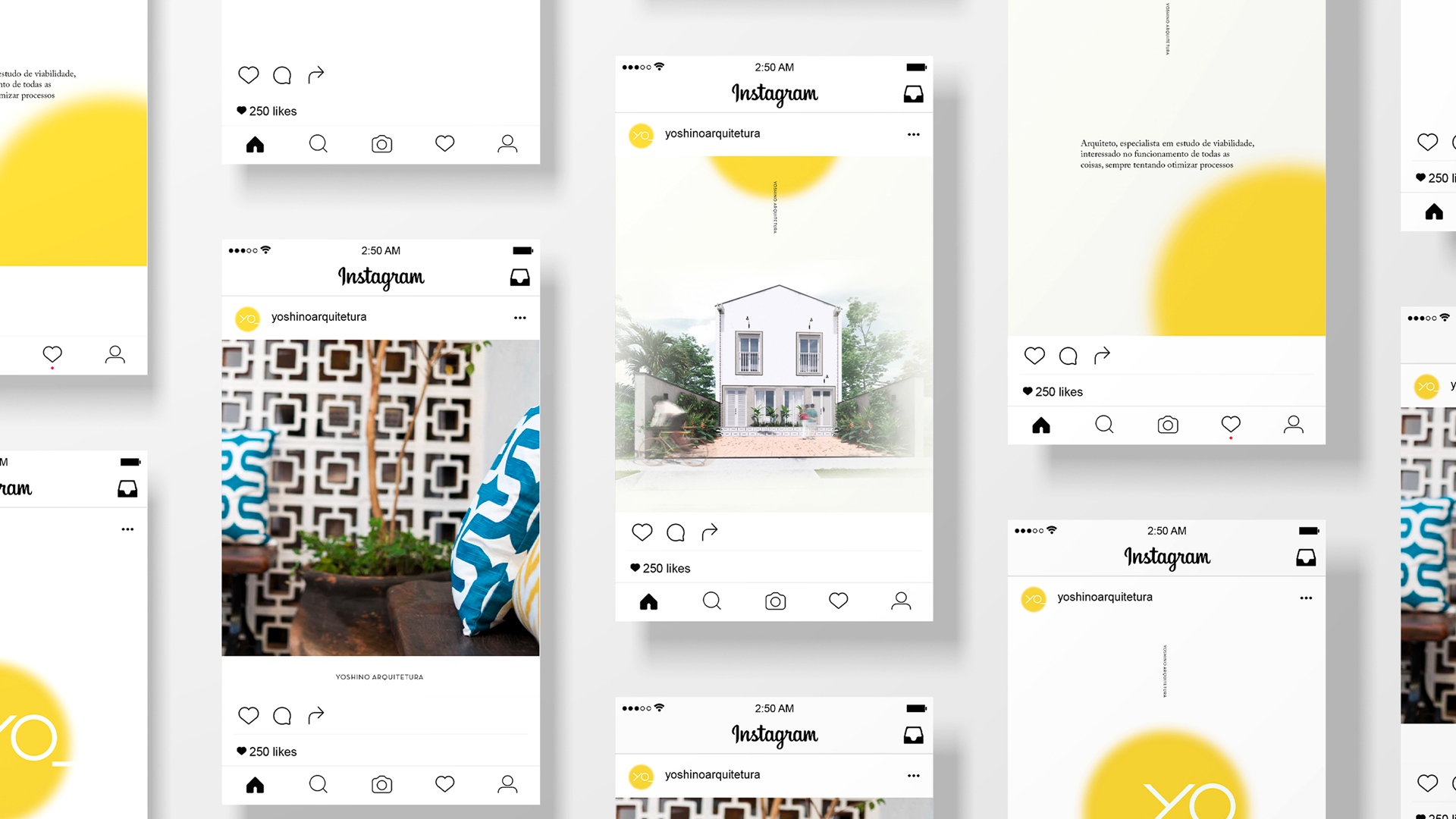
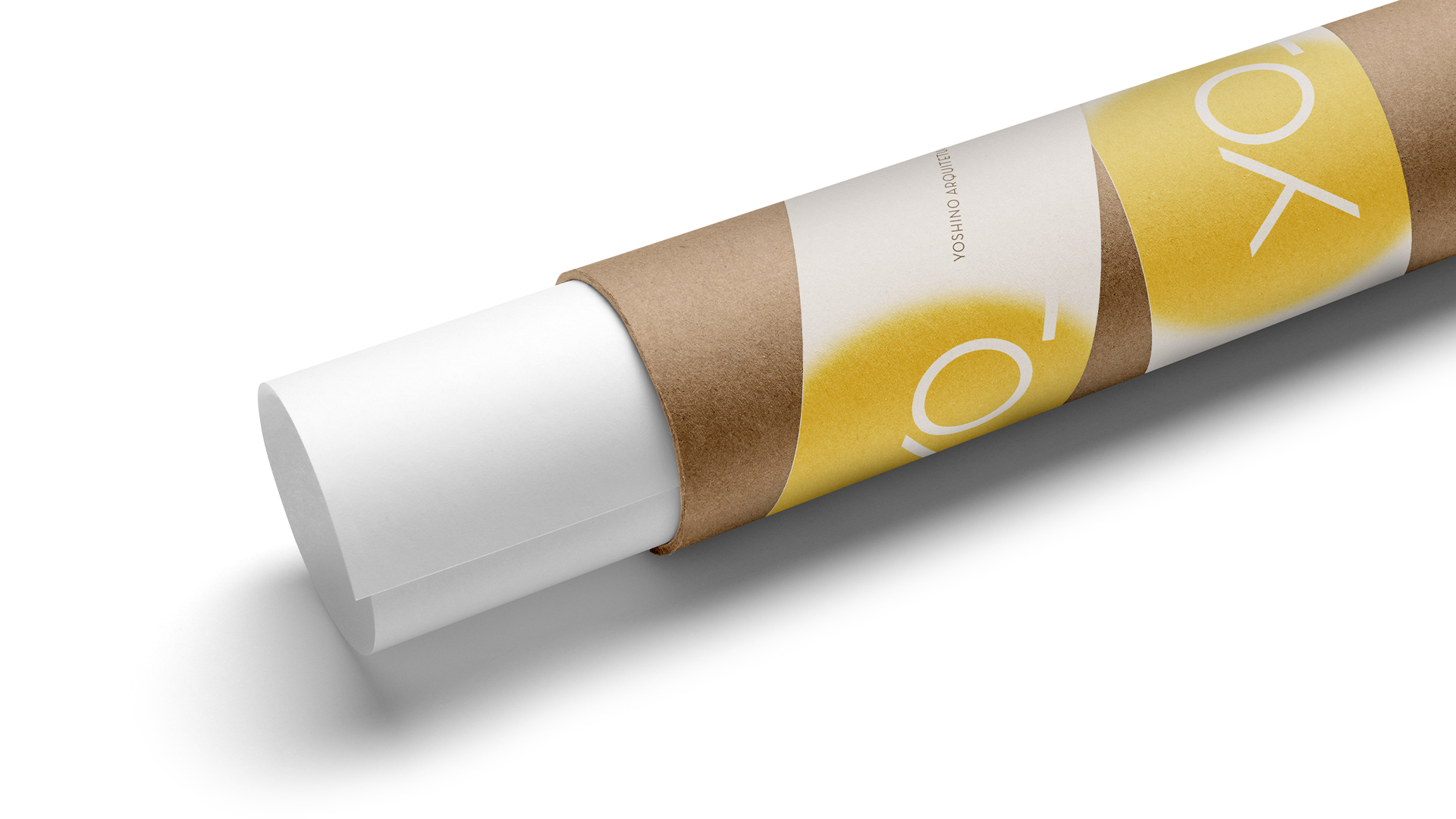
Branding for an architecture studio in São Paulo. As the architect has Japanese and Spanish origins, we decided to highlight the first syllable of his name Yoshino, Yo (I, in Spanish), as a brand idea, complemented by the circle inspired by the Japanese rising sun. Thus, we were able to bring both elements, from Spain (in the Yo vocalization) and Japan (with the reference to the country’s flag). The application of the circle in ‘spray graffiti’ was chosen as a symbol of the hyper-urban focus of Yoshino’s work, but it also works as a point of light over the name, highlighting the graphic choice of Yo.
The construction of the YO was also precise, with the Y being formed at a 90o angle to its base. The O is also a perfect circle, reinforcing the simple geometric figures and lines so important in architectural design. Simple geometric lines, minimalism and modernity were a request of the briefing, as they represent the professional personality of the architect.
The choice of the color palette – white, black, gray and yellow – was made conscientiously, bringing yellow as a point of light, which highlights the brand and completes it.
In this brand, white spaces – like empty spaces in architecture – are extremely important, bringing the value of contemporary Japanese minimalism to its presence. With that, in the brand’s applications, we chose to preserve the blank spaces, creating a graphic system that breathes contemporaneity, urbanity and simplicity, like the architecture of Bruno Yoshino.

CREDIT
- Agency/Creative: My dear Studio,
- Article Title: A Brand Built From the Self, Its Ancestry, Its Present, Its Future
- Organisation/Entity: Agency
- Project Type: Identity
- Project Status: Published
- Agency/Creative Country: Spain
- Agency/Creative City: Barcelona
- Market Region: South America
- Project Deliverables: Brand Identity
- Industry: Construction
- Keywords: mydearstudio, architecture, yoshino, brasil, identity, brand design, japonese, spanish, street, yellow, sun
-
Credits:
Graphic Design: Willian Hebling
Creative Direction: Camila Kintzel
Graphic Design: Rafa Ferro
Creative Direction: Rafa Ferro


