Bad Baker had the right idea, saying no to mean measures like margarine and compound chocolate. And instead saying yes to cookies that double down on real chocolate and are never a stinge on the ginge(r). But the brand and packaging weren’t communicating, not even small talk.
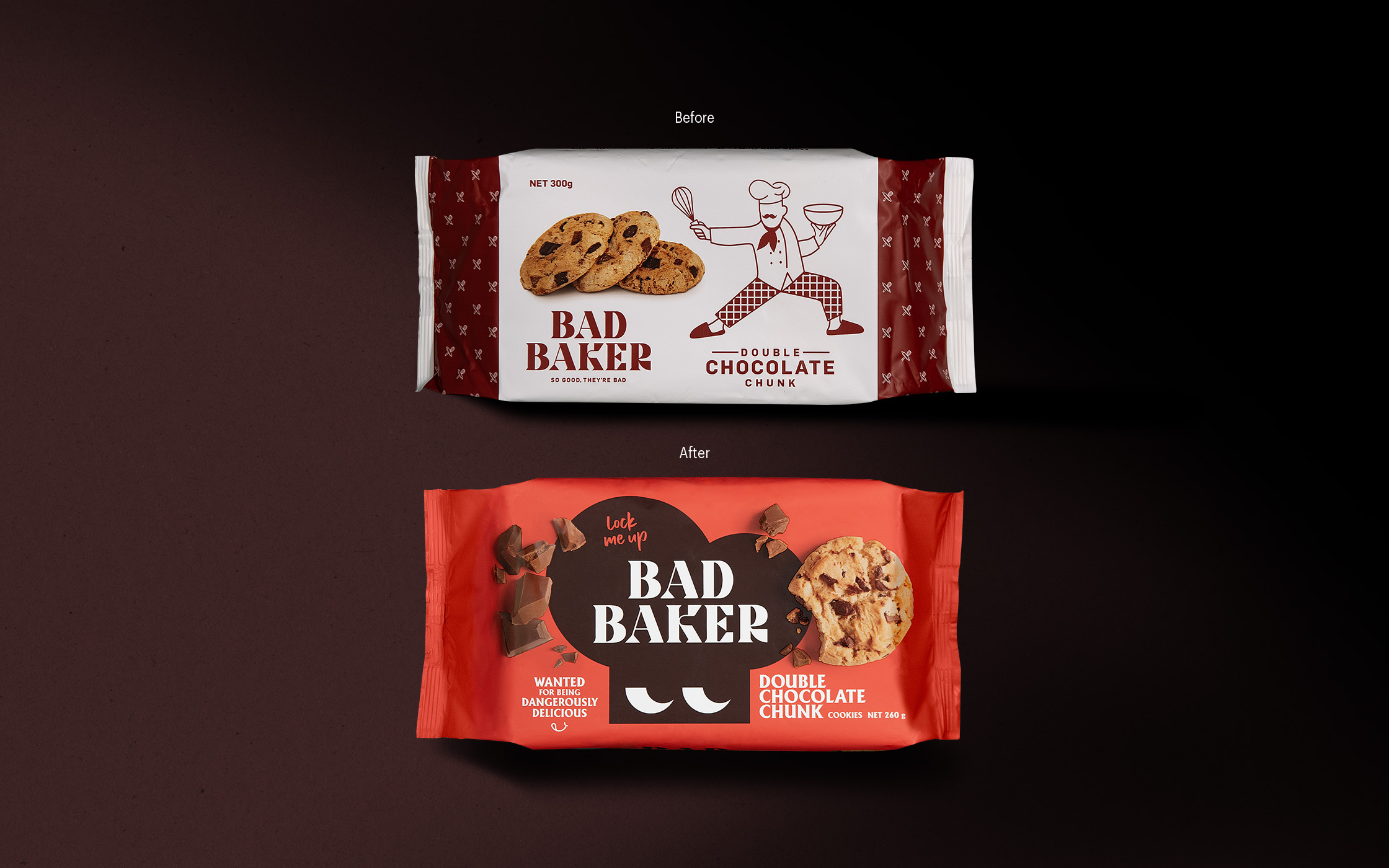
Dow Goodfolk identified the need for a stronger brand story, something captivating that people will fall in love with which resulted in a new look that stands apart from its competitors on supermarket shelves.
The brand lacked emotional connection, there was no story being told. Dow Goodfolk took advantage of Bad Bakers previous characterful intents with their brand name and the glimpses from their old packaging and build this out to be more considered and intentional.
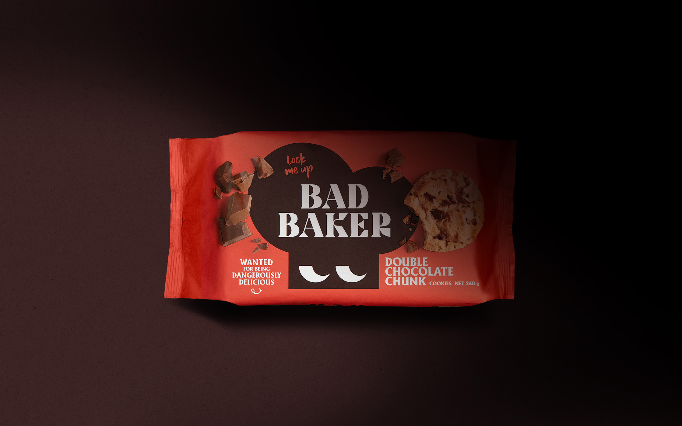
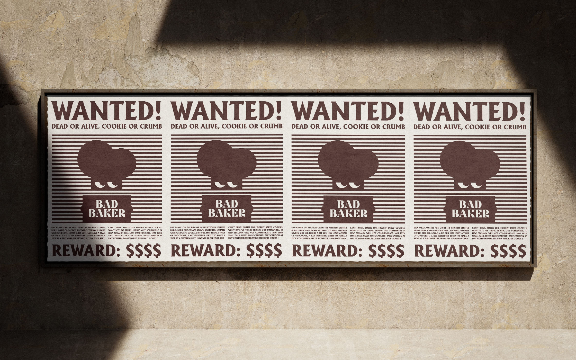
The name and logo weren’t up for grabs, so this was something that had to be worked with. The concept of ‘wanted for being dangerously delicious’ was developed which comments on the brand name, and their product offering being cookies that are so good, they’re dangerously delicious – you can’t stop at one. This concept also allowed a new brand mascot and an identity full of character and personality to be developed.
Working with the brand name, a new brand symbol of a baker hat was designed that allowed the brand to become recognisable and iconic across any brand touchpoint.
The brand symbol needed to represent the Bad Baker story and allow Bad Baker to expand in the future without being strictly ‘sweet baked goods’.
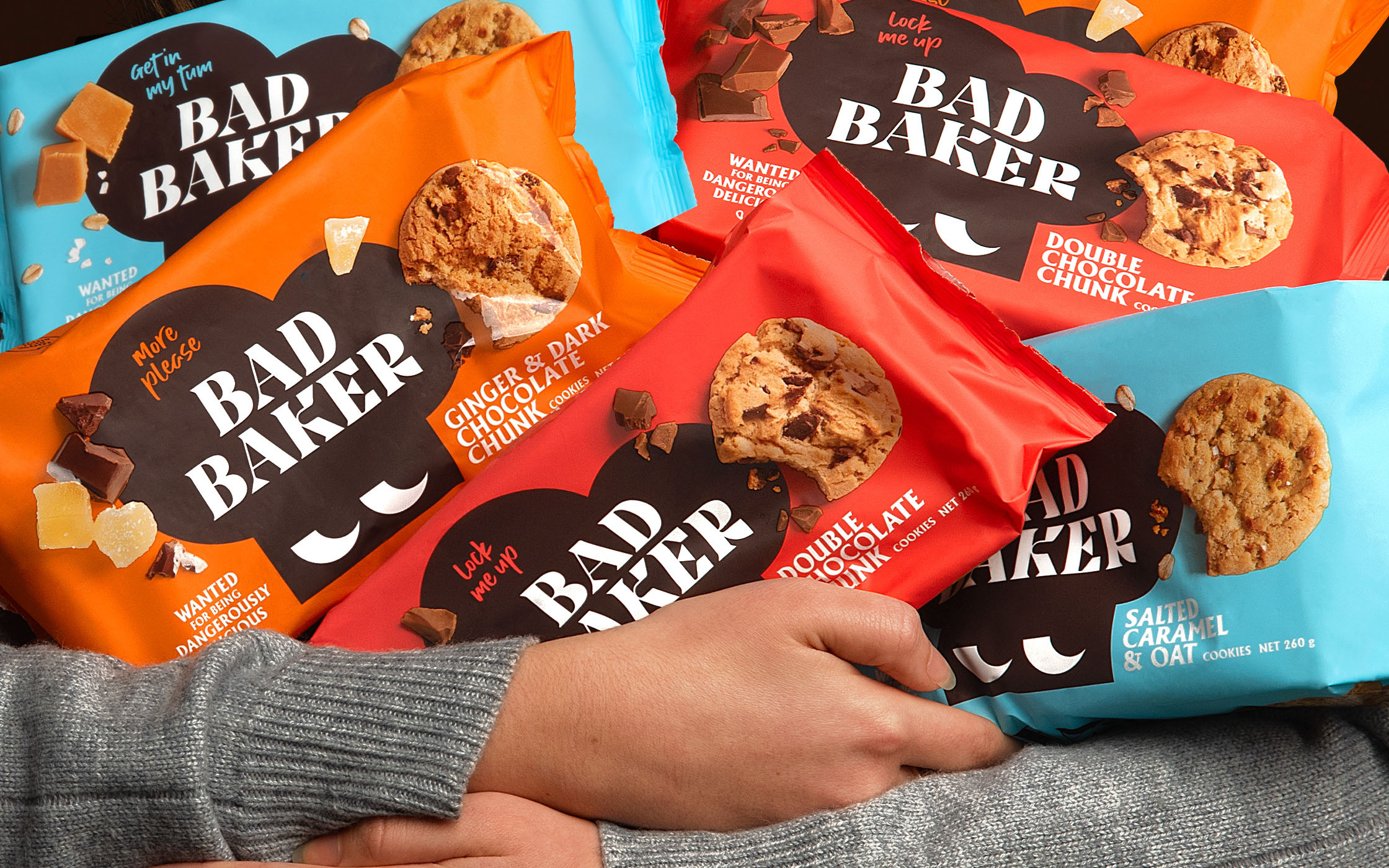
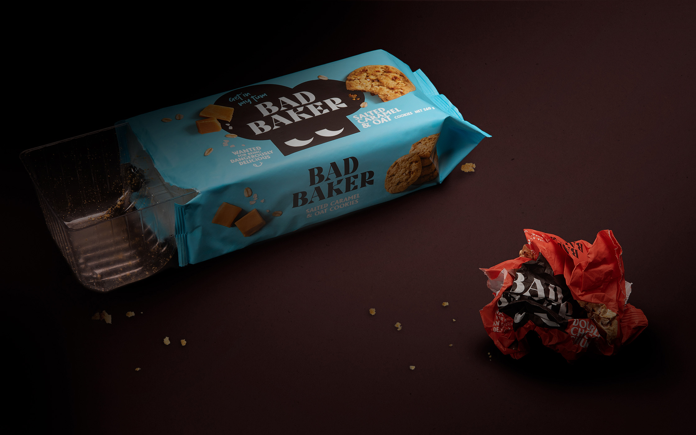
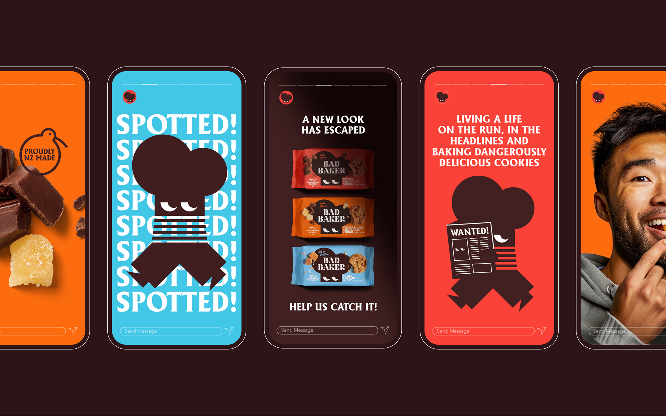
With product standout at the forefront, new packaging was designed to stand out on shelf, highlight the delicious, flavourful products within and most importantly communicate the Bad Baker story and build the relationship between shoppers and Bad Baker.
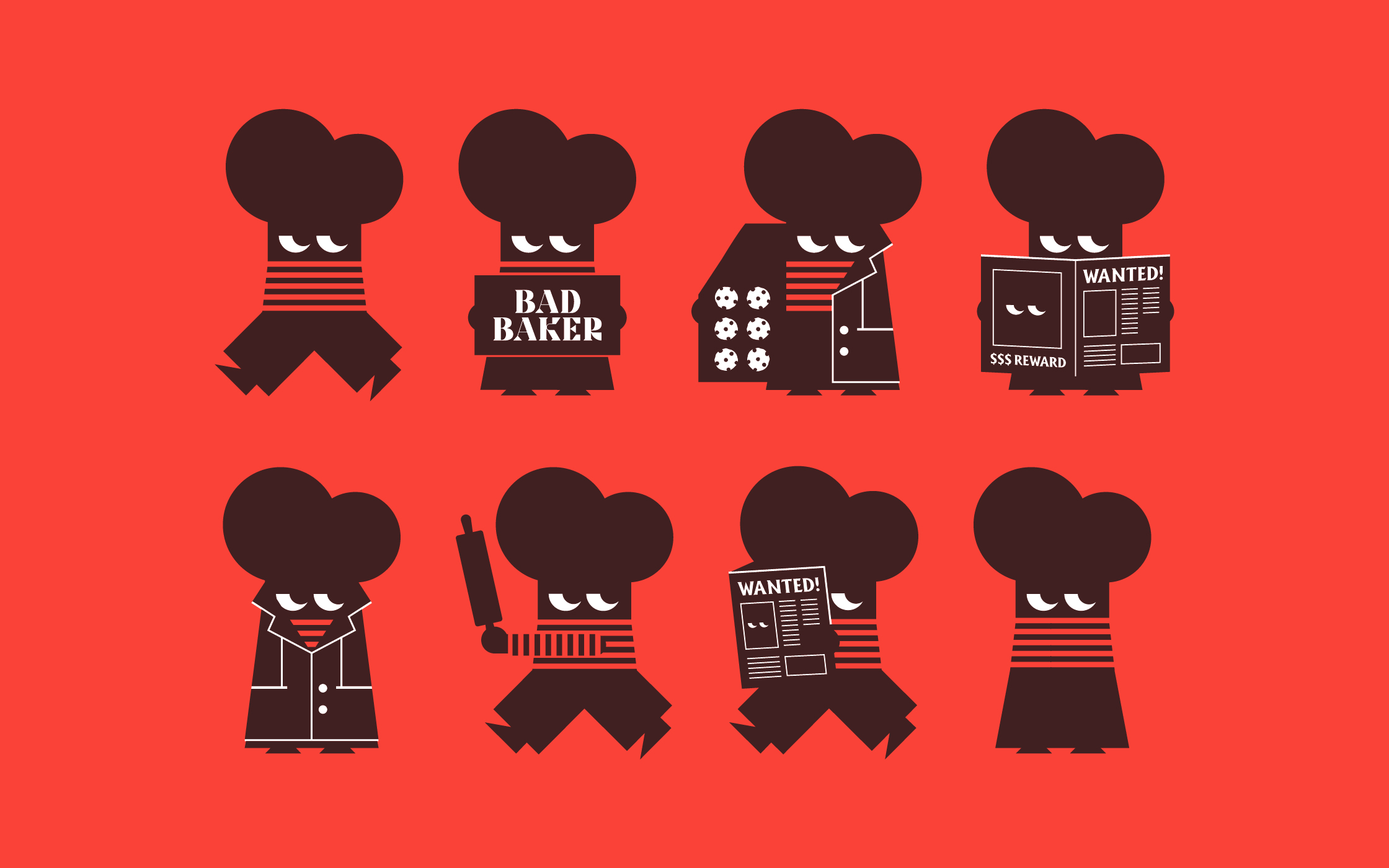
Redesigning the Bad Baker mascot was a very important (and fun) task. The character needed to be memorable, loveable, and capable of communicating the brand story.
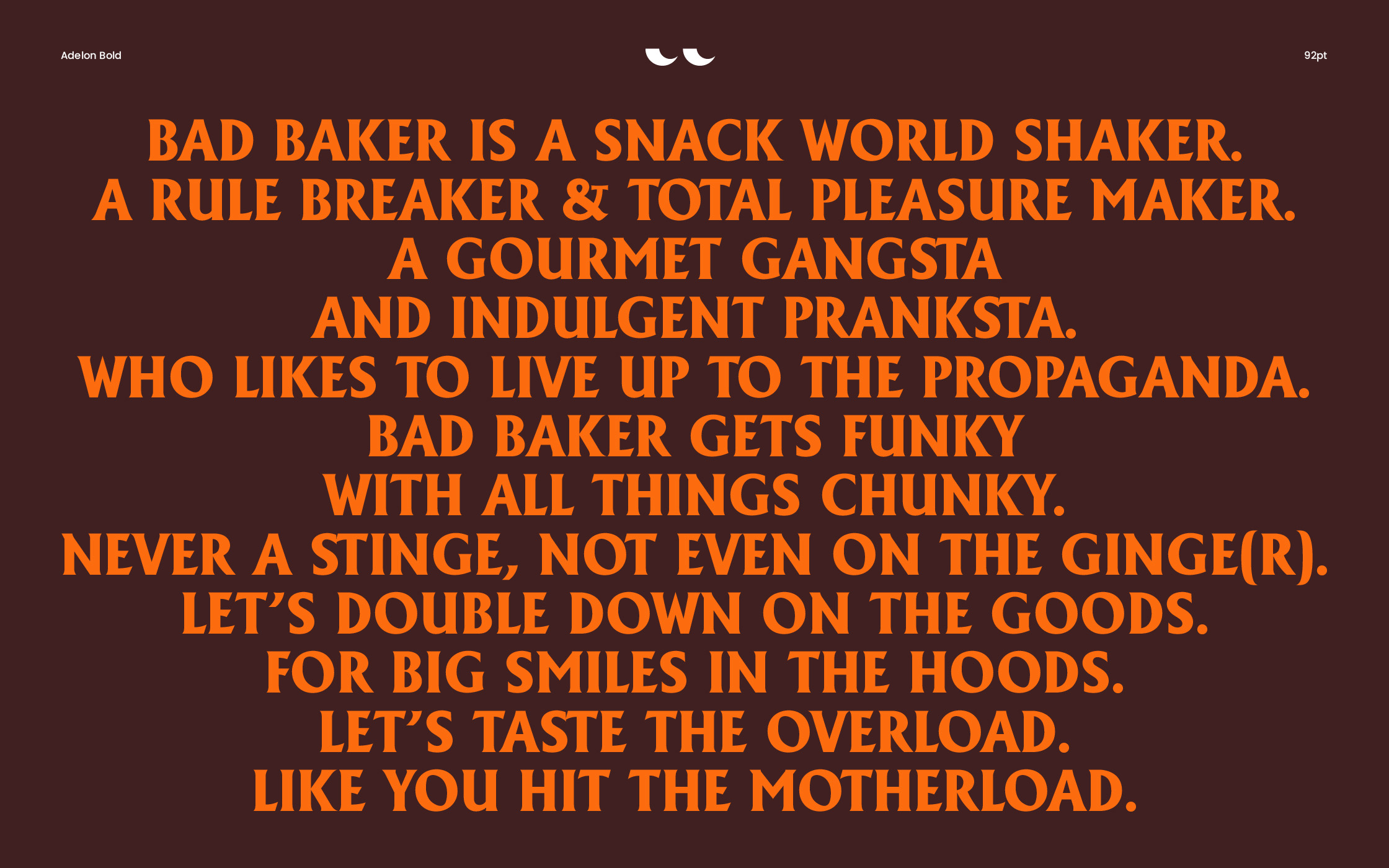
The new Bad Baker is a full-time baker, part-time bandit, is constantly on the run hiding from the paps, rule-makers, and their mobs of fans (baddies). Bad Baker can now be easily recognised across all brand assets whether that be as eyes, head, or body.
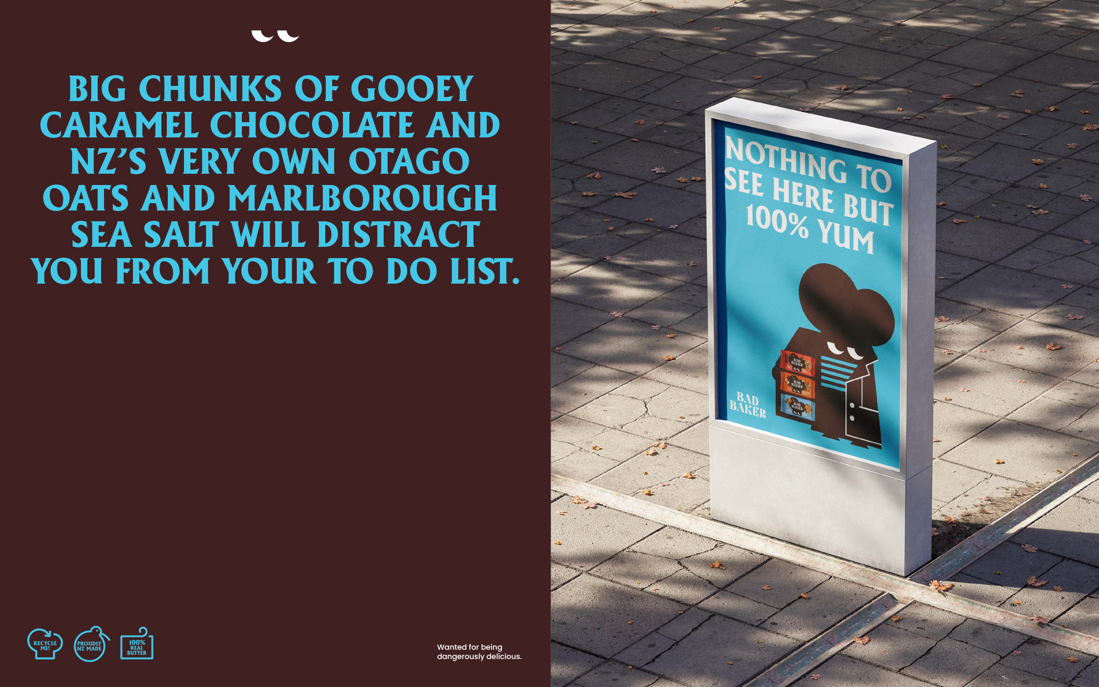
With the new positioning in full force Bad Baker is causing havoc on the streets, on supermarket shelves and in your household kitchen. If you spot Bad Baker approach with caution as may contain dangerously delicious goods.

CREDIT
- Agency/Creative: Dow Goodfolk
- Article Title: A Bold New Identity and Packaging Design for Bad Baker by Dow Goodfolk
- Organisation/Entity: Agency
- Project Type: Packaging
- Project Status: Published
- Agency/Creative Country: New Zealand
- Agency/Creative City: Auckland
- Market Region: Oceania
- Project Deliverables: Art Direction, Brand Design, Brand Identity, Brand Redesign, Brand Refinement, Brand Rejuvenation, Brand Strategy, Brand Tone of Voice, Branding, Character Design, Creative Direction, Design, Icon Design, Illustration, Packaging Design, Photography Styling
- Format: Flow-Pack
- Industry: Food/Beverage
- Keywords: Packaging Design, Illustration, Character, Cookies, Colour, Identity
-
Credits:
Creative Director: Donna McCort
Designer: Georgia Billman
Production/Artwork: Simon Burton
Account Director: Haidee Wallace
Managing Director: Annie Dow


