


A nostalgic favourite, reimagined. Sara Lee’s brand reboot blends its warm, familiar heart with a bold new look — revitalising an Australian icon for the next generation of dessert lovers.
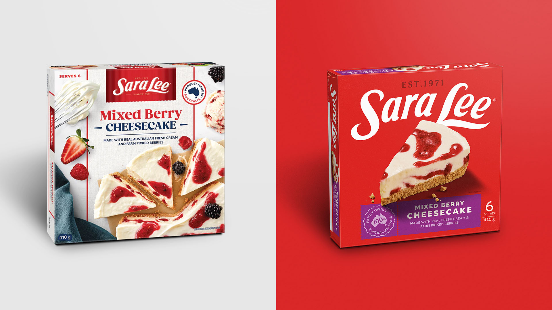
For more than 50 years, Sara Lee has been woven into Australia’s dessert tradition — a freezer-aisle staple that conjures memories of home, family, and celebration. Generations grew up with its cheesecakes, pies, and ice creams, yet while the recipes stayed loved, the brand’s visual identity had become dated, inconsistent, and increasingly invisible in a competitive category. Disegno was tasked with a delicate challenge: modernise Sara Lee without losing the deep emotional connection people already have with it.
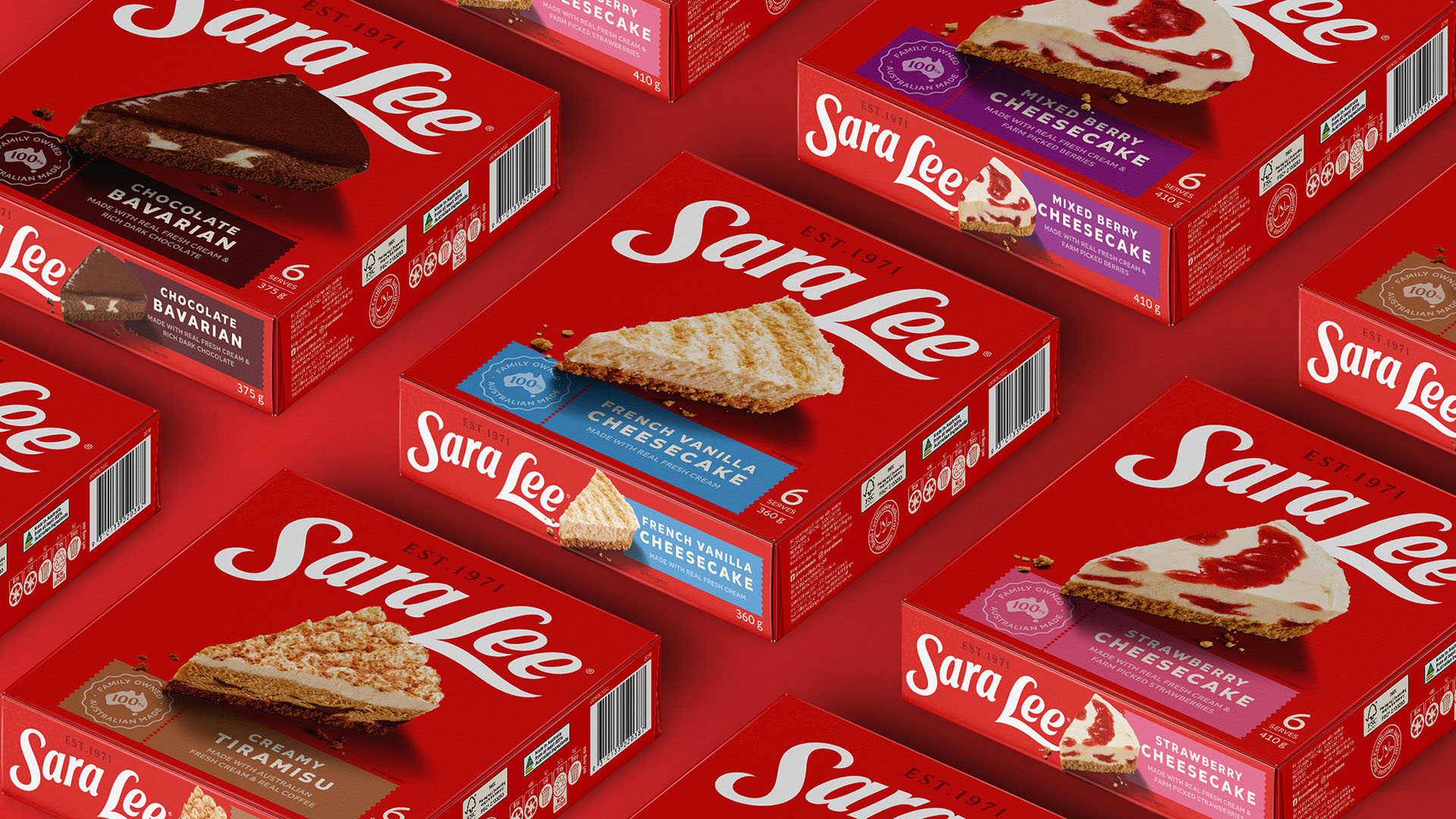
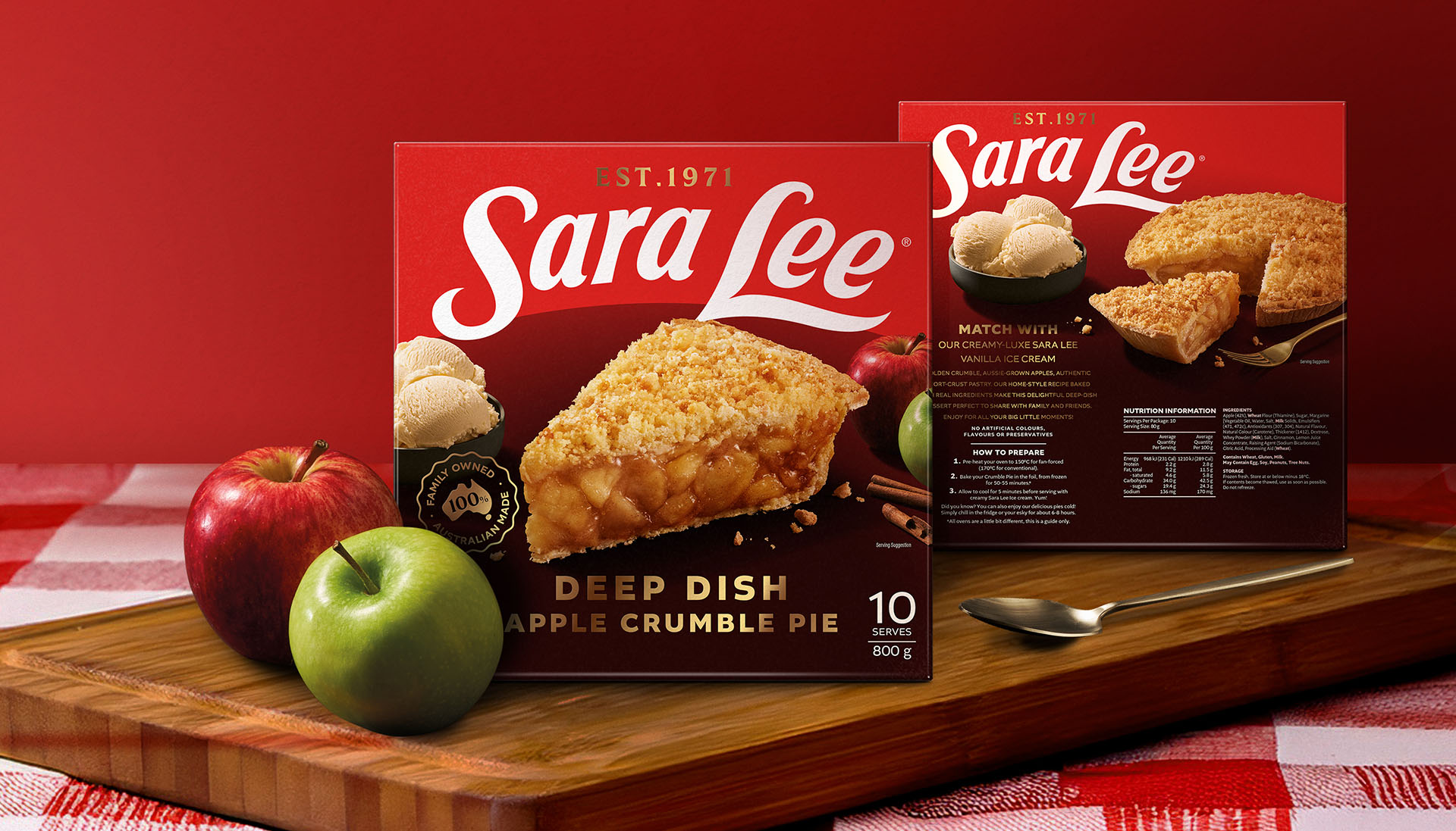
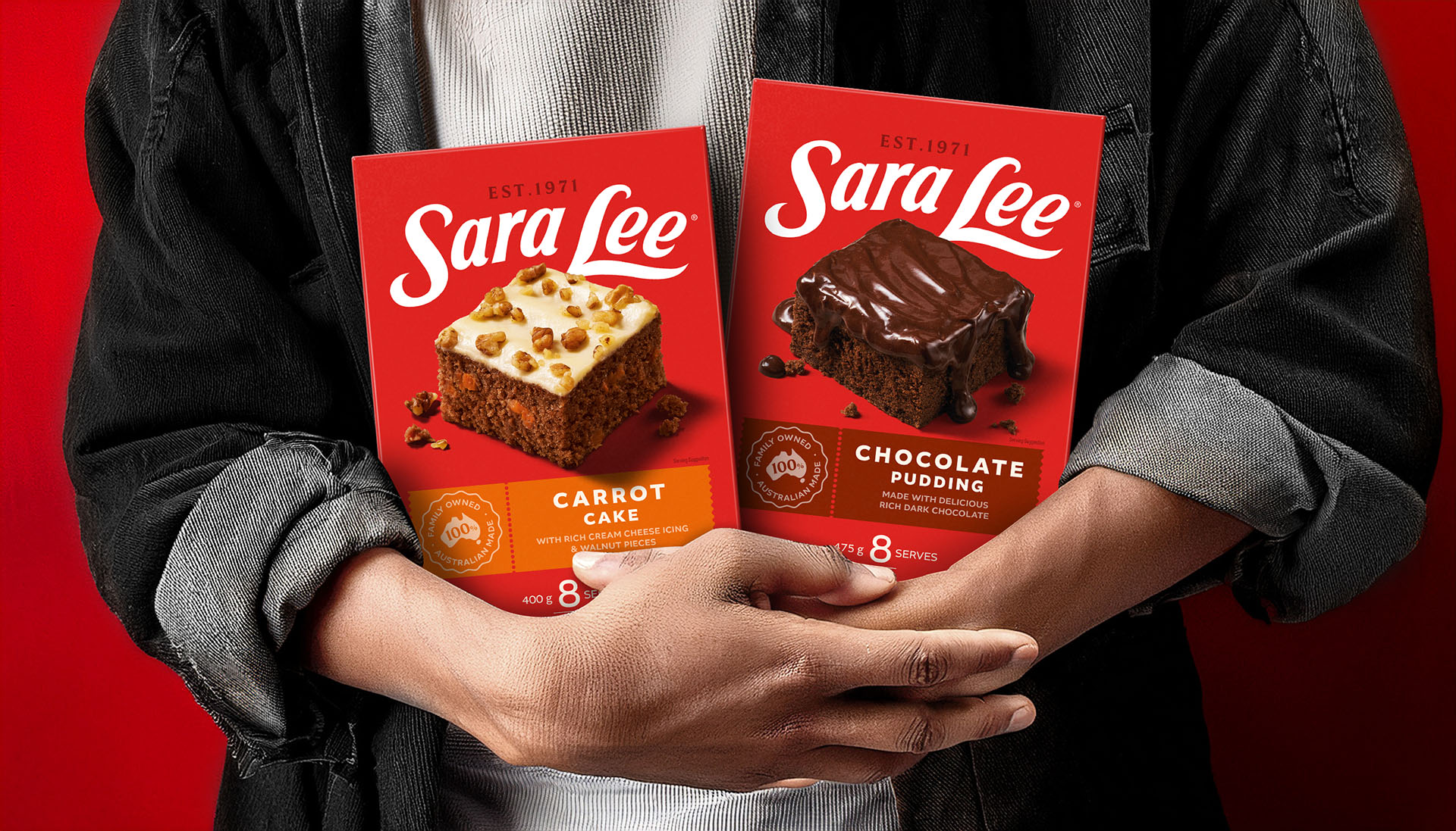
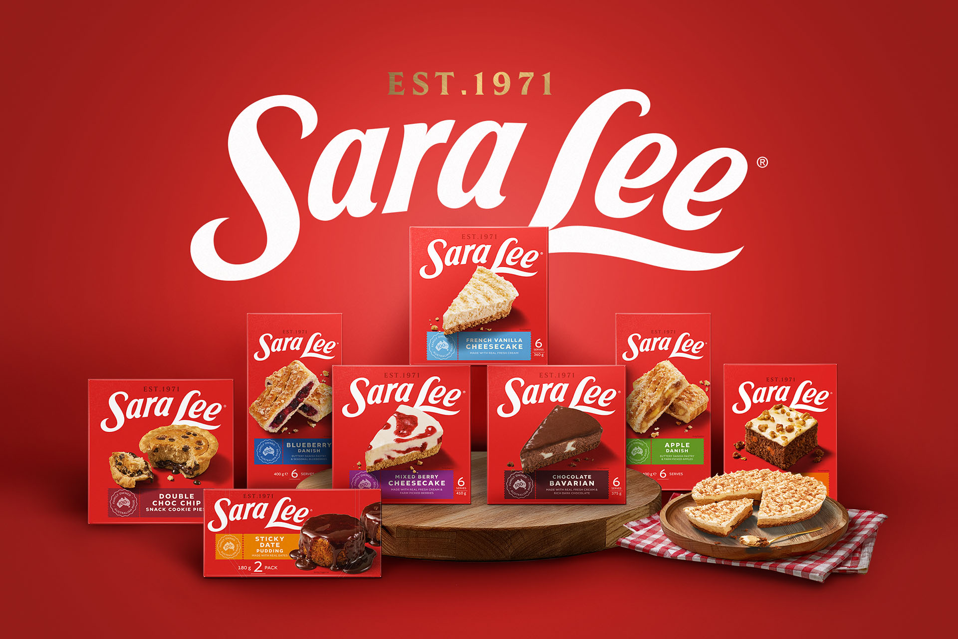
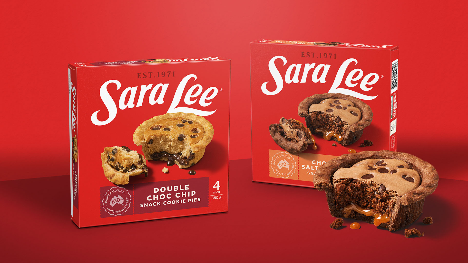
The reboot began by re-establishing red as the brand’s unmistakable signature — bold, vibrant, and instantly recognisable at a glance. The logo was redrawn for clarity and precision, ensuring it performed equally well across small frozen packs, large-format boxes, and digital touchpoints.
Photography was elevated to hero status. Shot with an indulgent, honest approach, the food imagery is warm, generous, and appetising without feeling artificial. Each dessert is styled to capture the moment it’s served — melting ice cream, sliced cheesecake, a spoon about to dip in — evoking the shared joy of eating together rather than the perfection of a studio set.
Typography was simplified, harmonised, and paired with the strong brand colour to create consistency across the entire range. Every design choice was intentional, stripping away clutter so the focus remained on the product and the emotional pull of the Sara Lee name.
The result is a unified, contemporary brand system that stands out in the crowded freezer aisle while staying true to the comfort, warmth, and joy that made Sara Lee a household name. It’s proof that an icon can evolve without losing its essence — a brand refresh that feels both completely new and exactly as you remember it.

CREDIT
- Agency/Creative: Disegno
- Article Title: A Big Red Comeback: Disegno Spearheads Sara Lee Brand Reboot
- Organisation/Entity: Agency
- Project Type: Packaging
- Project Status: Published
- Agency/Creative Country: Australia
- Agency/Creative City: Melbourne
- Market Region: Oceania
- Project Deliverables: Brand Identity, Brand Rejuvenation, Brand Strategy, Packaging Design, Photography
- Format: Box
- Industry: Food/Beverage
- Keywords: Legacy Brands, Iconic Brands
-
Credits:
Partner & Head of Strategy: Aaron Turner
Creative Director: Natasha Pandji
Designer: Glen Crawforth
Designer: Jay Adamson
Production & Retouching: Oliver Bermes
Photographer: Dan Magree
Food Styling: Theresa Stastny


