


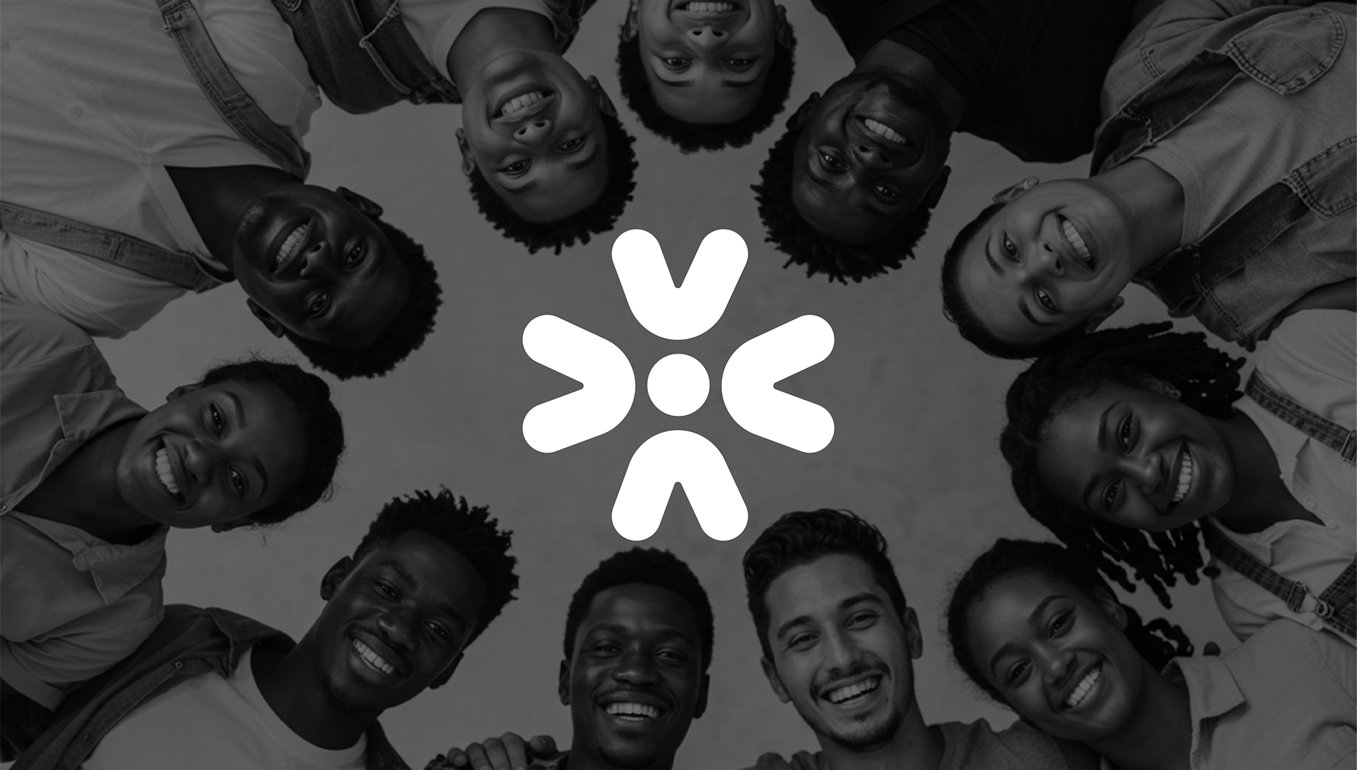
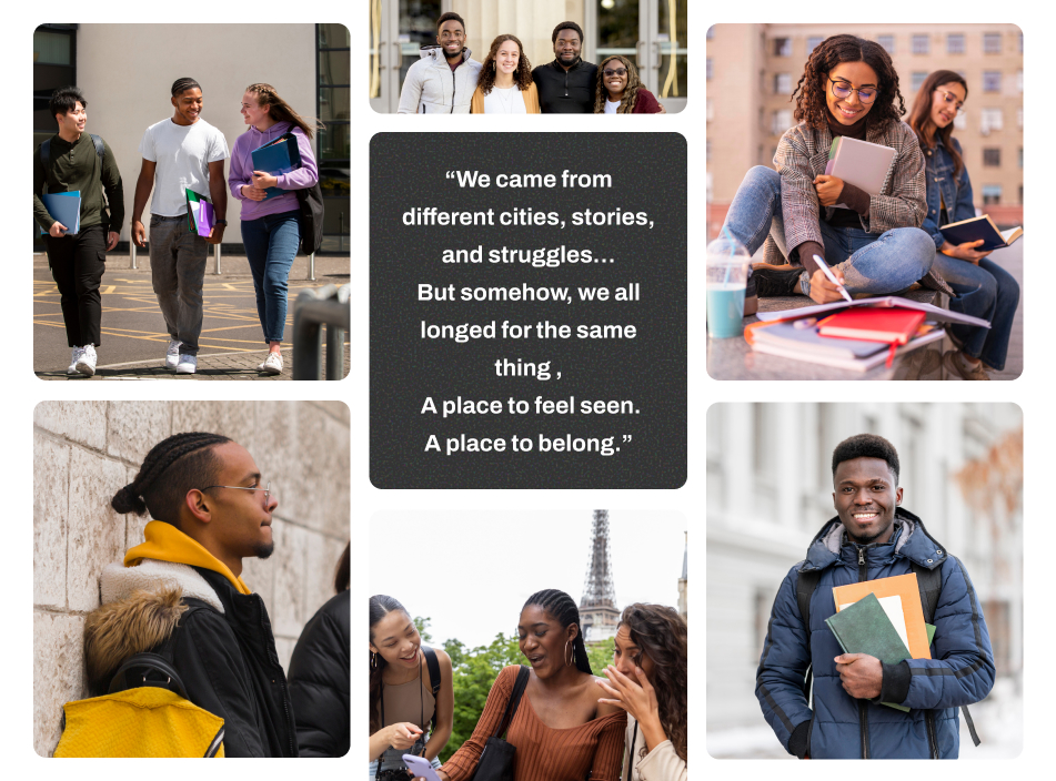
In a world where distance can often feel like disconnection, The Gathering was born to foster meaningful connections among individuals from all walks of life. Rooted in the spirit of community, this brand creates a vibrant sanctuary where people come together, not just to meet, but to share ideas, uplift one another, and grow exceptionally through collaboration and impact.
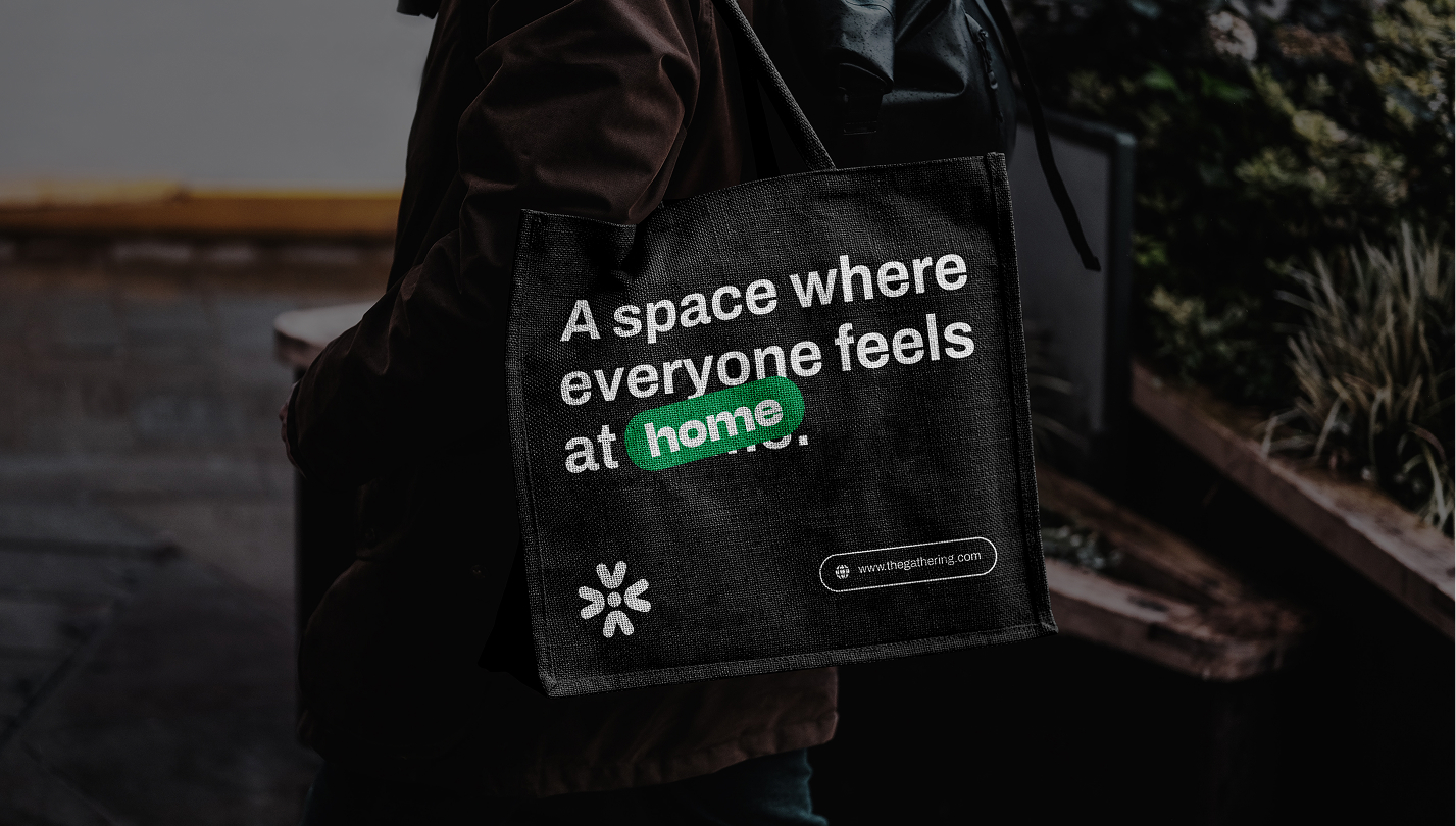
More than just an event platform, The Gathering has evolved into a safe, inclusive space that nurtures belonging and mutual support. Whether you’re far from home or simply seeking deeper connection, it offers a sense of family and purpose that transcends borders and backgrounds.
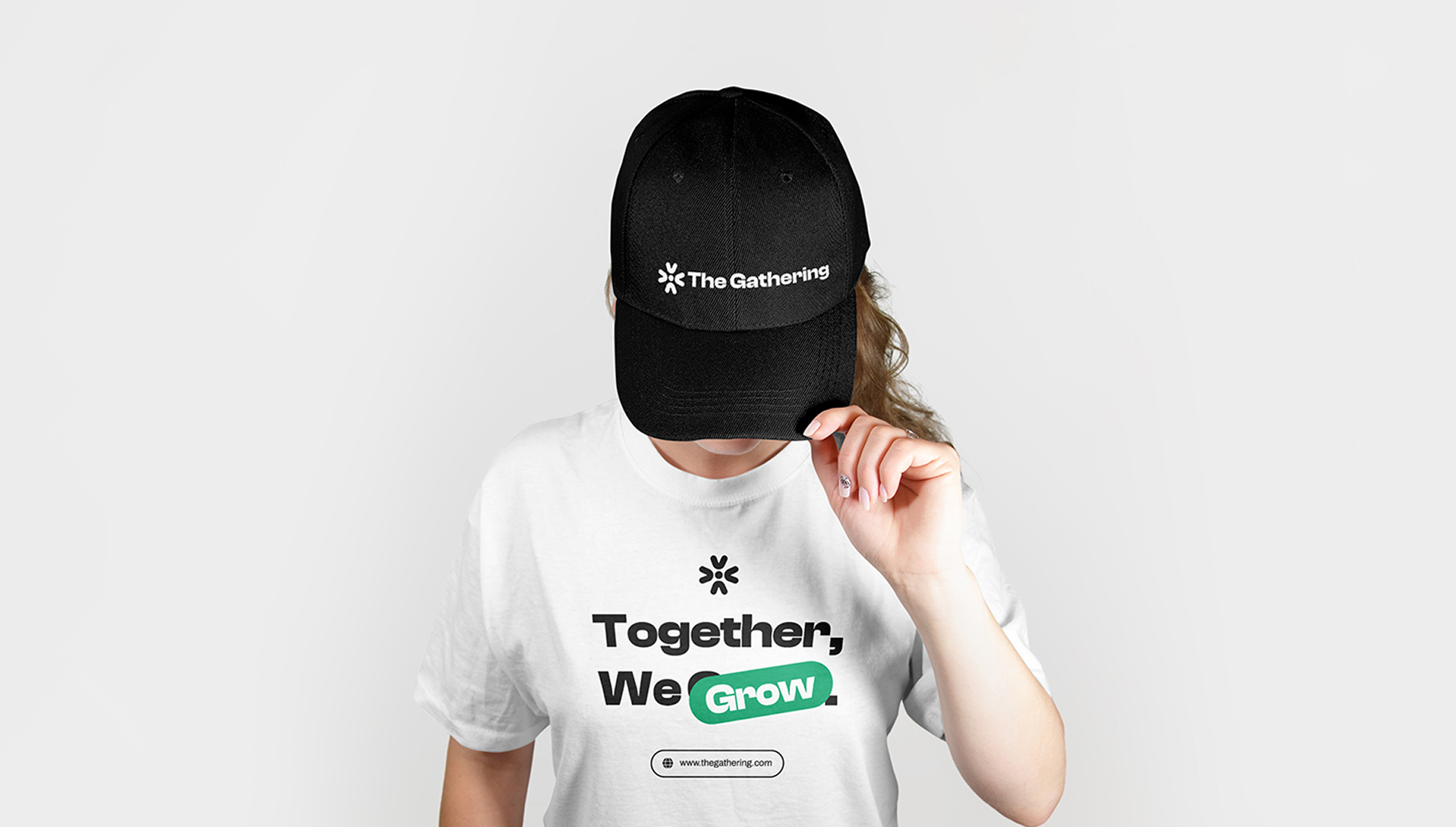
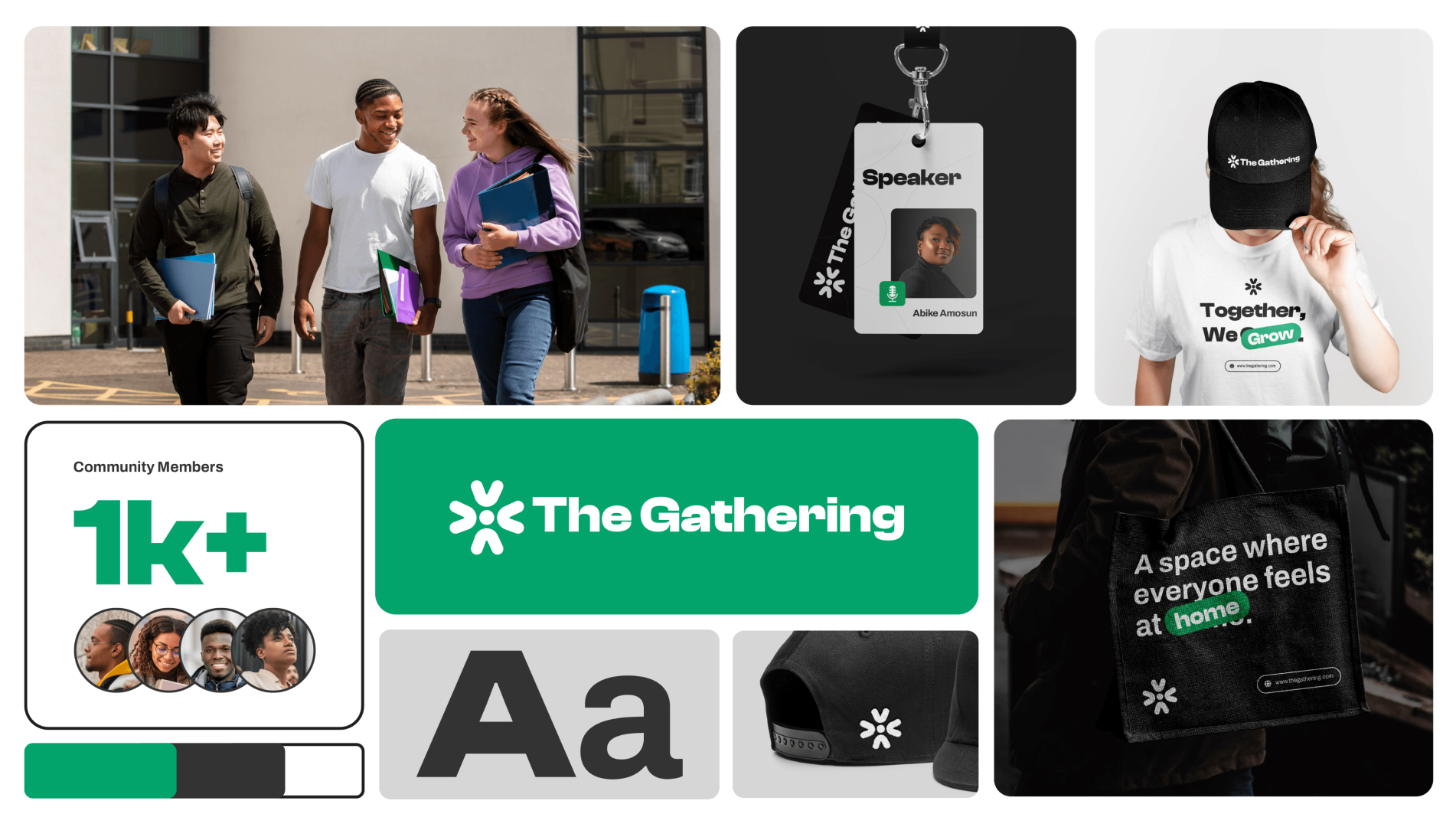
The Logo
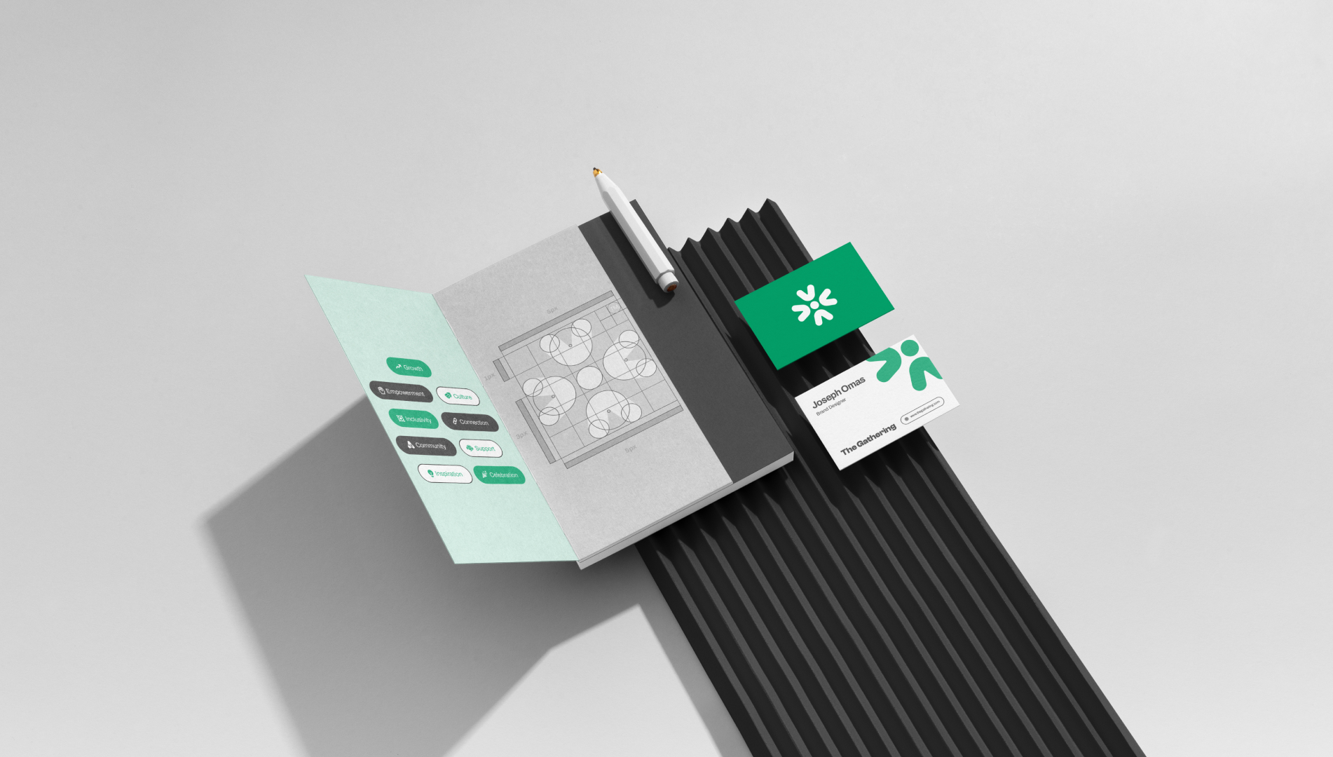
To craft a lasting and meaningful mark for The Gathering, I explored various abstract forms. From clustered dots to directional arrows, all symbolizing motion, unity, and inclusion.
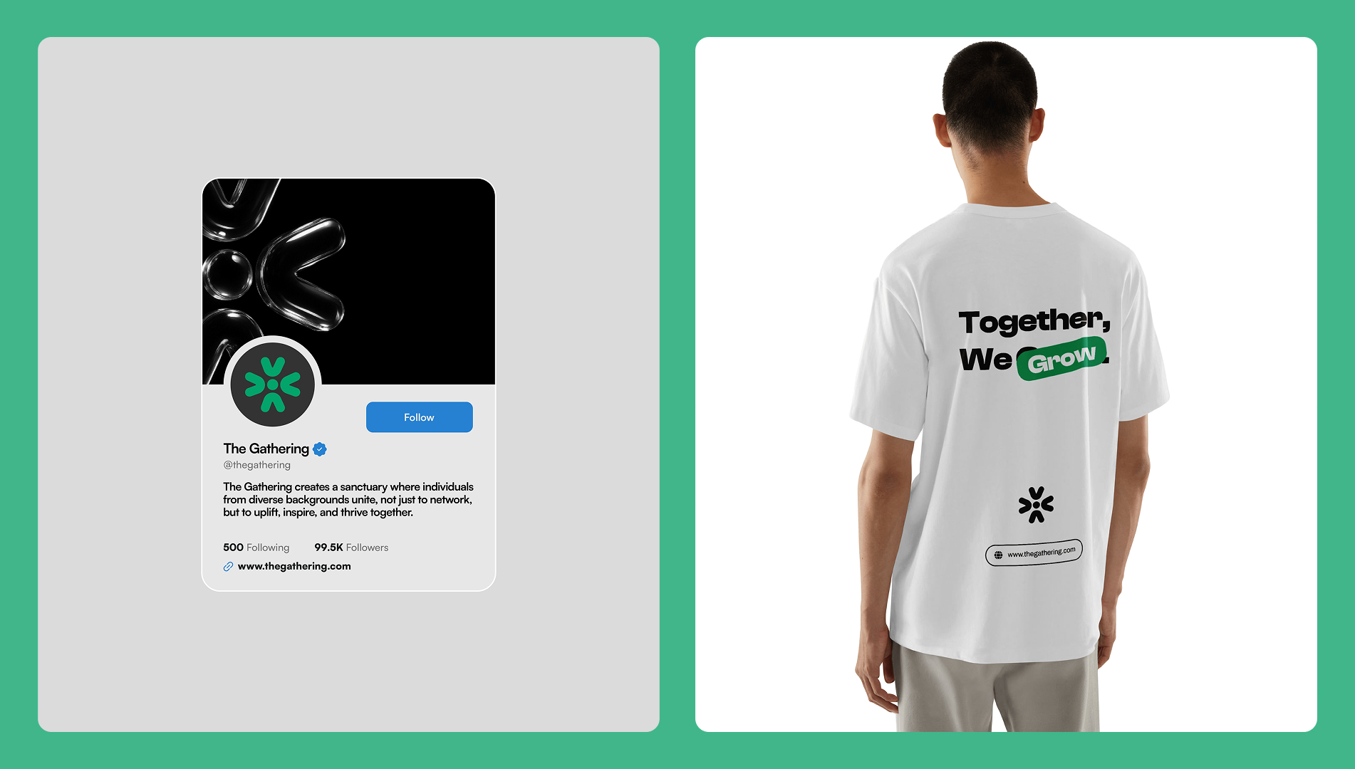
The final logo represents diverse individuals coming together, pooling their heads into a shared center. Each arm of the symbol reflects unique people, converging in harmony to form a cohesive, connected whole.
It’s not just a mark, it’s a visual metaphor for community, collaboration, and the power of gathering.
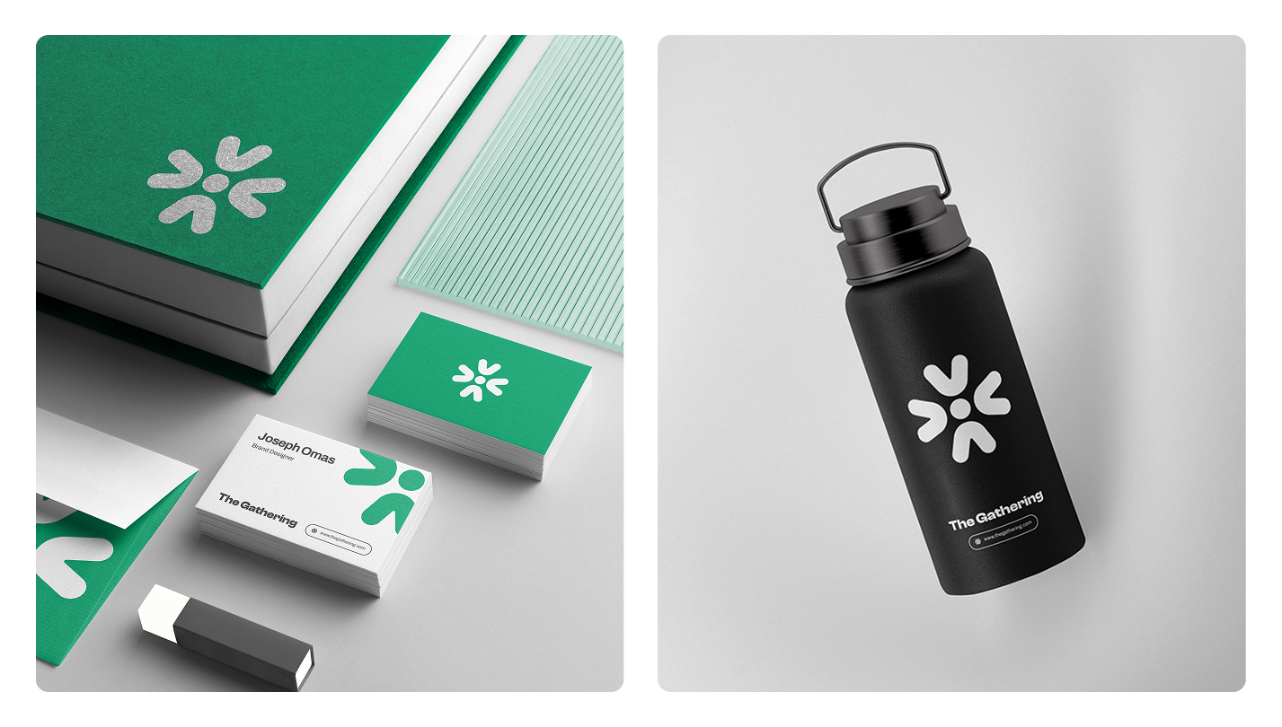
Colors
For the color palette, I took subtle inspiration from the Nigerian flag, using tones that nod to our roots without feeling too literal.
The green suggests growth, unity, and shared identity, while the lighter tones add a sense of calm, openness, and welcome. The goal was to create a modern, versatile palette that feels both familiar and fresh, grounding the brand in culture while keeping it globally relevant.
Typography
I paired Clash Display for headings with Archivo for body text to strike the right balance between bold expression and clean readability.
Clash Display brings a modern, confident feel to titles, perfect for a brand that celebrates culture and connection. Archivo keeps the body copy clear and accessible, ensuring the message remains easy to digest across all touchpoints.
Together, they reflect The Gathering’s spirit, that’s support, inclusive, and community.
Conclusion
We all crave to be part of something, bigger than ourselves, we feel the void in isolation, we bear the loud silence within the closing walls of uncertainty, and worse is when all these questions are asked when we are far from home.
Creating The Gathering was more than a design process. It was about capturing the essence of belonging for those living far from home. Every element, from the logo to the color palette and tone of voice was shaped to reflect a people, identity, and shared experience.
This brand isn’t just a visual system. It’s a safe space, a community, and a story that continues to grow.

CREDIT
- Agency/Creative: Joseph Omas
- Article Title: A Beacon of Belonging: The Gathering’s Inclusive Brand Identity
- Organisation/Entity: Freelance
- Project Type: Identity
- Project Status: Published
- Agency/Creative Country: Nigeria
- Agency/Creative City: Delta
- Market Region: Global
- Project Deliverables: Brand Design, Brand Guidelines, Brand Identity, Creative Direction, Editorial Design, Logo Design, Poster Design
- Industry: Non-Profit
- Keywords: Community
-
Credits:
Brand Identity Designer: Joseph Iyinbo


