Straight Forward Design – GoMo
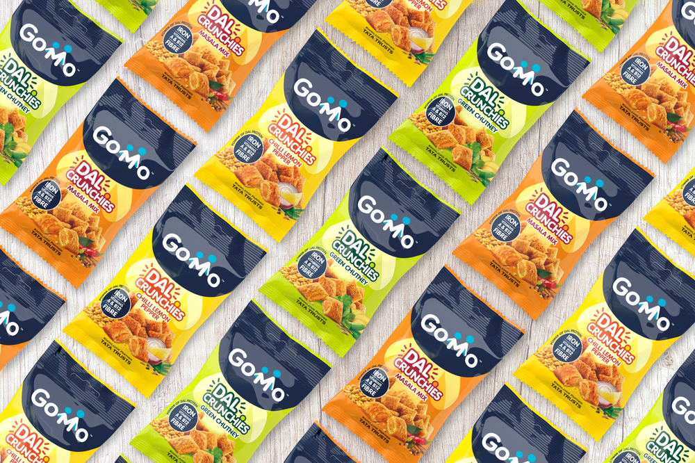
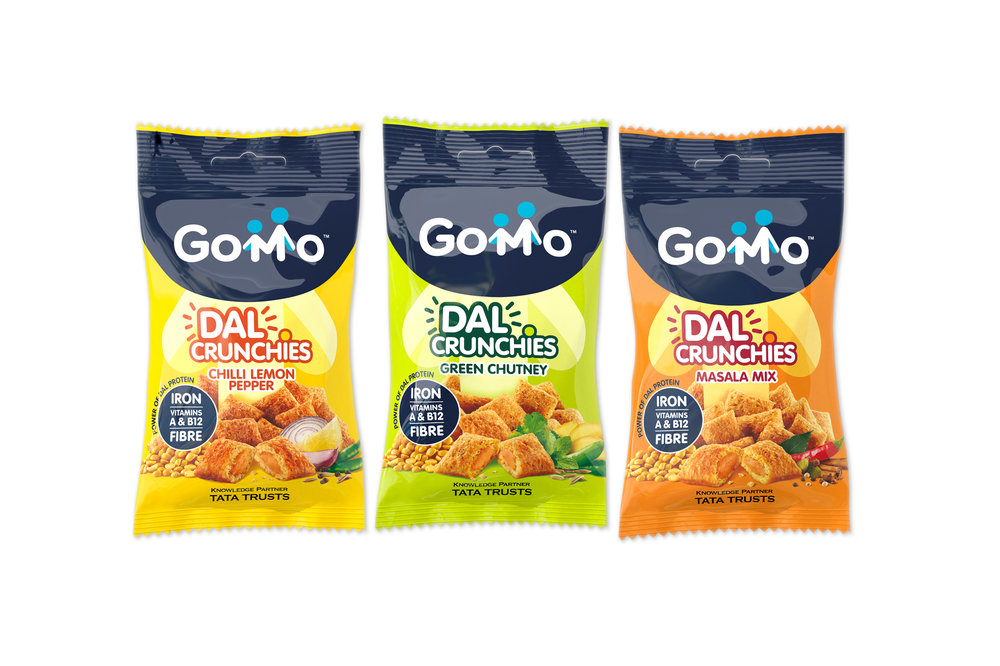
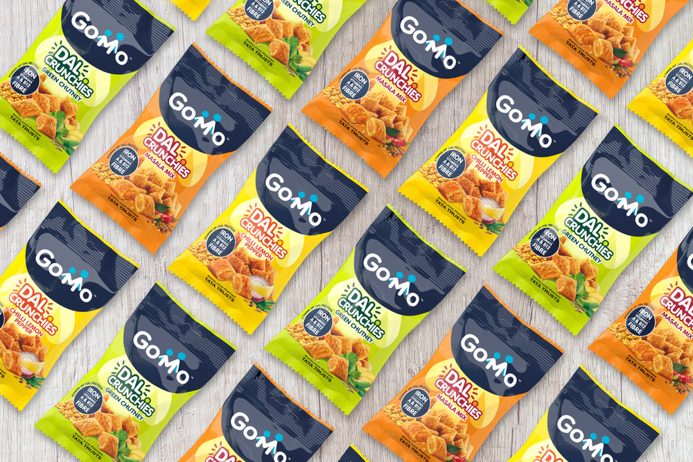
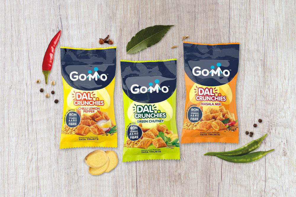
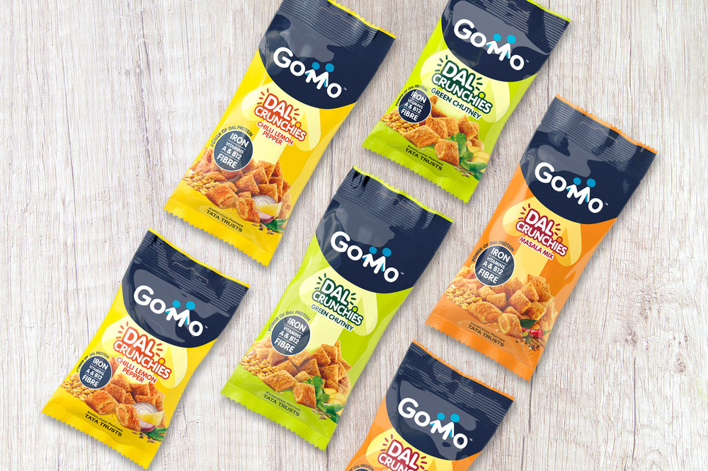
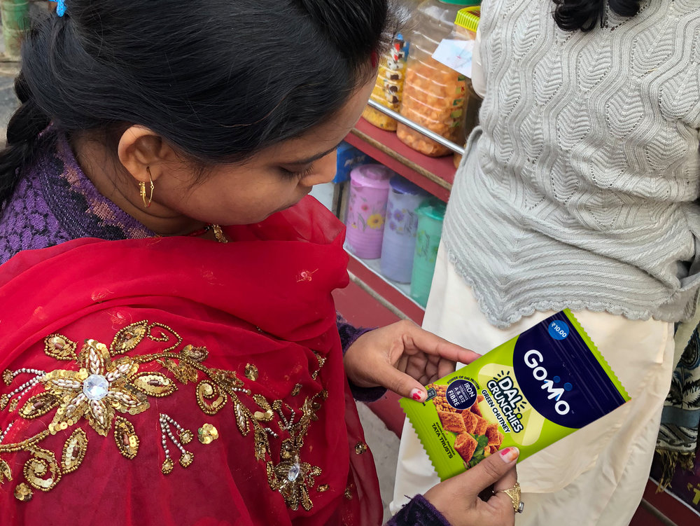
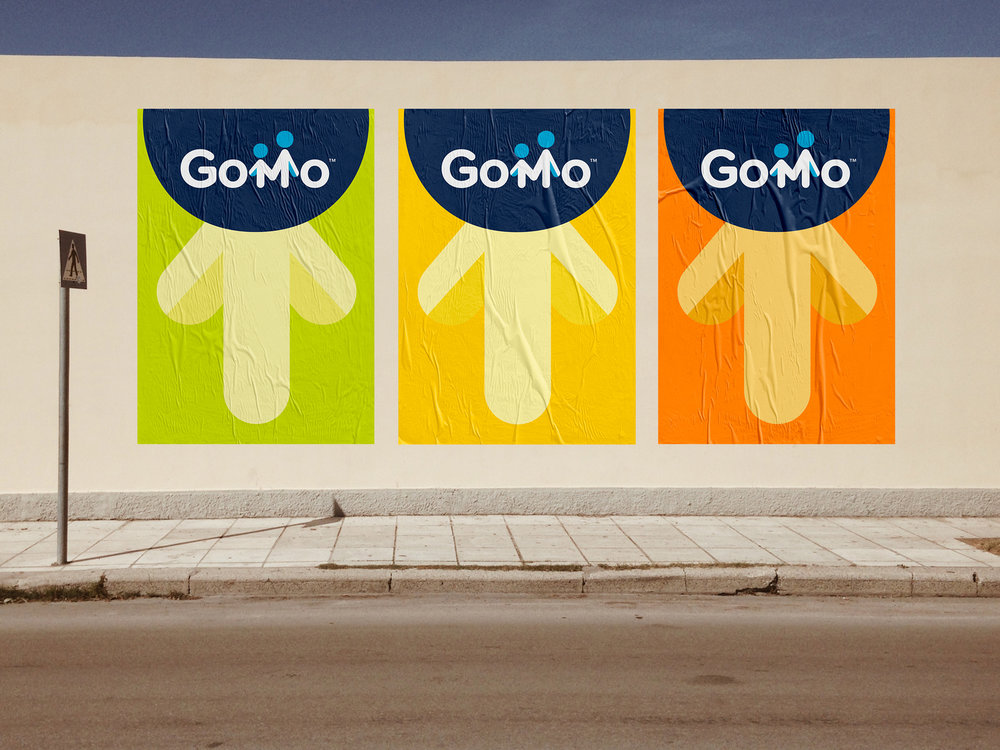
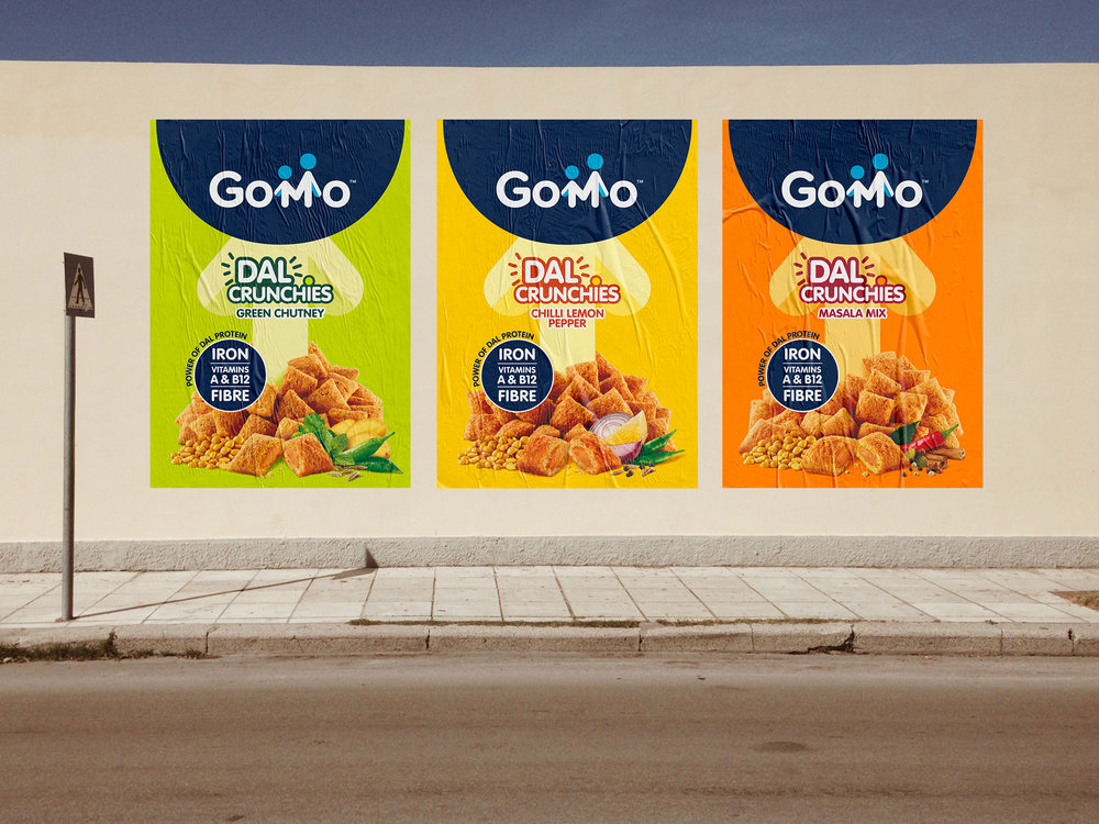
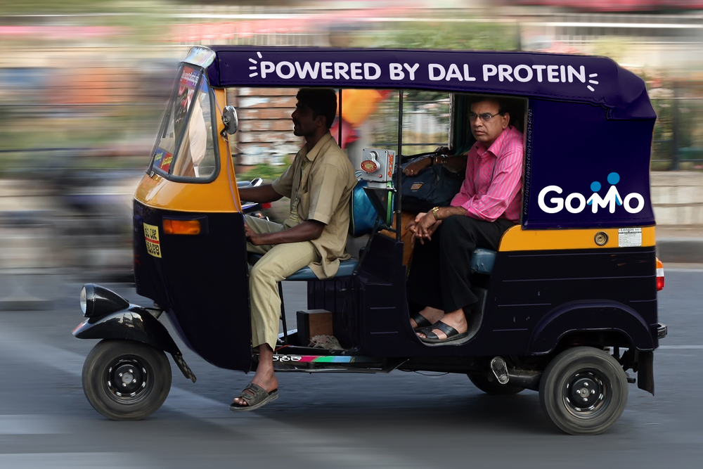
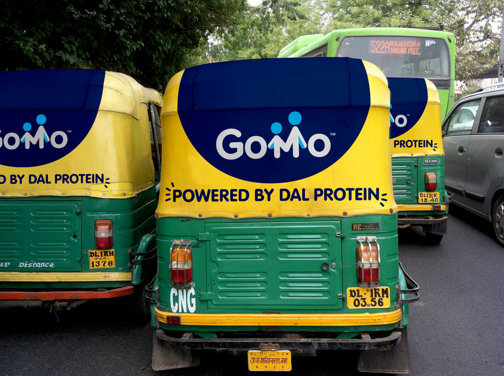
Mars Edge, a new entrepreneurial arm of Mars, Incorporated dedicated to human health and wellness through targeted nutrition, has launched a new product rich in protein and micronutrients in India, with a comprehensive brand and packaging strategy by Straight Forward Design. As part of Mars Edge’s drive to create better lives through nutrition, GoMo™ Dal Crunchies have been developed to help close the nutritional gaps of six- to 18-year-olds throughout the country, with flavour profiles to excite the typical Indian palette. Straight Forward Design was enlisted to create a brand identity that would appeal to and be trusted by Indian mothers – taking on board the 22 different national languages and myriad cultural responses to design cues.Mum’s the wordThe design team began its journey with an in-depth immersion and research trip to the country, working to understand the specific cultural responses to product names, on-pack imagery, written information and colourways.It was essential that the branding inspired trust in mothers. Straight Forward Design quickly established that mums are, most often, the key purchasers, with those precious bonding moments on the school run at the beginning and end of each day providing the key buying opportunities. Mike Foster, Creative Director of Straight Forward Design, says: “We wanted to create a positive, optimistic identity to send a very clear message to mums: ‘This is a safe, nutritious product that will give your child the strength to perform at his or her best every day.’”In response to the research, Straight Forward Design created the striking, easy-to-understand and phonetic brand icon, GoMo™. To appeal to mums, the M was developed to represent a mother and child holding hands. The arrows that form the M and appear under the logo signify growth and vitality and strengthen the ‘endorsed by mum’ messaging. And to further build product trust, a blue circle listing the key nutrients appears on the front.Decoding the packA visual shorthand was developed to reach people across India regardless of language or literacy. To that end, images of the ingredients play a vital role on pack, with colours that represent delicious Indian flavours and their nutritional qualities. And a deep blue was chosen as the primary brand colourway across all variants (Chili Lemon Pepper, Masala Mix, Green Chutney) to provide consistency and to represent trust and efficacy. Says Foster: “We became totally embedded. We had to spend the time in situ to totally understand the complexity of the Indian market. It was imperative that we appreciated the brand’s role, its audience, and that it was all about being safe, nutritious, and endorsed by mum.”Megha Mehta, Senior Brand Manager of Mars Edge, says: “This affordable, nutritious product has been created to help nourish school-going children, empowering them to live fuller lives. Straight Forward Design really grasped that, and delved deep to truly understand what a huge and diverse market we’re dealing with. The team has delivered a brand that appeals on so many levels to Indian mums.”


CREDIT
- Agency/Creative: Straight Forward Design
- Article Title: Straight Forward Design Partners With Mars to Create the Brand Identity for Gomo Dal Crunchies
- Organisation/Entity: Agency, Published Commercial Design
- Project Type: Packaging
- Agency/Creative Country: India
- Market Region: Asia
- Format: Bag
- Substrate: Plastic


