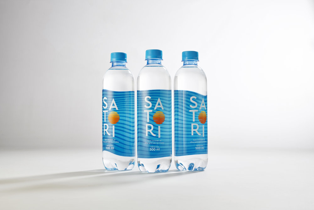
Dinosaur Vietnam – Satori
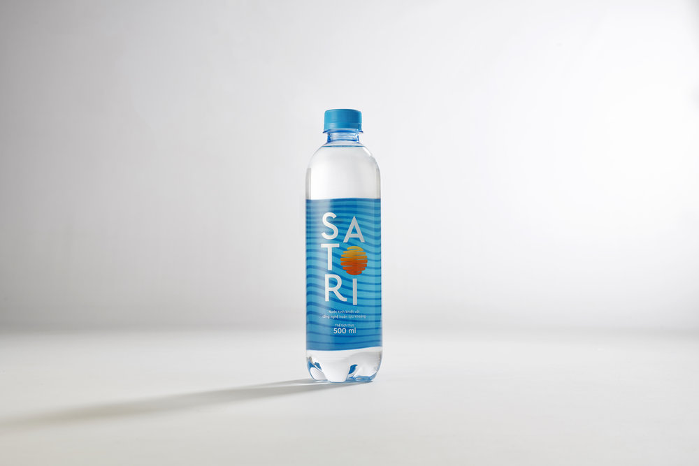
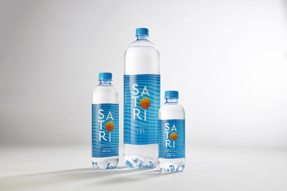
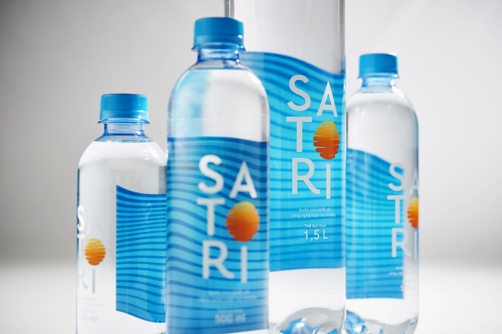
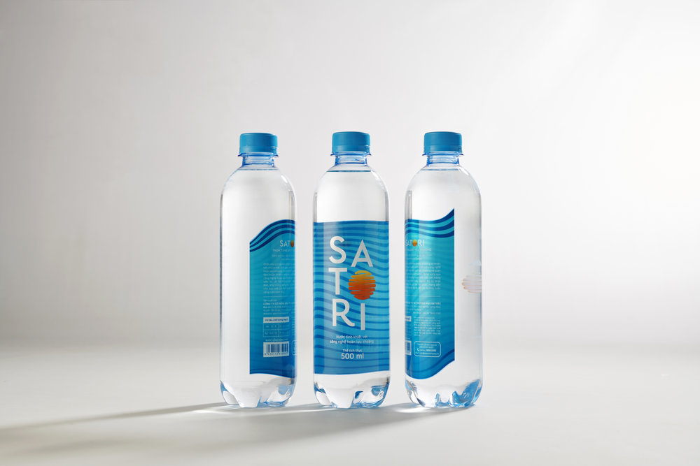
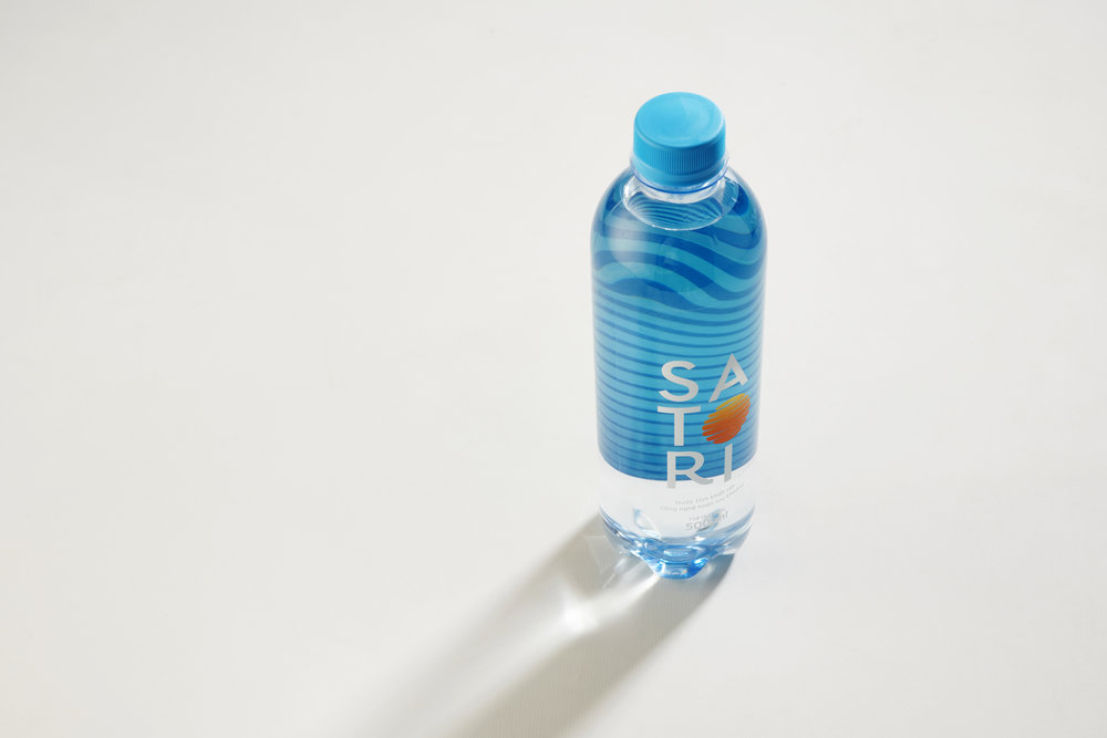
Transparency meets energy and vitality in the packaging design of Satori WaterTransparency is most commonly understood to be a visually uninhibited space, but transparency can be reinterpreted to curate various design elements to create a unique viewer perspective.What better way to depict purity of water than utilizing transparency of the packaging itself in a visually stunning way. The team at Dinosaur Vietnam has worked closely with Satori corporation to create these outstanding packaging design which make you instinctively want to reach out for the bottle at shop shelf. While the logo unit is printed on the front of the bottle, a specially created wave pattern is printed at the back. When seen from the front, the waves create interesting visual illusions. Against an all blue calm backdrop, a rising sun shines brightly, replacing the letter ‘O’ in the brand name Satori which means awakening in Japanese.
CREDIT
- Agency/Creative: Dinosaur Vietnam
- Article Title: Satori Packaging
- Organisation/Entity: Agency, Published Commercial Design
- Project Type: Packaging
- Agency/Creative Country: Vietnam
- Market Region: Asia
- Format: Bottle
- Substrate: Plastic


