Omdesign – Quinta do Crasto Vinha da Ponte
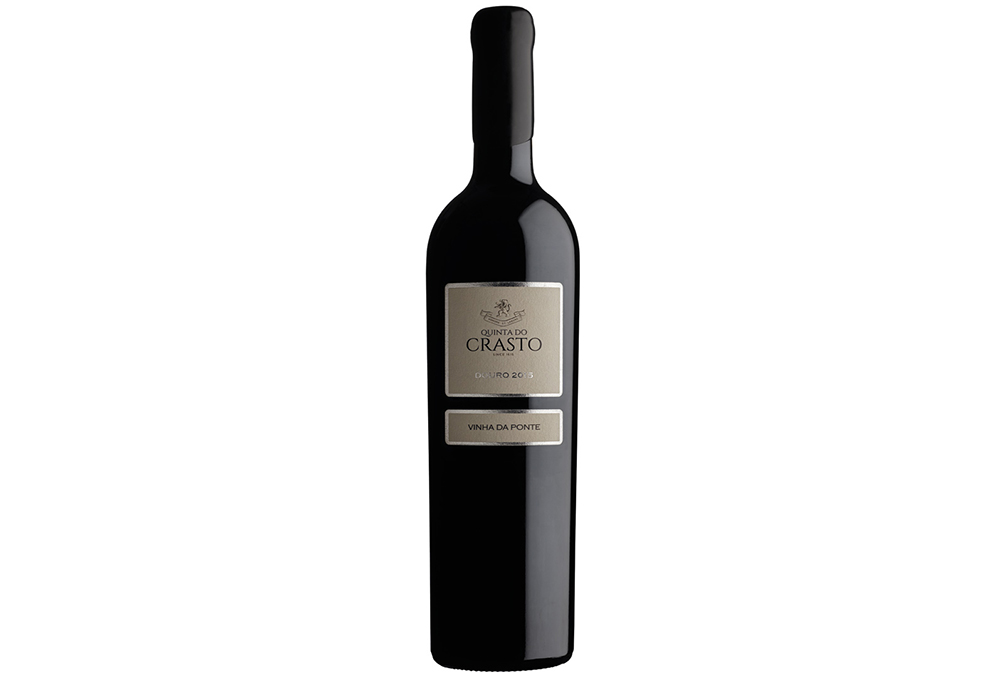
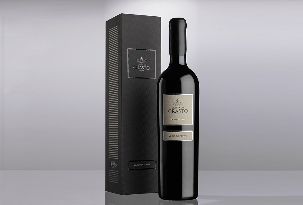
In the year of the commemorations marking the 400th anniversary of Quinta do Crasto, an emblematic estate from Douro with wines recognized worldwide, Omdesign was responsible for the image rebranding of Quinta do Crasto Vinha da Ponte, considered as one of the crown jewels of the brand wines’ portfolio.
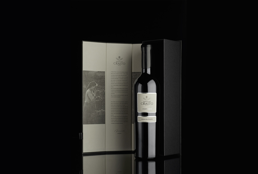
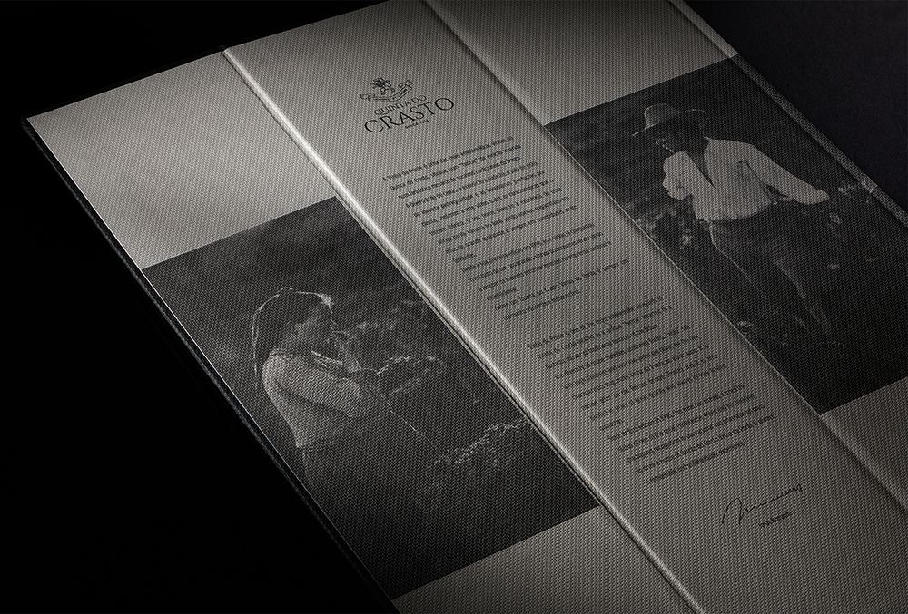
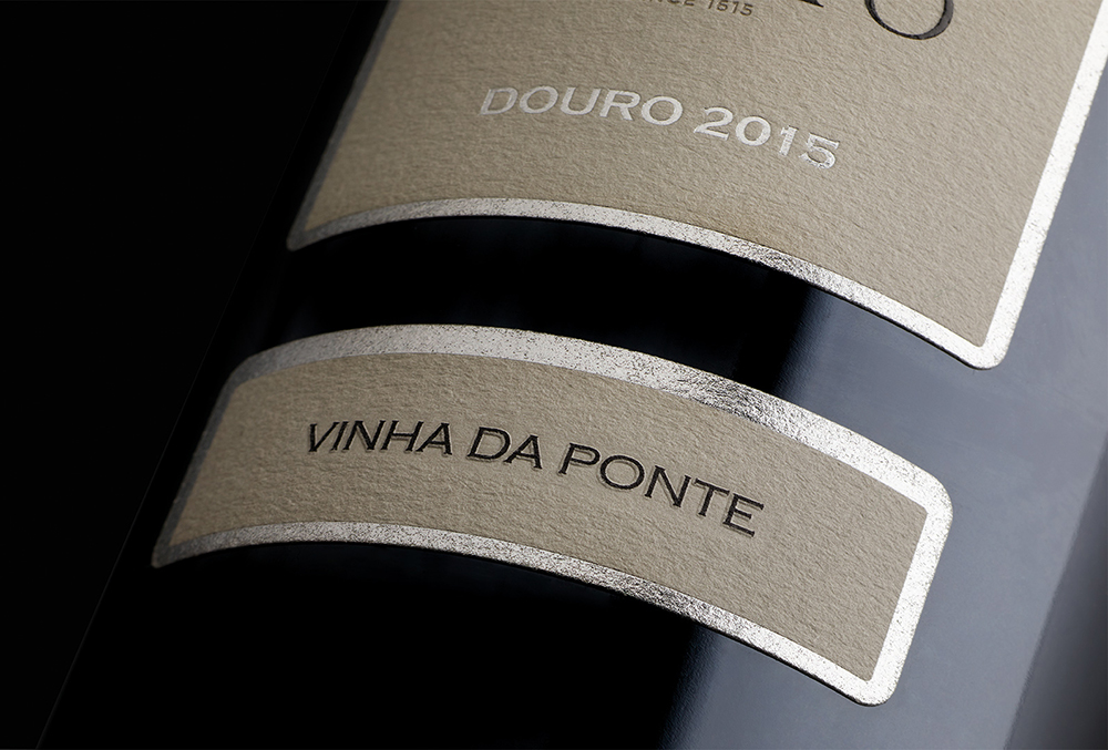
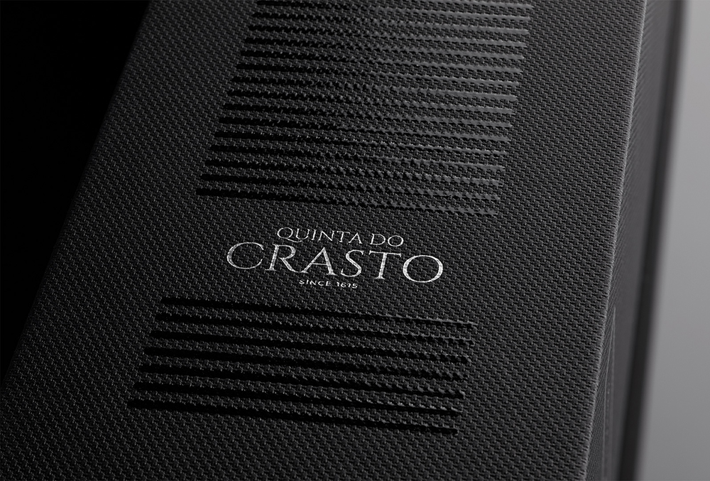
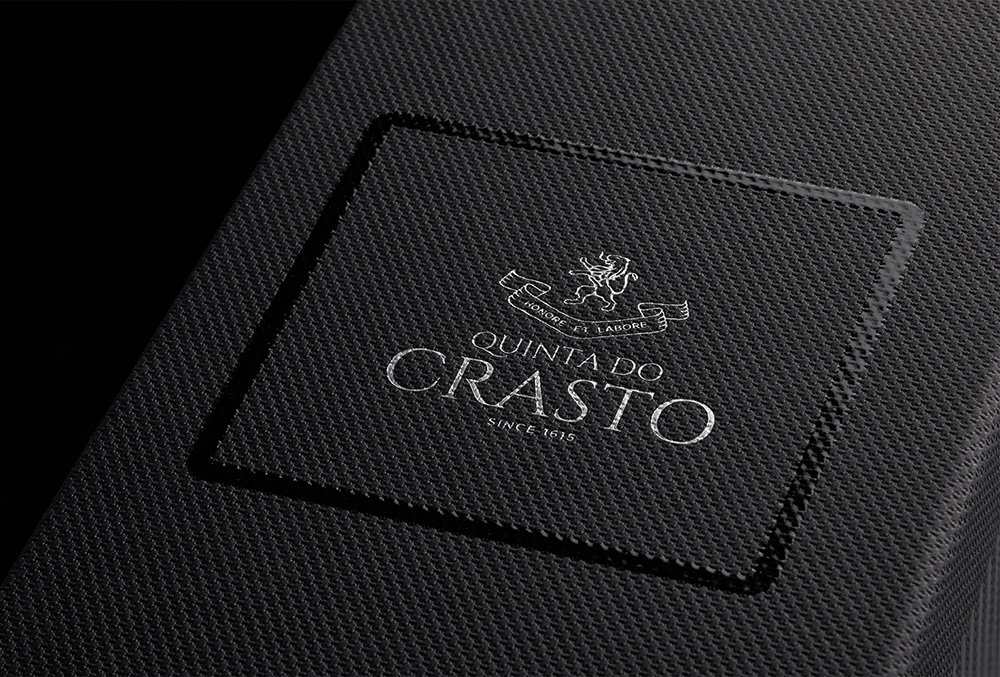
Quinta do Crasto Vinha da Ponte is now presented with a more elegant and classic image. At the sides, this packaging contains elements that reflect the lines and the unique landscape of the Douro valley, where Quinta do Crasto stands guard. Inside, there is a brief presentation of Vinha da Ponte, a very special vineyard that brings us back to the singularity of this terroir. This exclusivity of this wine’s image is even reinforced by distinctive finishes, as silver stamping, varnish and fine paper.
The major challenge was to develop a redesign for this special wine that was able to keep the elegance and the elements of the projects created for their anniversary.
