César Moura – Adega Do Mato Wine
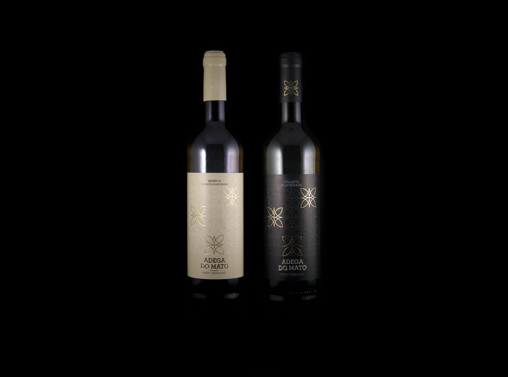
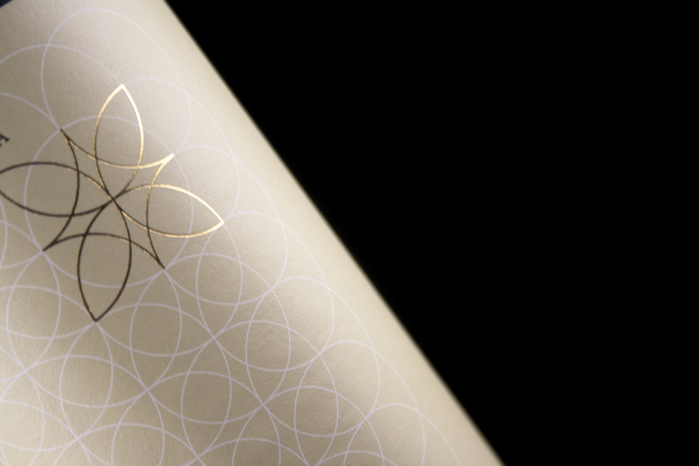
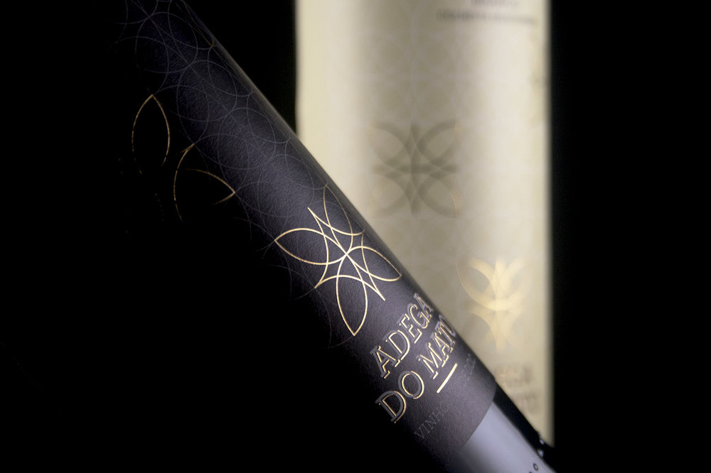
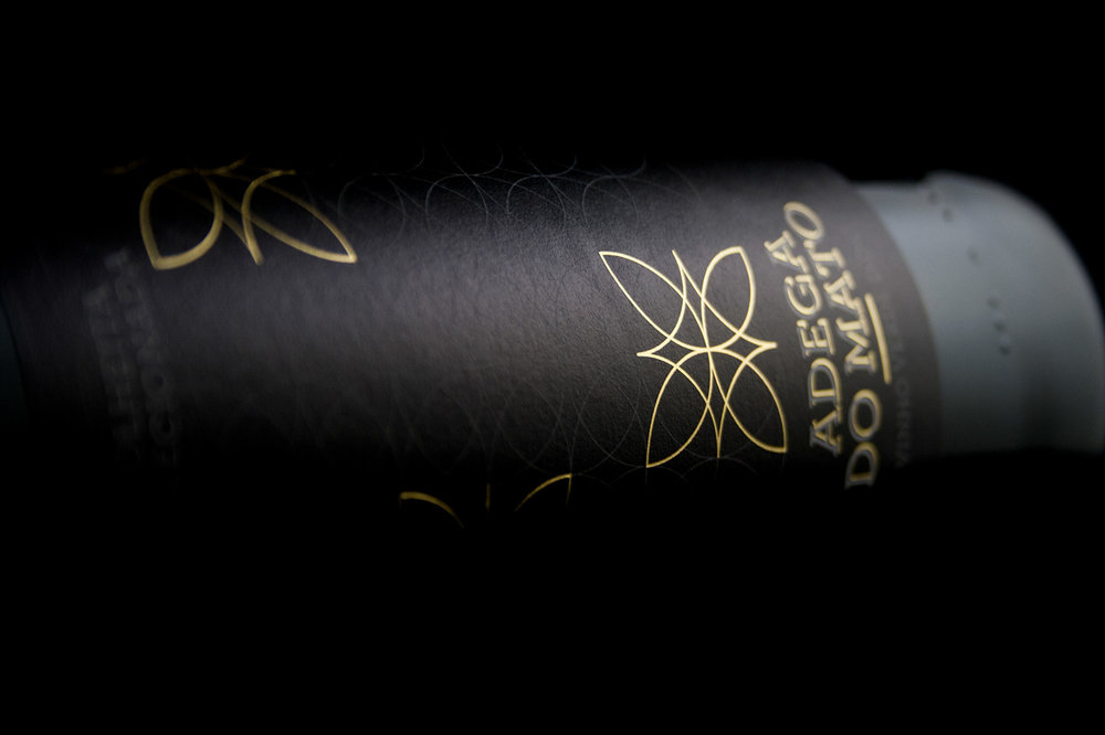
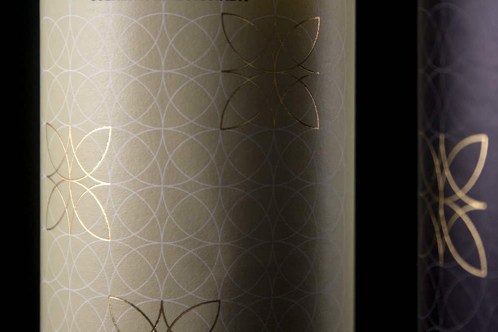
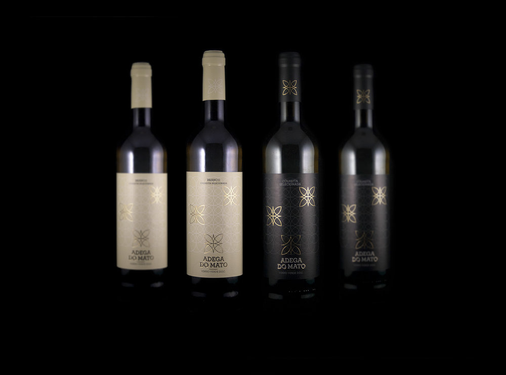
In 2012, Adega do Mato was rebuilt and Raul Vaia made the choice to bring the family’s dream to life and started producing ‘’Vinho Verde”.With a new corporative branding, 2019 is a turning point for the business.The main message Adega do Mato wishes to convey and it’s reflected in the sustainable processes used throughout the company’s procedures, is that the environment deserves to be respected. With that in mind it was important to transmit it on the brand image as well.Inspired by the perfect geometry and fractals that mother nature has to offer, the communication of the brand is created through perfect circular forms creating flourished elements, becoming the logo of the brand.

CREDIT
- Agency/Creative: César Moura
- Article Title: Adega Do Mato Wine Label
- Organisation/Entity: Freelance, Published Commercial Design
- Project Type: Packaging
- Agency/Creative Country: Portugal
- Market Region: Multiple Regions
- Format: Bottle
- Substrate: Glass, Pulp Paper
FEEDBACK
Relevance: Solution/idea in relation to brand, product or service
Implementation: Attention, detailing and finishing of final solution
Presentation: Text, visualisation and quality of the presentation


