
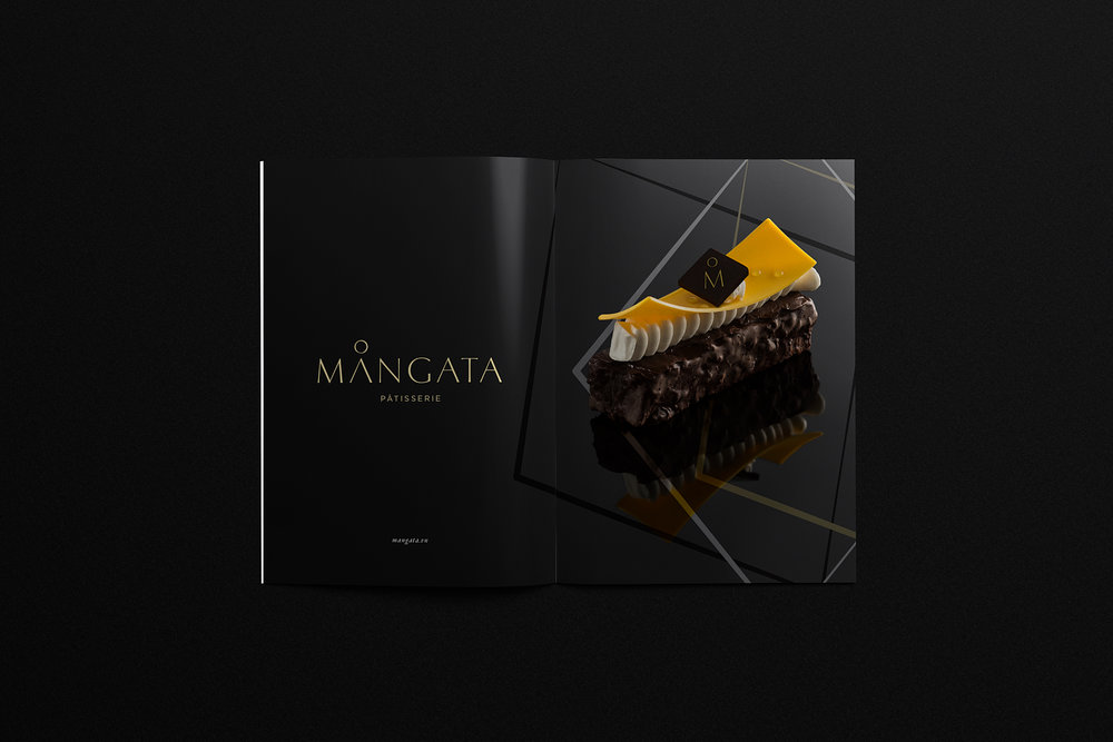
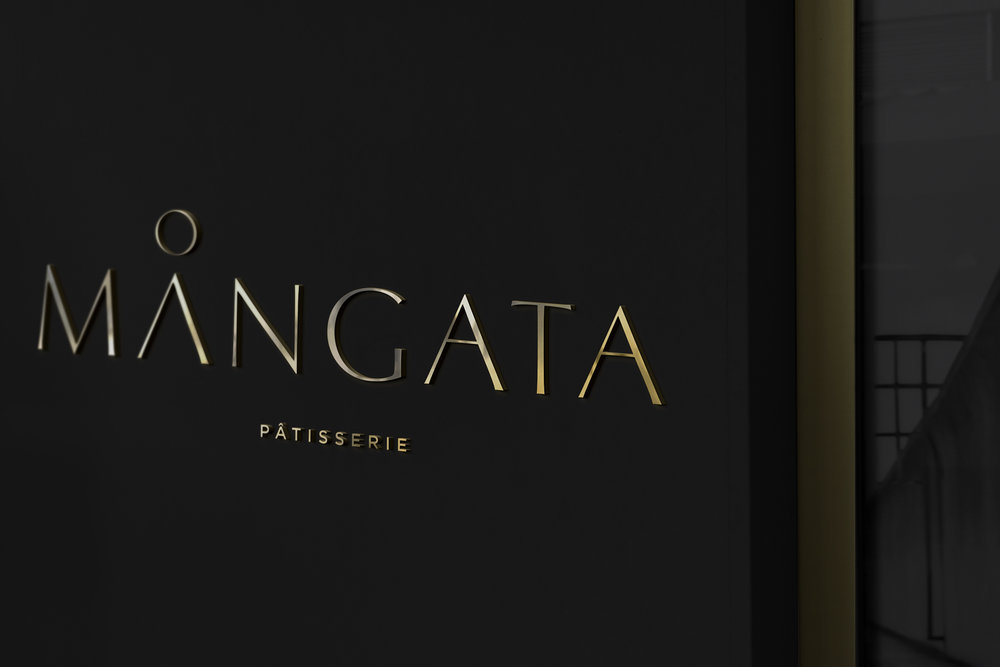
” Mångata Pâtisserie launched to be one the luxury bakeries in Saigon serving truly well-designed cakes with high-tea concept. The owner has been wandering, researching and studying for a long time in French and Belgium to find the-one recipes. Endorsing the minimal lifestyle of Northern Europe, the brand name is chose for its unique meaning, a feeling for falling in love, romantic and delight, like a beautiful novel, a love song, something comes without thoughts but from the bottom of hearts.
Concept
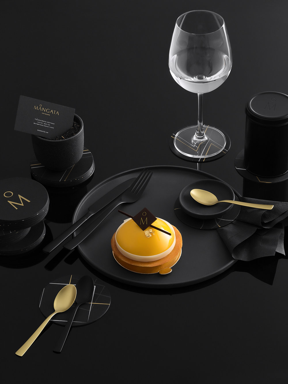
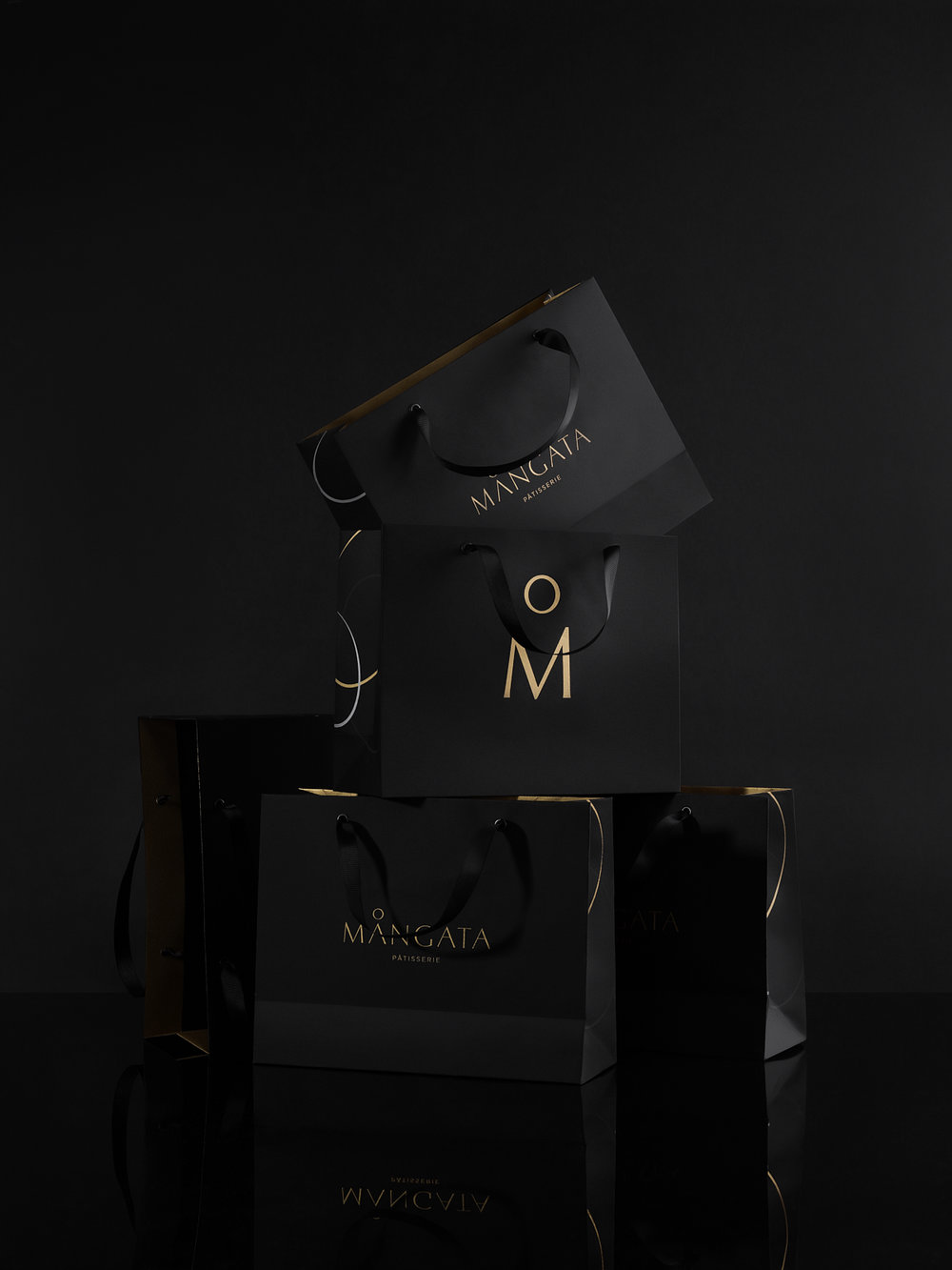
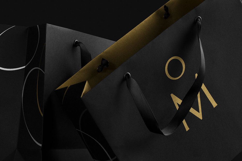
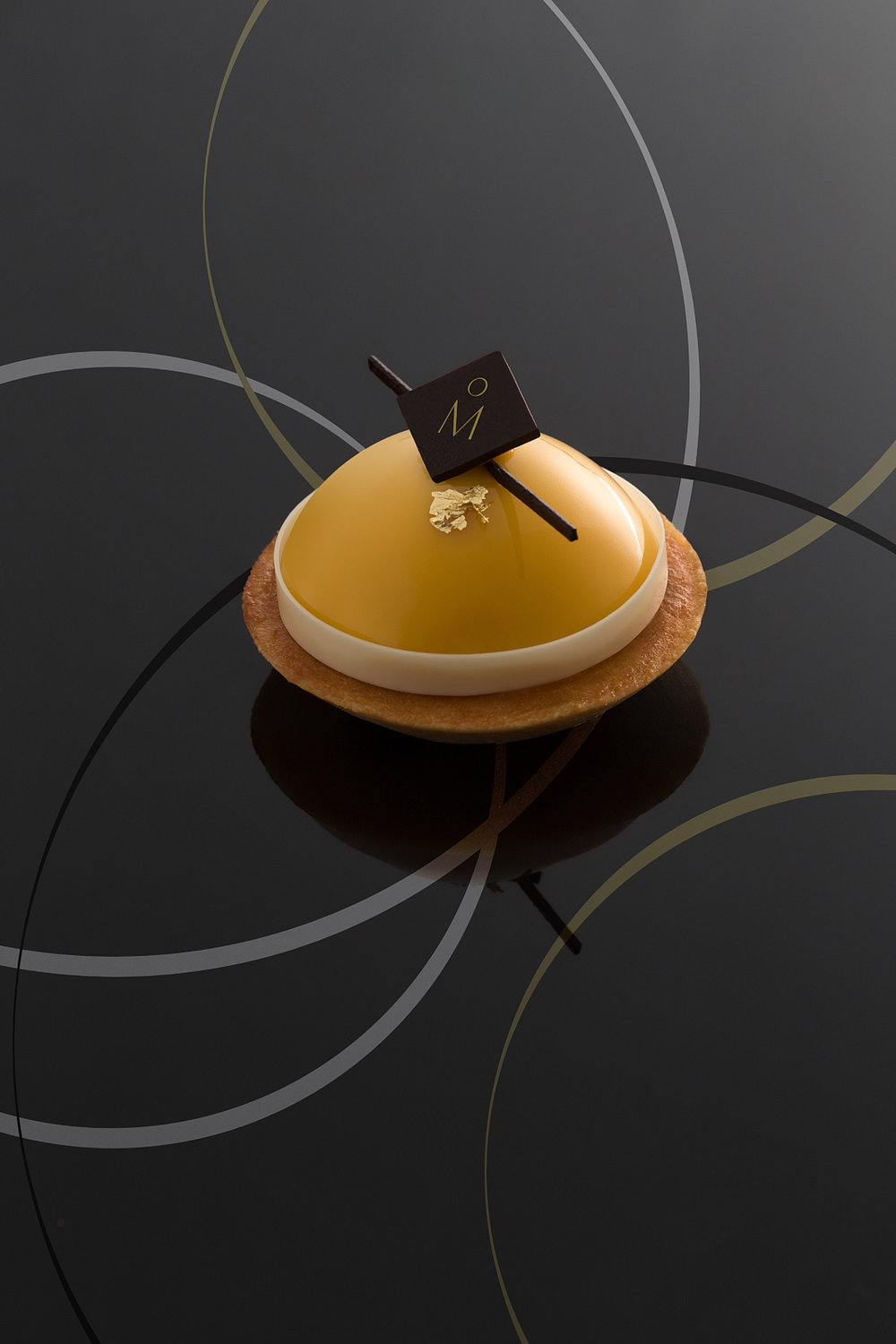
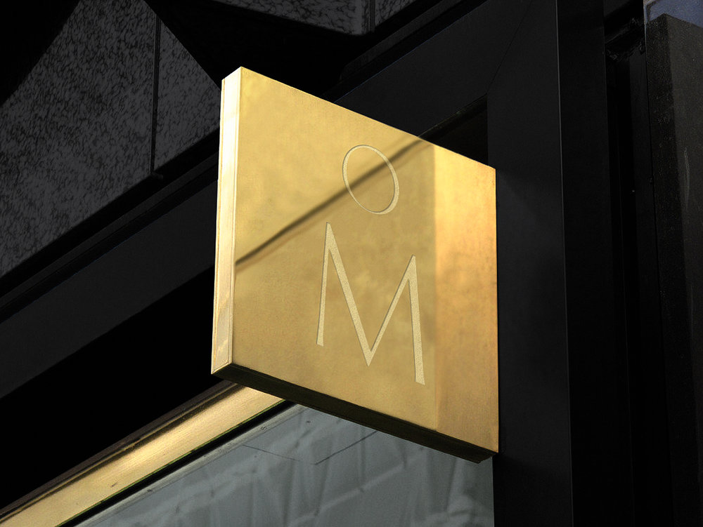
The concept is mainly focus to create a visual identity and system for packaging and other brand materials that is unique, strong and sustainable. Mångata has a different meaning in Swedish, a unique romantic scene : the glimmering, road-like reflection of the moon creates on the night sea. The scene is really inspired and visually appealed, so we brought it into the brandmark, making Mångata more unique and rememberable but not overwhelmed its content. The colour palette, black & gold, imitates the atmosphere of the dark sea, also, gave the brand a mysterious, luxury touch.
Visual system
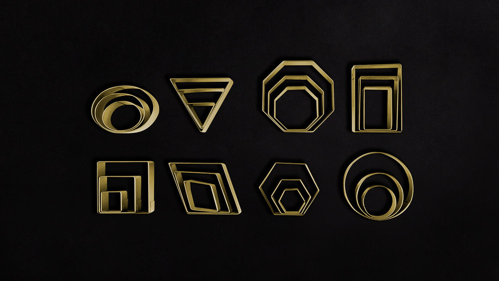
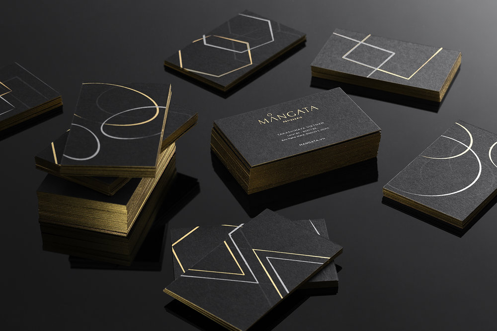
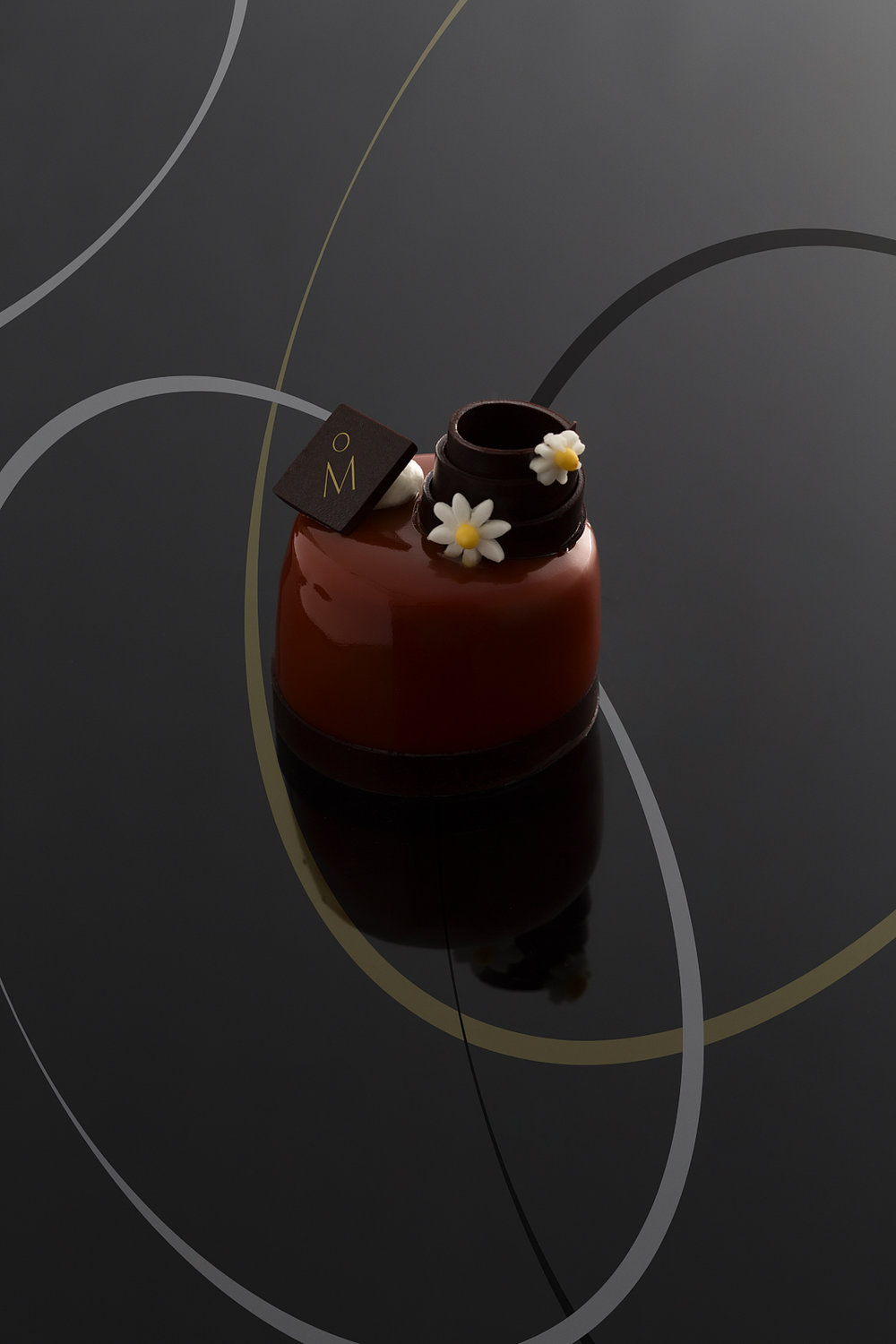
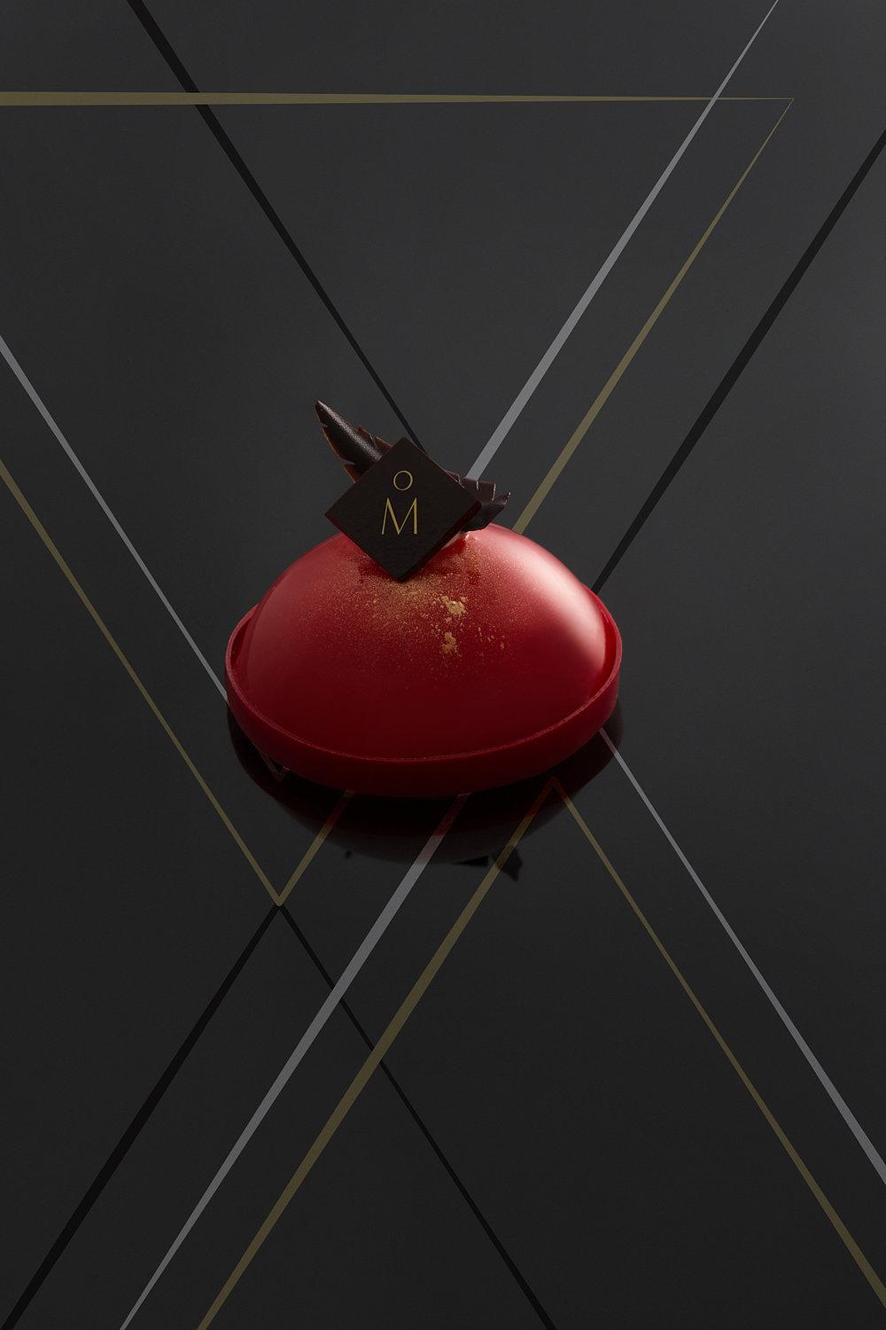
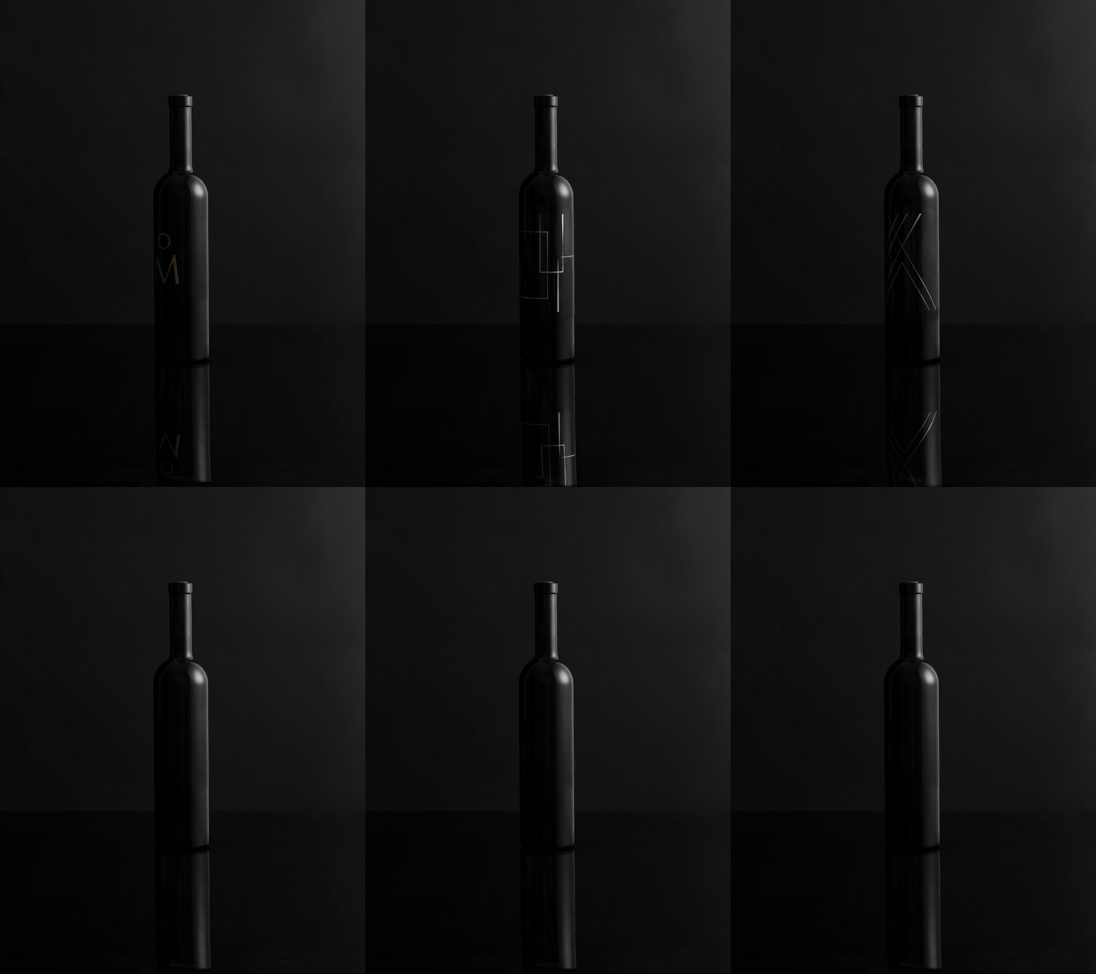
The contemporary art of plating is exploding with so many new creation and design, but it all comes from geometric-based concept with various type of geometric cutters and molds. The visual system was developed and applied dynamically for brand materials, involving a personal touch to Mångata.”




CREDIT
- Agency/Creative: M — N Associates
- Article Title: M — N Associates – Mångata Pâtisserie
- Project Type: Packaging
- Format: Bag, Bottle, Jar, Tray
- Substrate: Glass, Metal, Pulp Paper


