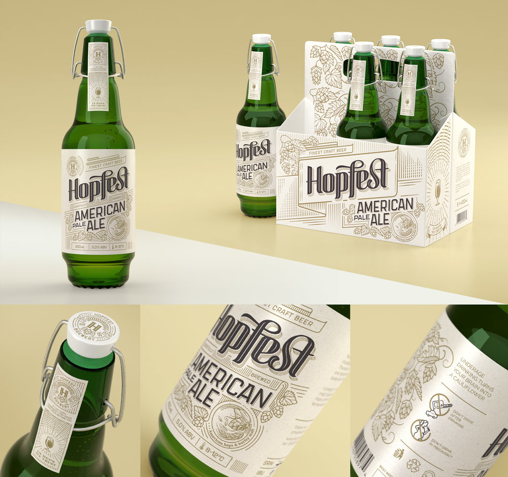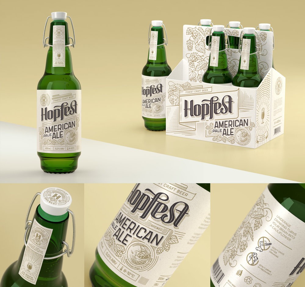
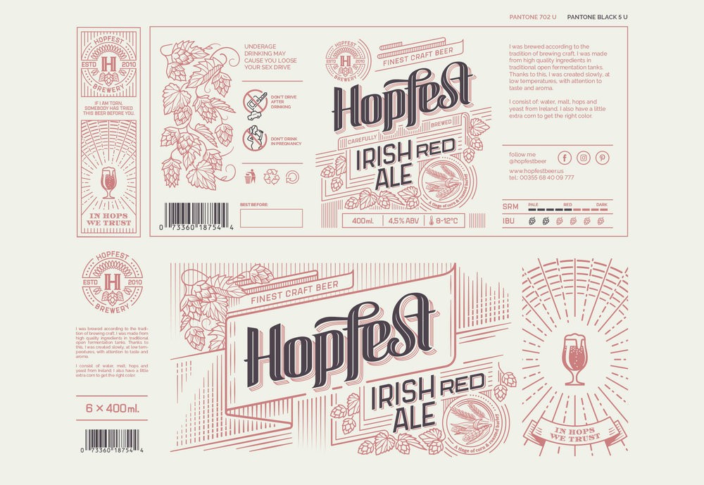
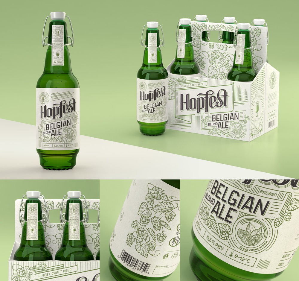
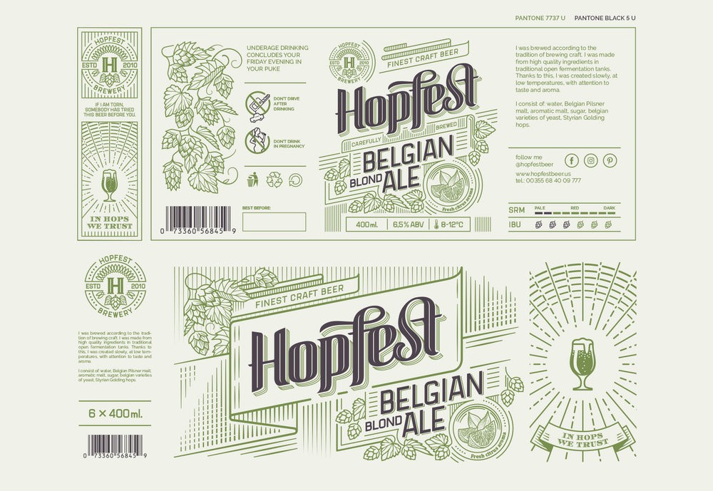
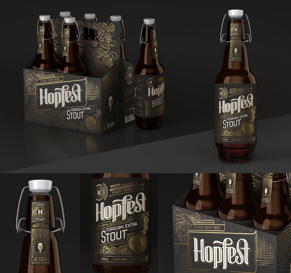
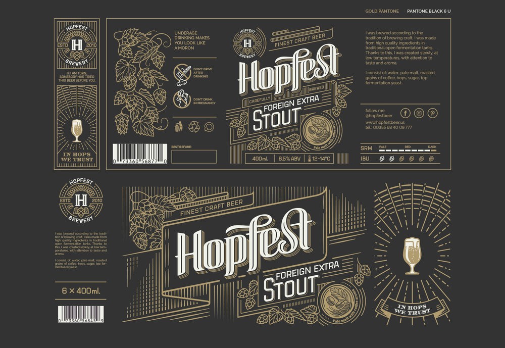
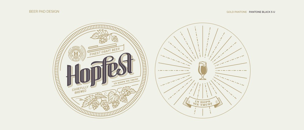
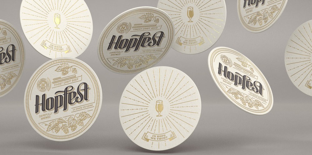
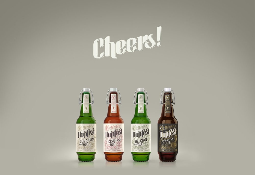
“Hopfest displays a traditional approach to a beer label design. To not to become too conventional though, there are few tonge-in-cheek elements in it. The shape of the bottle is quite unique so hopefully, the overall apperance presents itself like a fussion of old and new.
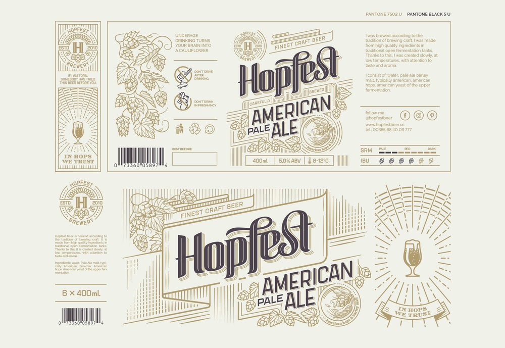
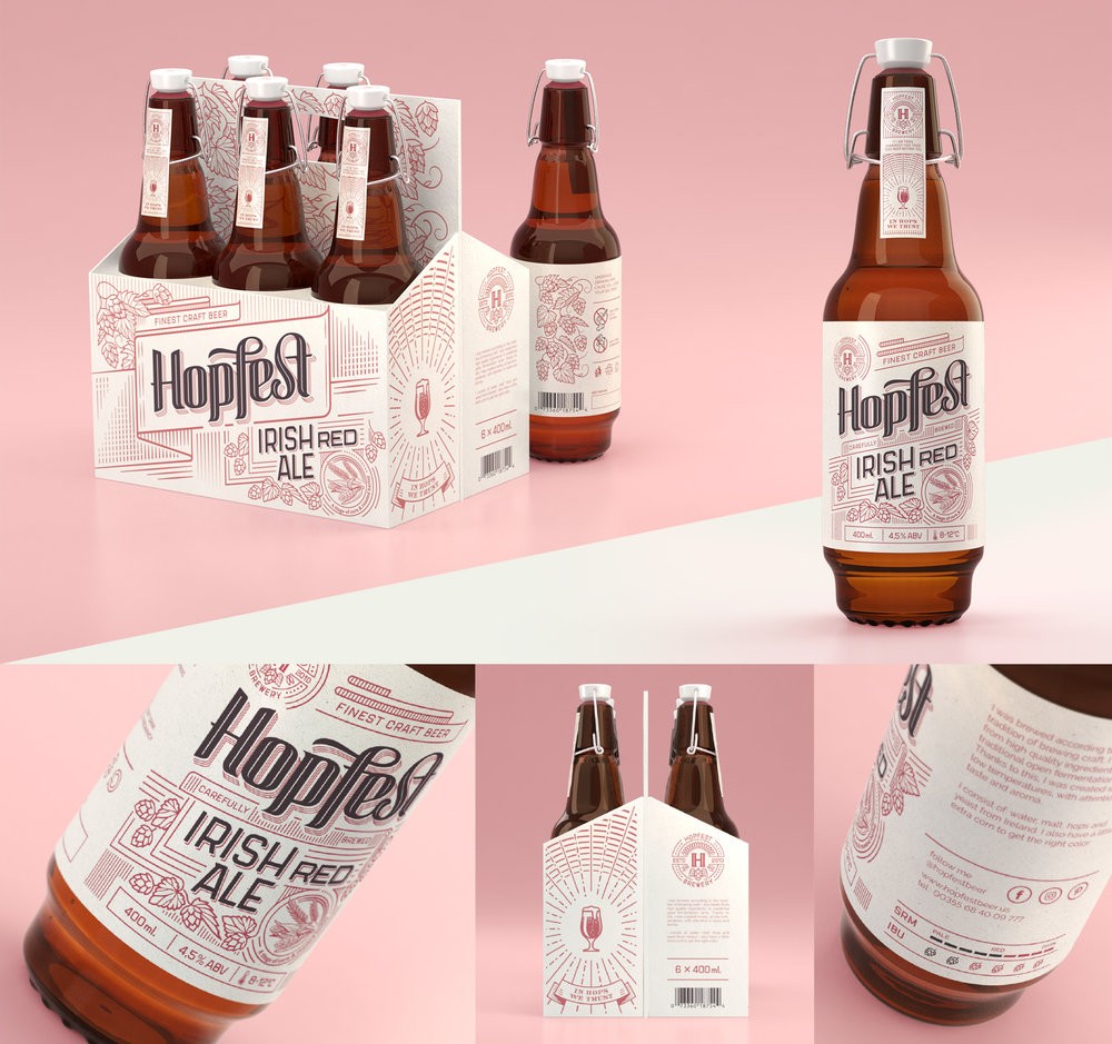
Hopfest comprises of 4 styles of craft beer. The challange I had in my mind, was executing a line of packaging for a high end product with a minimum resources in materials. The graphic design was supposed to be a primary mean of “selling the product”.
The project scope: structural design of the bottle, brandig ,custom lettering, labels graphic design, 3d modelign and rendering.”
CREDIT
- Agency/Creative: Marek Jagusiak
- Article Title: Marek Jagusiak – Hopfest Craft Beer
- Project Type: Packaging
- Format: Bottle
- Substrate: Glass, Metal, Plastic, Pulp Paper
FEEDBACK
Relevance: Solution/idea in relation to brand, product or service
Implementation: Attention, detailing and finishing of final solution
Presentation: Text, visualisation and quality of the presentation


