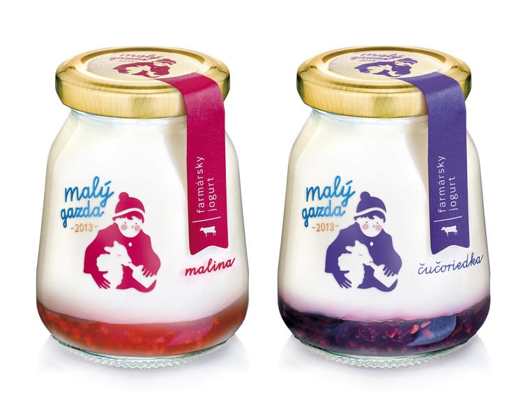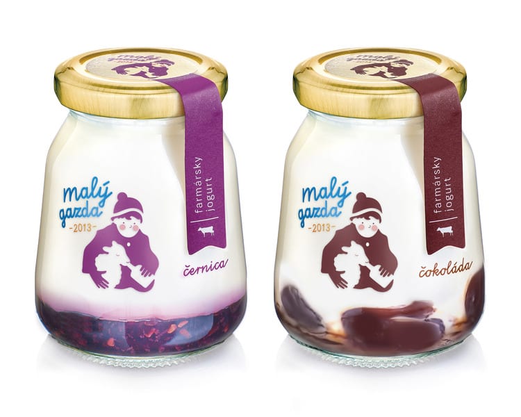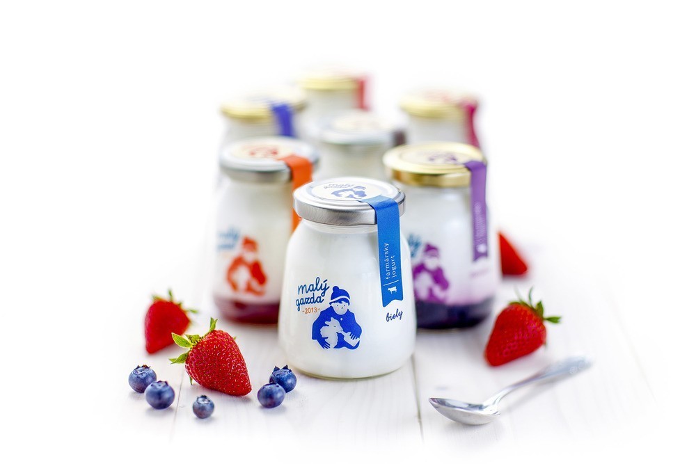
Slovakian design agency Pergamen was tasked to design the packaging and logo of a range of premium yogurts produced by the dairy company Malý Gazda.
The main challenge was to communicate the various product lines with a limited budget that did not allow the creation of different illustrations.
Studio Pergamen overcame this problem by creating a simple and evocative illustration of a young boy feeding a ship and by changing the colour of this logo and of the side stripe according to the different flavours.

By cleverly choosing a primary school font, this packaging evokes childhood memories and unlocks rural emotions in the consumers – exactly what is expected by a premium range of dairy products.

CREDIT
FEEDBACK
Relevance: Solution/idea in relation to brand, product or service
Implementation: Attention, detailing and finishing of final solution
Presentation: Text, visualisation and quality of the presentation


