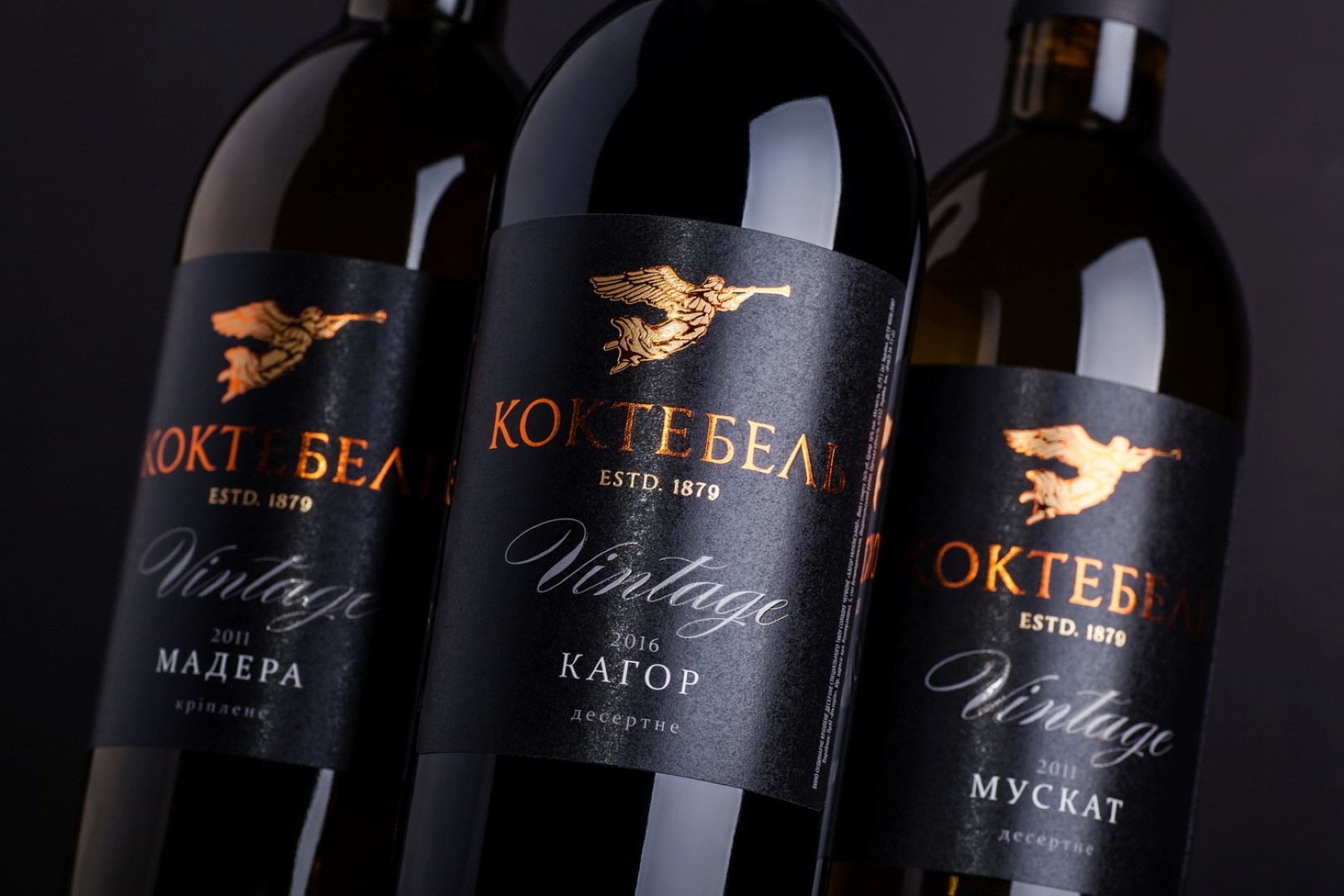
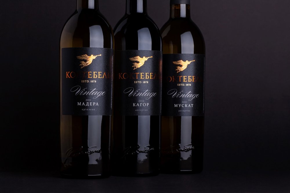
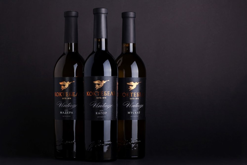
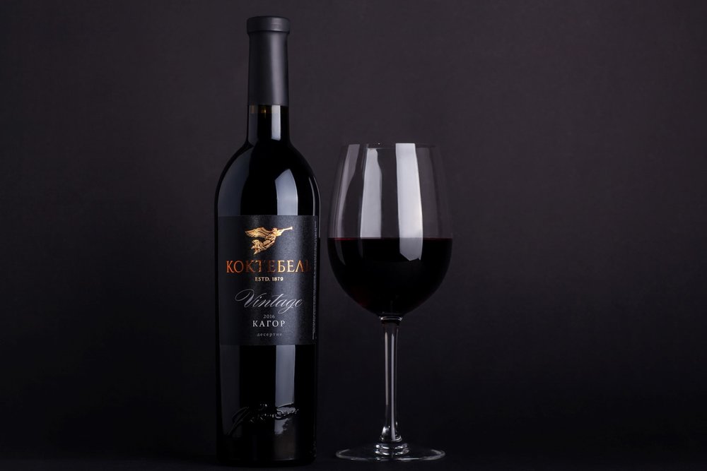
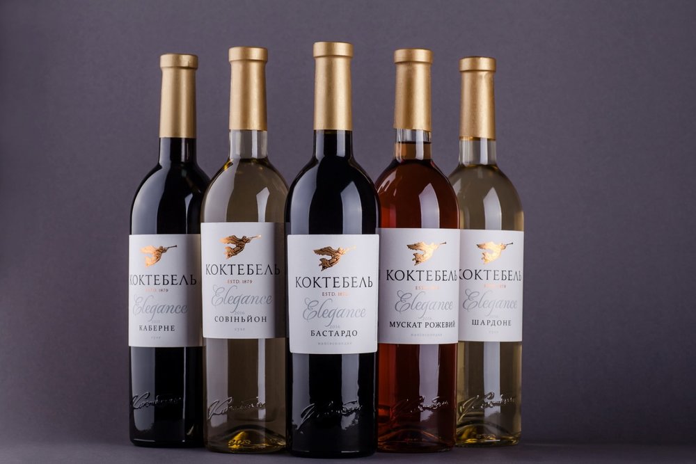
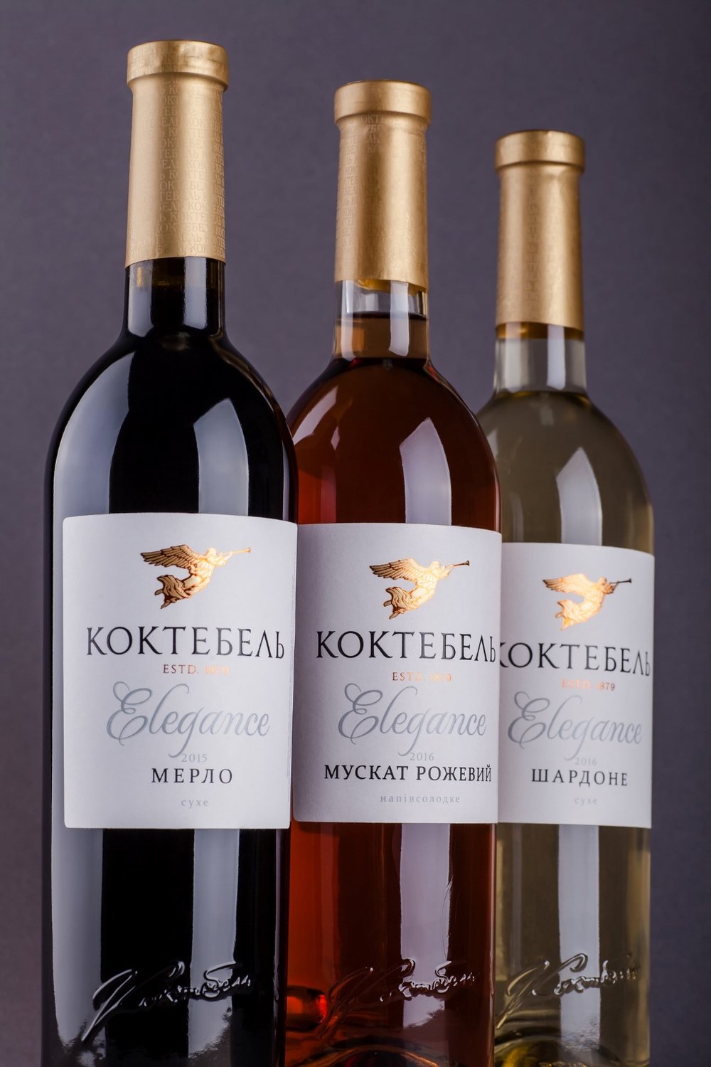
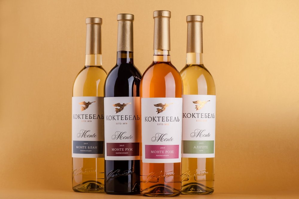
” The story of the Koktebel trademark can be traced back to the second half of the XIX century, when the first vines were planted and the first drinks produced in the Crimean region of the same name. Today, Koktebel is one of the most renowned and successful brands in the Ukrainian market, which, nonetheless, appeals more to a more senior buyer group. The brand owners have decided to reorient it towards a younger target audience, while still retaining the brand’s recognizability and link to the legend that was used as the basis for the brand’s promotion in recent years. That’s why we’ve focused on creating a tempered, classic, and, at the same time, modern label for Koktebel, which would correspond to the client’s reviewed vision of the trademark.
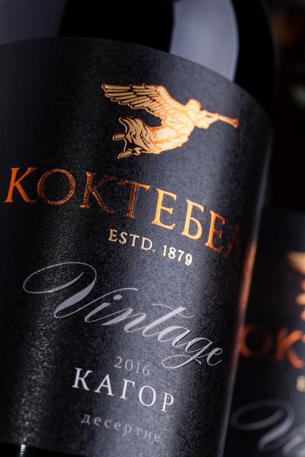
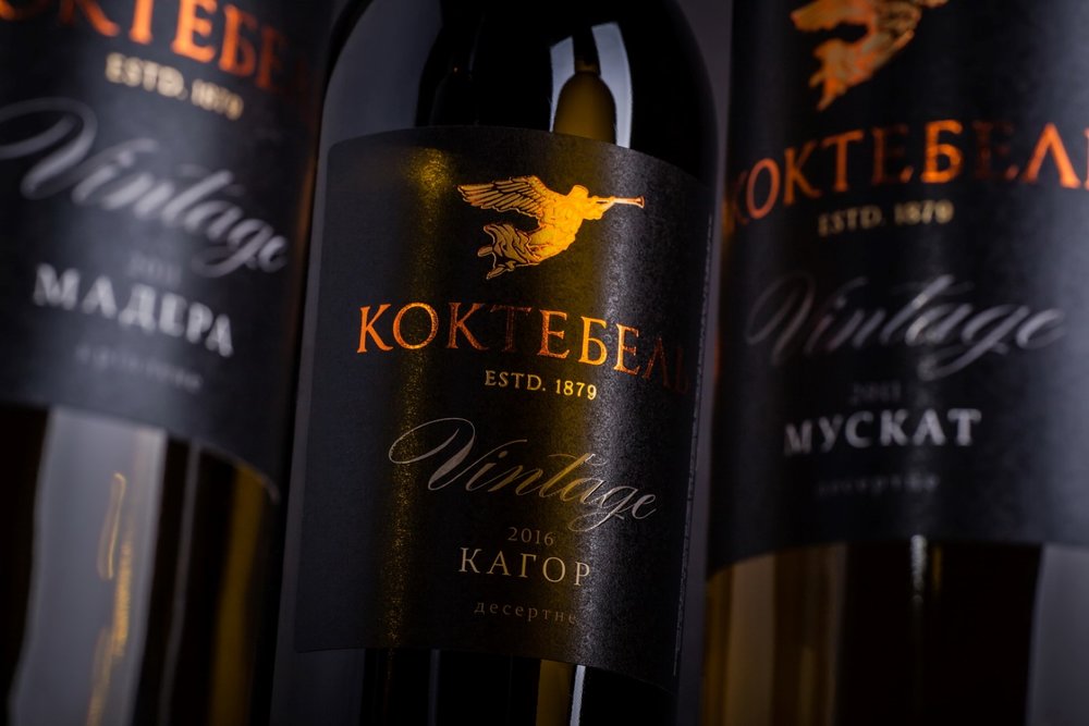
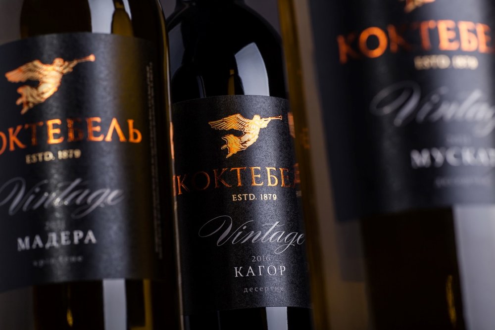
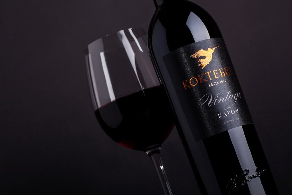
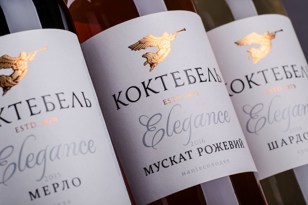
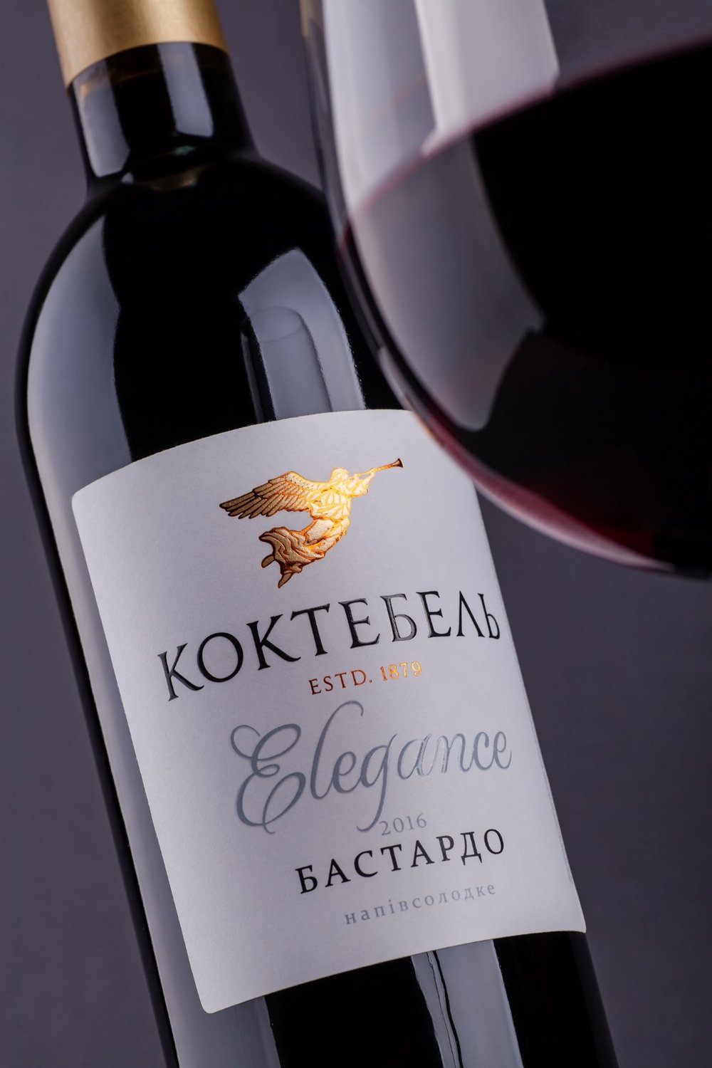
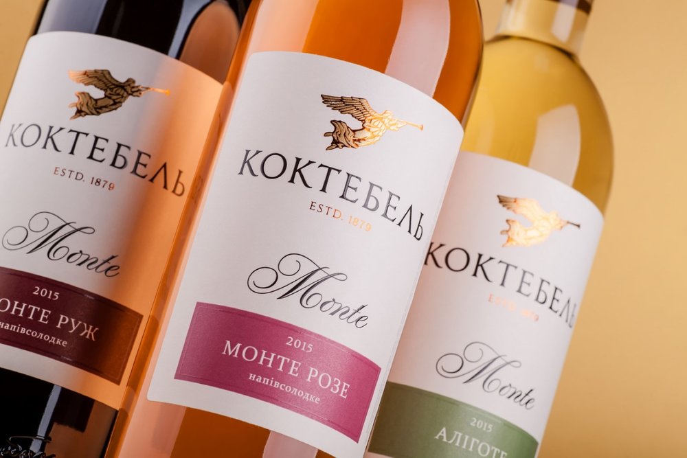
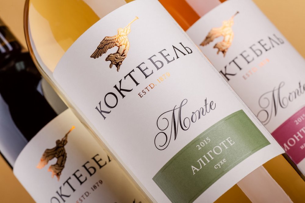
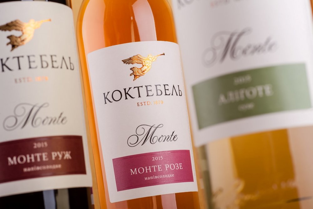
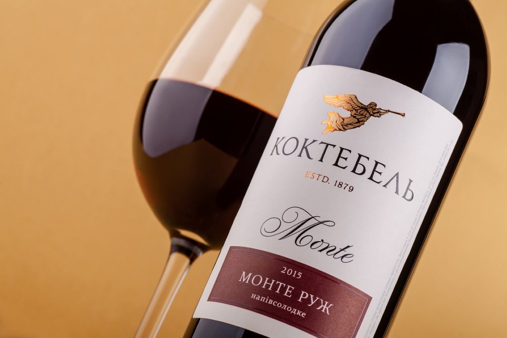
Stylistically the label design for Koktebel can be described as tempered, minimalistic, modern. The main identificator and graphic element of the label is the angel logo, specially reworked by our illustrator, which is based on an image that was previously featured only on the back label, and linked to the marketing legend of the brand. The trademark includes three different product lines – Monte, Elegance and Vintage – aimed at different price ranges. Each line has its own label design, which reflects the product’s positioning, while also sharing the general visual style of the trademark. All three product lines employ additional post-printing techniques that are used to amplify the volume of the label and make it more attractive.”
CREDIT
- Agency/Creative: 43oz.com Design Studio
- Article Title: 43oz.com Design Studio – Koktebel
- Project Type: Packaging
- Format: Bottle
- Substrate: Glass


