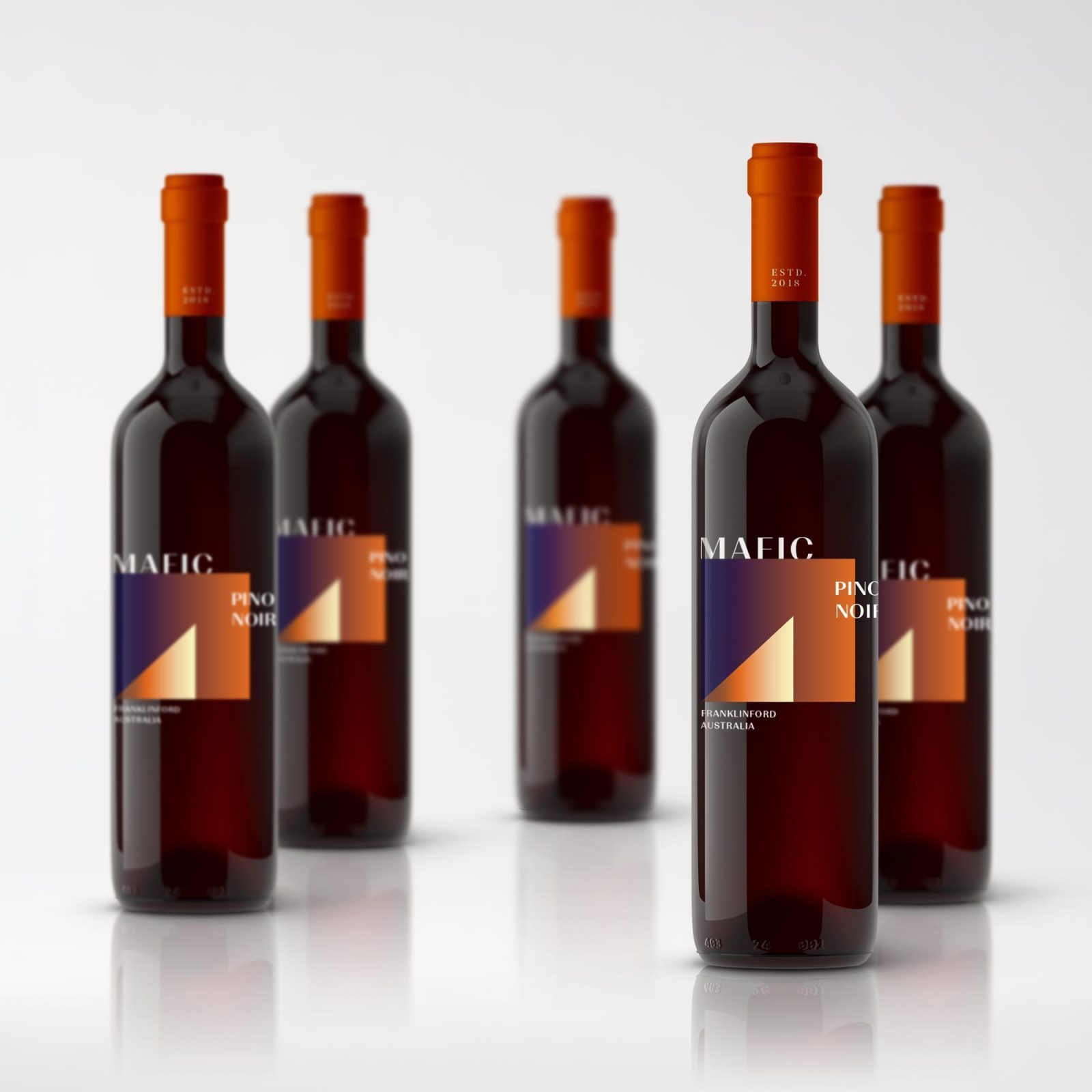
Semantics Design – Mafic
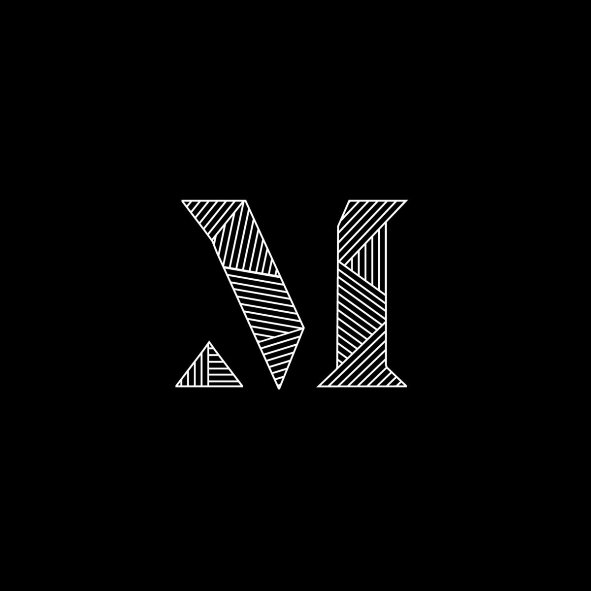
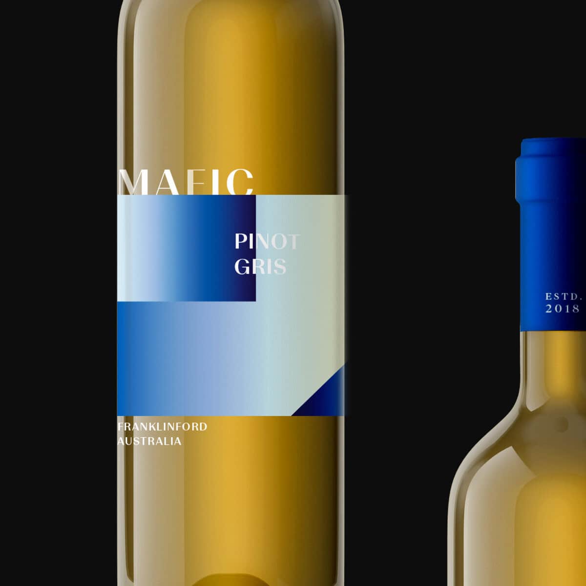
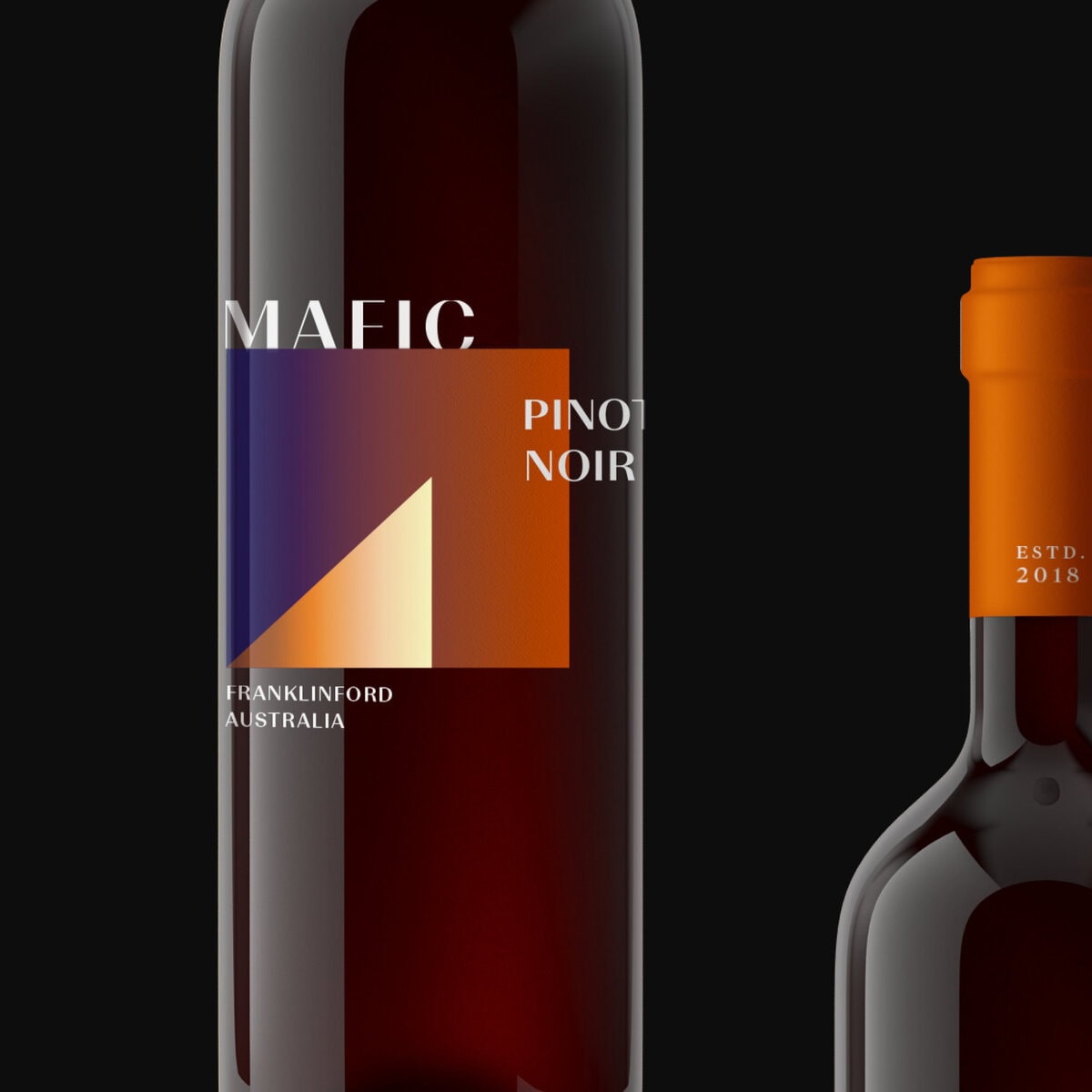
Mafic Estate is a young winery at the base of an extinct volcano in Central Victoria. ,Together we worked through the naming, brand story, identity and packaging. Mafic lava has a thick viscosity resulting in tough, dense and coarse igneous rock formations. The textures, grains and patterns of this rock have been interpreted into a distinguishable logo that retains a simple elegance. Labradorite, a feldspar mineral often found in mafic igneous rocks was inspiration for the palette due to its broad spectrum of blues, greens, yellows, greys and browns.
CREDIT
- Agency/Creative: Semantics Design
- Article Title: Mafic Corporate Branding and Packaging
- Organisation/Entity: Agency, Published Commercial Design
- Project Type: Packaging
- Agency/Creative Country: Australia
- Market Region: Oceania
- Industry: Hospitality
FEEDBACK
Relevance: Solution/idea in relation to brand, product or service
Implementation: Attention, detailing and finishing of final solution
Presentation: Text, visualisation and quality of the presentation


