Caparo Design Crew – La Coquille De La Vie
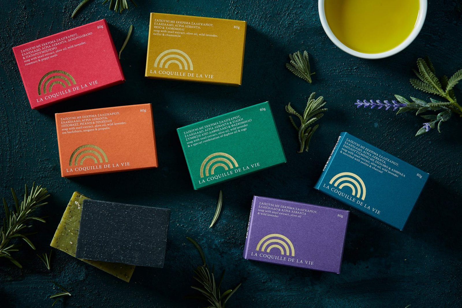
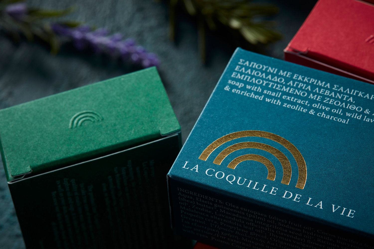
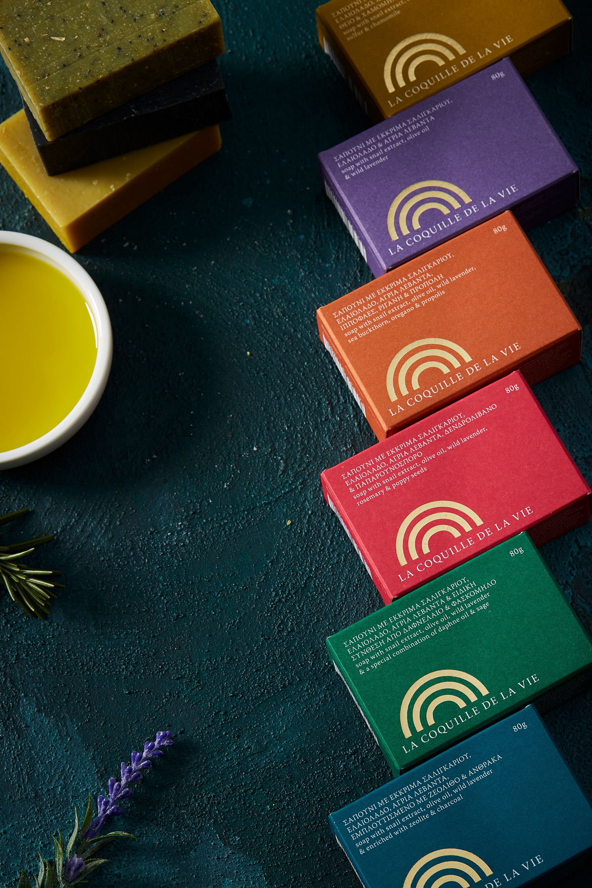
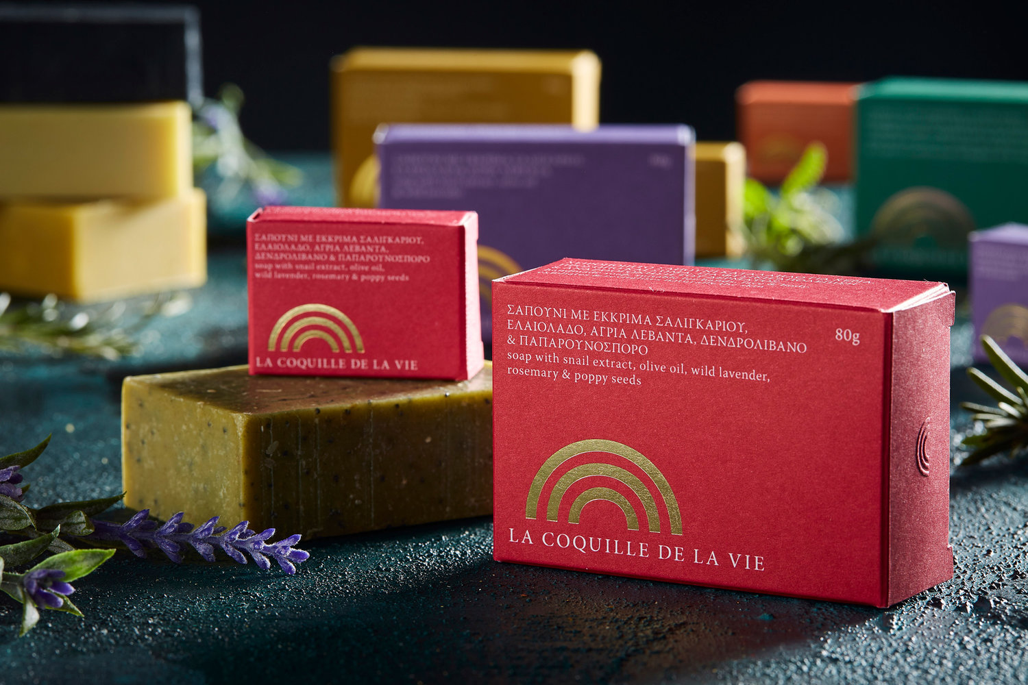
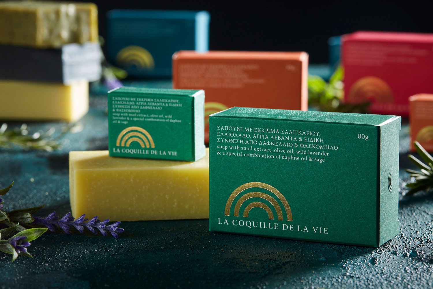
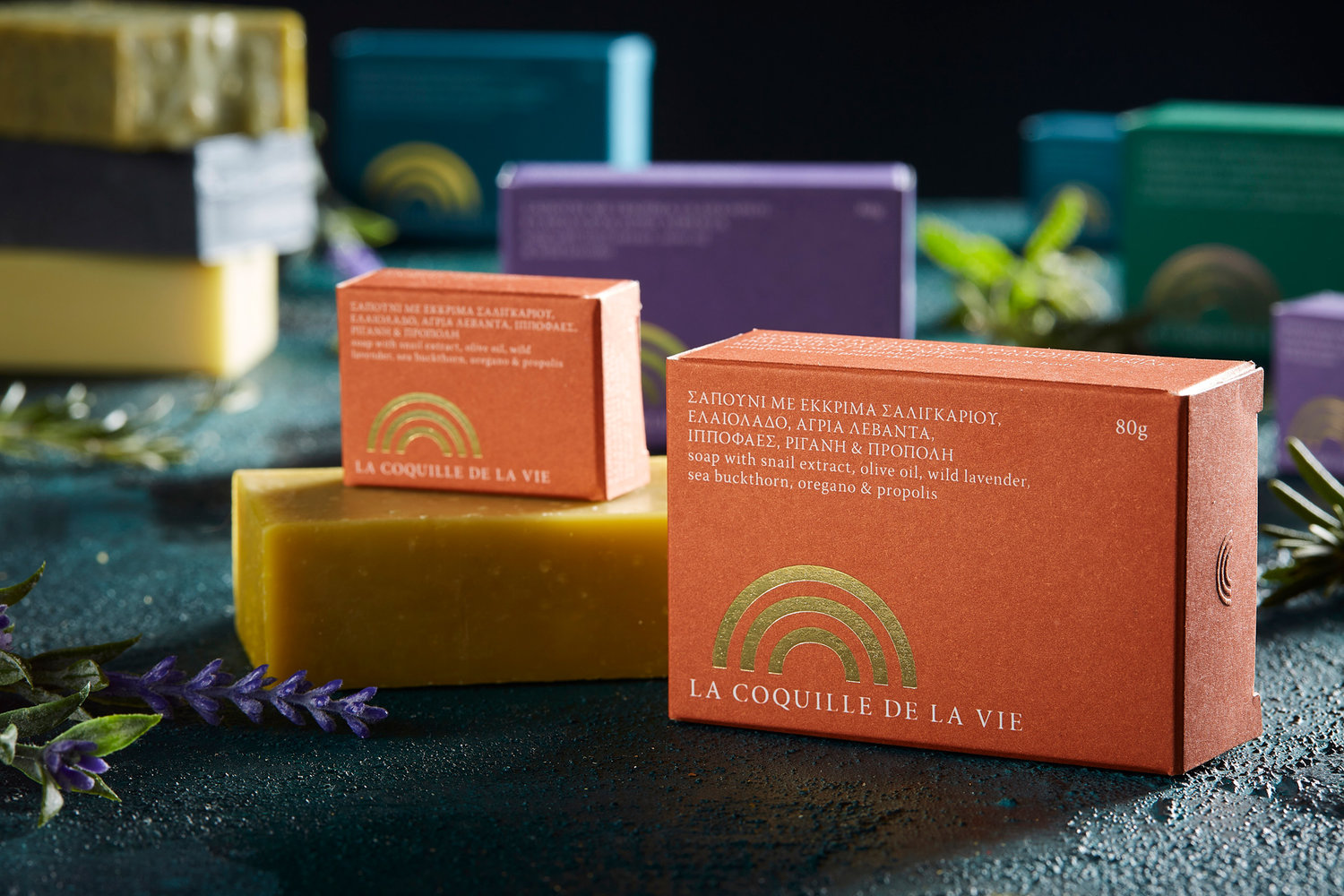
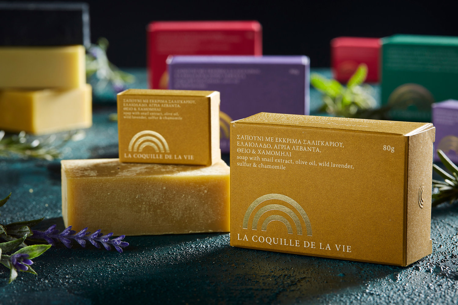
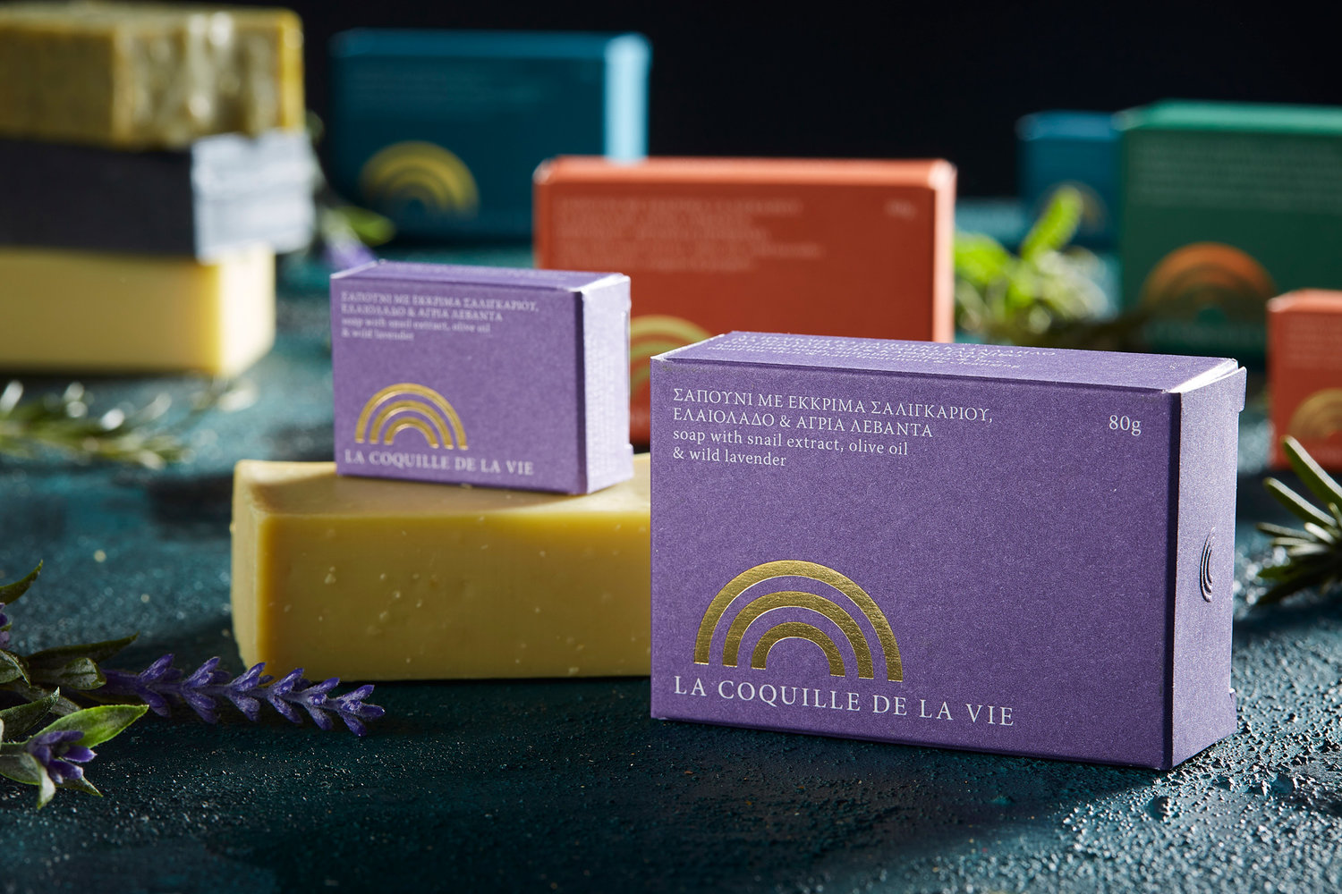
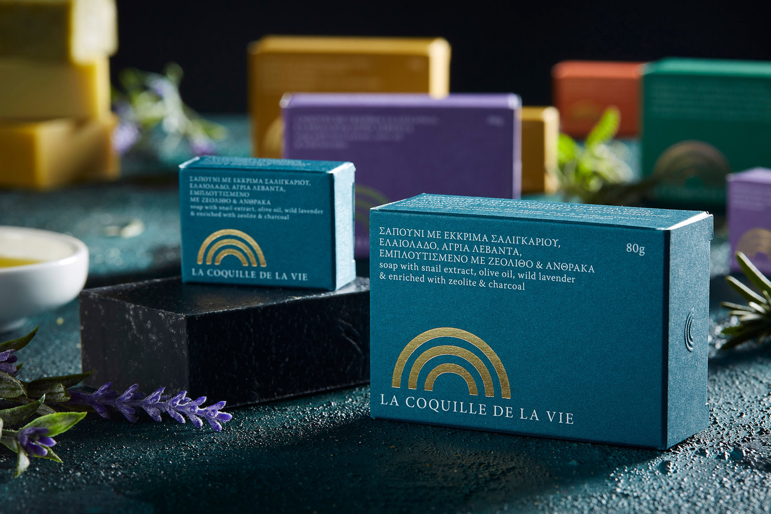
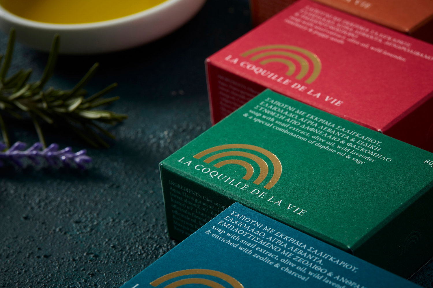
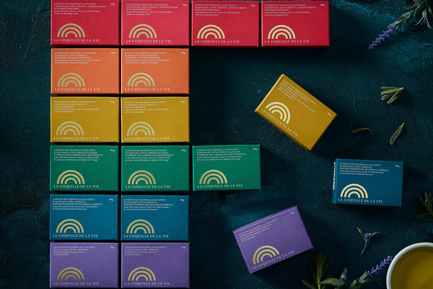
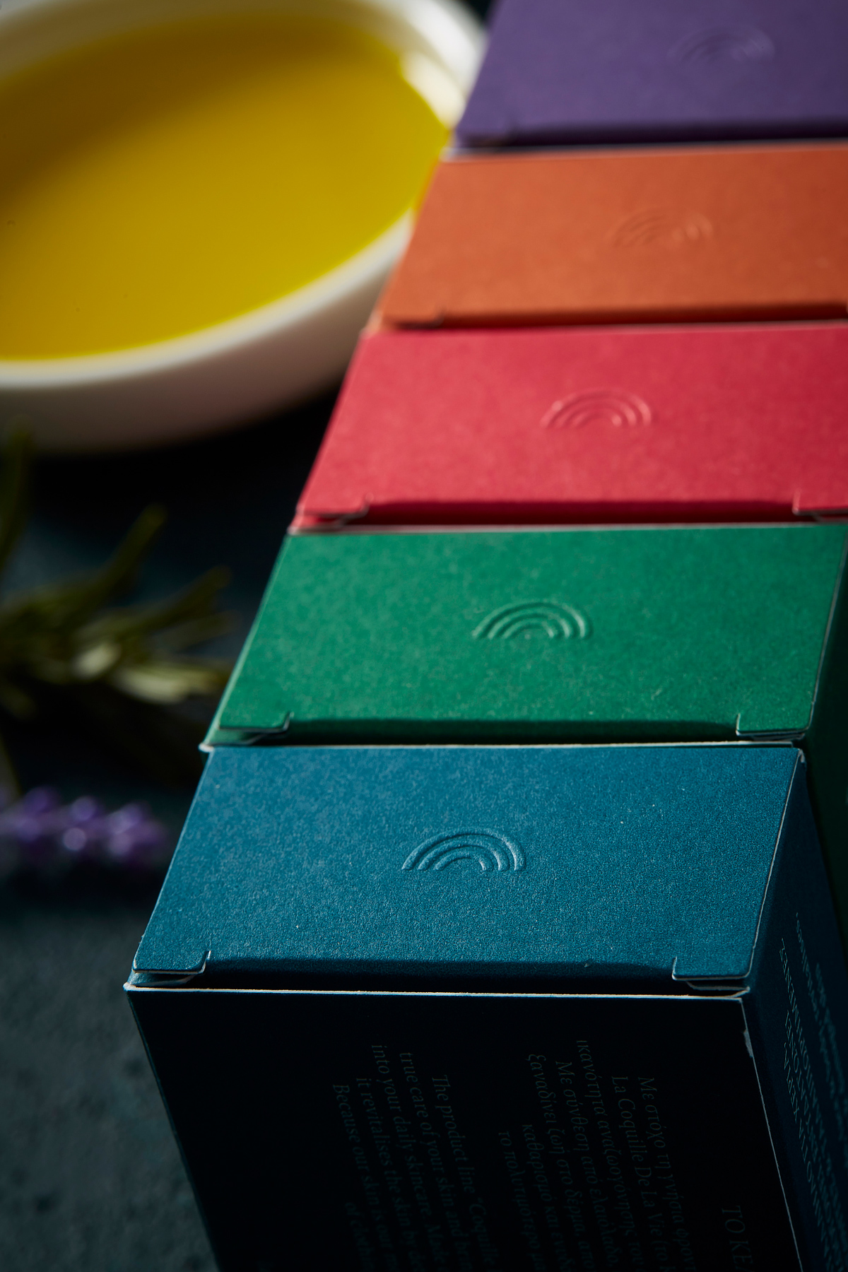
The client’s need was to create a new niche brand that could stand out compared with the global brands in the category of premium skin cosmetics products. The product’s USP is that they contain snail extract and multiple natural ingredients. Snail extract is known to have regenerative and rejuvenating properties and helps human skin.The packaging —We designed the packaging identity of the first product range of the brand, six different soaps. The product was launched in two sizes, the regular size and sample size. We used several special printing effects that contribute to the feeling of premioumness on the packaging. The boxes were printed both externally and internally with Pantone colors. The palette combines earthy and vivid colors reflecting the natural ingredients depending on the soap type. The packaging is embossed on the side using the brands’ symbol and we also used the hot-stamping technique with gold color on the front. The main visual element of the packaging is the logotype and the color. The delicate serif typography as a secondary tool shapes the gentle and premium look & feel of the packaging.The brand —La Coquille De La Vie means in French ‘The Shell of Life’. We designed from scratch the brand concept and identity including the name, logo, and packaging.The shell-like logo is a fusion of forms inspired by the rainbow, the eye, the sun, and the abstract form of an ordinary target containing a series of symbolisms. About the love life of snails: Snails are hermaphrodite species. The genitalia of these creatures is hidden in their throats, just behind their eyes. Since they do not really have penises, they engage in an ‘erotic archery’, throwing erotic “arrows” to one another. Arrows, mainly consisting of calcium, do not contain sperm, but make the victim more receptive to the semen of the shooter.Inspired by the erotic life of snails, the logo symbolizes the snail’s shell and the form of a shooting target. We can consider that achieving better health and our effort for beauty and well being is part of the wider context of a person trying to attract erotic partners. Consequently, the parallelism of the idea of the erotic target with human nature characteristics is an idea that creates interesting connotations.The word de la vie (life) also carries multiple meanings. The brand promises a kind of genesis and regeneration in a vegetal and mild way. The morphological reference of the logotype to the rainbow and the sun enhances the symbolism of renewal, freshness, (re) birth and optimism.
CREDIT
- Agency/Creative: Caparo Design Crew
- Article Title: La Coquille De La Vie, Natural Soaps With Snail Extract, A Sophisticated Brand
- Organisation/Entity: Agency, Published Commercial Design
- Project Type: Packaging
- Agency/Creative Country: Greece
- Market Region: Europe
- Format: Box, Case
- Substrate: Pulp Paper


