Ruto Design Studio – “Sychronos Asklipios”
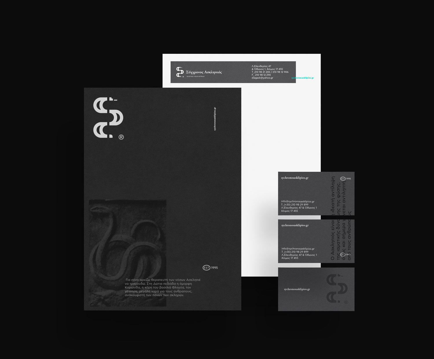
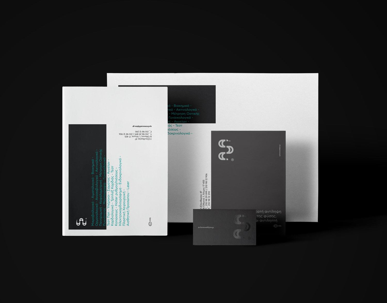
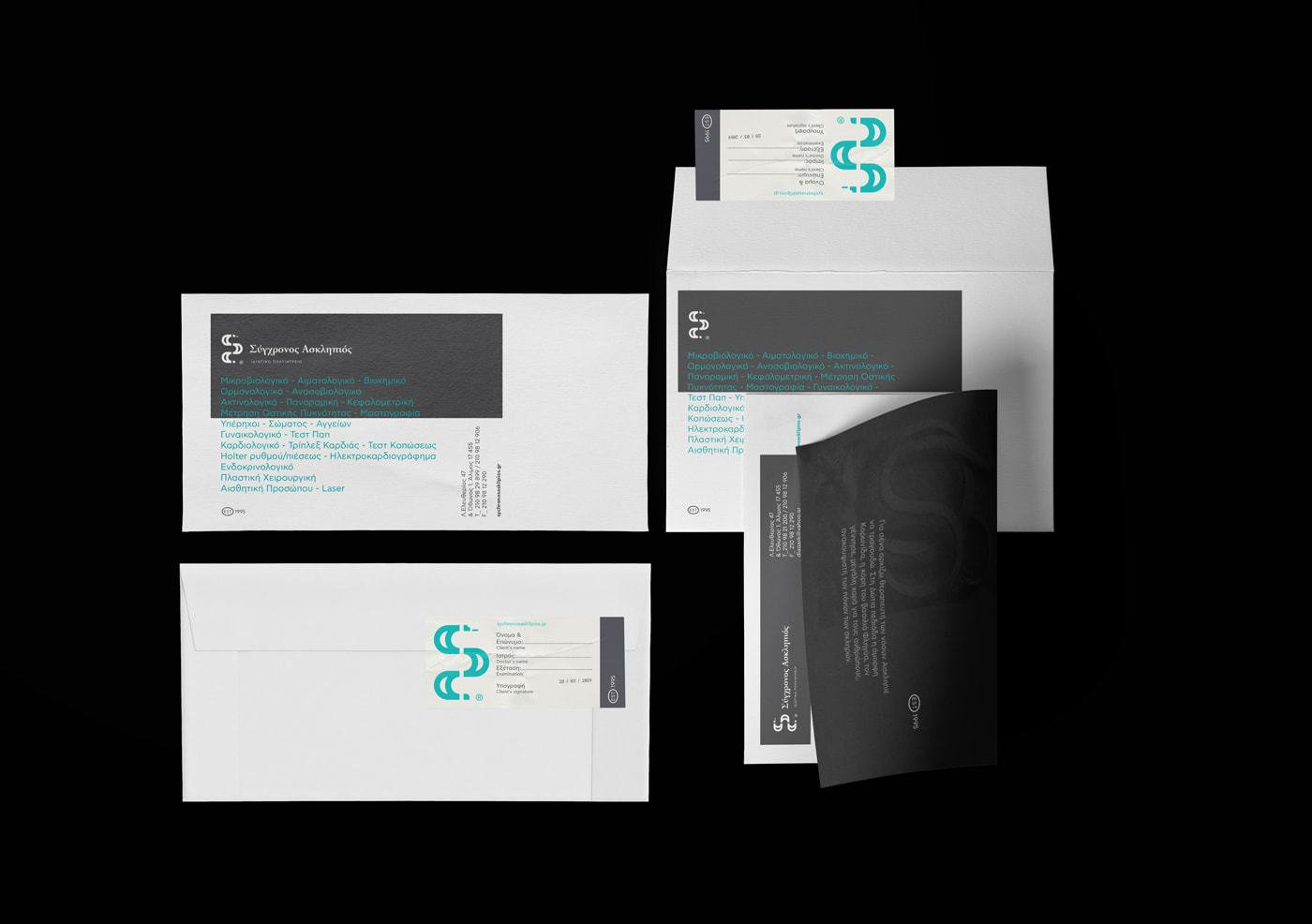
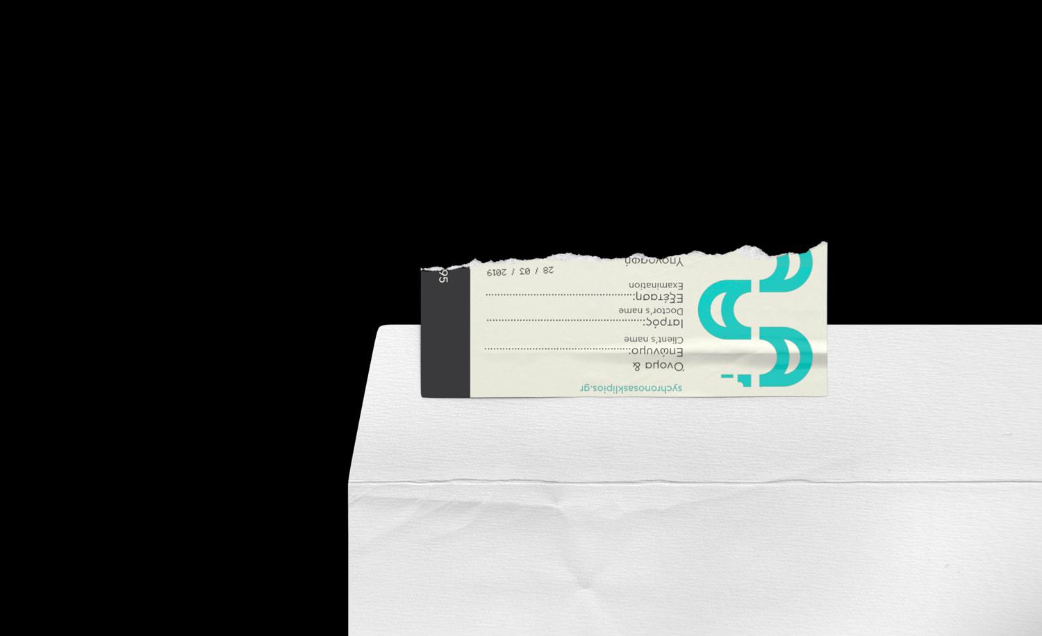
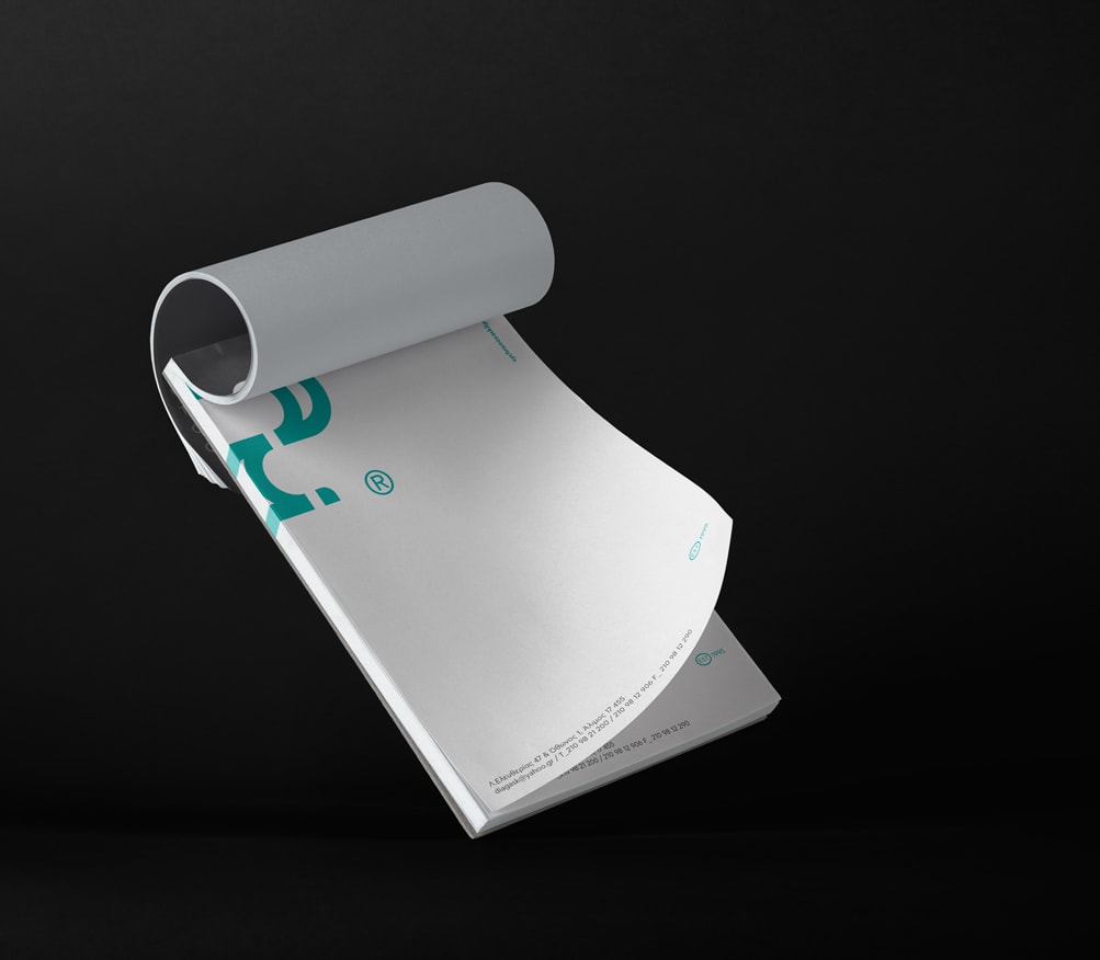
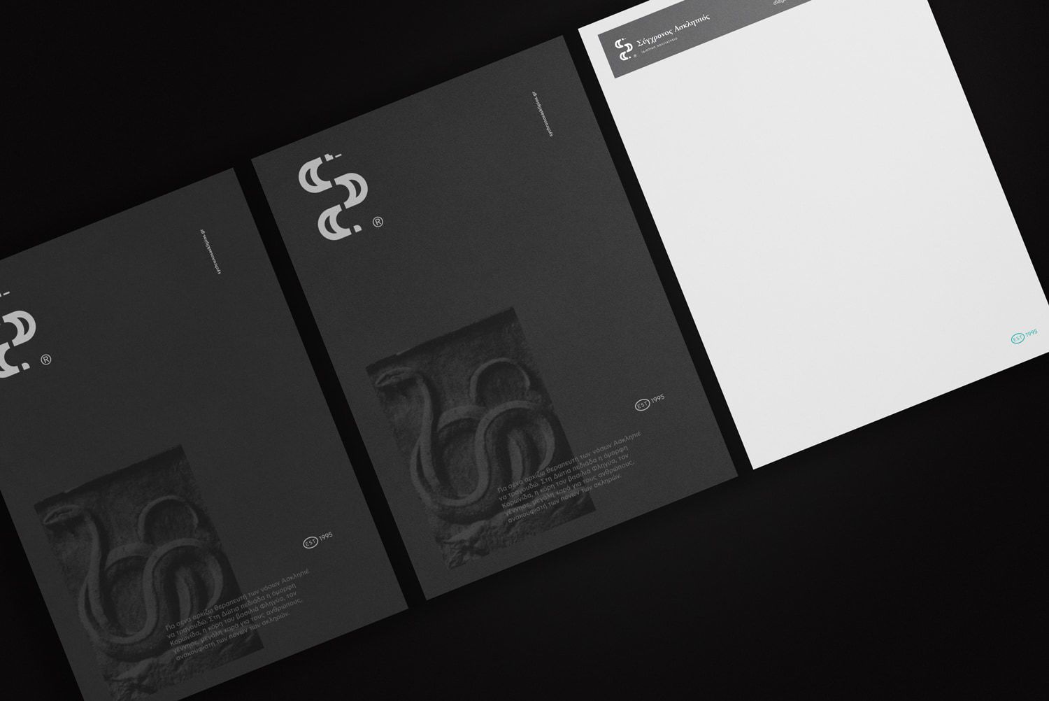
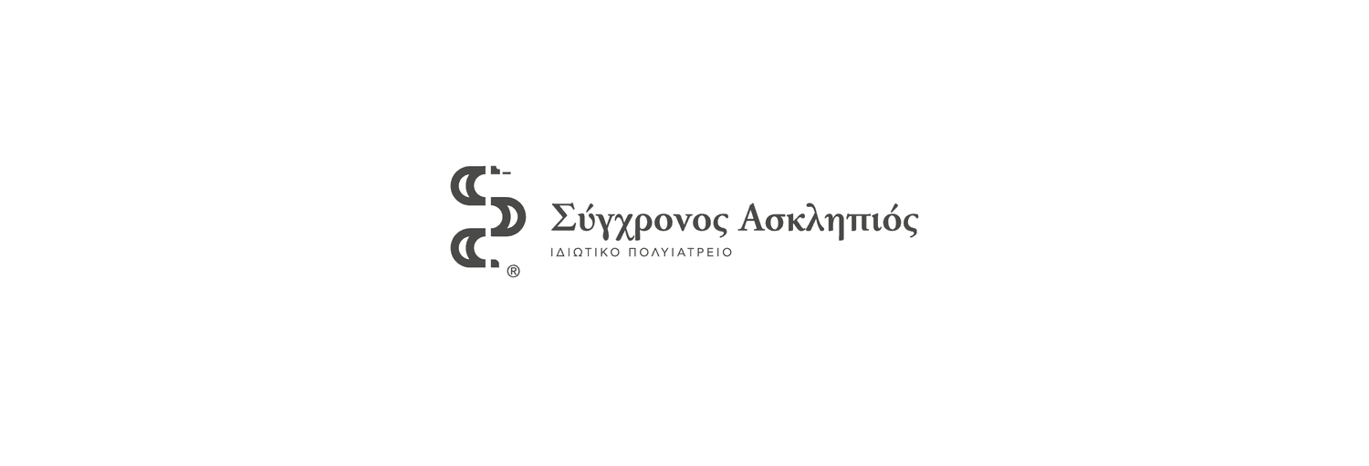
The brand concept is moving around Asclepius’s rod and the snake he uses to make medicines. We created a modern symbol of the snake, using the negative space to imply the rod on the vertical axis. Using an image of a marble tablet that has a sculpt of the snake as reference, we created an optical identity that uses grey rectangle shapes (marble) as background and the information pops out like an embossed sculpt.The high contrast on the colours and the big typography takes a key role in the project while it reflects the brands personality and essence.
CREDIT
- Agency/Creative: Ruto Design Studio
- Article Title: Visual Identity for Multi Clinic Called “Sychronos Asklipios” Contemporary Asclepius
- Organisation/Entity: Agency, Published Commercial Design
- Project Type: Packaging
- Agency/Creative Country: Greece
- Market Region: Europe
- Industry: Health Care
FEEDBACK
Relevance: Solution/idea in relation to brand, product or service
Implementation: Attention, detailing and finishing of final solution
Presentation: Text, visualisation and quality of the presentation


