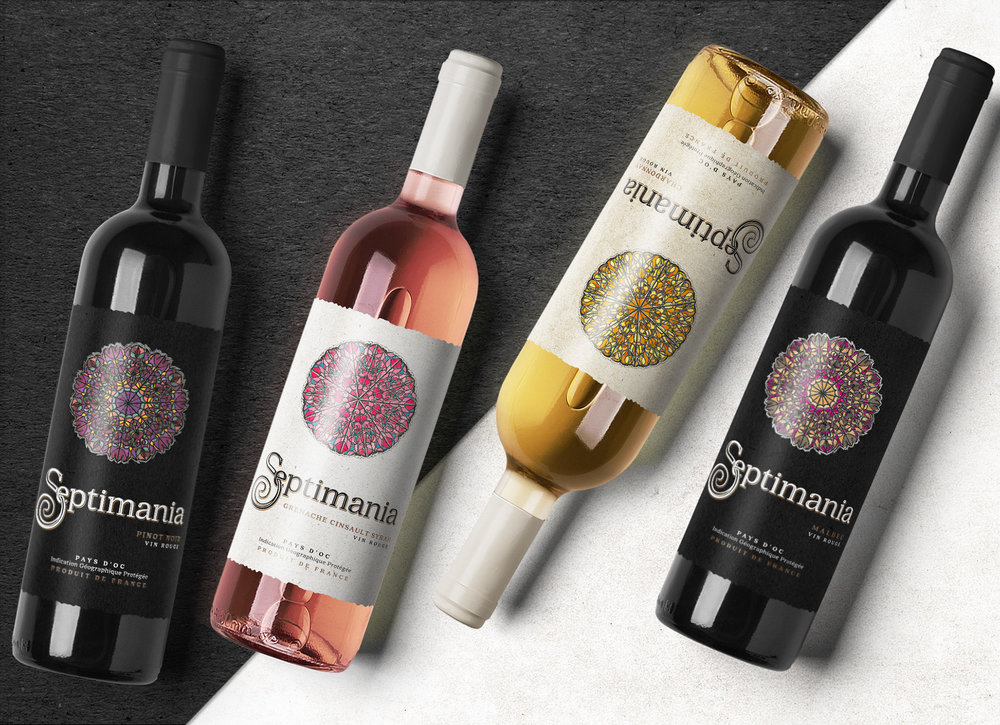
TolTol Studio – Septimania Wine
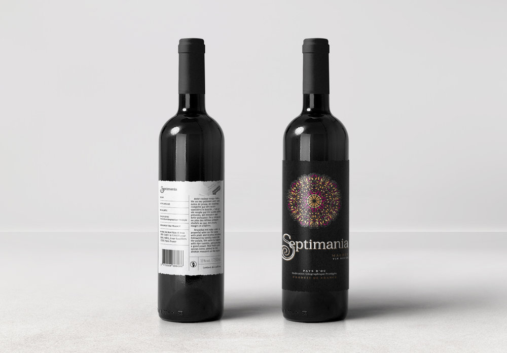
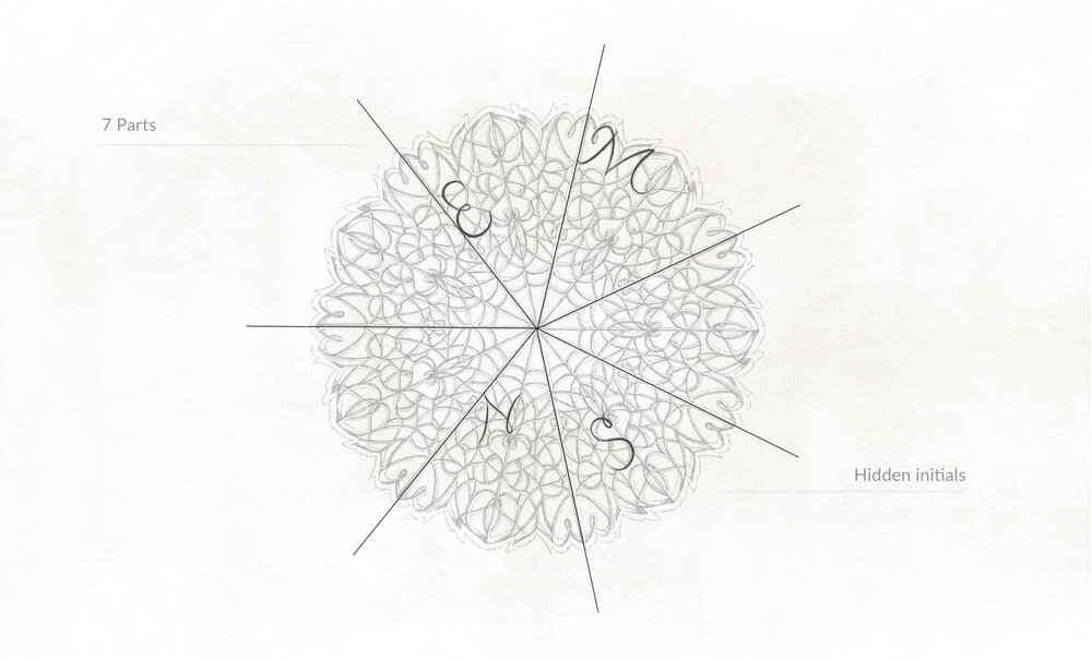
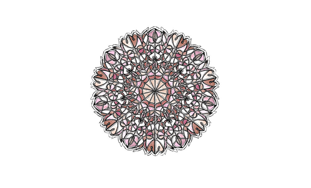
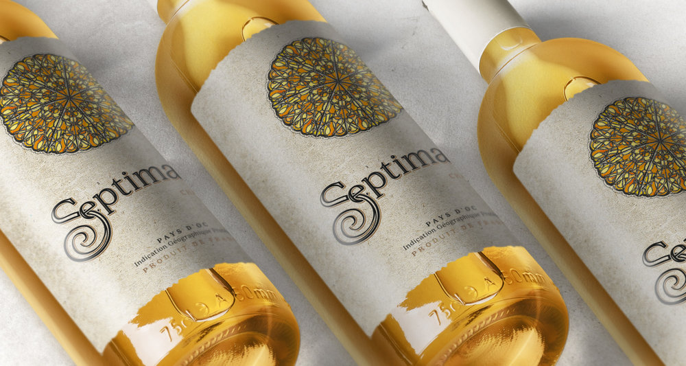
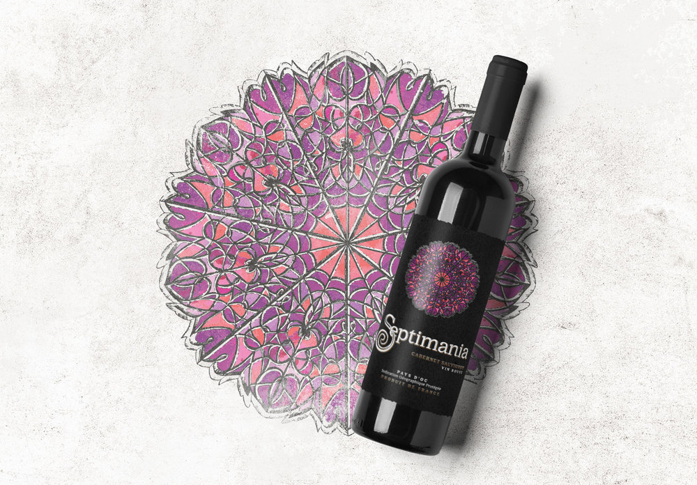
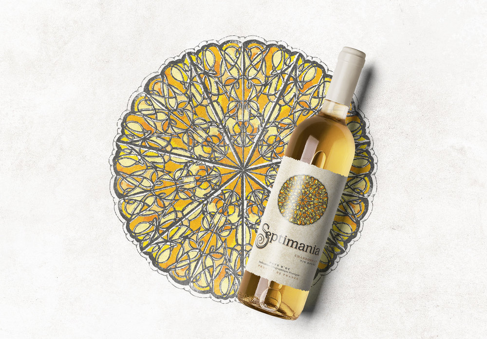
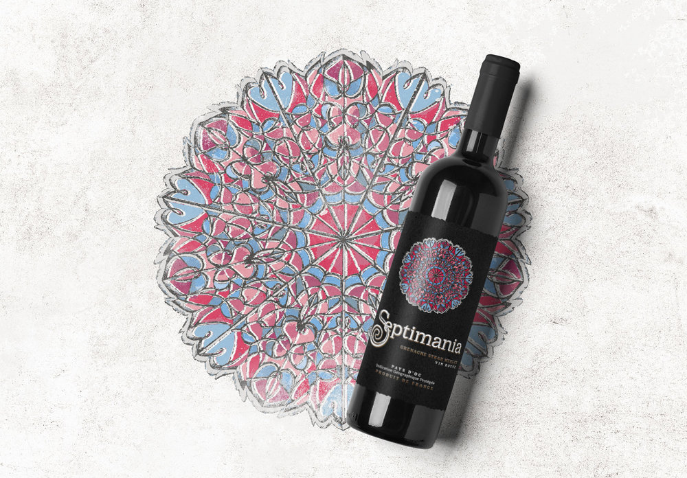
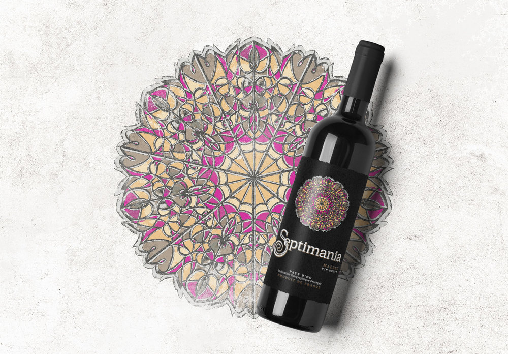
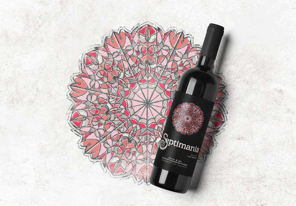
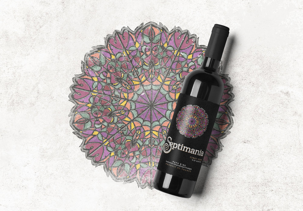
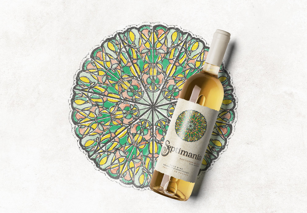
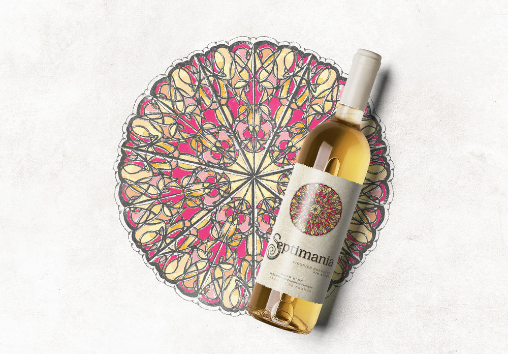
Identity for the entire portfolio of wines reflected the metaphor belonging to the name – Septimania – is a historical region on the French coast – that’s keeping secrets and riddles that there’s a lot more in this affair than meets the eye. There is the location of vineyards that produce wine for our brand.We developed an illustration with 7 parts. That’s explaining the semantics of naming. Construction of Illustration developed of founder’s initials. For color solutions developing, we took enologist consultations, who have been working with wine portfolio. The main idea is to make a color palette for each bottle corresponding with wine aroma and taste.


CREDIT
- Agency/Creative: TolTol Studio
- Article Title: Packaging Design of Septimania Wine Labels
- Organisation/Entity: Agency, Published Commercial Design
- Project Type: Packaging
- Agency/Creative Country: Russia
- Market Region: Europe
- Format: Bottle, Wrap
- Substrate: Glass, Pulp Paper
FEEDBACK
Relevance: Solution/idea in relation to brand, product or service
Implementation: Attention, detailing and finishing of final solution
Presentation: Text, visualisation and quality of the presentation


