Studio Thomas – Good & Proper
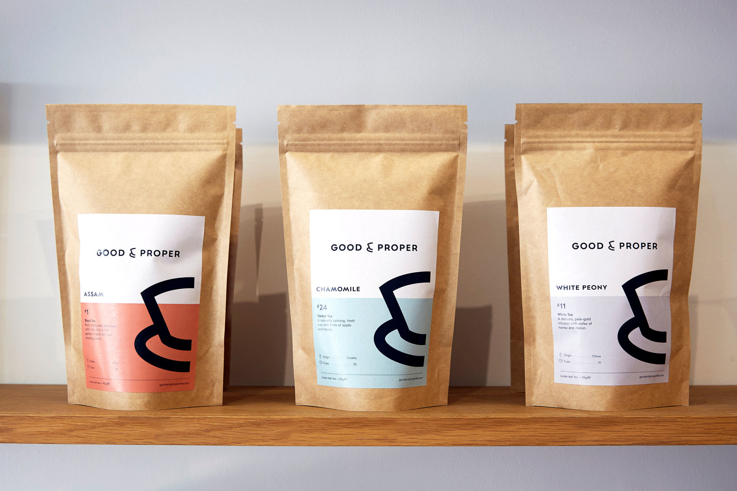
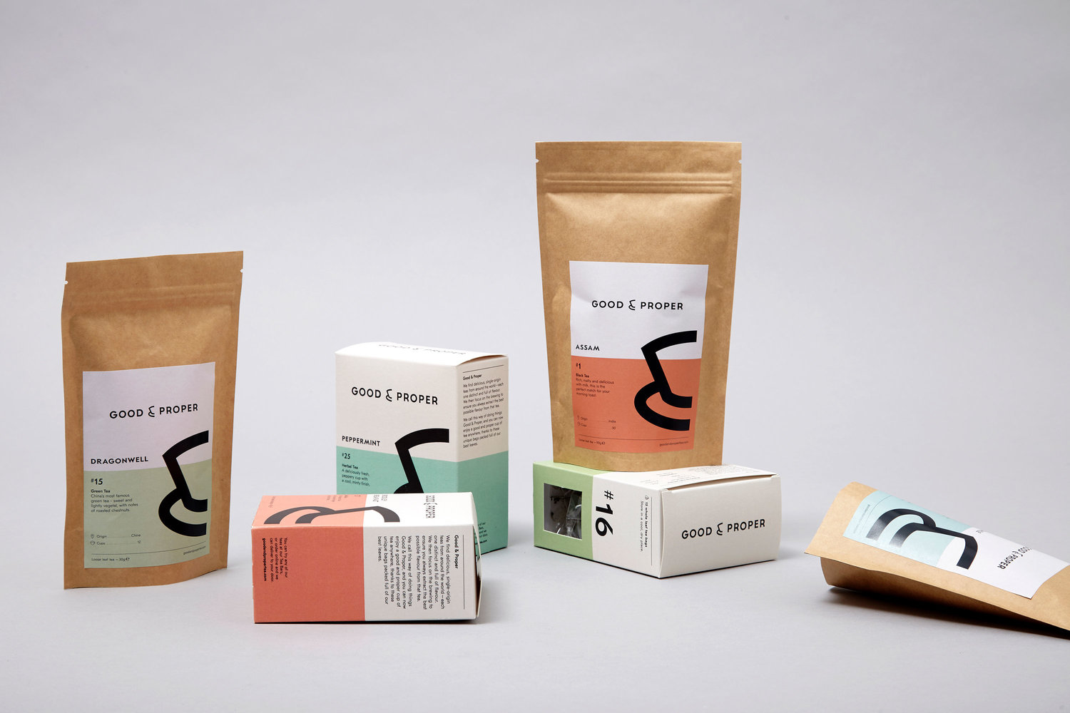
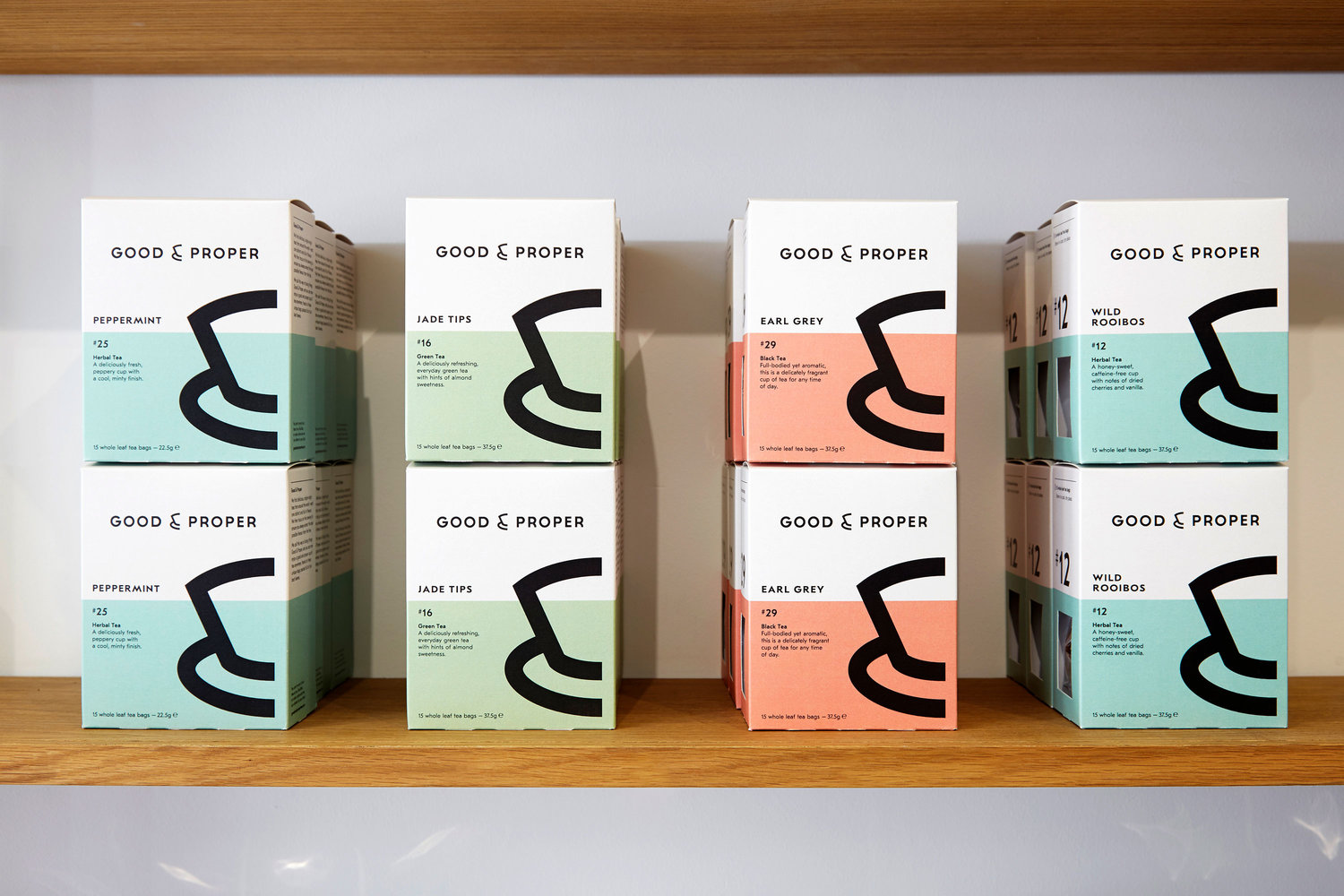
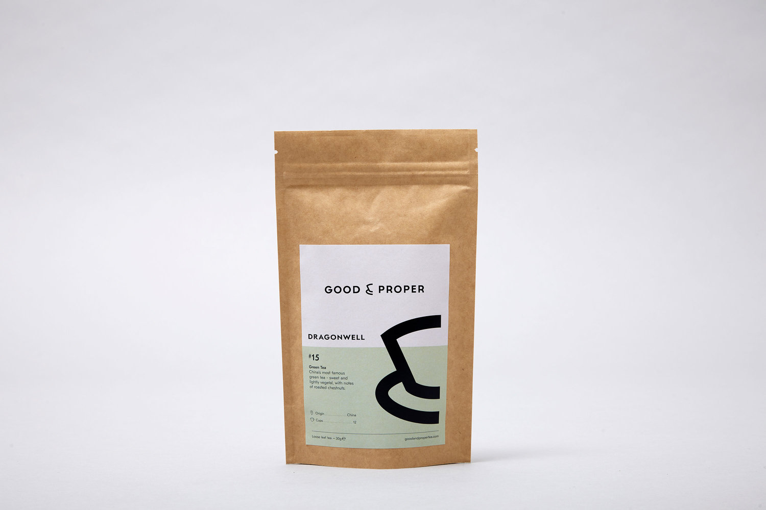
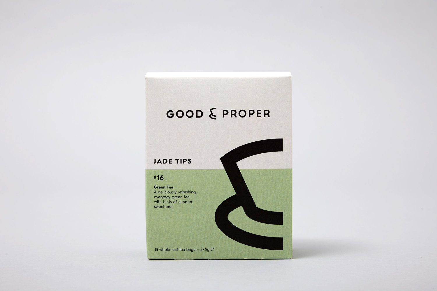
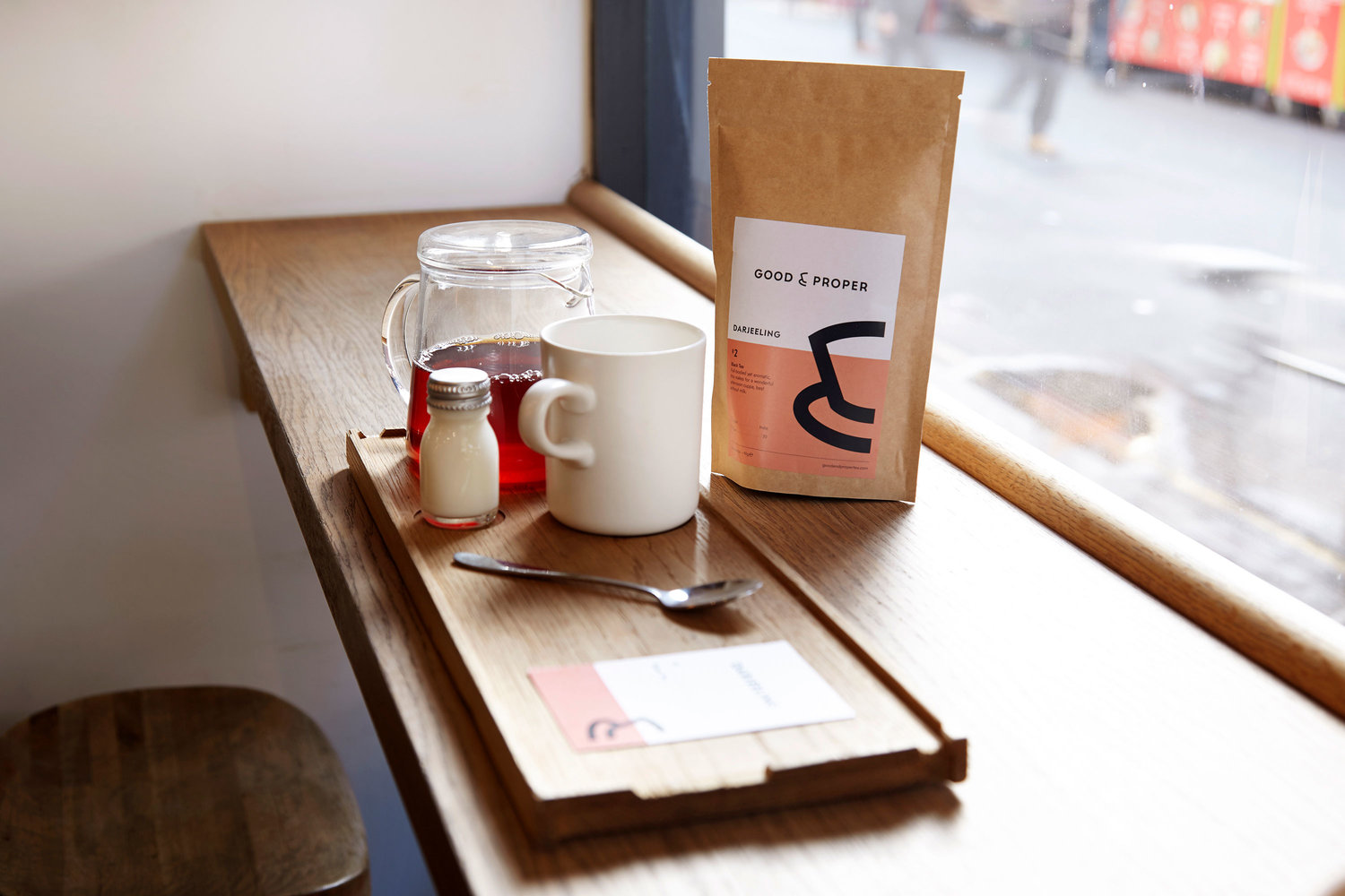
Good & Proper are perfectionists when it comes to tea, every part of their process focusses on making the perfect cup. What they needed was a brand and design structure that shared this same attention to detail and a visual look and feel that could take them from London boutique, to nationwide supermarket shelf. With the key objective being to make top quality tea, accessible and appealing to a wide audience. There were fundamental design issues to address as a part of the development. Re-drawing the logos, treatment of typography, graphic assets and how everything works together in a consistent way. The project produced a complete new design, typographic approach, colour palette and numbering system. This was applied to create the bold new range of tea packaging for tea bag boxes and tea leave pouches, as well as in store communication and marketing materials.
CREDIT
- Agency/Creative: Studio Thomas
- Article Title: Identity and Packaging Design for Good & Proper
- Organisation/Entity: Agency, Published Commercial Design
- Project Type: Packaging
- Agency/Creative Country: United Kingdom
- Market Region: Europe
- Format: Bag, Pouch
- Substrate: Pulp Paper


