Midday – Metis
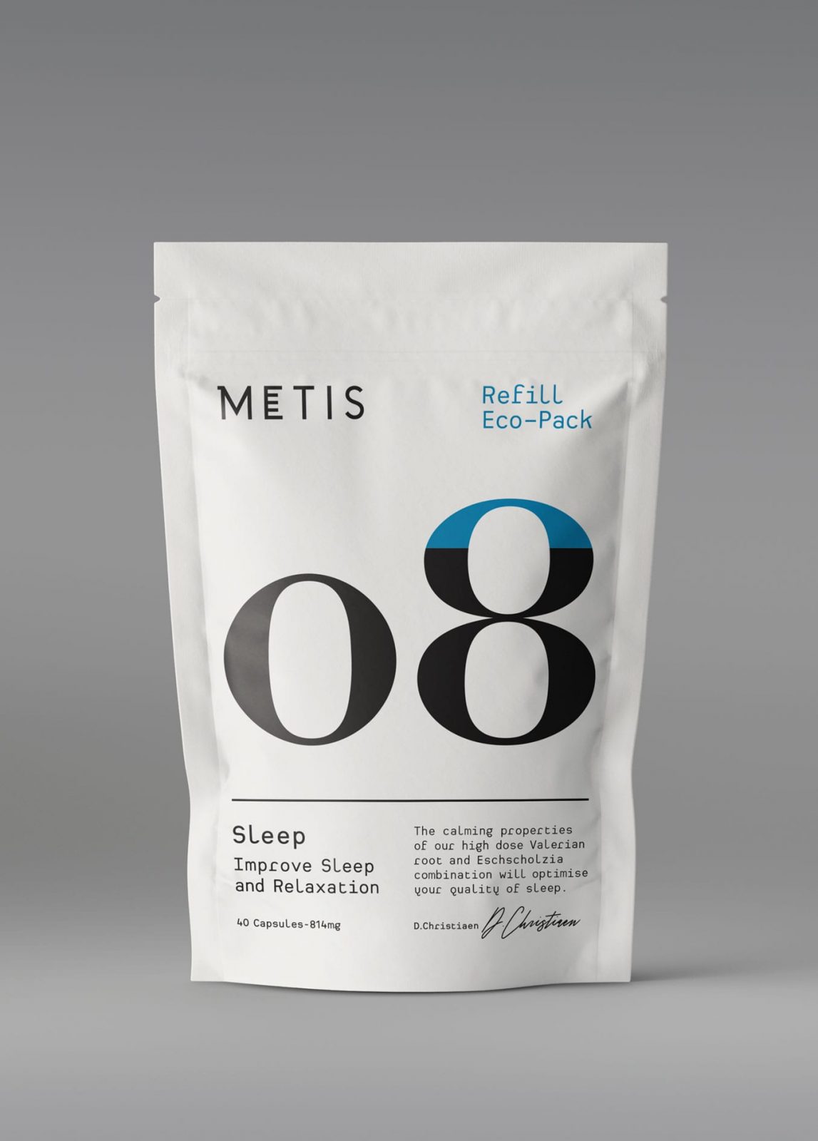
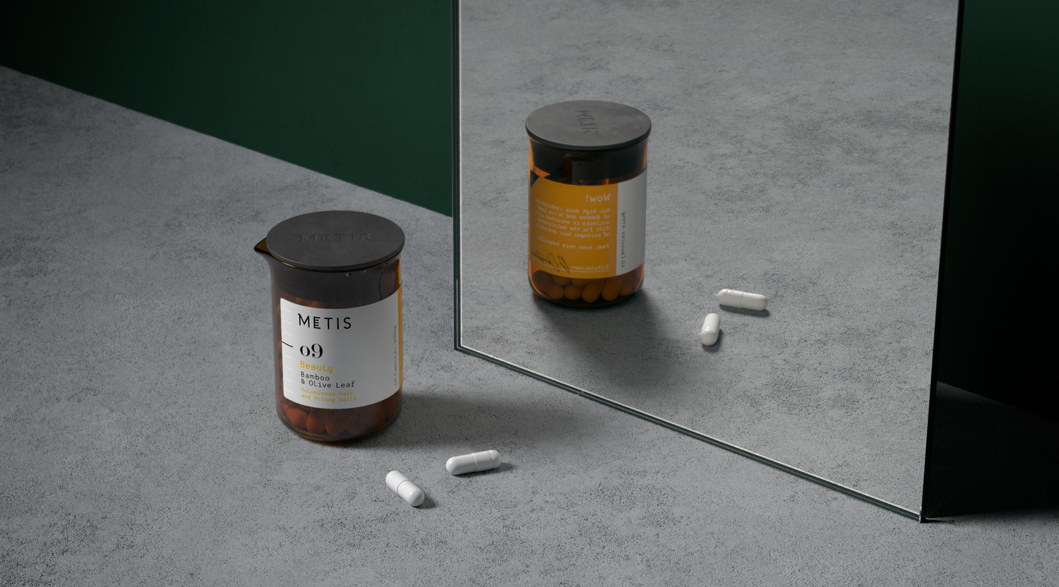
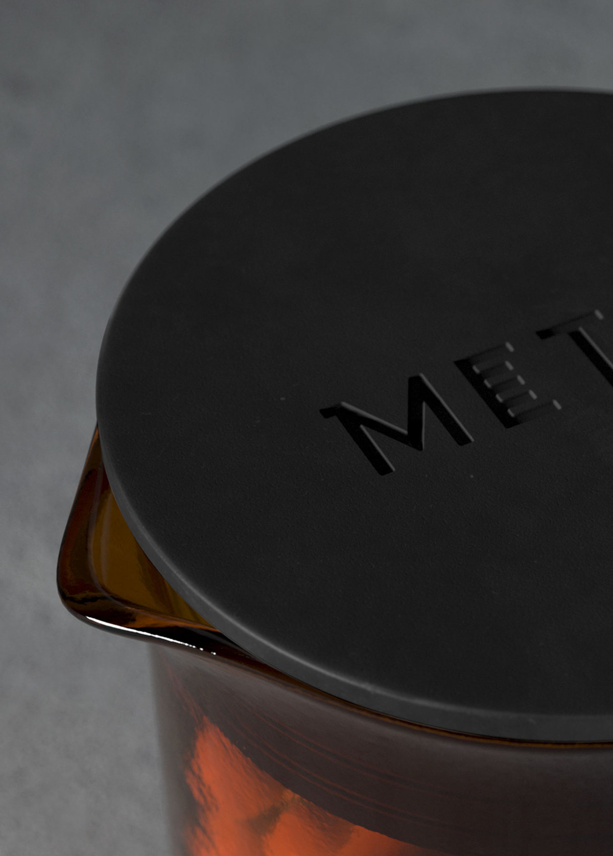
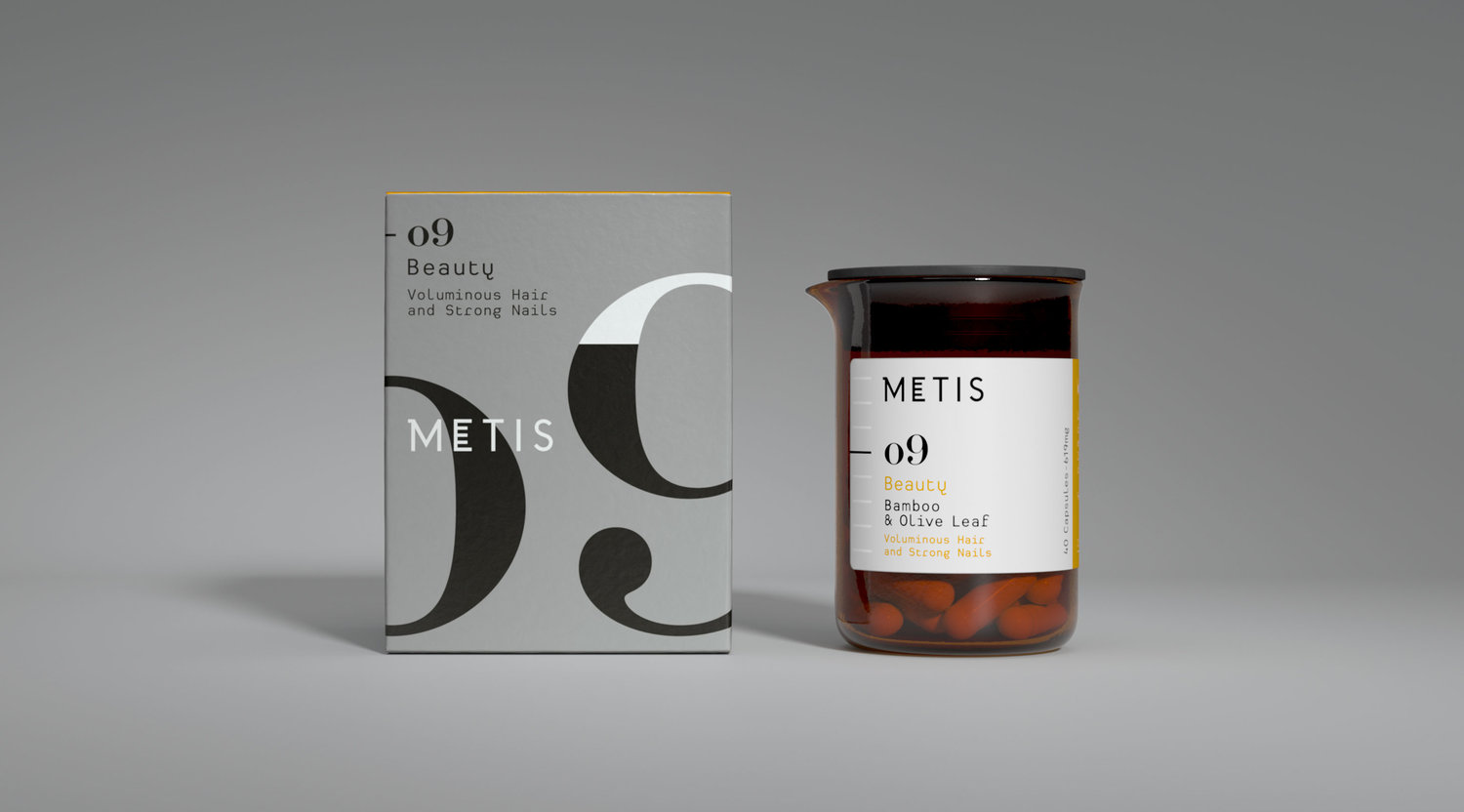
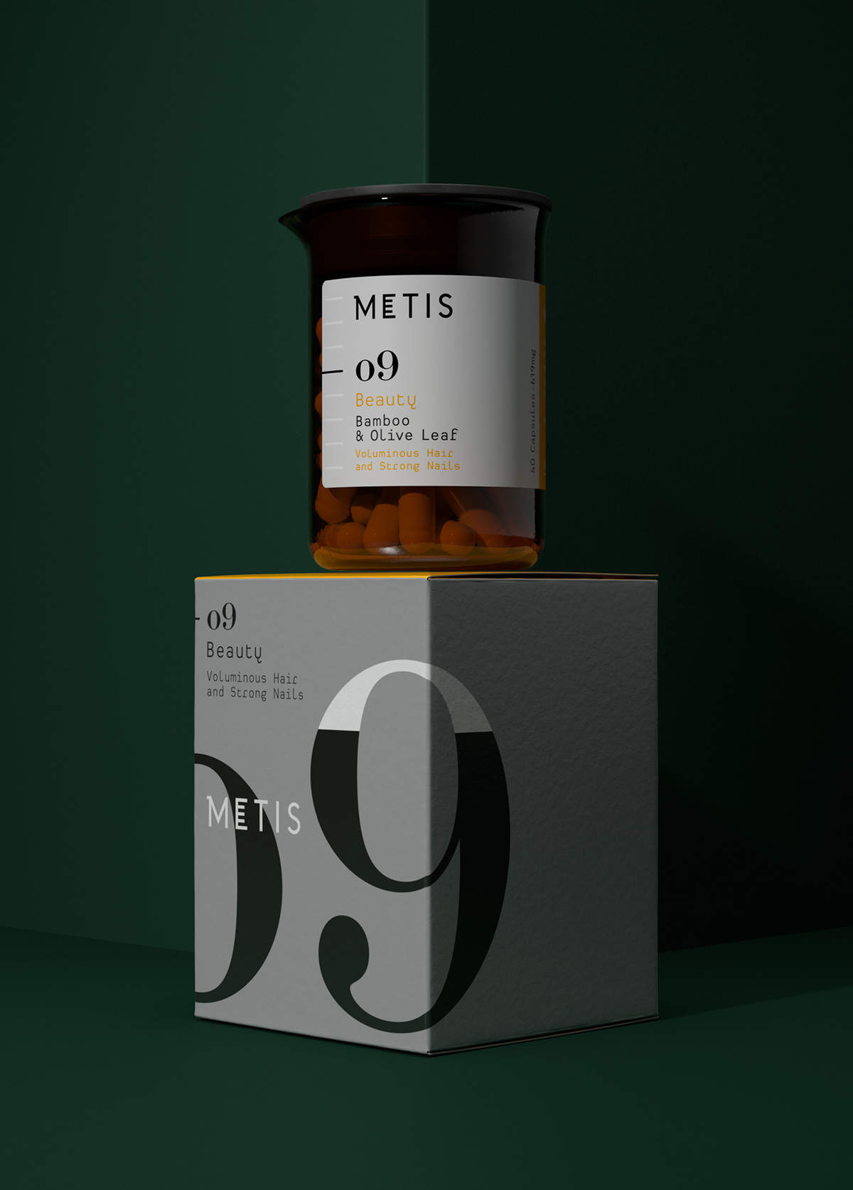
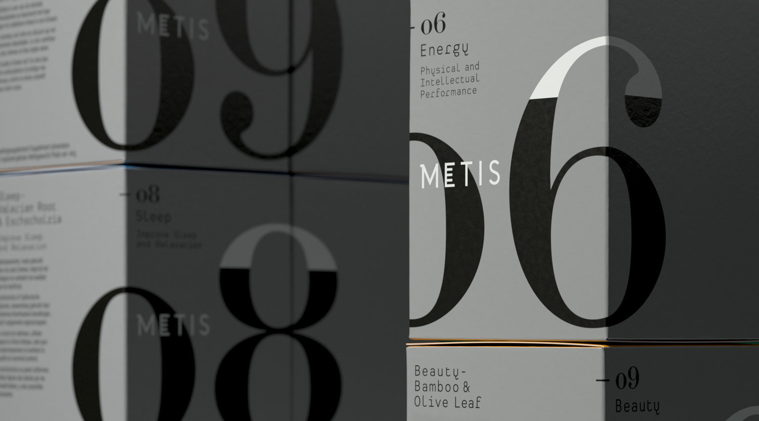
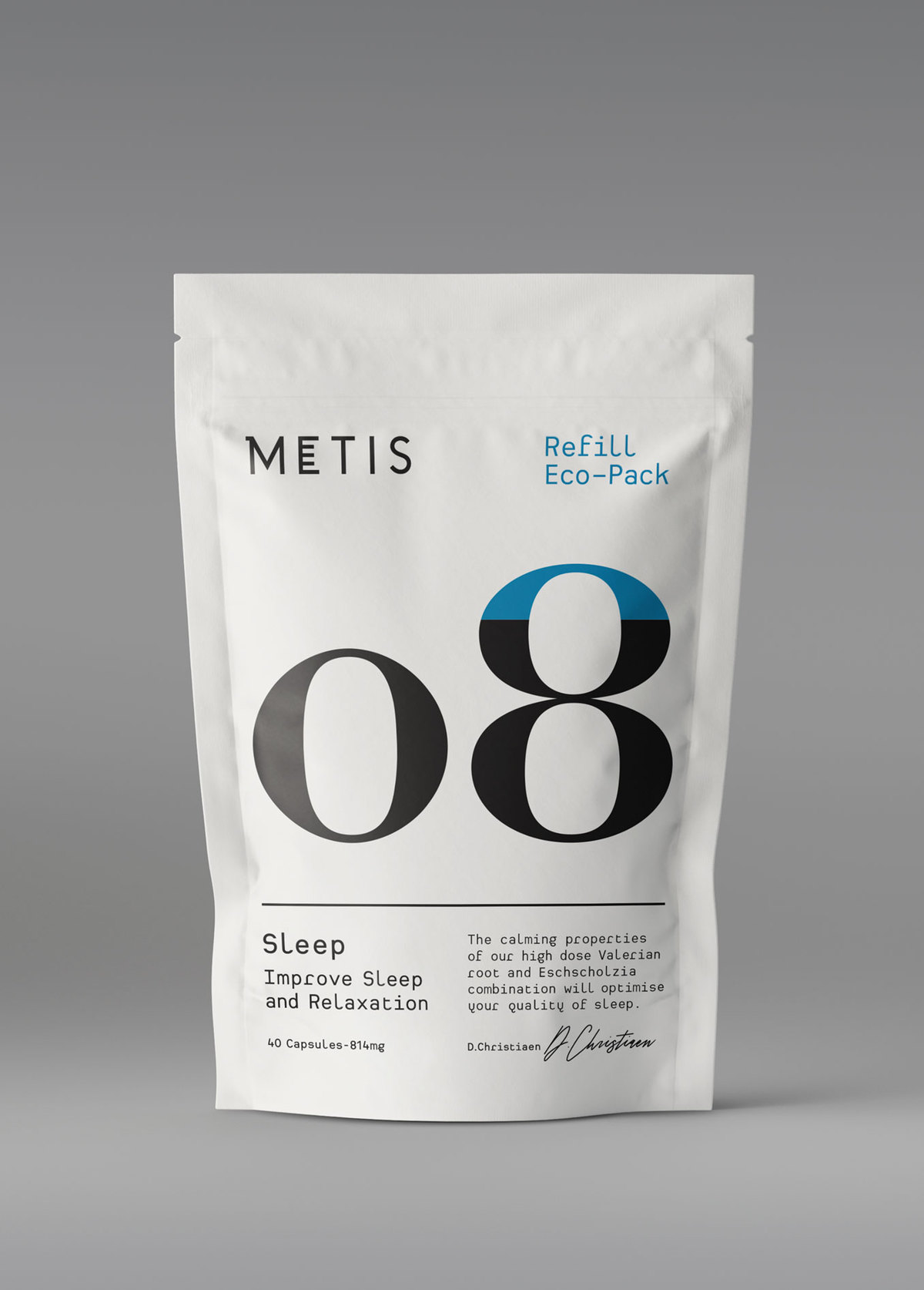
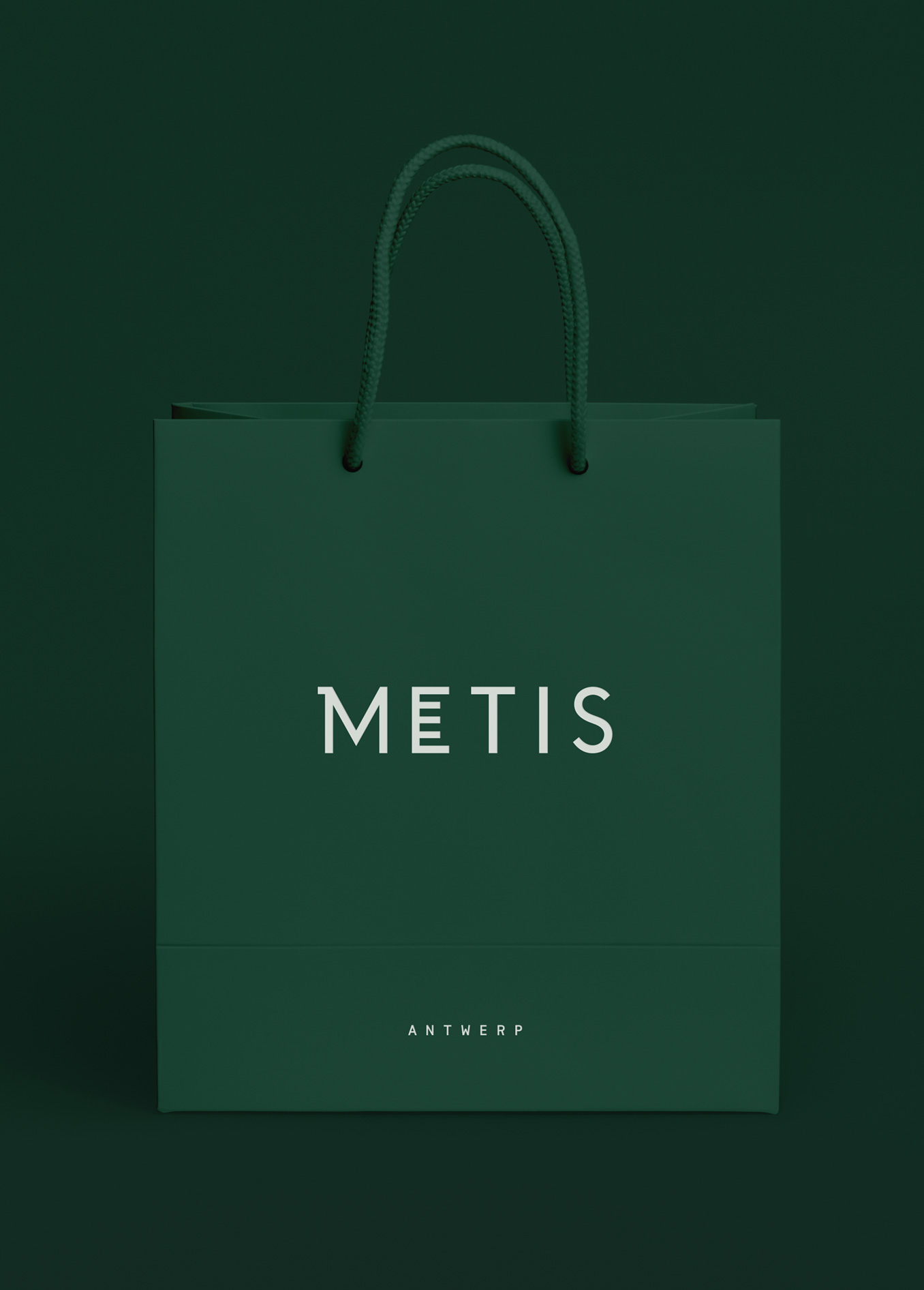
Brand creation for Metis, a premium supplement brand that specialises in high-dose and effective combinations of vitamins, minerals and plant extracts.Founder and pharmacist Dirk Christiaen brings many years of scientific experience to his innovative all-natural formulas. His powerful blends are designed to help affluent, ambitious professionals cope with demanding work and social/family lives.We set out to break the sterile and functional supplement category norms, instead create a luxury pack inspired by the science behind every efficacious blend. Within this category it’s common place to see a high-price point due to the quality of the ingredients used, however, the category is typically visually sterile and functional, almost exclusively made-up of white plastic bottles. We have created a brand and unique packaging structure that better reflects the premium-ness of the product and brings long overdue desirability to the category. An amber, beaker-style bottle is teamed with a varnished label which highlights the linear brand assets and variant number. The de-bossed silicone lid silently seals the pack and creates a contrast of tactility with the rigid glass bottle.The design takes inspiration from the cosmetics world to create a premium supplement brand which brings long overdue desirability to the category and communicates the pharmaceutical expertise behind its highly effective formulas.
CREDIT
- Agency/Creative: Midday
- Article Title: Brand Creation and Packaging Design for Metis from Antwerp, Belgium
- Organisation/Entity: Agency, Published Commercial Design
- Project Type: Packaging
- Agency/Creative Country: United Kingdom
- Market Region: Europe
- Format: Box, Jar, Pot
- Substrate: Plastic, Pulp Board, Pulp Paper


