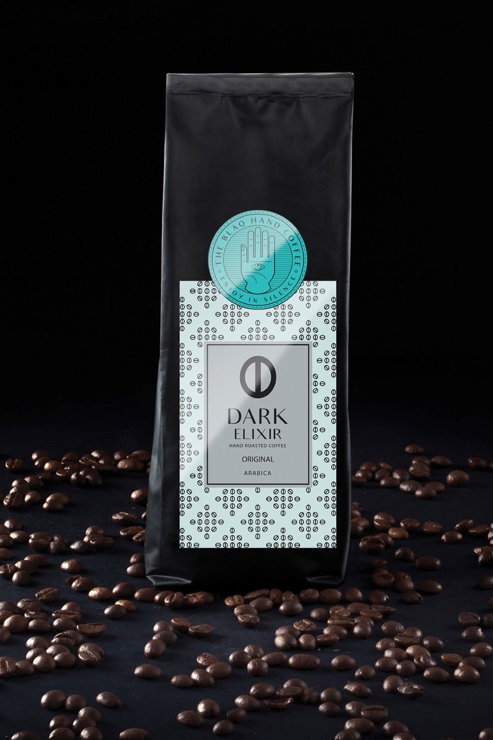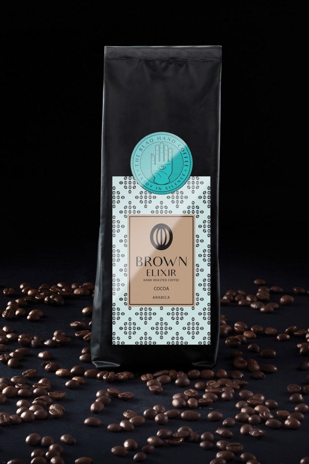
” It is normal to wonder…”why Alchemy was chosen in order to promote and advertise a coffee brand?”. The main reasons why I turned to this field, are the mystery and the obscure and symbolic concepts of which it is comprised. Influenced by the Hermetic Art, as well as by my study
on the doctrines of Paracelsus, I designed the labels of my product – with the intention to apply an essence of mysticism in the designs – in resemblance to the Alchemic Opus Magnus, or Great Work. According to Paracelsus the work of the Alchemists was the quest fot the Philosopher’s Stone. The Philosopher’s stone was a legenedary substance so pure – thus so powerfull – that it could turn matter into gold and at the same time
be an elixir of life usefull for rejuvenation and achieving immortality. This important quality, that came to my attention was the inspiration to use coffee and chocolate as bars of gold and silver respectively in order to represent the elixir. For every product there is a symbol which is it’s trademark, representing the materials it consists of. These symbols signify the secrets of their production as well as the identity of the products themselves.
Every package has a pattern that includes the elements the product consists of. With these in mind, I concluded that the creation of a logo based on “The Hand of the Philosophers” or “The Hand of the Mysteries” (an Alchemic symbol which contained all the secret practices and principles of the craft), would be a successful identity for the product, named “BLAQ HAND” accordingly. The secret ingredients contained in the product, resemble the Alchemic secrets of “The Hand of the Philosophers” and the logo is completed by the use of “HAMSA” – an arabic symbol for good luck – as a finishing touch. This is how my coffee got a name and a symbol…”


CREDIT
- Agency/Creative: Constantinos Charitos
- Article Title: Constantinos Charitos – Blaq Hand Coffee
- Project Type: Packaging
- Format: Bag, Bottle, Cup, Pouch, Sachet
- Substrate: Plastic


