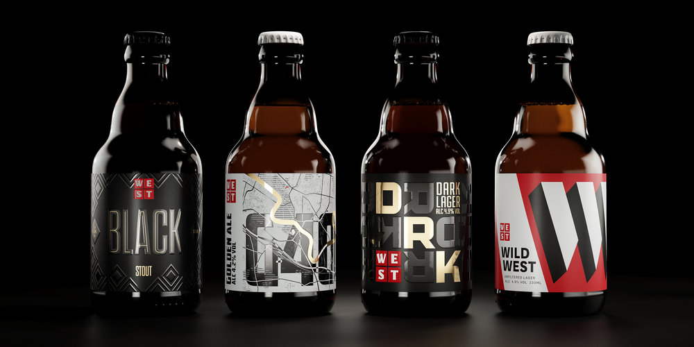
Thirst Craft – WEST Beer bottle project
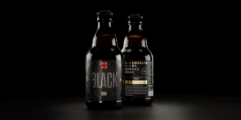
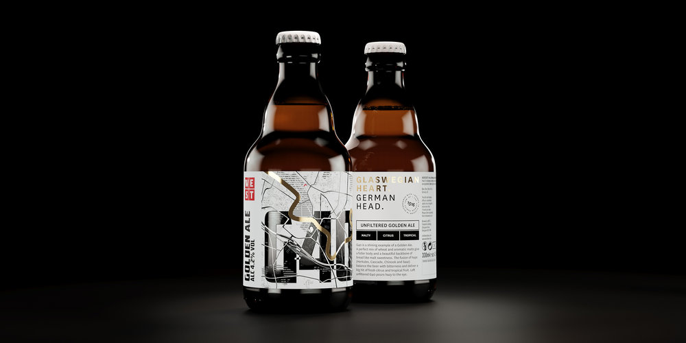
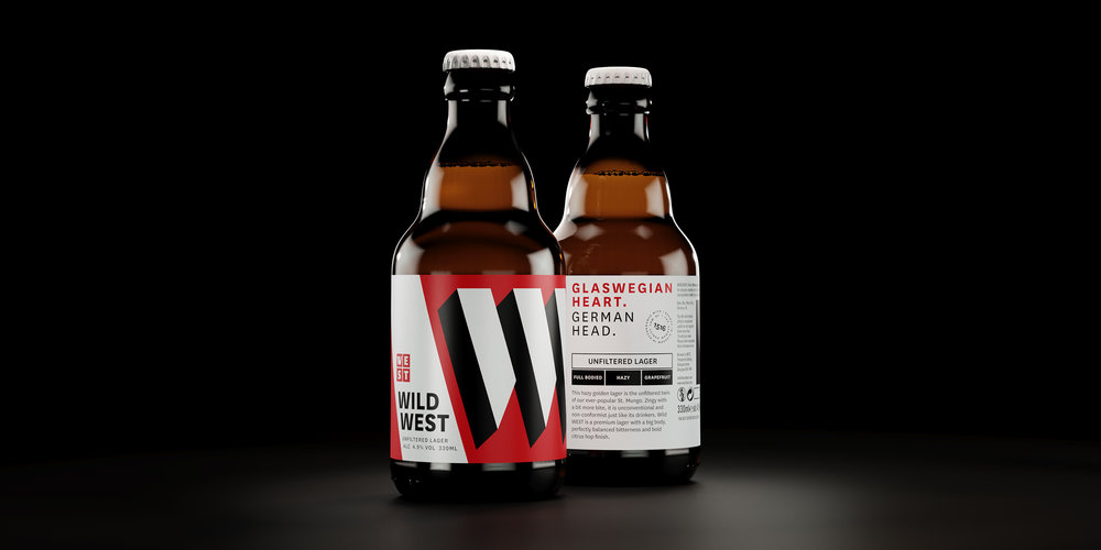
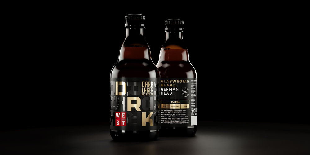
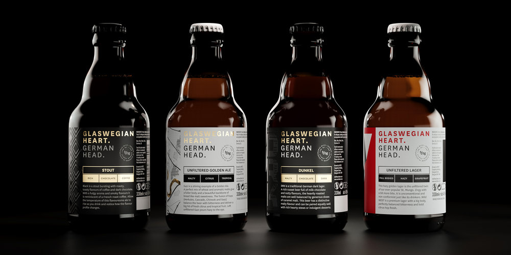
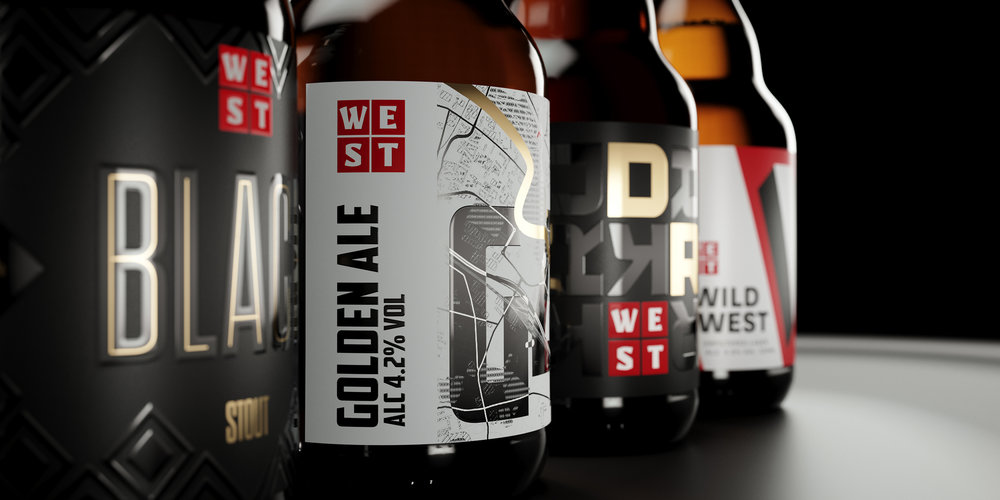
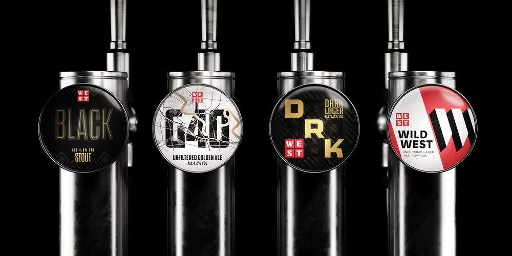
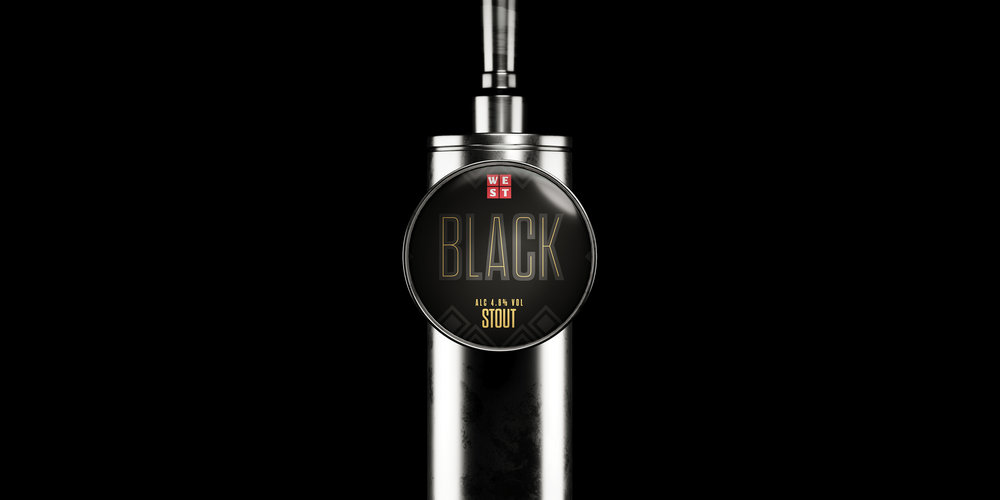
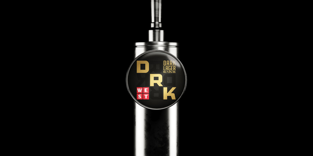
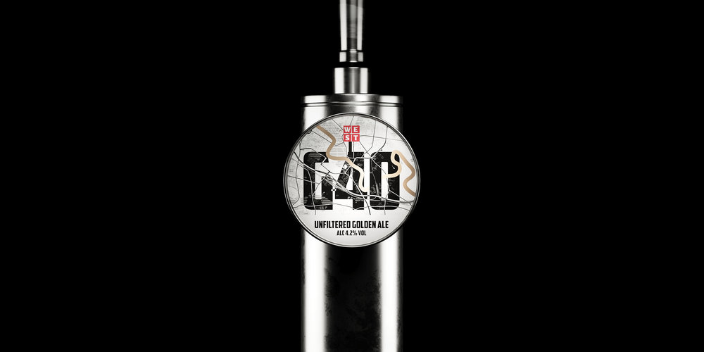
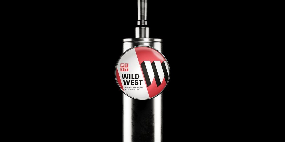
WEST Brewery has built its reputation on a Glaswegian Heart, German Head attitude, but Thirst has built WEST’s brand through a cohesive colour palette. So when four new styles were introduced to WEST’s range, Thirst turned to their established colour strategy and beer names to inspire each brand.WEST’s red, black, white and touch-of-gold brand colours are famous in both the on and off trade, so Thirst leveraged this powerful palette to create a cohesive bottle range. Each name is brought to life in WEST’s signature playful, bold, graphic style: Black and DRK expand on WEST’s square brandmark while G40 tells the story of WEST’s home and Wild West introduces a bold ‘W’ device. The bottle range is the second phase of Thirst’s WEST work which builds brand through red, black, white and gold rather than rigid brand systems. This approach brand blocks bar fridges and supermarket shelves through colour rather than consistency, allowing for a more eclectic, expressive and engaging range.

CREDIT
- Agency/Creative: Thirst Craft
- Article Title: Thirst Craft Continue to Unite WEST Brewery’s Range Through Colour
- Organisation/Entity: Agency Commercial, Published
- Project Type: Packaging
- Agency/Creative Country: United Kingdom
- Market Region: Europe
- Format: Bottle
- Substrate: Glass


