Artware – Forno Classico Bakery
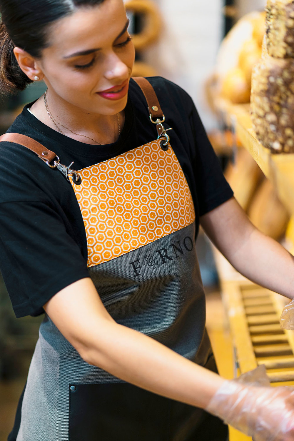
The process of rebranding and the design of the new packaging for a company that exists as a vital part of a large market audience’s daily routine is a significant challenge, as rebranding should be done in such a way that it does not obscure the direct reference but at the same time it provides the audience with a new communication experience. This was exactly the case of Forno Classico, a chain of bakeries in Kavala, with an extensive market audience.
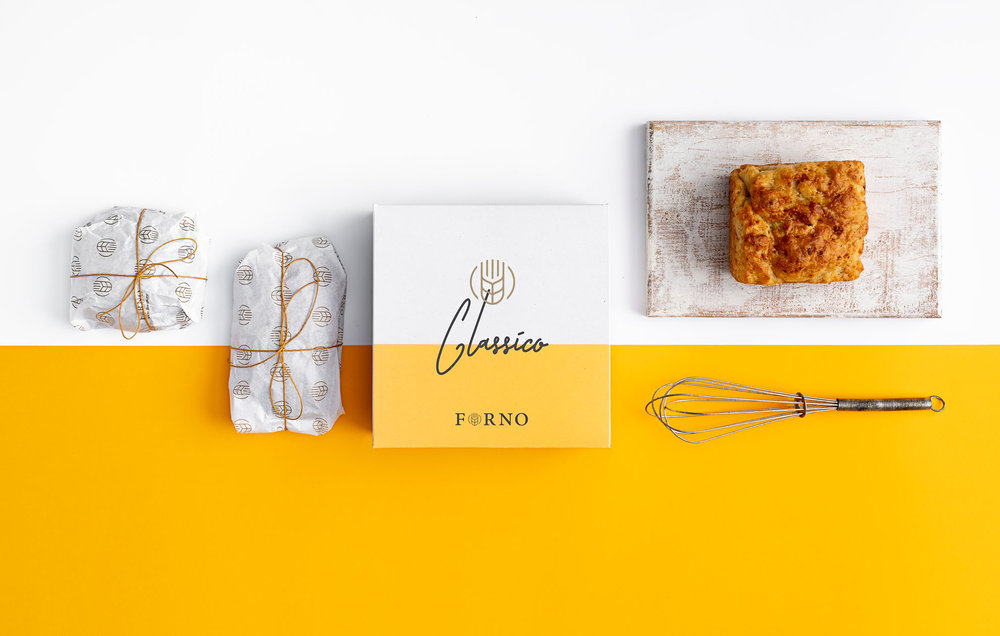
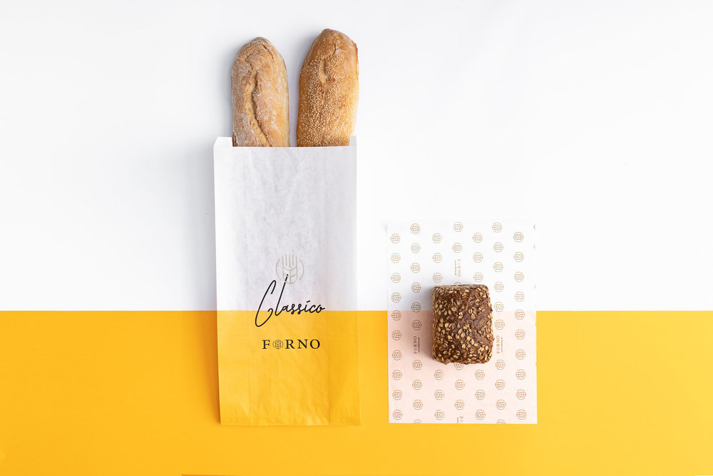
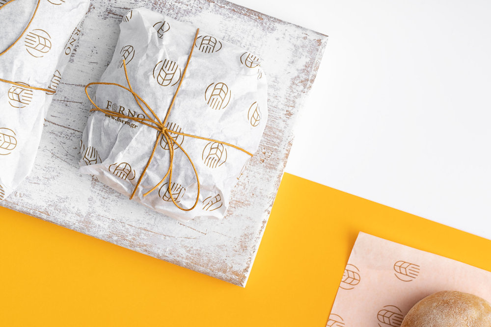
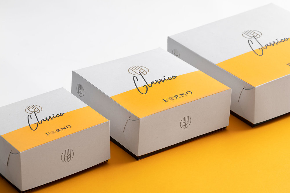
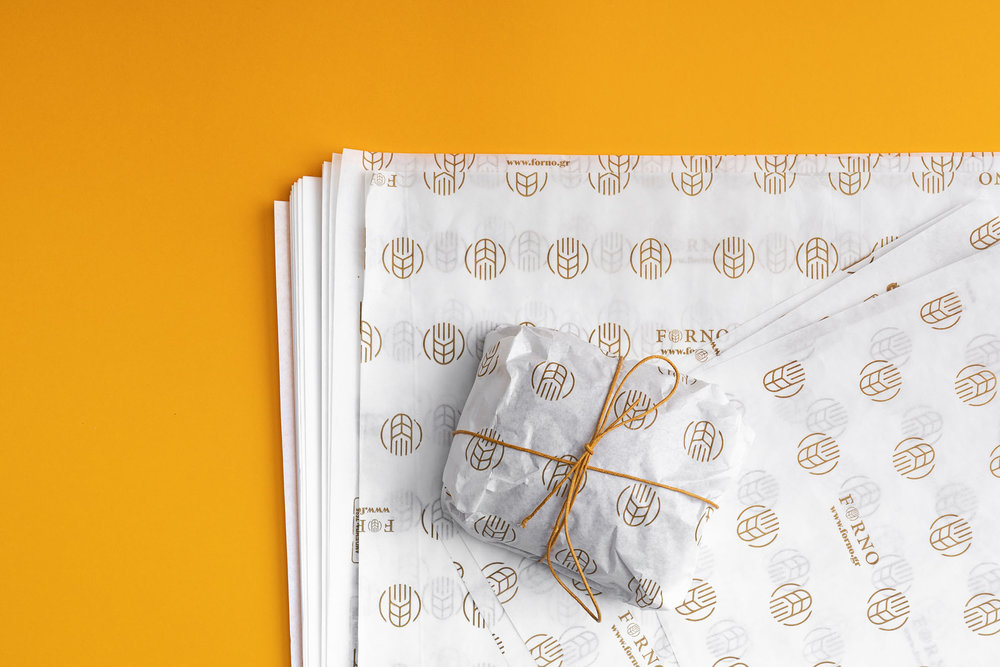
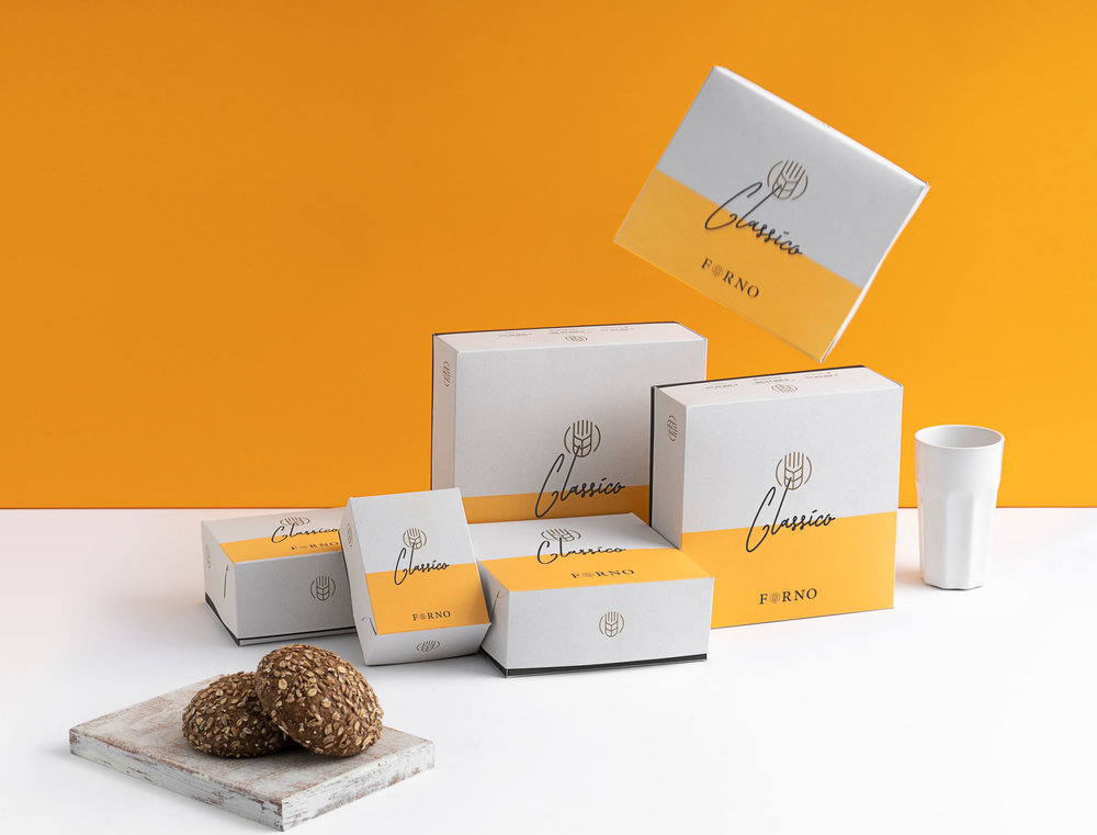
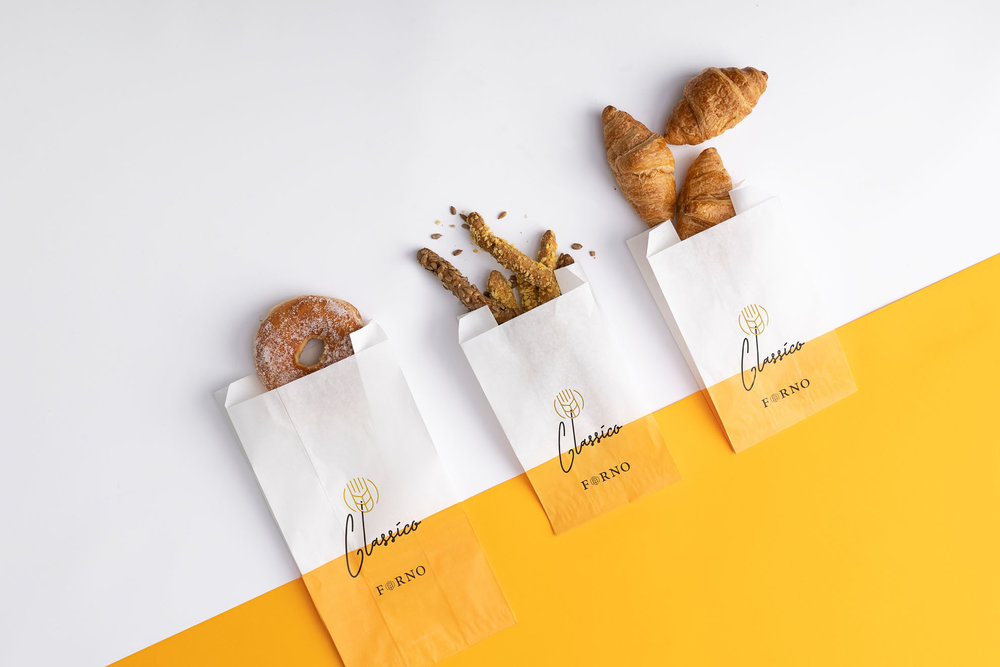
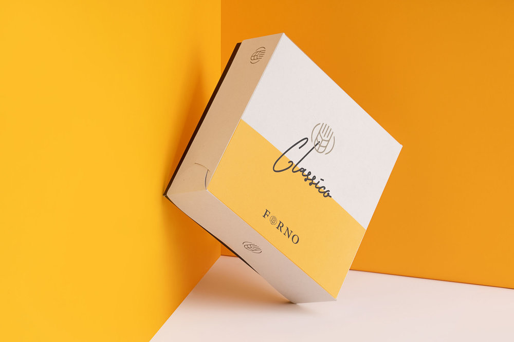
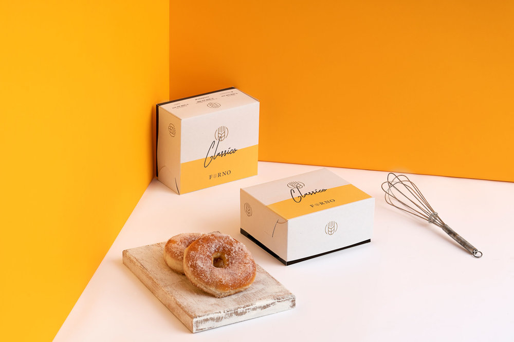
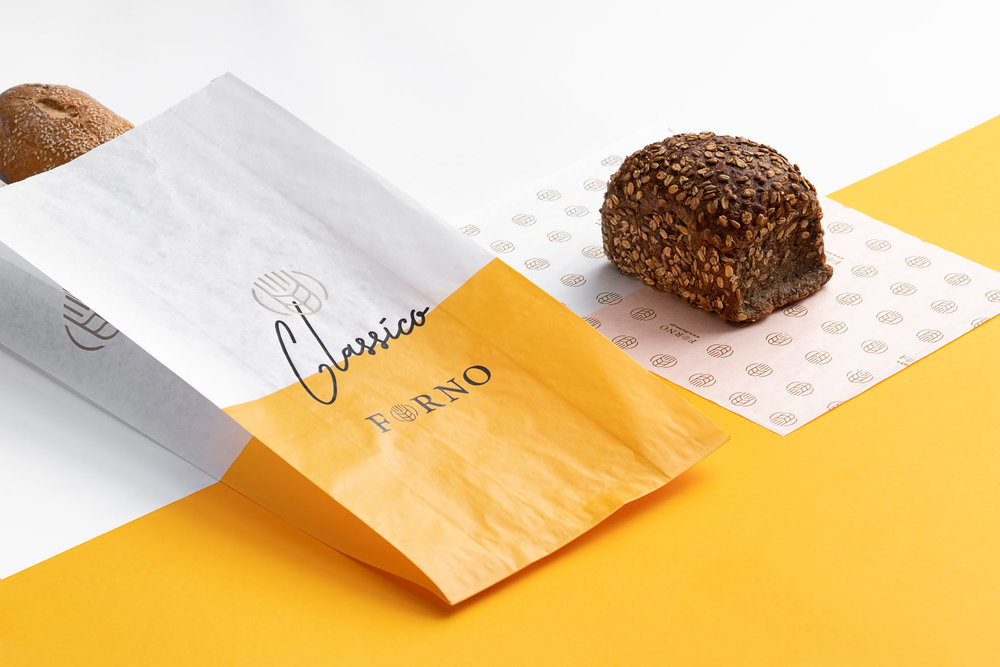
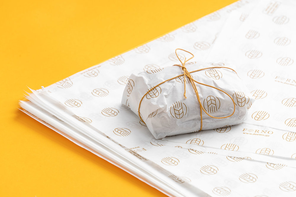
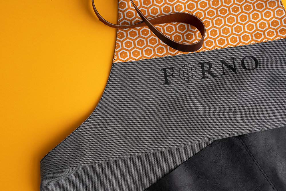
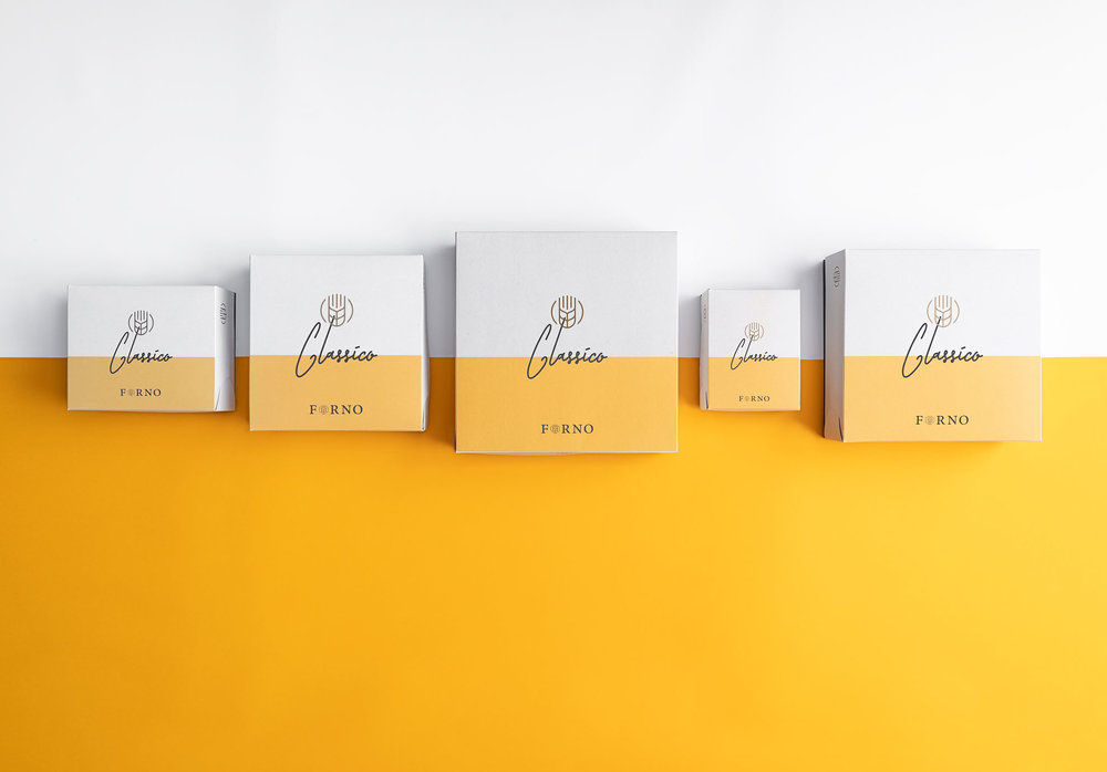
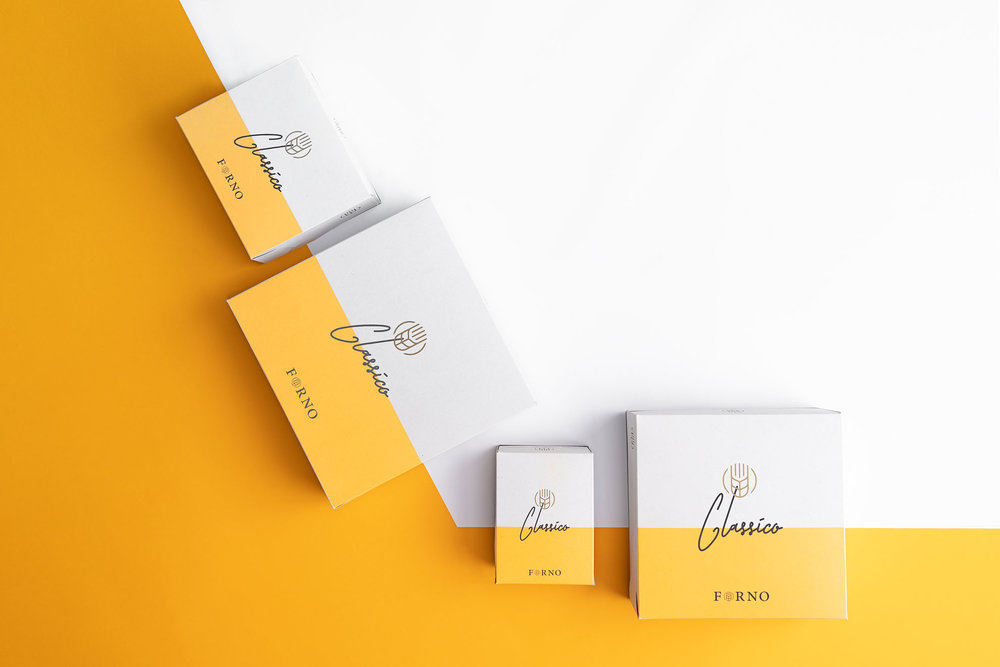
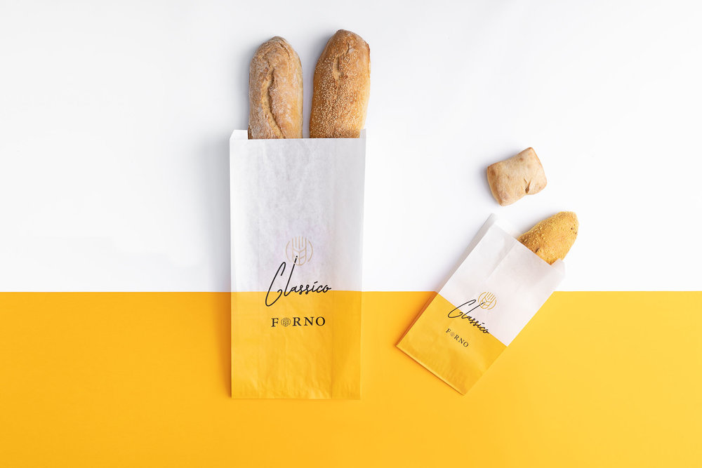
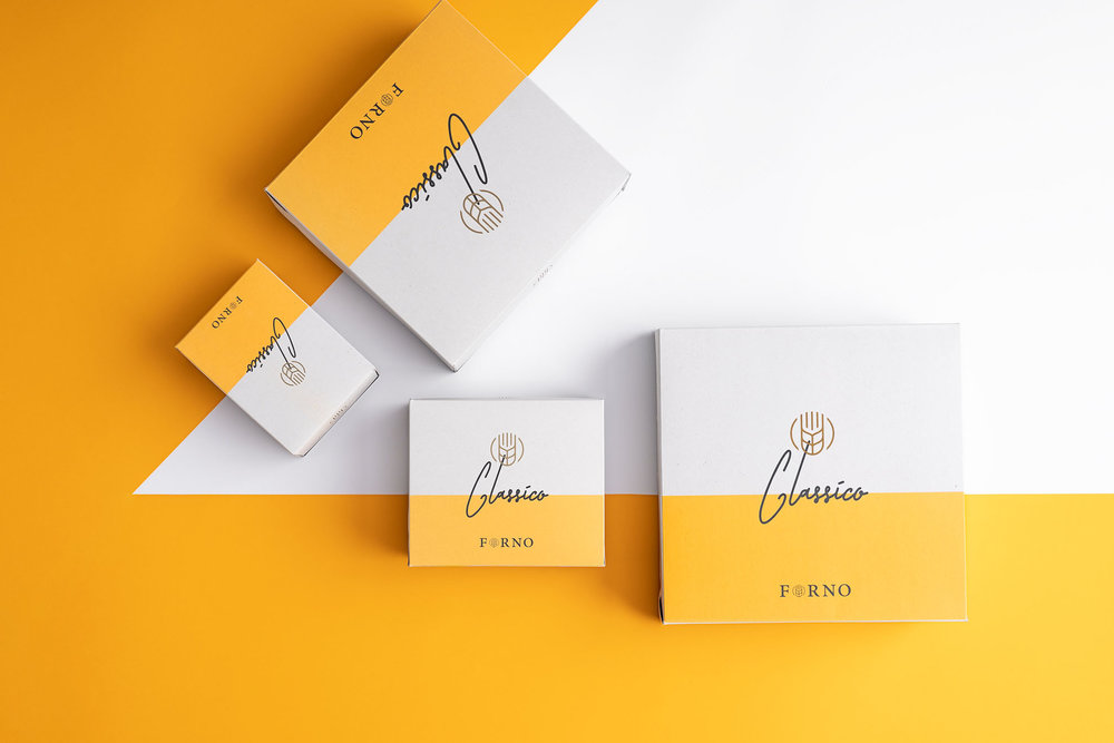
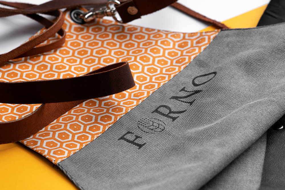
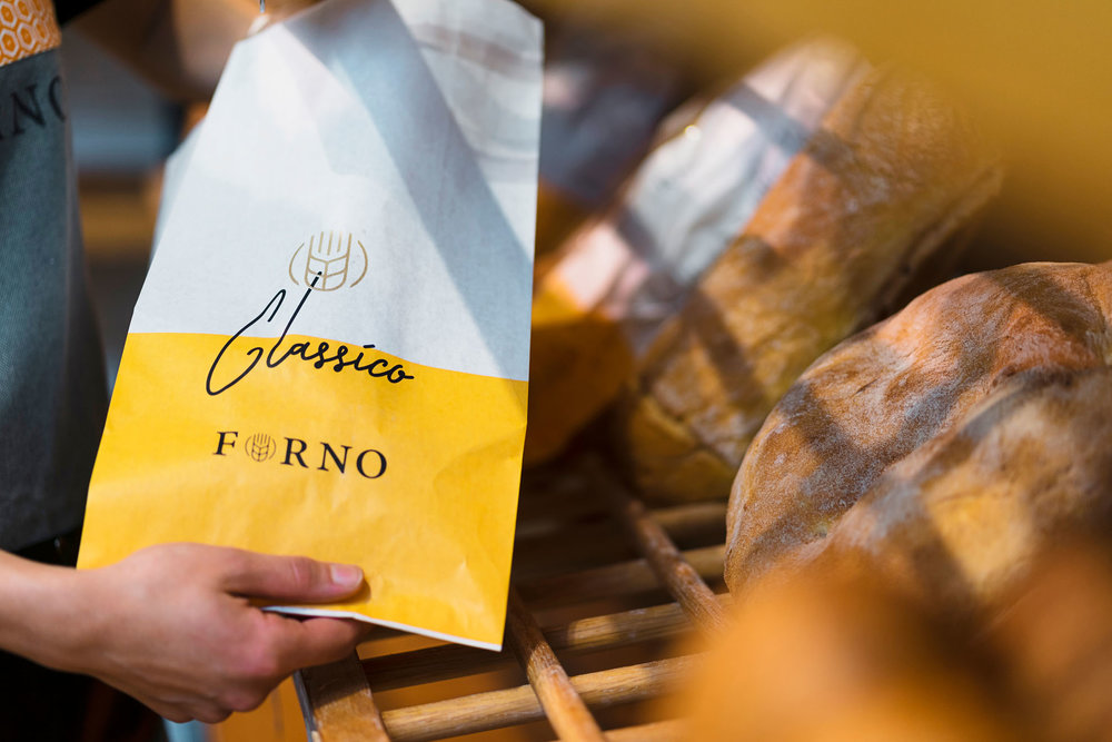
Considering rebranding under these circumstances, the brand takes its distinctive place in the logo, while Classico is visually upgraded through a classic handwritten font. The final ingredient of the logo is the graphic representation of the ear of the wheat, which is significantly redefined and placed at the top of the logo’s image. The result is a new, fresh logo, with all the elements of the brand’s identity in a distinct position, and a set of information that remains connected with the company’s long tradition.
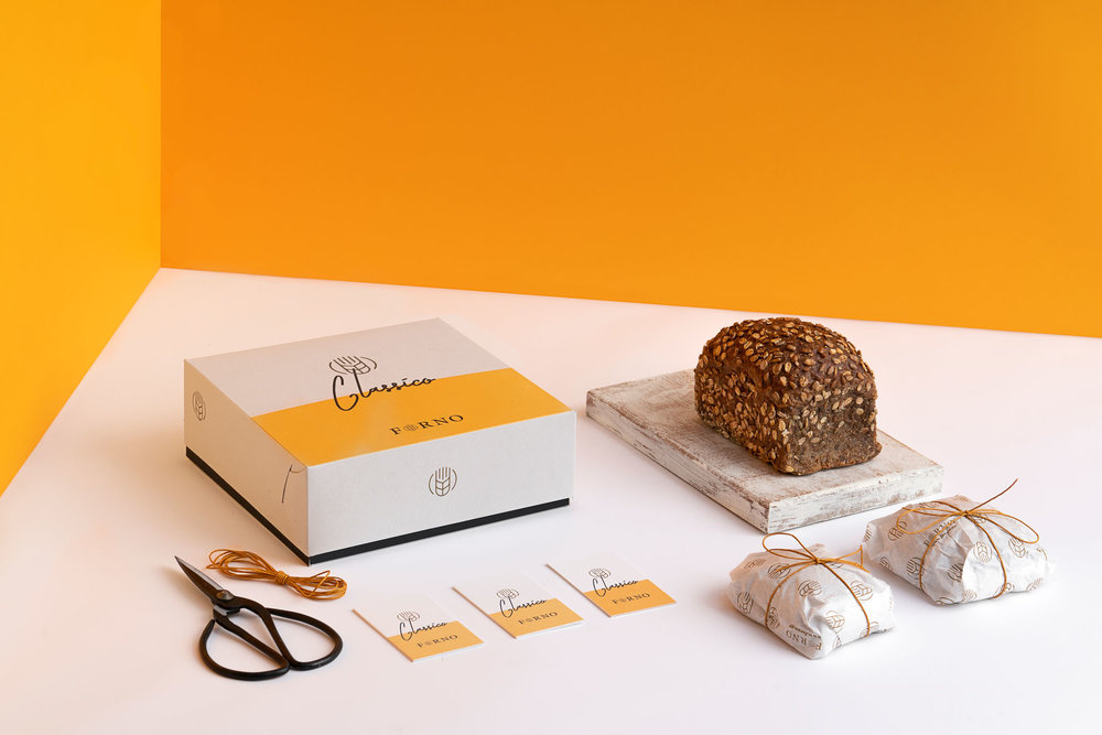
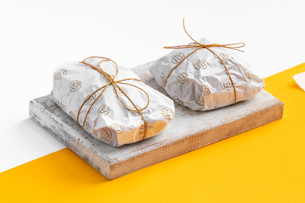
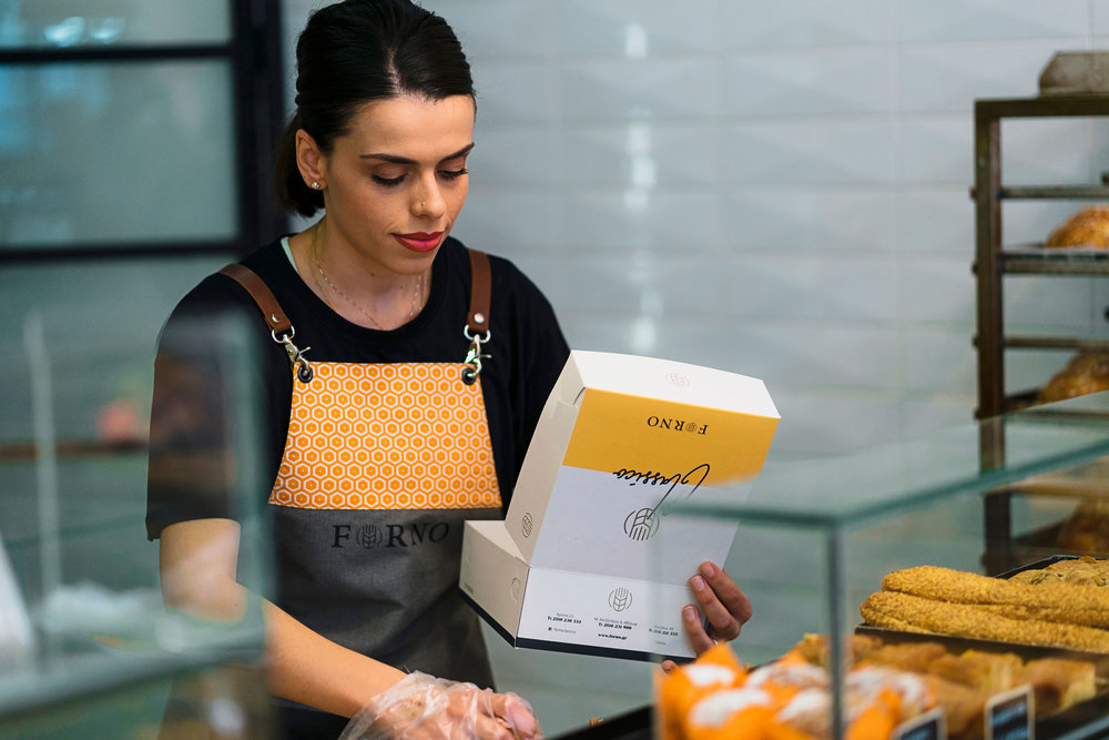
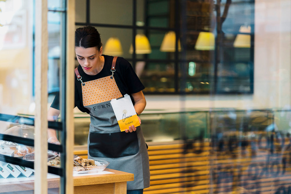
Designing the new Forno Classico bakery products’ packaging, Artware applied a dominant dichotomy of pure white and an intense hue of yellow. This two-tone palette includes in its spectrum all the colour tones of the products and thus it is blending harmoniously with the content. Finally, as a last touch, each package has its own quote, printed on the inside top.
CREDIT
- Agency/Creative: Artware
- Article Title: Forno Classico Bakery Rebranding Project
- Organisation/Entity: Agency Commercial, Published
- Project Type: Packaging
- Agency/Creative Country: Greece
- Market Region: Europe
- Format: Box, Sachet, Wrap
- Substrate: Pulp Paper
- Industry: Food/Beverage


