


Superfluido – Yo,verde
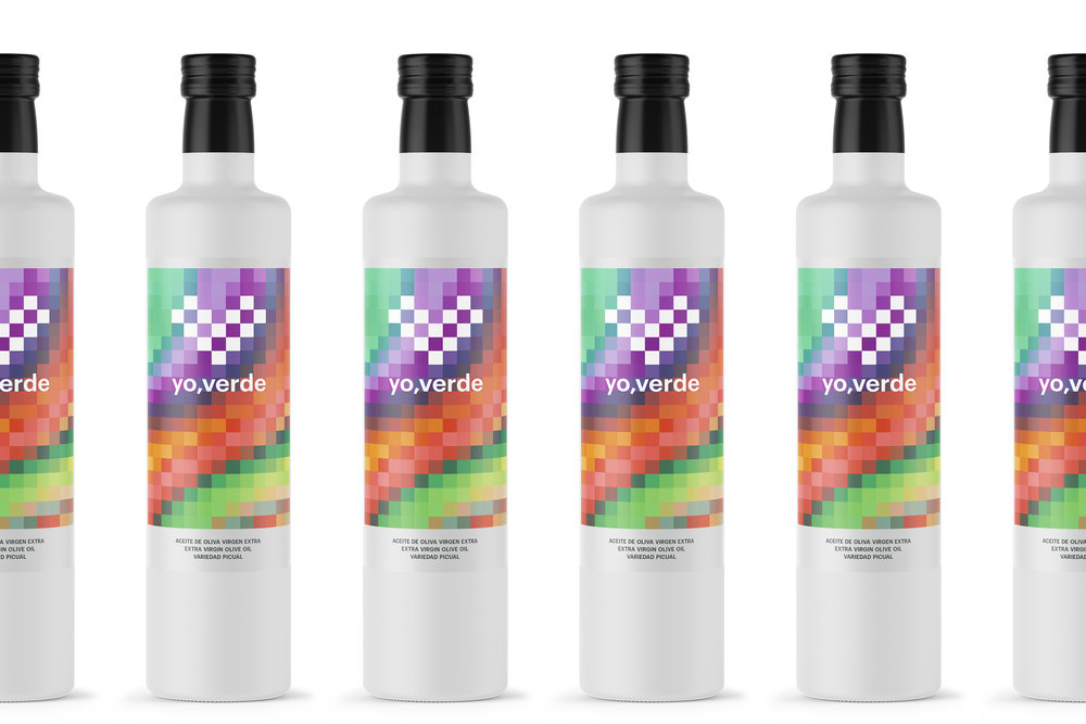
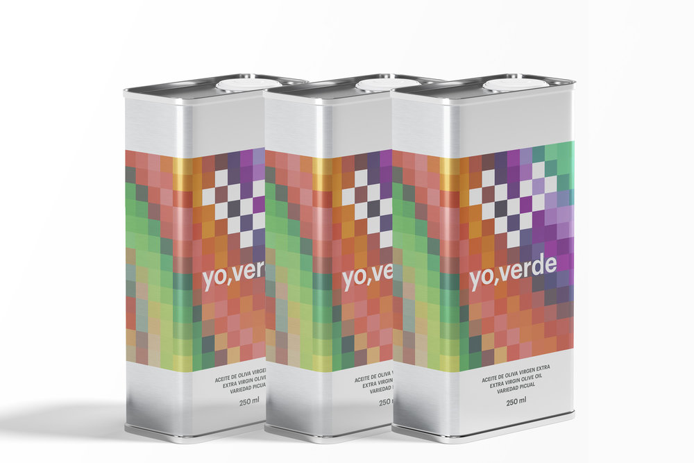
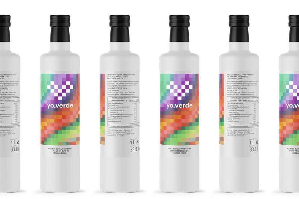
Yo, verde expands its product with great quality of an extra virgin olive oil that stands out for the harmony of flavours and smells. The challenge was to reflect these qualities along with the variety of colours and nuances through which the fruit goes to reach its optimum state of maturity. In addition, we achieved the brand did not lose the identity with which it is expressed. As the graphic hallmark of the brand is the pixel, we decided to create a pixellated colourful harmony since our purpose was that these bottles could serve to unify all their products without losing the identity of each one. Thanks to that, we got a bold and unmistakable design. The graphic system is very flexible what allows it to be applied to different containers and materials such as glass, tin, label or silkscreen.
CREDIT
- Agency/Creative: Superfluido
- Article Title: Packaging Design for Olive Oil Yo,Verde from Spain
- Organisation/Entity: Agency Commercial, Published
- Project Type: Packaging
- Agency/Creative Country: Spain
- Format: Bottle, Can
- Substrate: Glass, Metal


