Dorian – Oda a Nuestra Tierra
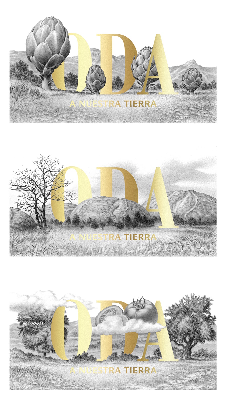
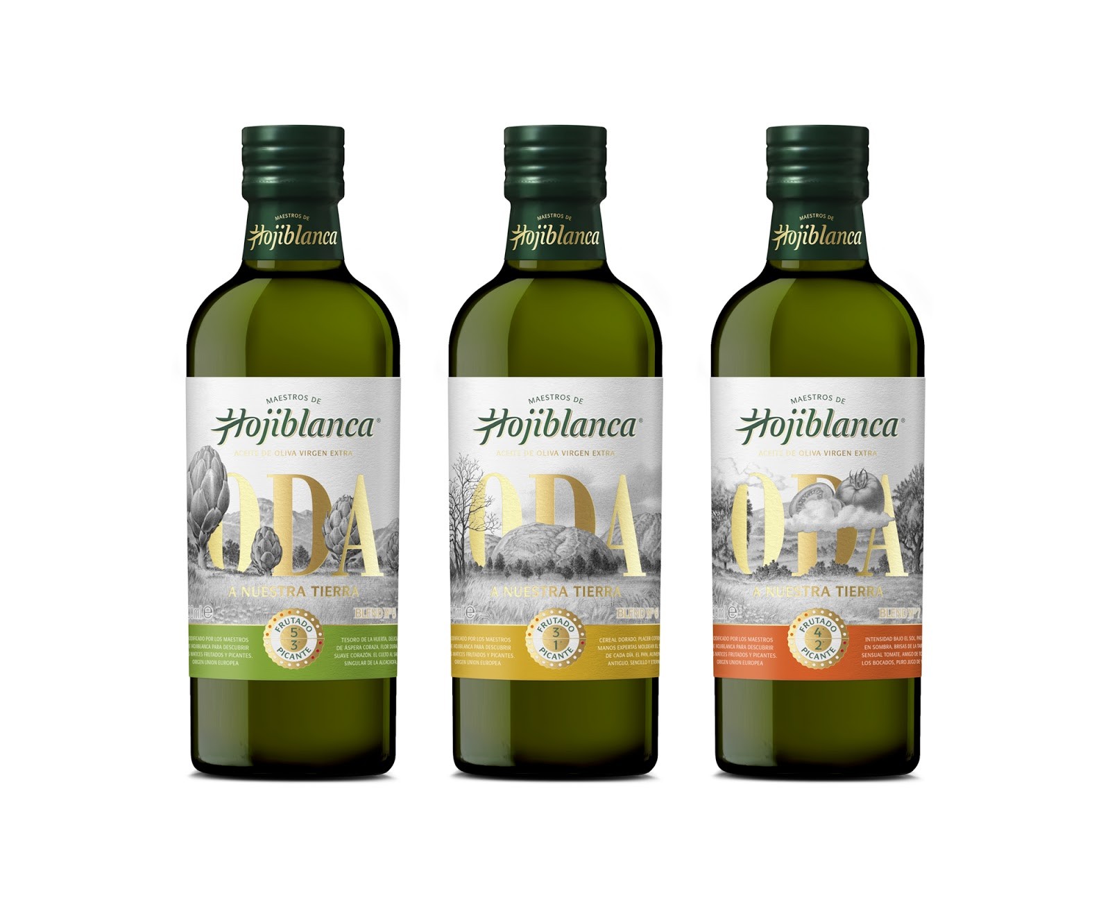
Maestros de Hojiblanca, the leading olive oil brand in the Spanish market, commissioned us to create the packaging for its premium range.Each bottle had to pay tribute to an essential product of Spanish gastronomy (artichoke, bread and tomato), without looking like flavored oils for the consumer.In addition, the design had to be consistent with the brand architecture that we had already created for the rest of the line, as well as raising the premium perception of the product.Inspired by surrealism, the design represents each of the products in bucolic illustrations where artichokes are trees, bread loafs are mountains and a tomato is the sun. A risky and innovative concept for the brand and its products.Using mostly white in the labels helps differentiating significantly the product from the rest of its competitors in the supermarket, the use of gold hot foil gives the oil a sophisticated touch and a bright color band is used to clearly differentiate the products of the range.An elegant and careful design that communicates the briefing provided by the client in a singular and creative way.The conceptual use of surrealism is something atypical and risky, both for the brand and for a mass market product of these characteristics and diffusion. The result is a product with an attractive wink for consumers and a design that stands out and differentiates from its competitors.


