Fabula Branding – Kak Doma
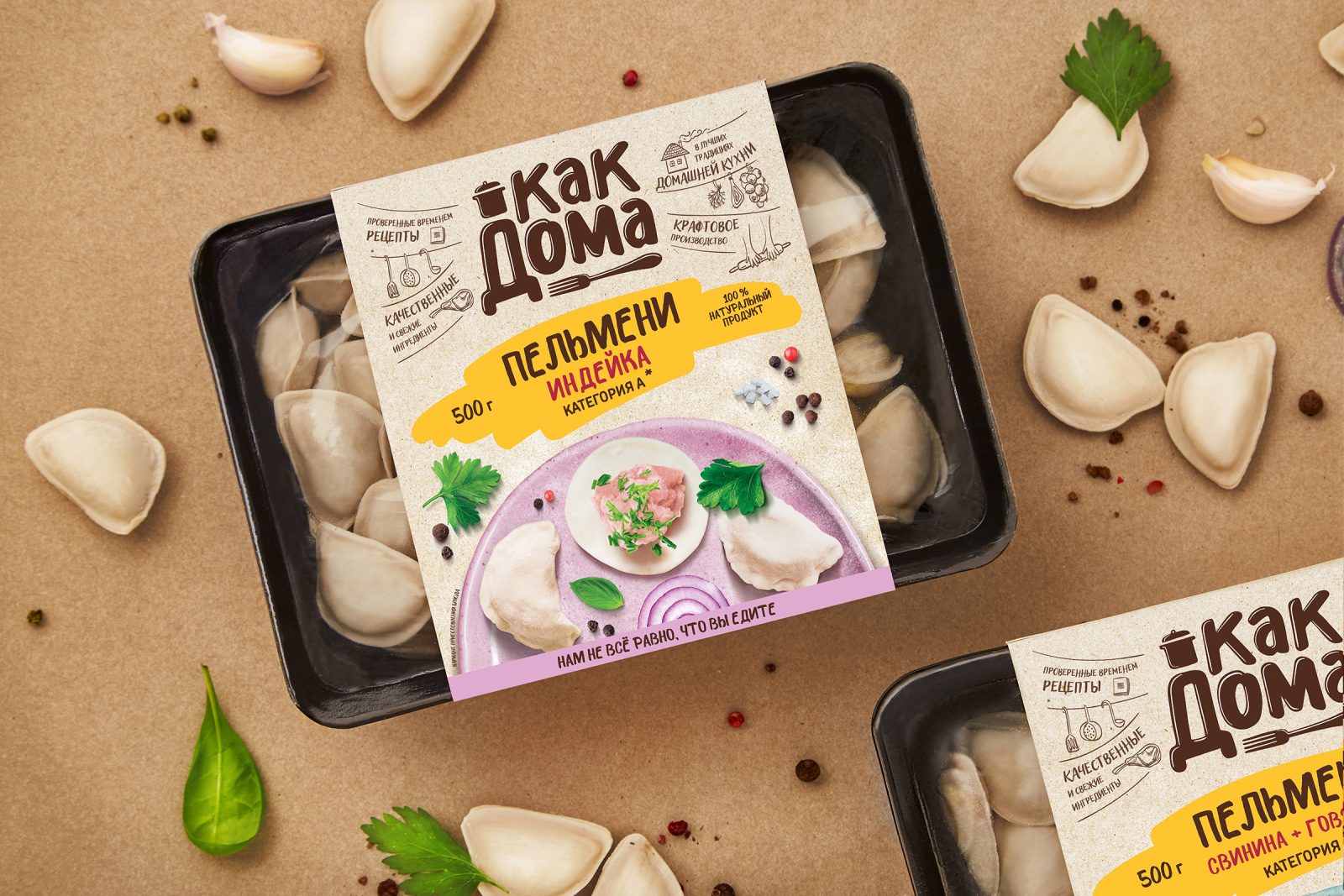
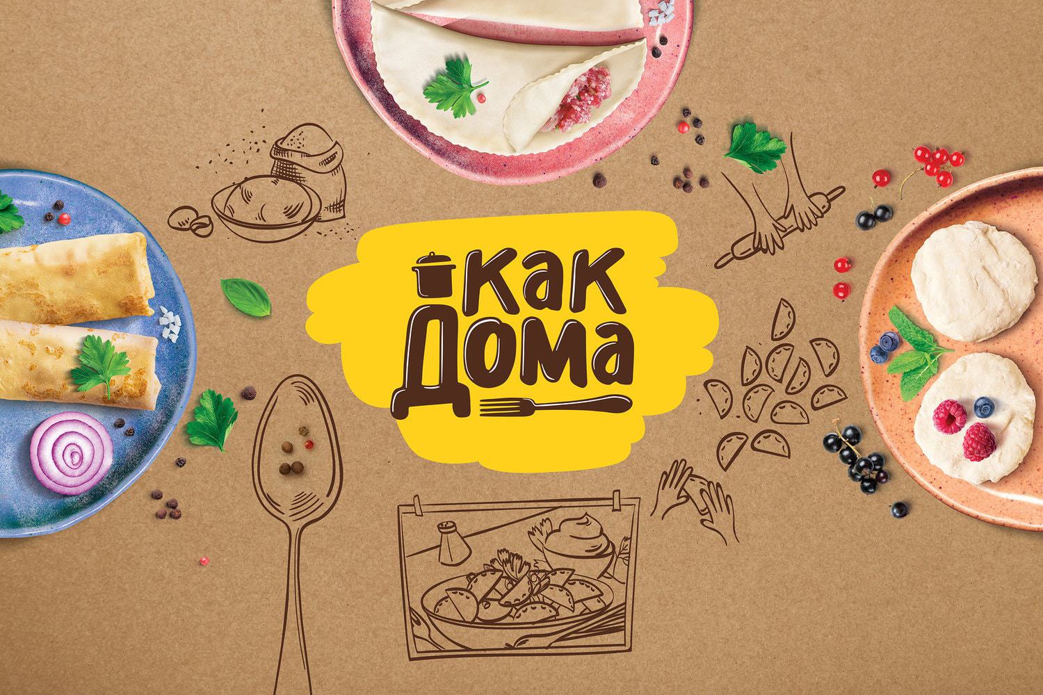
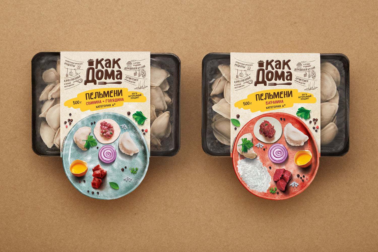
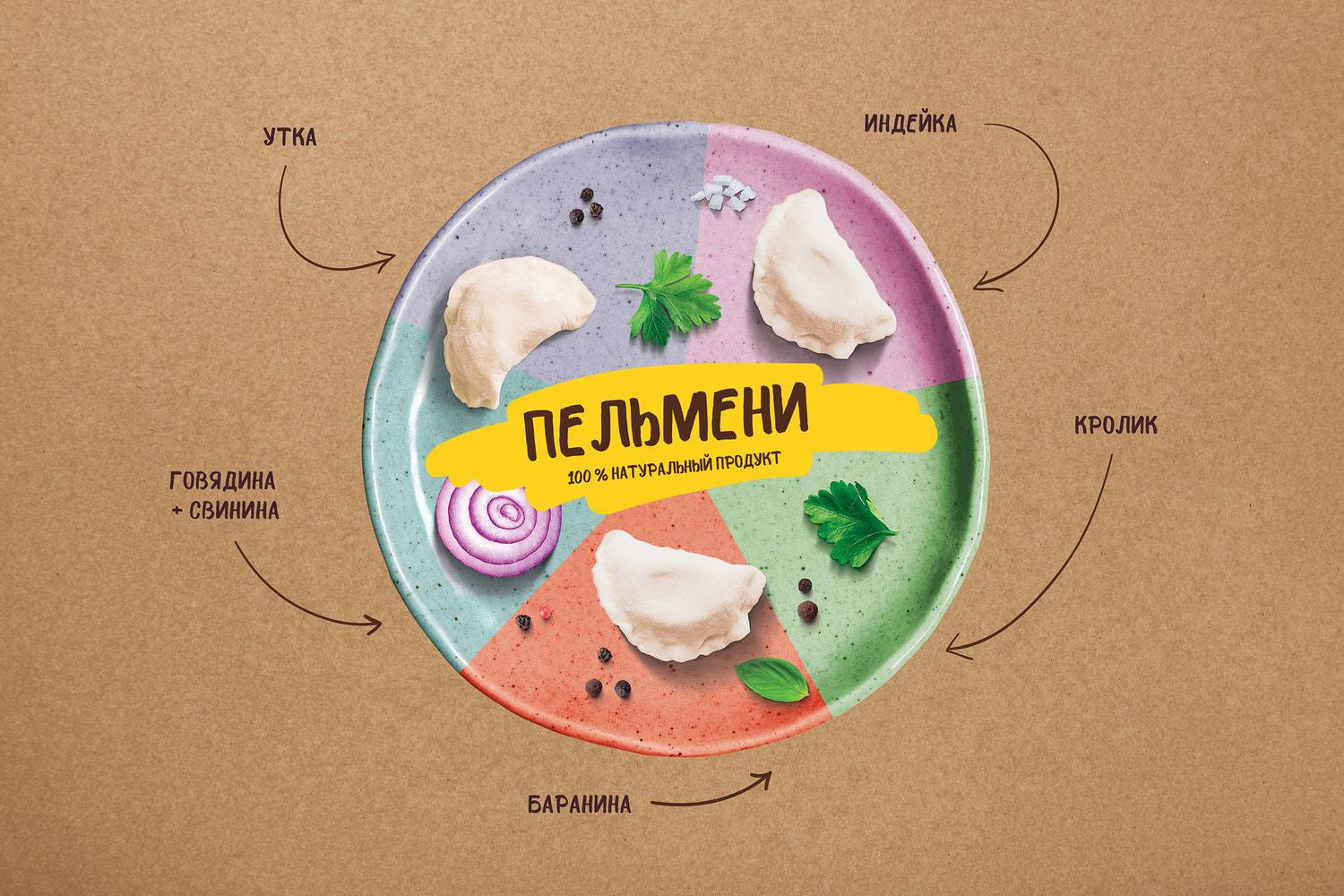
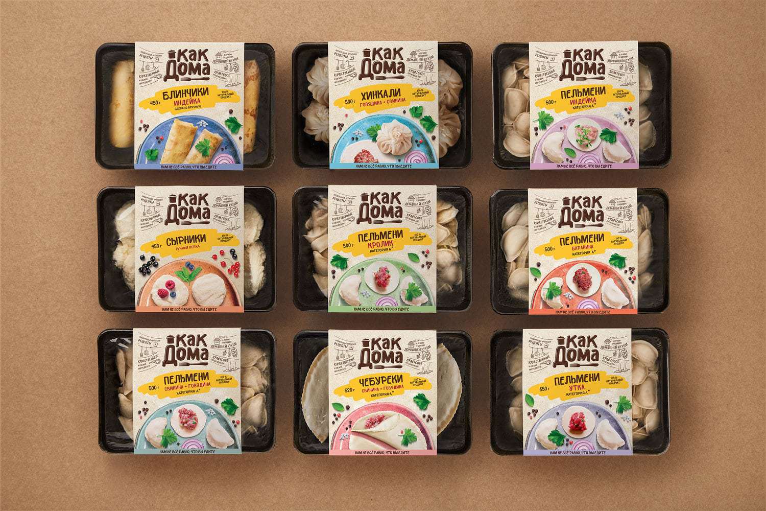
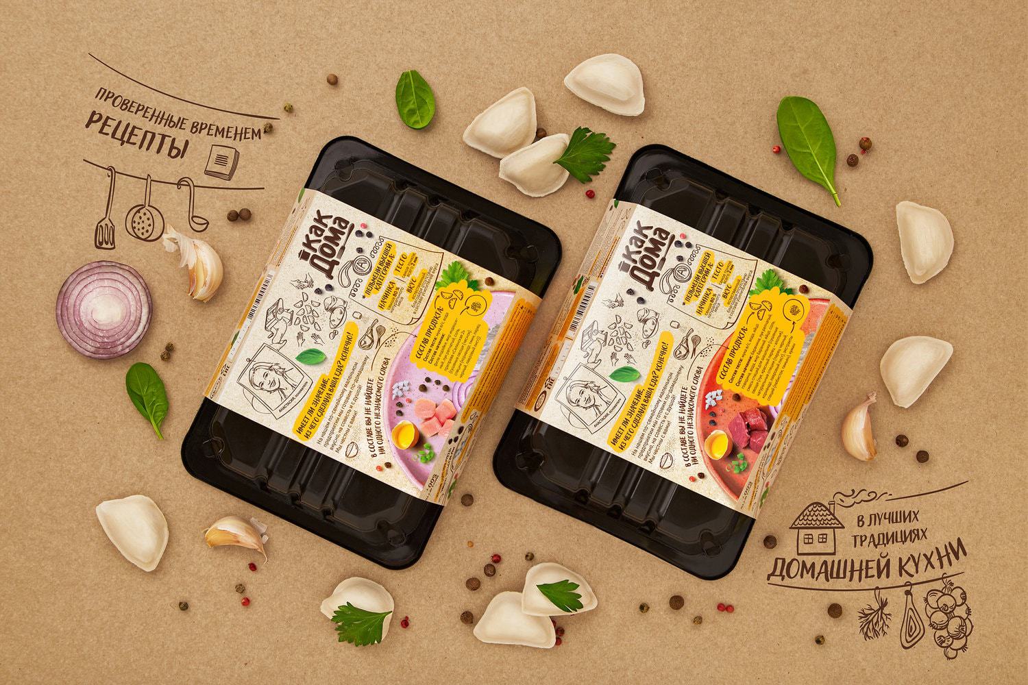
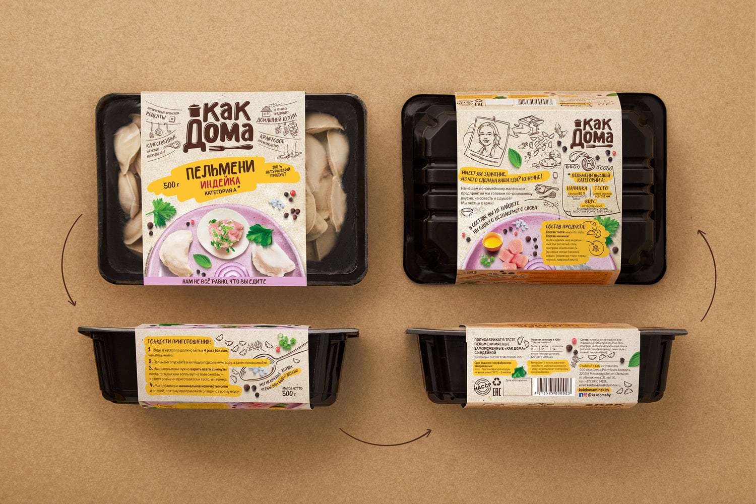
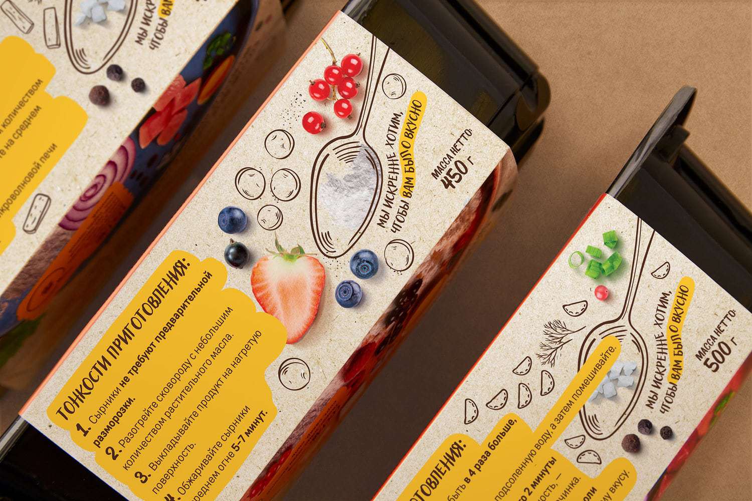
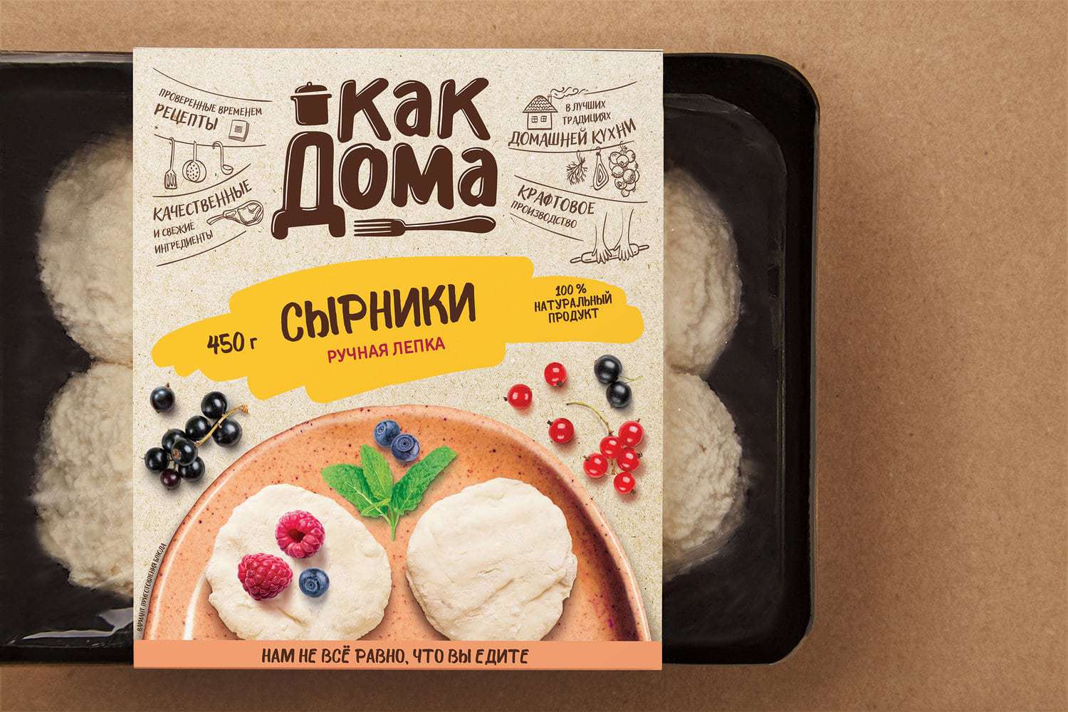
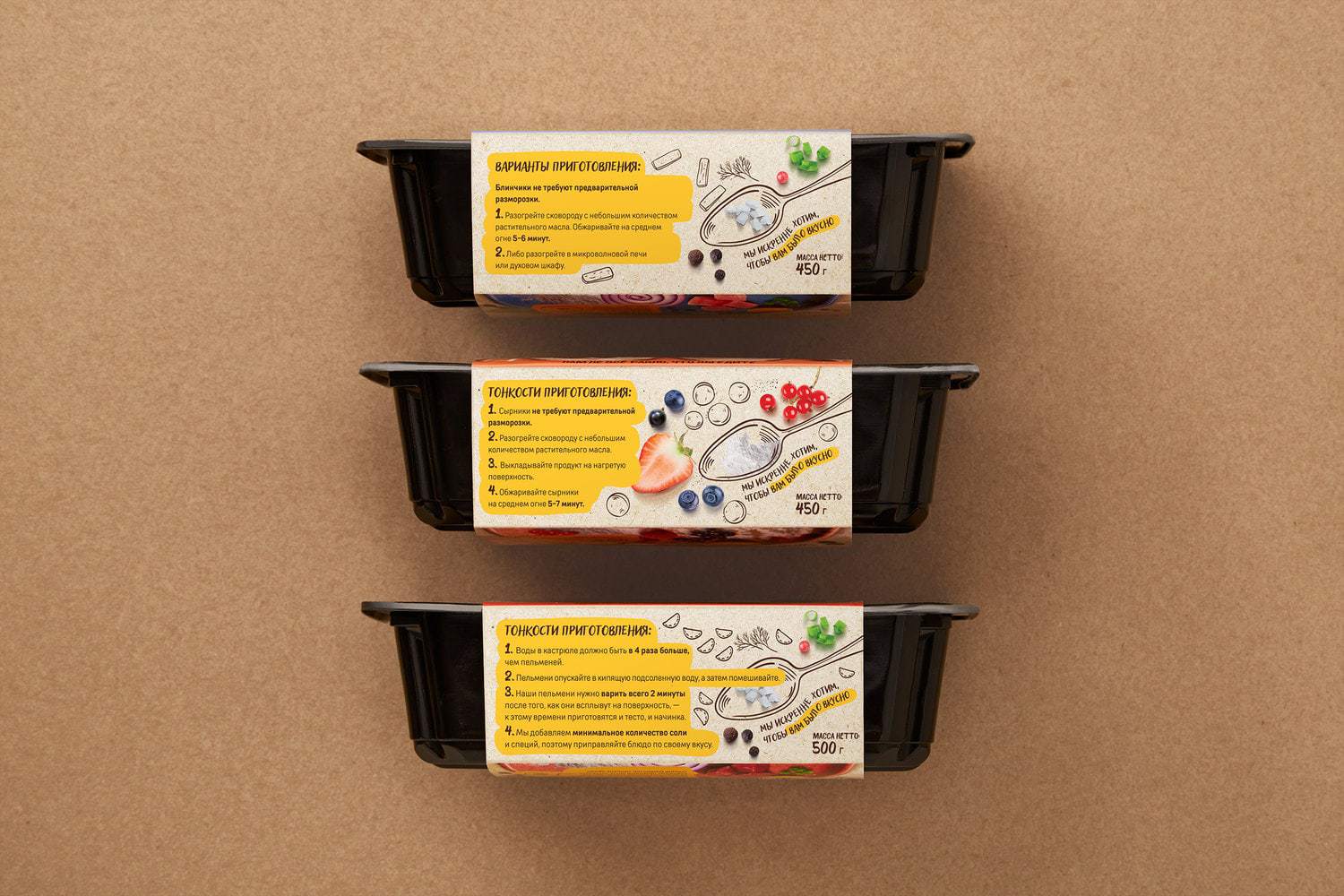
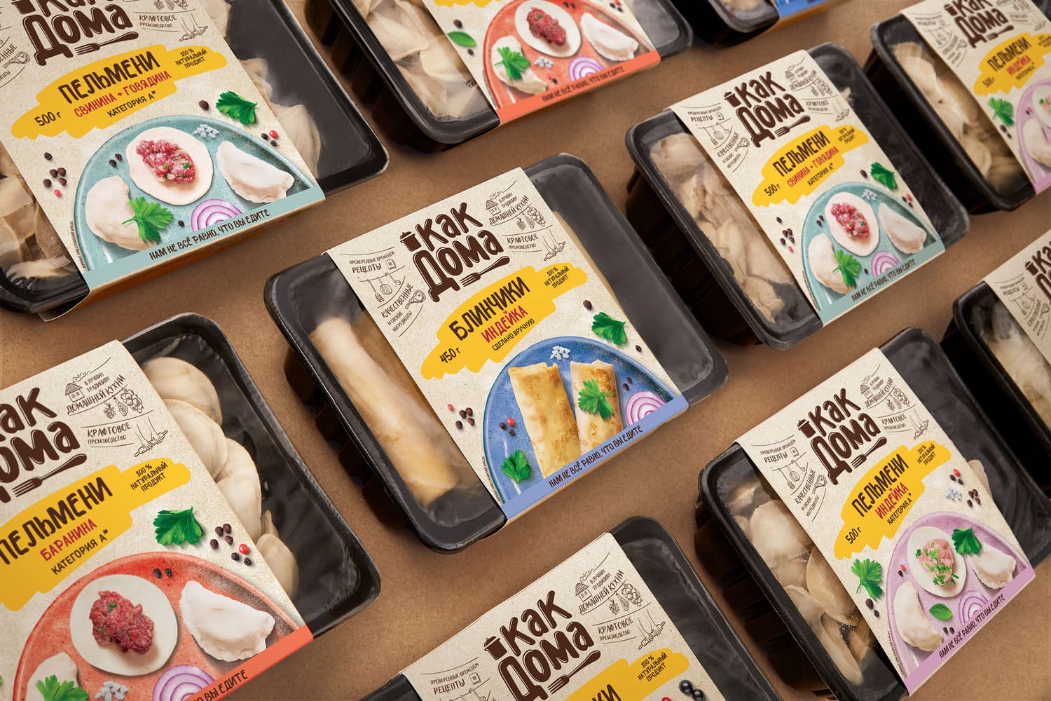
Just Like at Home (Kak Doma) is a brand of high-quality culinary products: ravioli, dumplings, meat pastry, curd pastry, and so on. All products are cooked in accordance with traditional recipes and contain only natural ingredients earning the trademark’s presence in the highest price category. However, the existing visual image failed to present all its advantages. Therefore, the consumers were unable to appreciate the product and they chose cheaper alternatives of lower quality.The main task of the new package design was to establish contact with the target audience and to communicate the nature of the product. We developed communications that made the manufacturing process clear and understandable for everyone.The story of Just Like at Home products starts with the logo. Smooth lettering and graphic elements help identify the products as craft production. The food zone continues to explore the nature of the trademark: we showed the photos of actual ingredients on a handmade ceramic plate. Surfaces and images imitating hand painting add to the image.Moreover, it was important for us to communicate the honesty and mission of the manufacturer. To do so, we placed the photo of the company’s founder and her address to the consumers on the package. “Does it matter what your food is made of? Of course it does!” — says the owner of the brand.The new design also required a new packaging solution. We replaced a rigid vacuum bag (too technological for a handcrafted product) with a container. Boxed in containers, the products of the brand seem different from mass production and are easy to distinguish from their competitors on a shelf.

CREDIT
- Agency/Creative: Fabula Branding
- Article Title: How Package Design Affects Product Perception: A Solution for the Just Like at Home Trademark by Fabula Branding
- Project Type: Packaging
- Agency/Creative Country: Belarus
- Market Region: Europe
- Format: Tray
- Substrate: Plastic
- Industry: Food/Beverage


