Lemon Yellow – Roger’s Jam
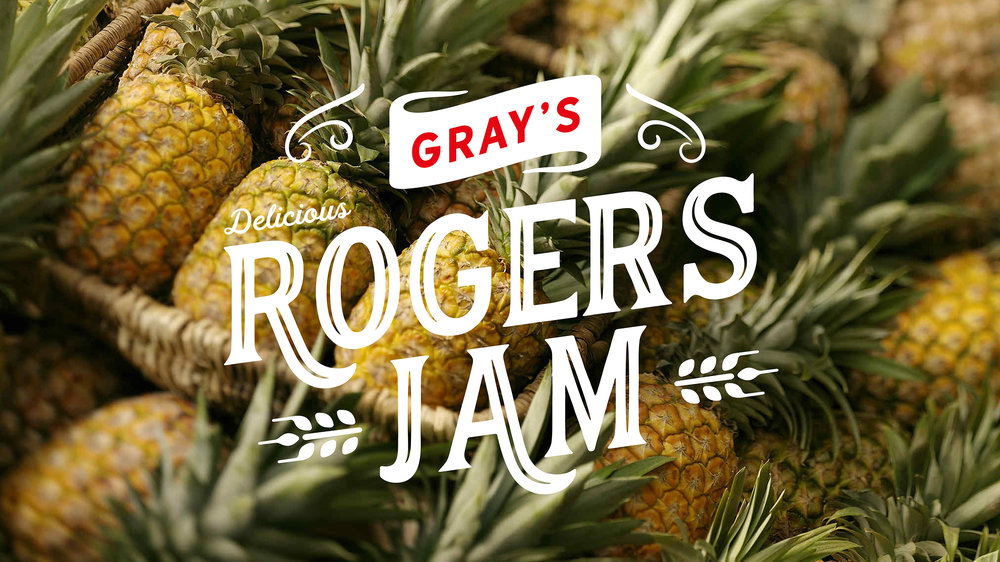
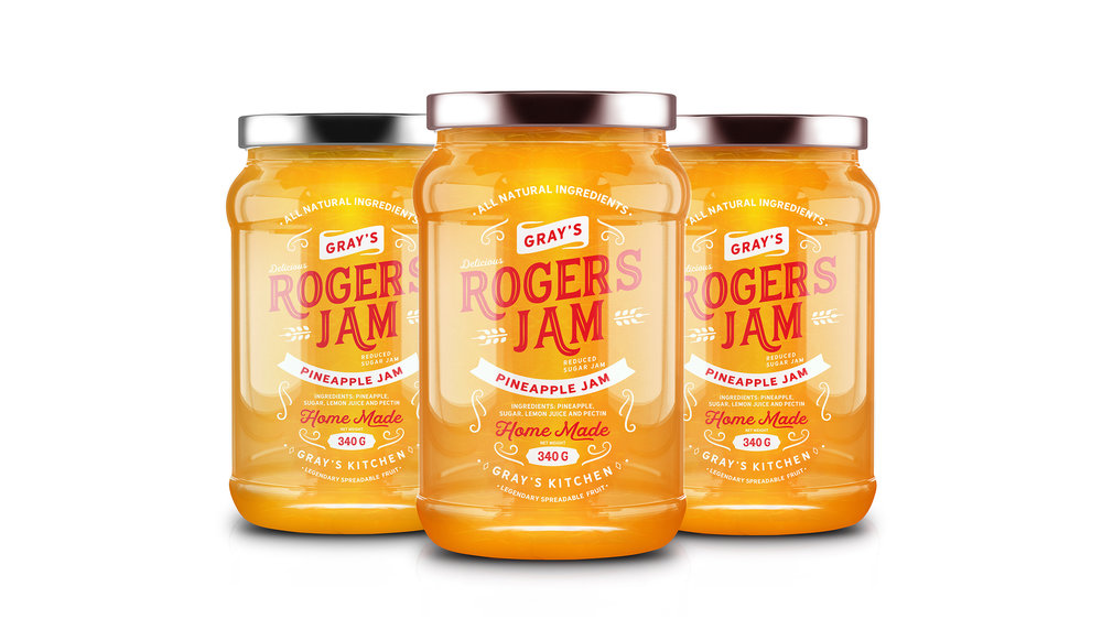
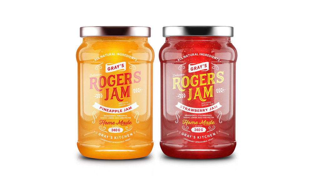
Rogers jam is brand name of homemade fruit jam product, made from an exclusive recipe, in a tiny grays kitchen with a lot of love and happiness. We had a task of designing the label to give a contemporary and consistent feel to the traditional jam flavours, keeping the fruit away which is always the core of the design. Sans and Sanserif fonts, simple typography, stylish and reduced style managed to create an elegant impression that encompasses both the look and the feel.


CREDIT
- Agency/Creative: Lemon Yellow
- Article Title: Roger’s Jam Packaging Design
- Organisation/Entity: Agency Commercial, Published
- Project Type: Packaging
- Agency/Creative Country: India
- Market Region: Asia
- Format: Jar
- Substrate: Glass
FEEDBACK
Relevance: Solution/idea in relation to brand, product or service
Implementation: Attention, detailing and finishing of final solution
Presentation: Text, visualisation and quality of the presentation


