
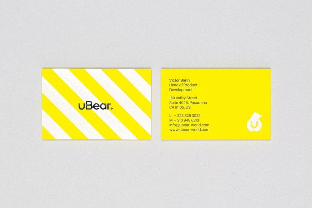
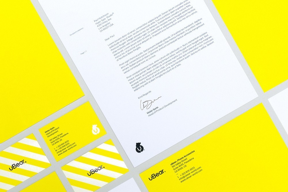
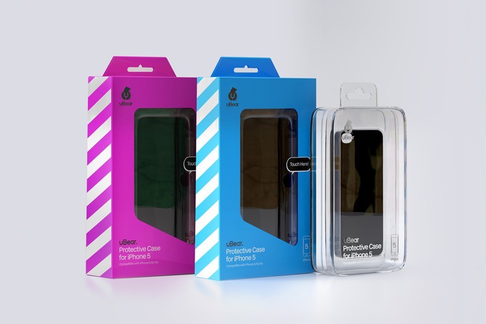
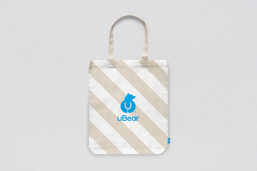
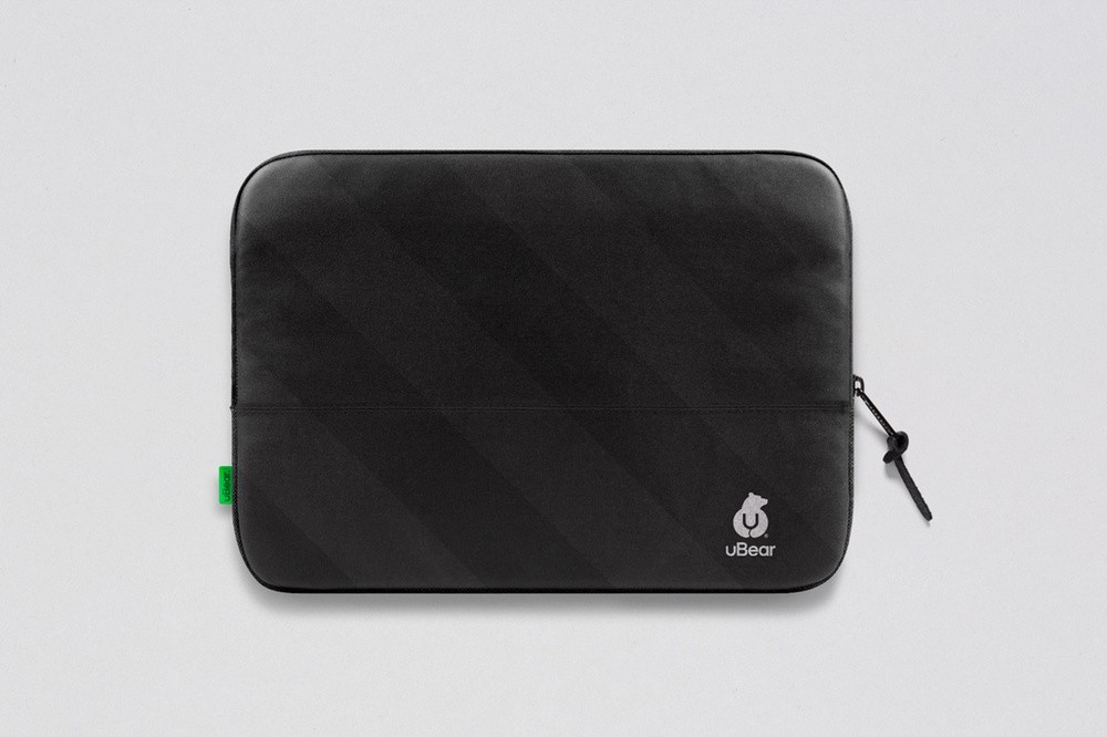
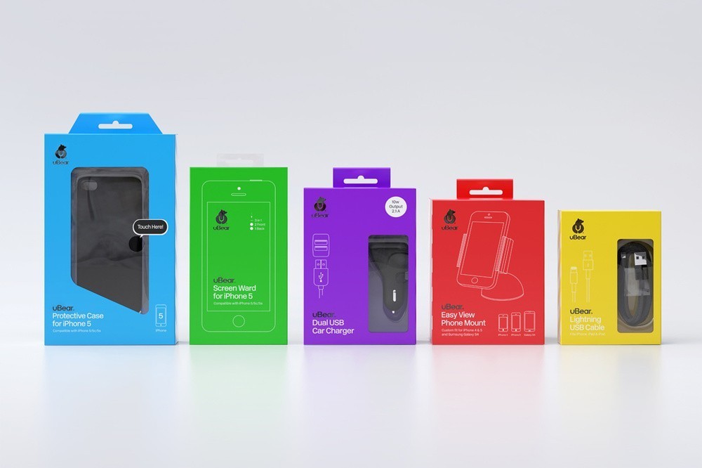
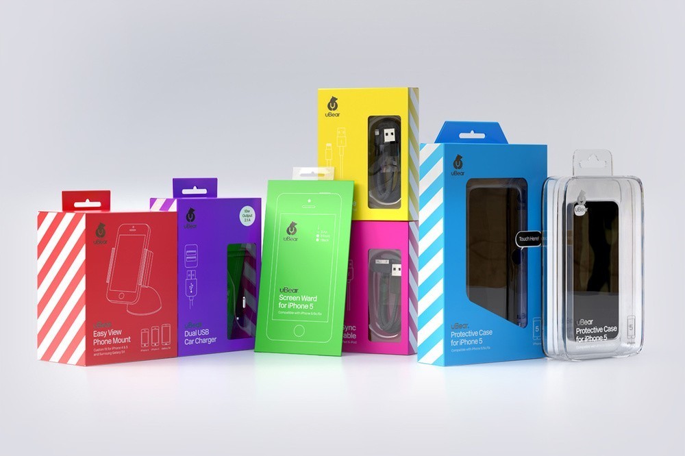
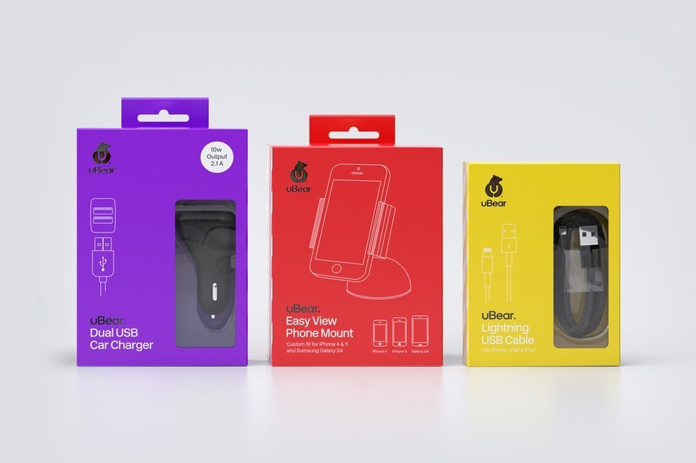
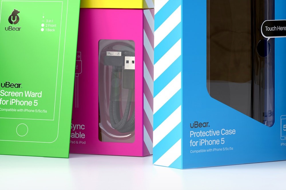
In collaboration with Hype Type Studio and Mash Creative, this line of electronics for uBear packs a punch with colors so vibrant it’s hard not to be mesmerized. Each product is packaged in a custom blister box illustrated with minimal white line drawings and rimmed with diagonal stripes. The brands image and products resemble that of candy stores or ice cream parlors of the 1960s.

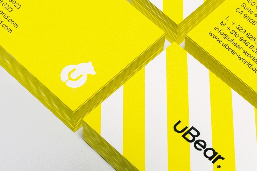
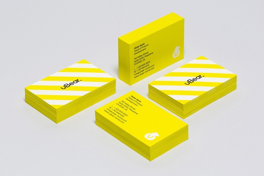
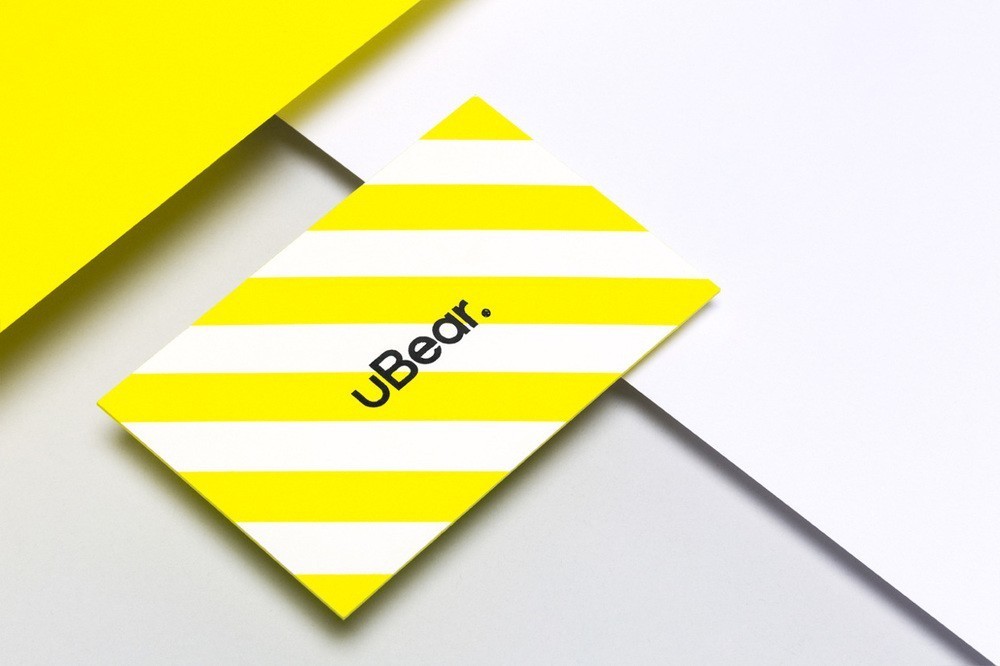
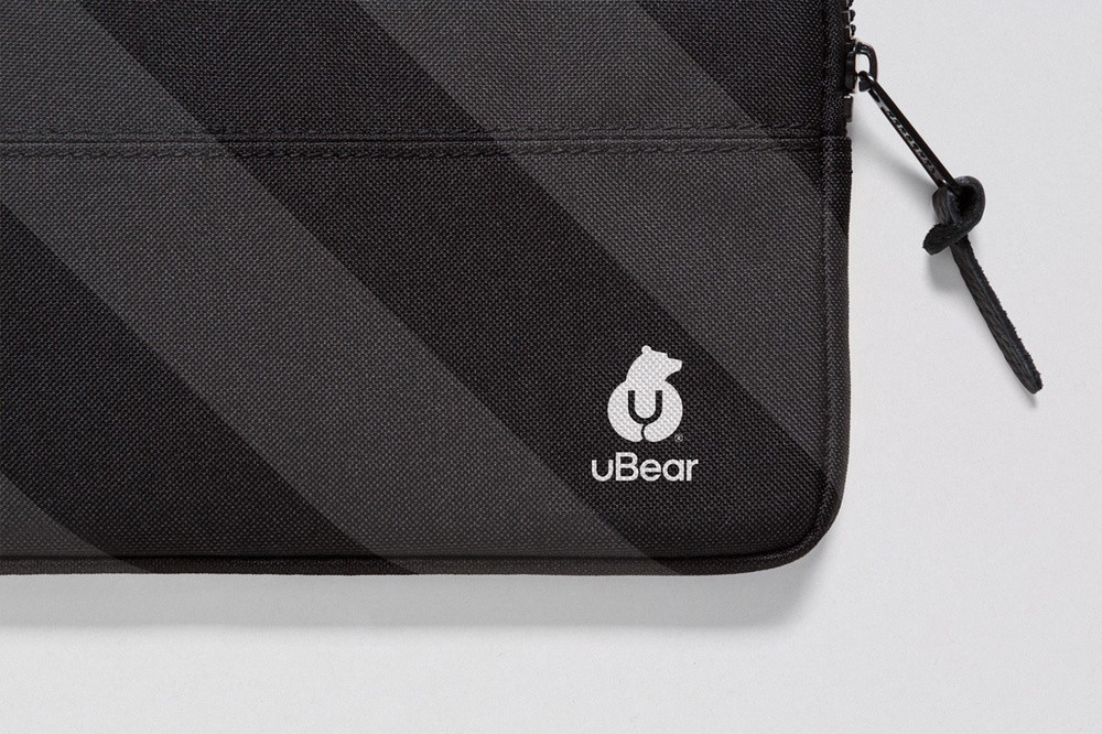
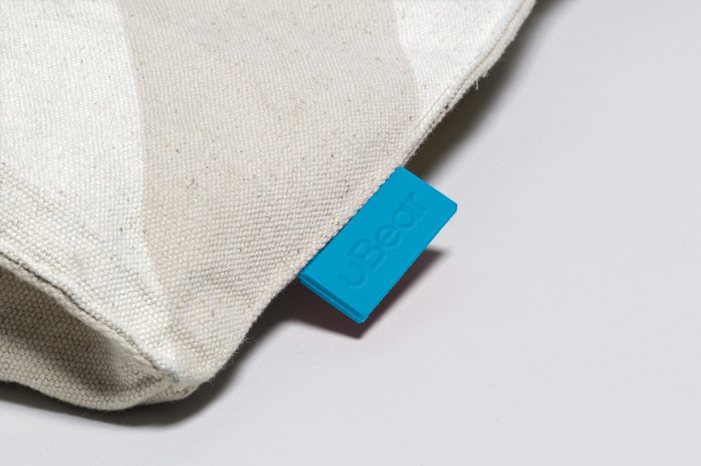
“Our brief for the uBear® logo was to create an identity that would be both adaptable and instantly recognisable. The logo consists of a stand alone Bear marque hugging the letter U, as well as a custom sans serif logotype. A unique, bold and bright colour palette was used throughout the packaging to help distinguish it from similar products on the market. The use of gloss varnishes and metallic foils throughout the packaging helps to create interest on the shelf. In addition to the identity and packaging, a fully responsive website was designed and built to allow a seamless user experience.”
CREDIT
- Agency/Creative: Hype Type Studio and Mash Creative
- Article Title: Hype – Type Studio: uBear ®
- Project Type: Packaging


