Jackdaw Design – Urban Cordial
Jackdaw Design, an independent branding and packaging design company in London, has helped relaunch Urban Cordial with a new brand identity that draws on the diversity and vibrancy of urban Britain. With 10.2 million tonnes of food in Britain being wasted yearly, the rebrand supports Urban Cordial’s ethical approach to sourcing fruit from British farms that would otherwise go to waste.
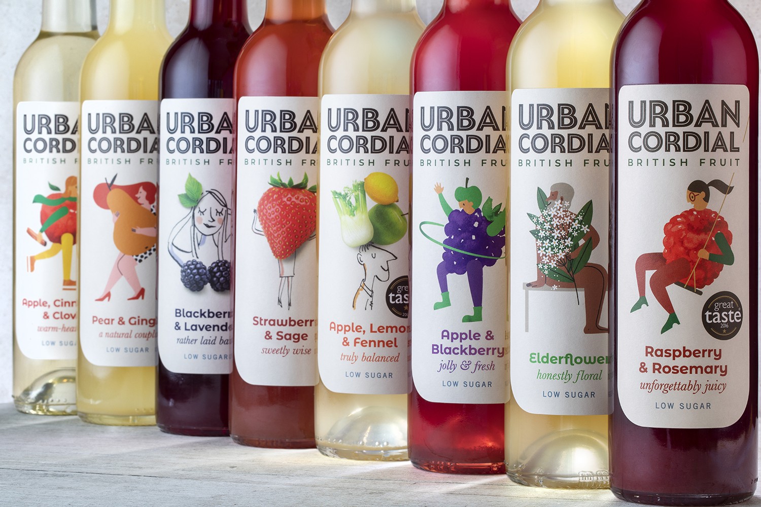
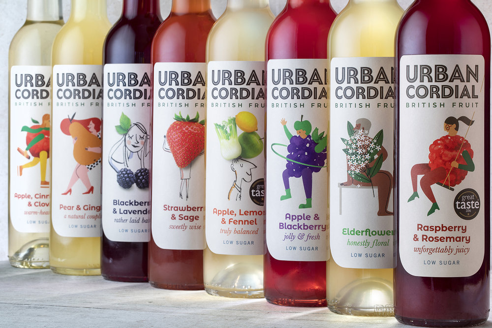
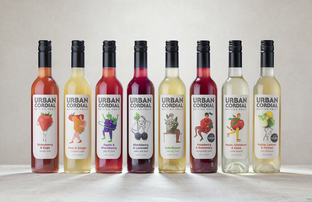
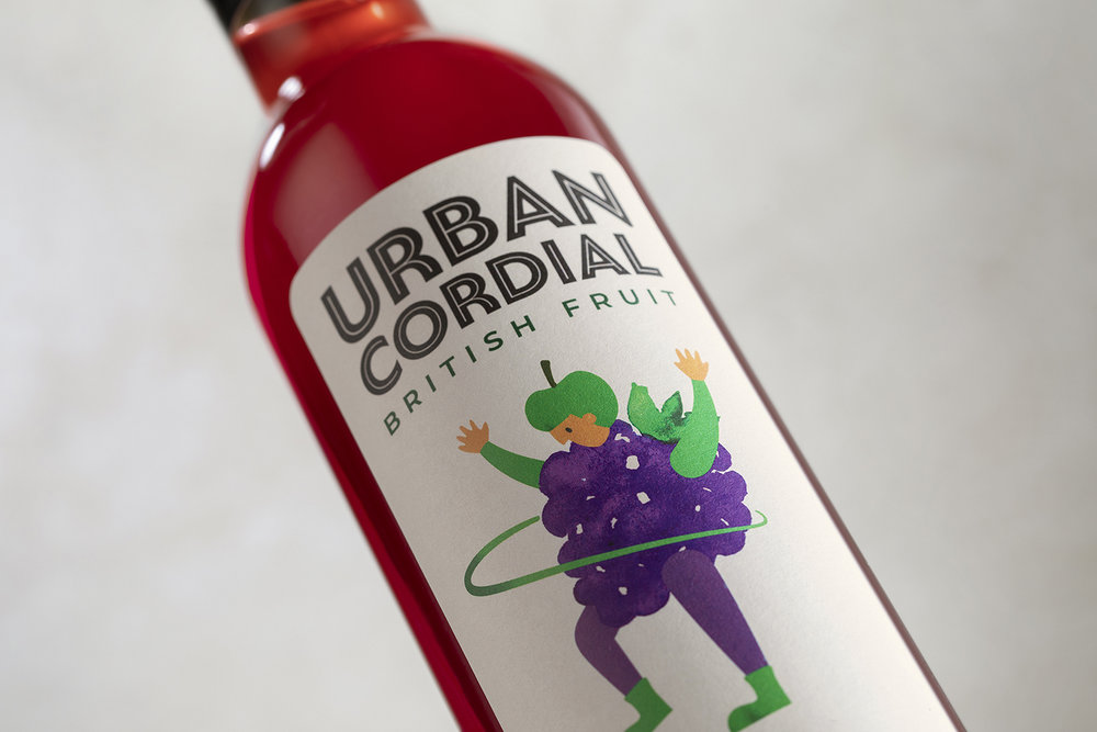
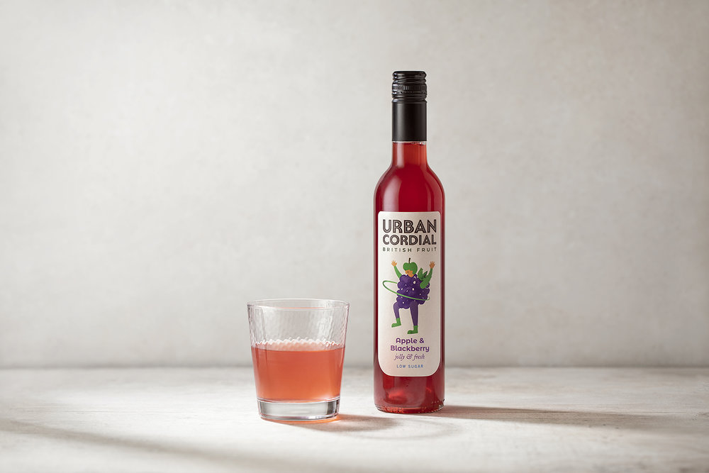
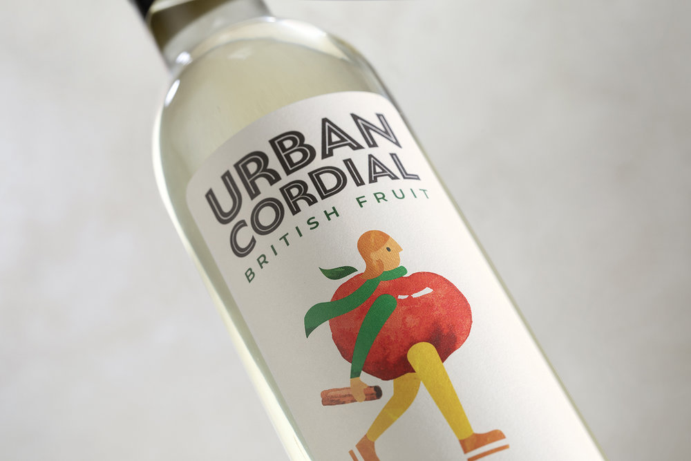
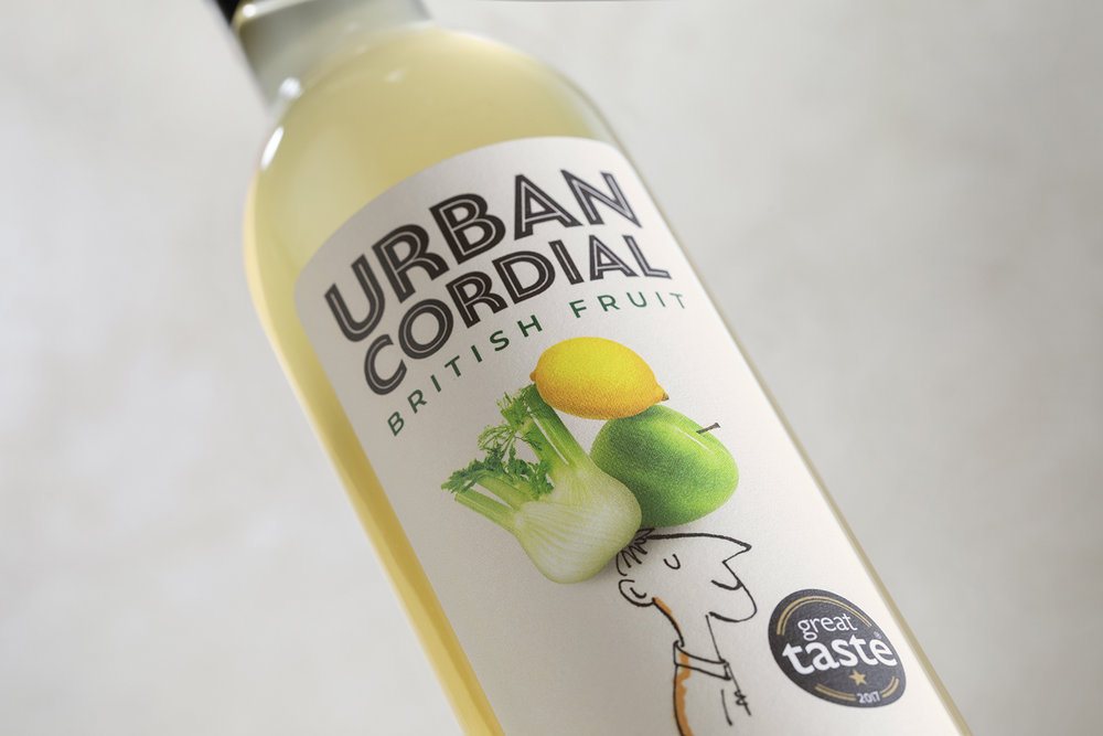
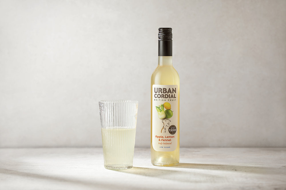
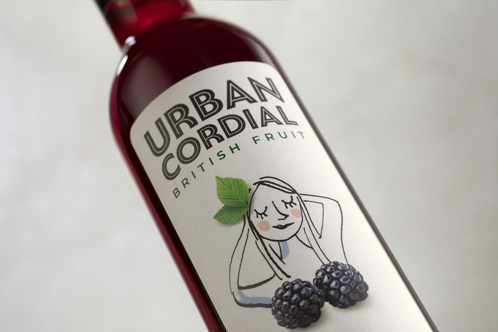
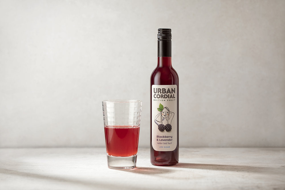
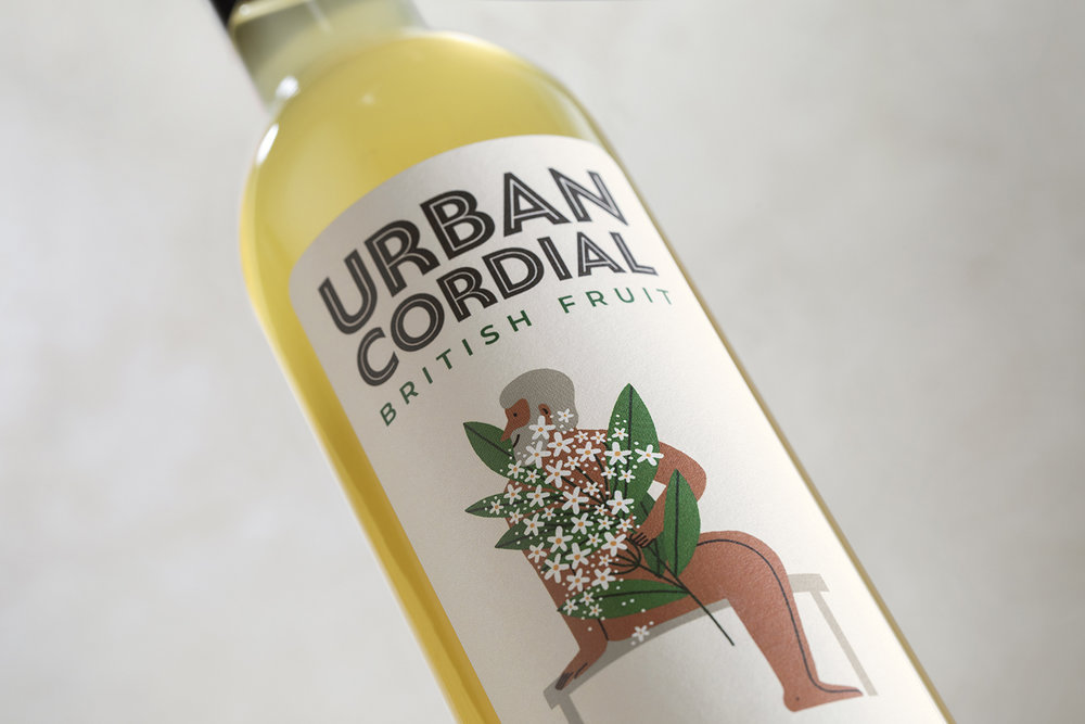
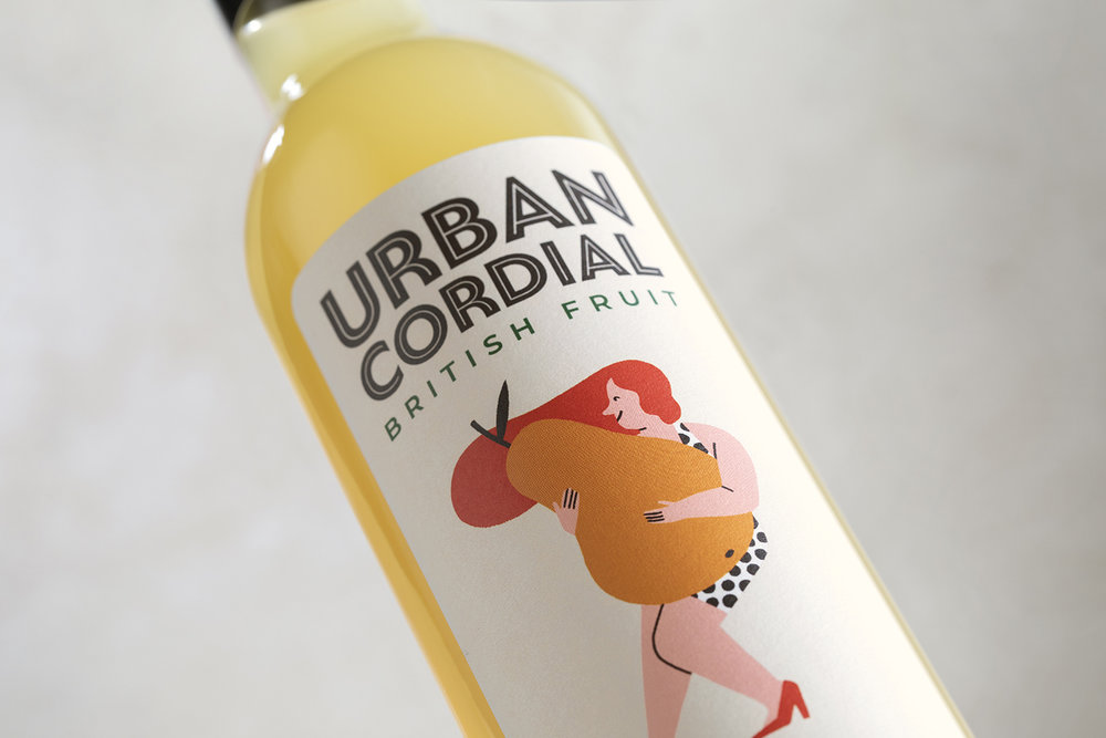
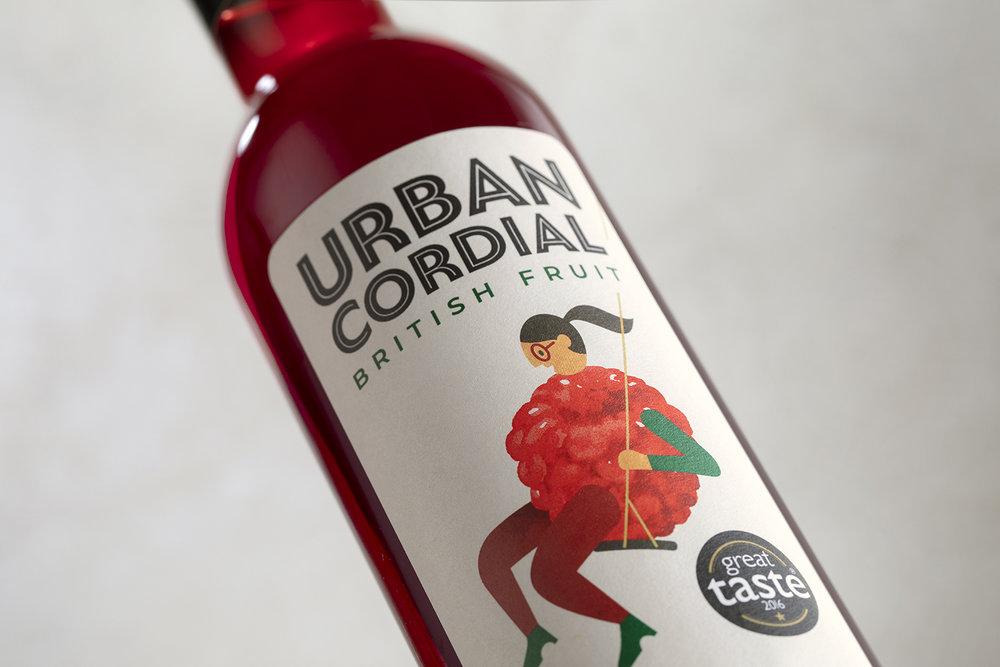
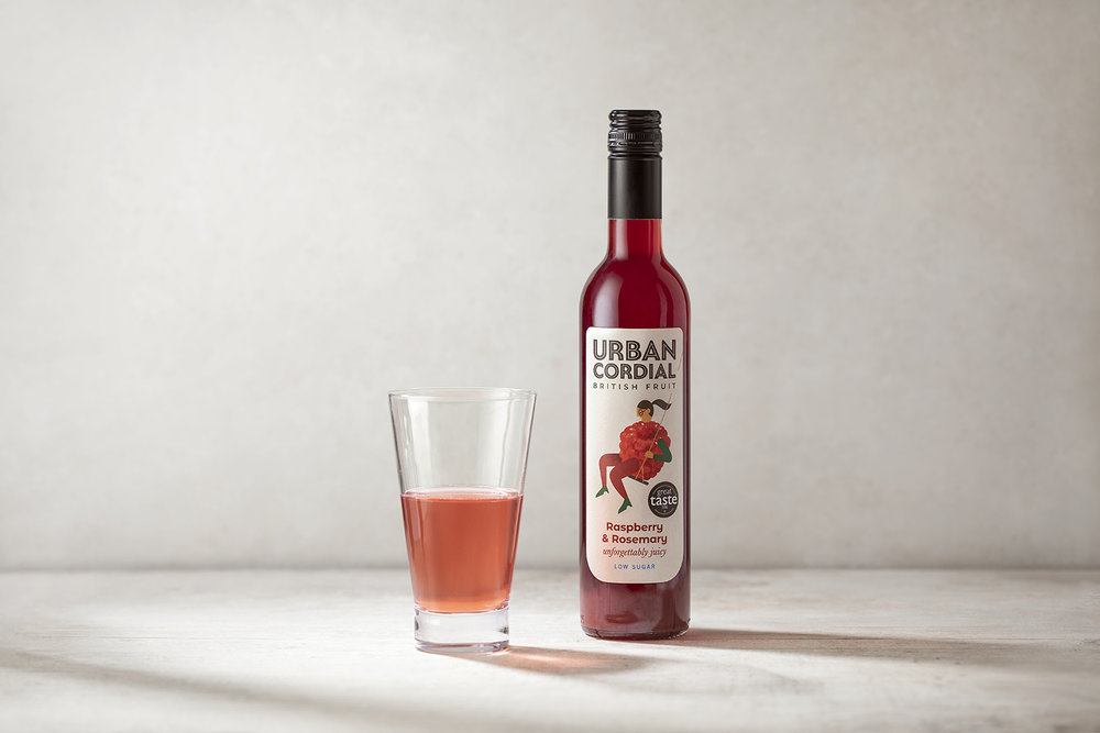
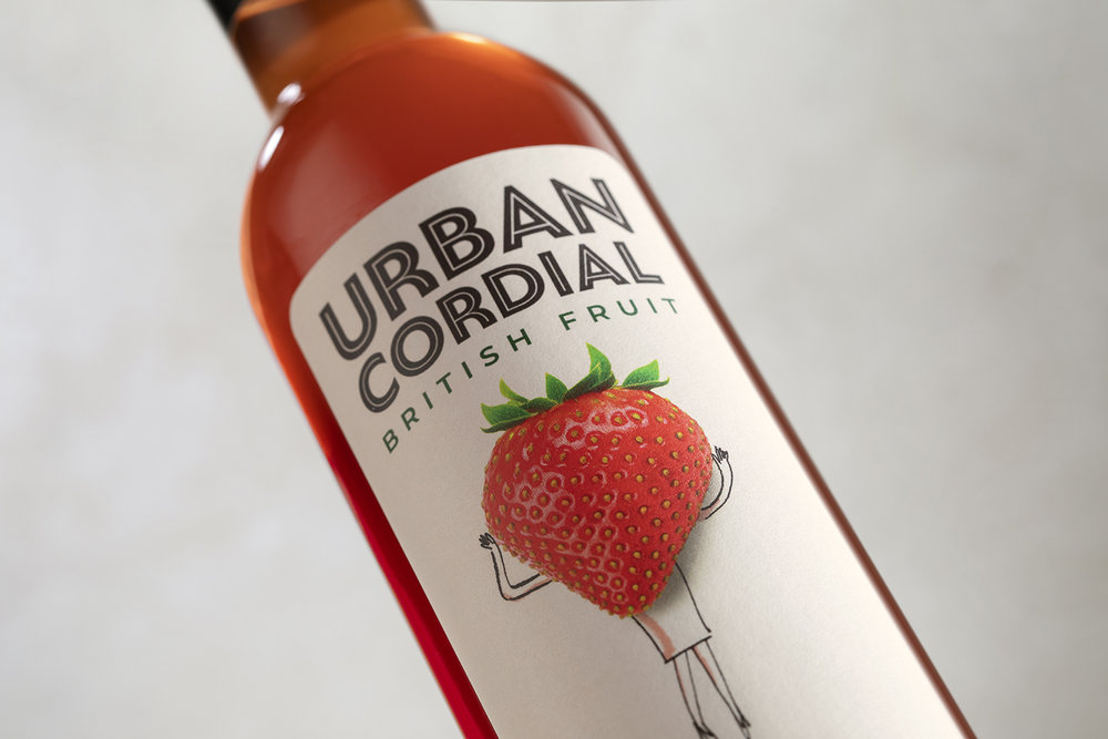
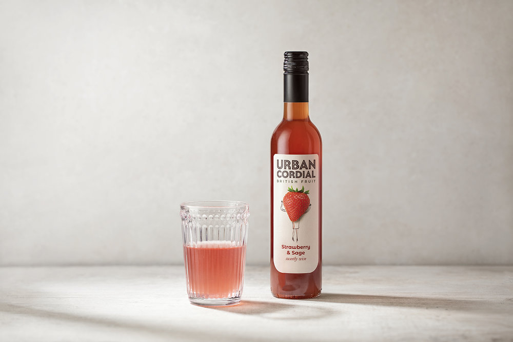
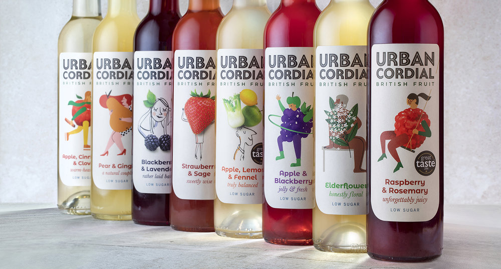
For each of the eight bottle label designs, the Jackdaw creative team collaborated with a number of illustrators to create a charming aesthetic. The clever introduction of a variety of artistic voices into the brand has created a world that’s dynamic, as well as distinctive.
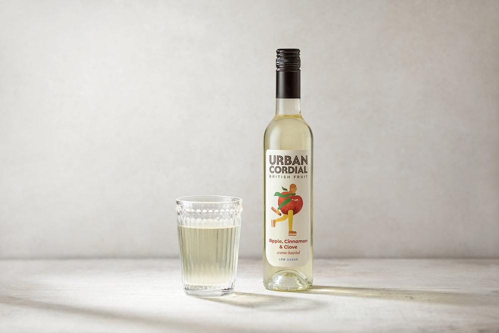
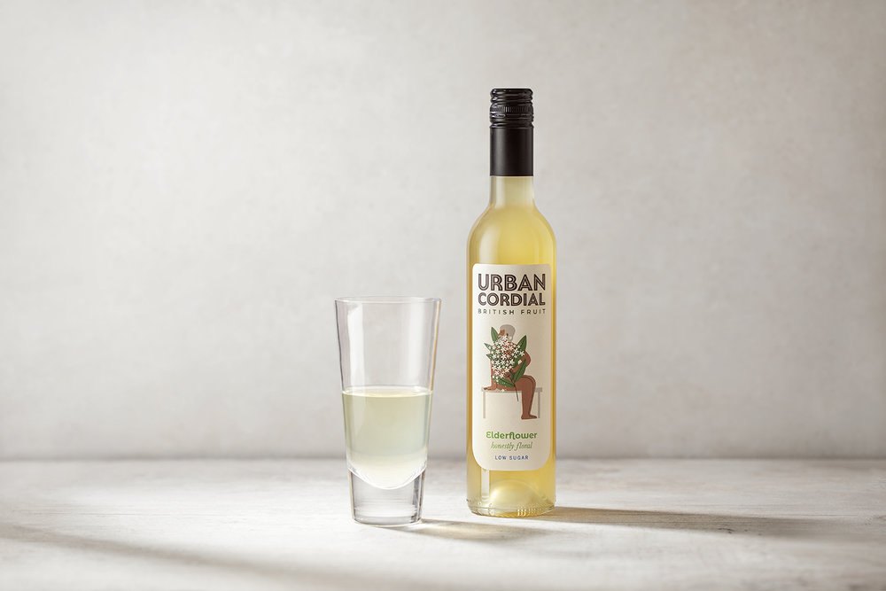
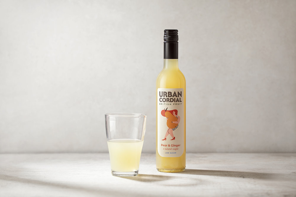
The new wordmark reflects Urban Cordial’s bold ambitions and delivers shelf standout. While the new bottle design, which has moved to a bordelaise shape, delivers a more premium proposition.
Each bottle of cordial has its own distinctive character, inspired by its ingredients and Urban Cordial’s fresh approach to using surplus fruit. Together with playful language, such as ‘Rather laid back’ for the Blackberry & Lavender cordial and ‘Sweetly wise’ for the Strawberry & Sage cordial this ensures brand engagement with customers. Other flavours include a delicately crisp hand-picked Elderflower, a zingy Pear & Ginger, a comforting Apple, Cinnamon & Clove and a light and healthy Apple, Lemon & Fennel.
Jackdaw was initially approached by Urban Cordial to tweak the existing packaging, but responded by reimagining the brand across all customer touchpoints in order to reposition the brand in a premium market worth more than £55m. Adult-focused soft drinks are increasingly popular, with consumers demanding healthier options and exciting flavours.
Jackdaw Design founder and director, Amanda Jackson: “The biggest challenge was ensuring we created a unified range with a diversity of visual styles that’s instantly recognisable as the Urban Cordial family. We needed to champion the different flavours while maintaining a consistent brand look and feel. We created the U-shaped label to deliver a cohesive brand with a unique twist. What results is a real homage to the contents within”.
Urban Cordial managing director, Natasha Steele: “We are thoroughly delighted with the new look for our brand. It embodies so much of what’s important to the Urban Cordial team: a devotion to craft, a love of creative expressions, and an obsession with quality. Jackdaw Design has helped us create something that is full of life and we know it will make a huge splash in the cordial market!”
CREDIT
- Agency/Creative: Jackdaw Design
- Article Title: Jackdaw Design Delivers a Brand Identity With a Unique Fruity Twist for Urban Cordial
- Organisation/Entity: Agency Commercial, Published
- Project Type: Packaging
- Agency/Creative Country: United Kingdom
- Market Region: Europe
- Format: Bottle
- Substrate: Glass


