Sed Estudio -Q’uma Chocolate
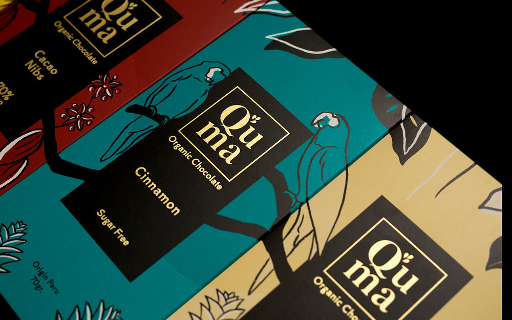
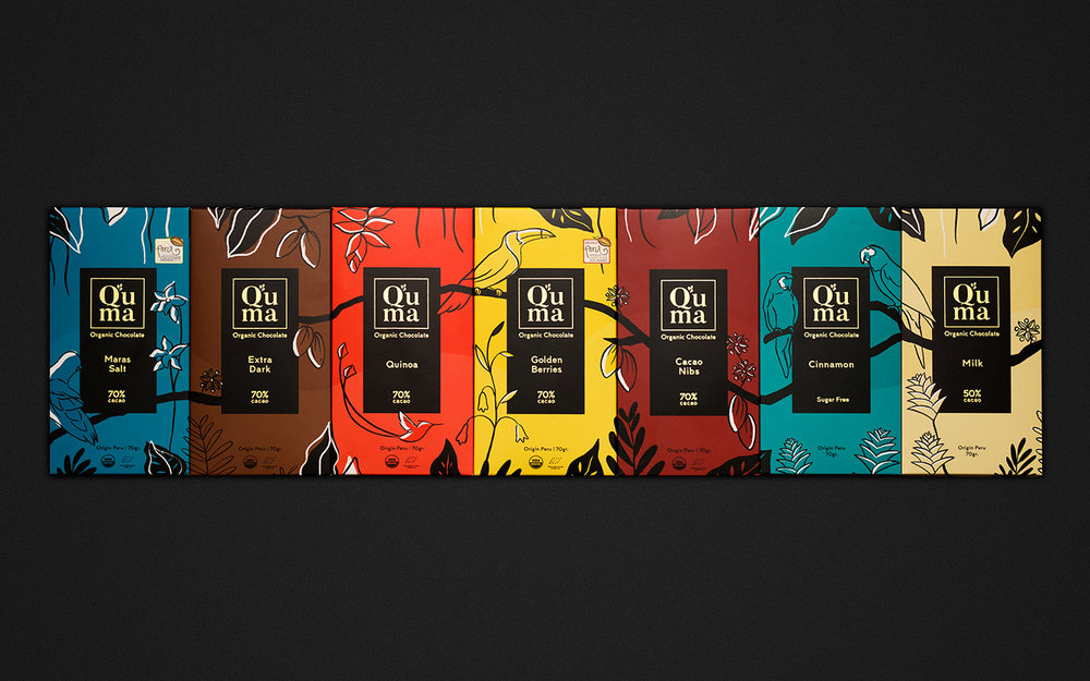
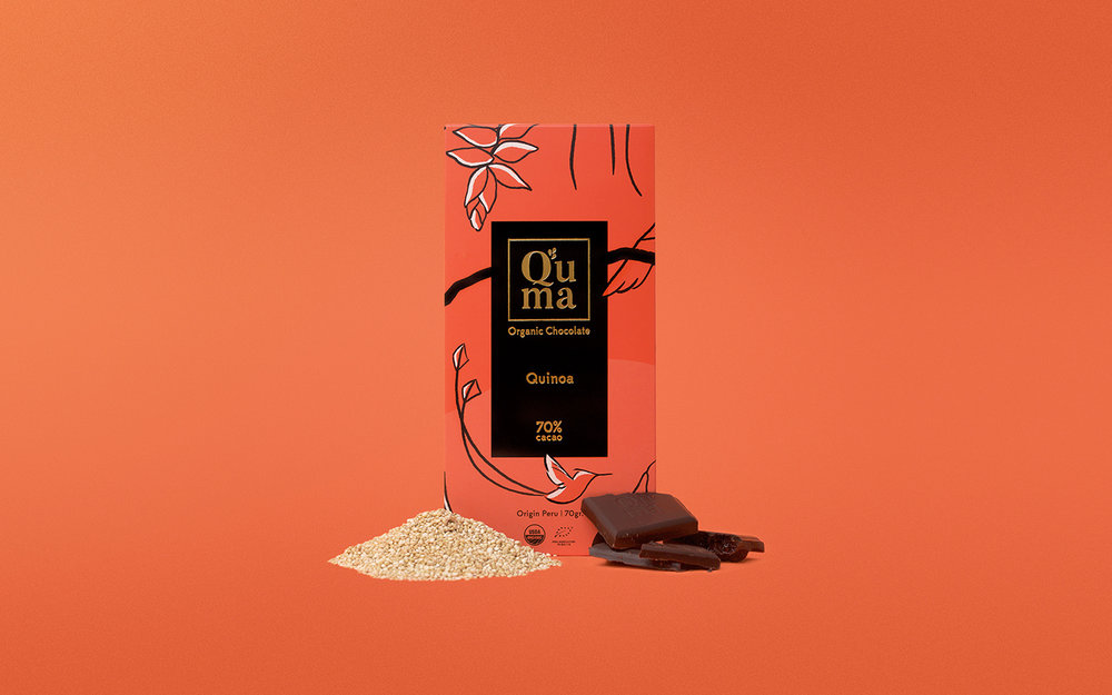
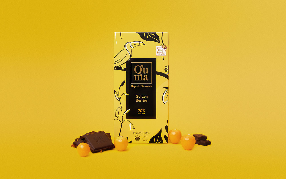
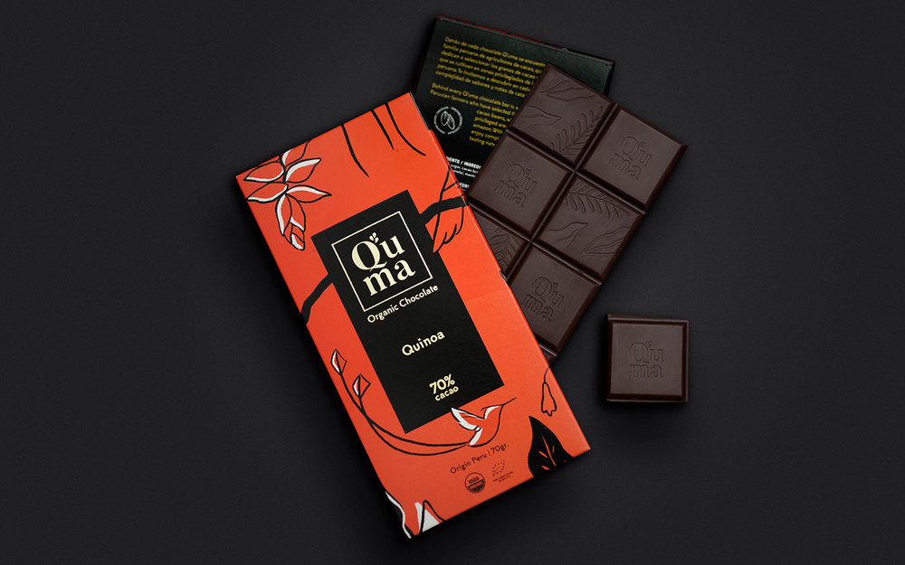
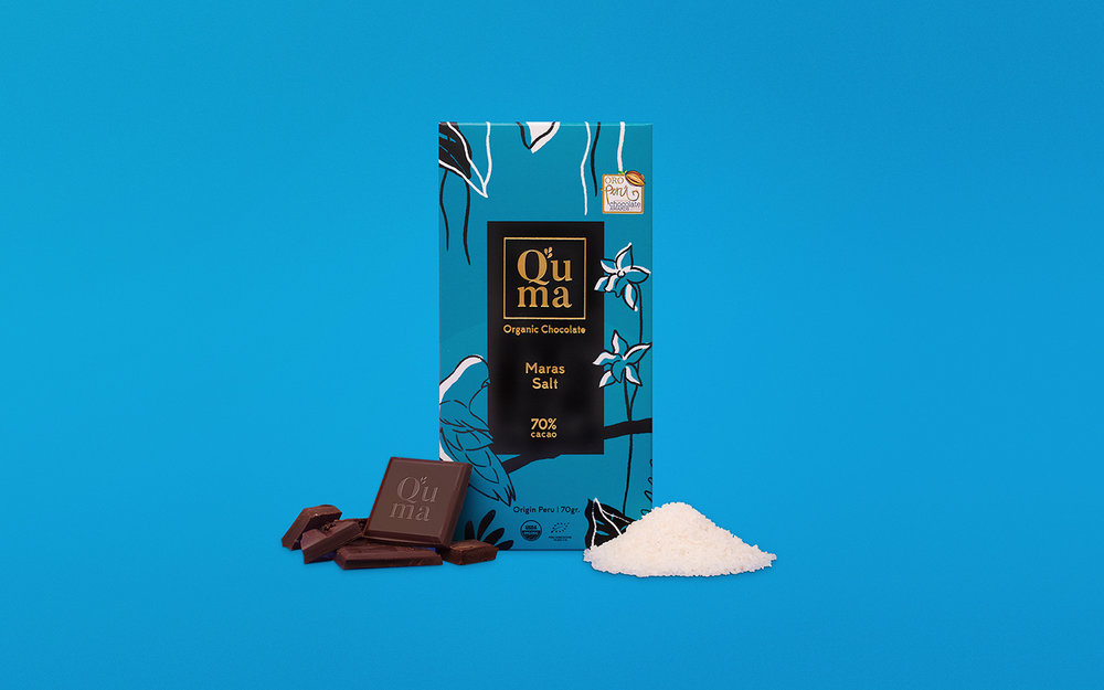
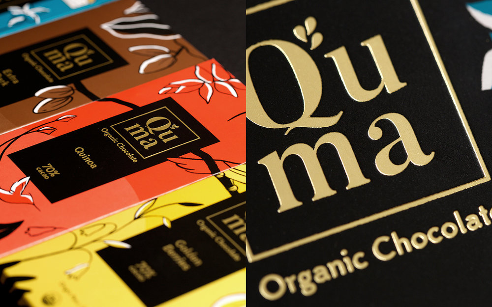
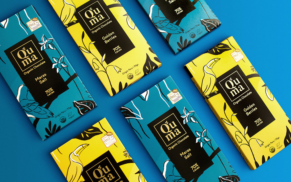
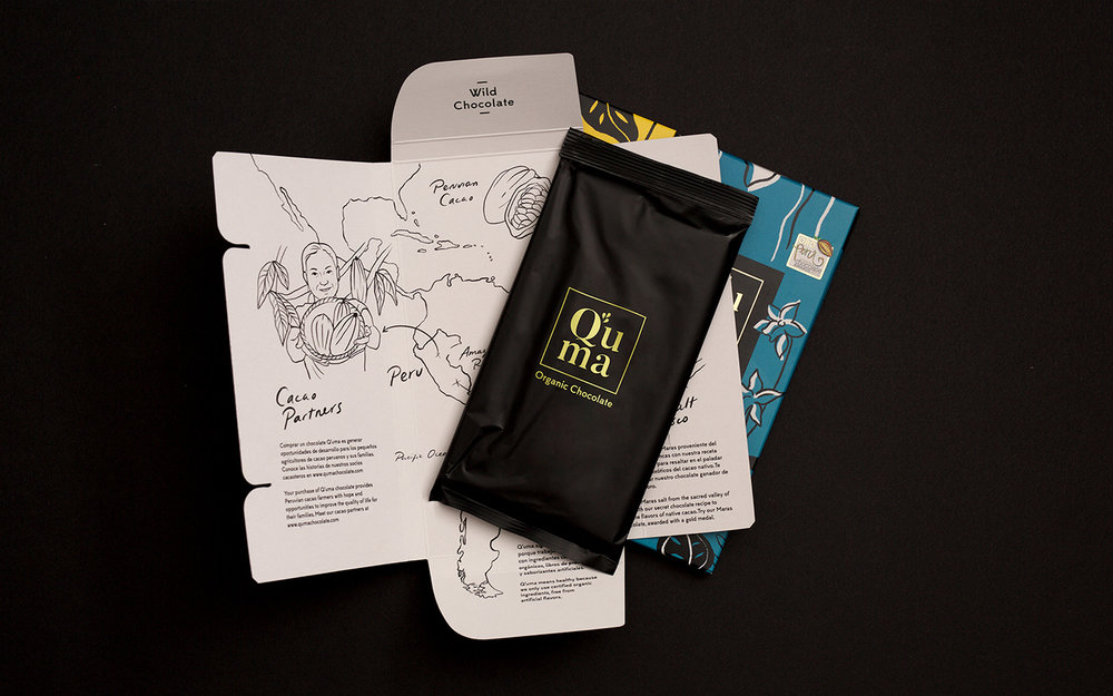
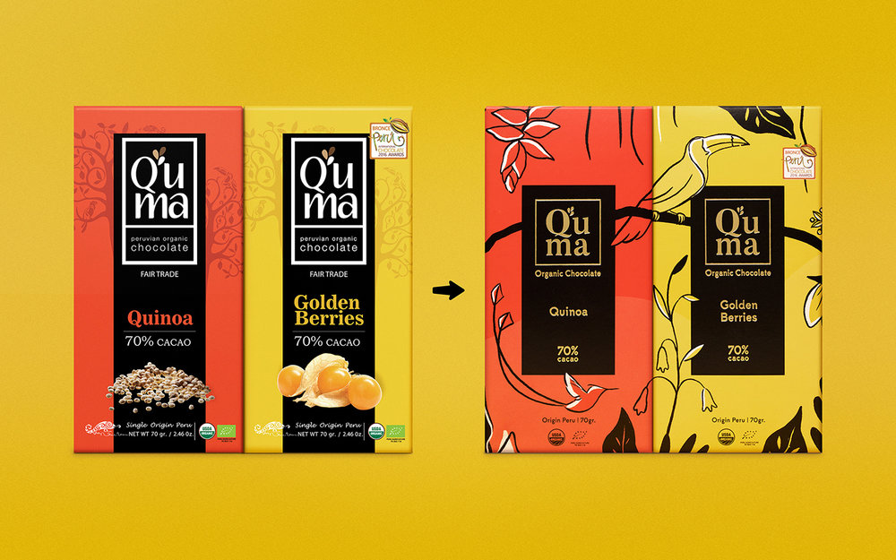
The goal: to create a more attractive packaging elevating Q’uma chocolate to a more premium look. During our research, we identified the following keywords: Peru, jungle, explore, farmers, exotic, elegant. We very much liked the combination between exotic and elegant.What if the packages form a landscape of the biodiverse flora and fauna of the Peruvian jungle? That way the brand will stand out at the point of sale. The next challenge was: to re-design the packaging showing an evolution and not a radical change. To achieve this, we deconstructed the original package and analyzed what elements we could preserve and what others we should re-do. We reused the black bar, the position of the logo and flavor. The colors were only adjusted in tones. Inside, information about the farmers or “Cacao partners” was added, as they are fundamental element to create the best chocolate.
CREDIT
- Agency/Creative: Sed Estudio
- Article Title: Q’uma Chocolate New Packaging, Inspired by Peruvian Jungle
- Organisation/Entity: Agency Commercial, Published
- Project Type: Packaging
- Agency/Creative Country: Peru
- Market Region: Multiple Regions
- Format: Box
- Substrate: Pulp Carton


