


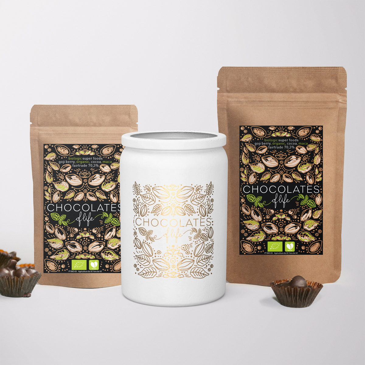
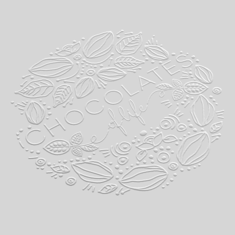
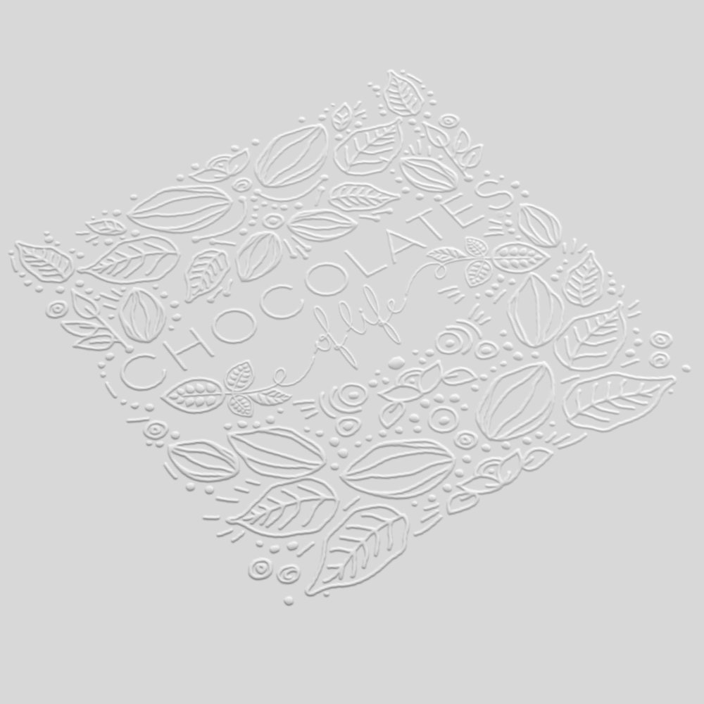
” Restyling logo and new packaging with ilustration for a vegan and organic chocolat breand. This is a exquisite chocolate and at the same time is a super food.
This recepie was created by the fouder of the company Dina Ornelas and she made this in to the project of her life.
The client hasked us to restyle the logo and the packaging so the visual impact is equal to the quality and flavour of the chocolate.
Not forgueting the importance of an organic and vegan visual percetion.
Illustrations were insprired on the cocoa fields and flora with a mix of indegena inspiration, we whanted to thave a beautiful patern the prepresents the purety of this dark chocolate.
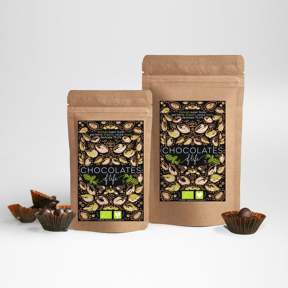
Wite because printed directy in the recicled paper gives a beautiful contrast with the brown paper, black because this is a 70,3% cocoa (dark chocolate) and green for organic, vegan and fairtrade.
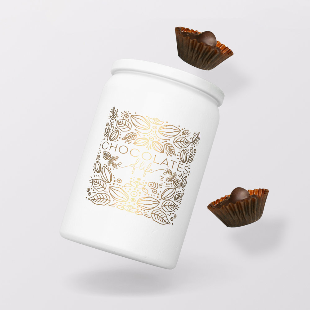
We created 3 diferent packagings for the same product., because we came to the conclusion that was necessery one bite size, for the inpulsive buy, a biguer one for consumption at home or with friends and a gift metal box for ofering in special ocasions.
We have two diferent size recicled paper bag printed with 3 direct colors wite, black and green. For the gift metal can we design a minimalist wite can with gold print the same illustration, giving an elegant and delicious image.”
CREDIT
- Agency/Creative: Can Design, Ana Lisa
- Article Title: Can Design – Chocolates of Life
- Project Type: Packaging
- Format: Can
- Substrate: Metal, Pulp Paper


