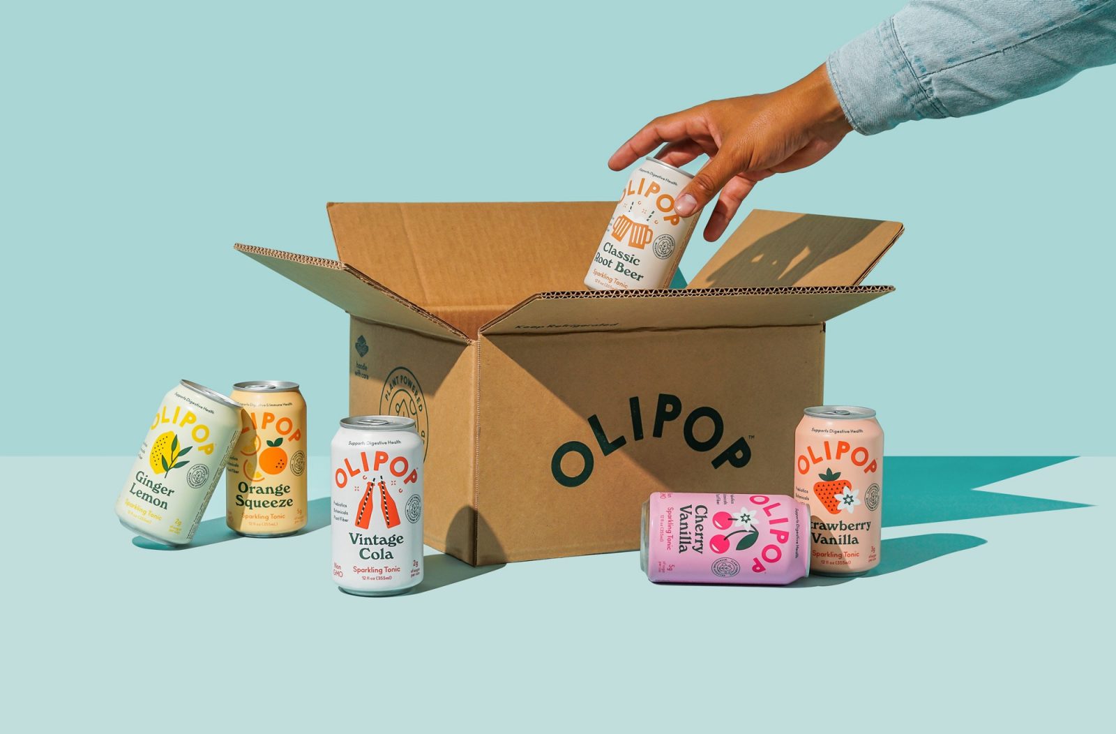
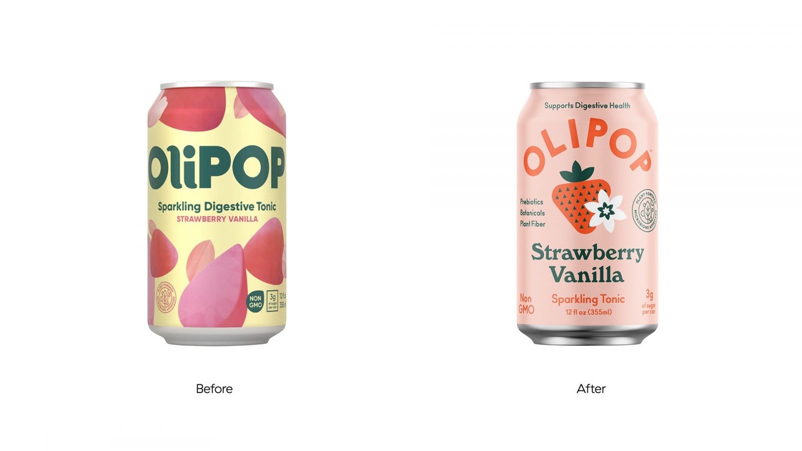
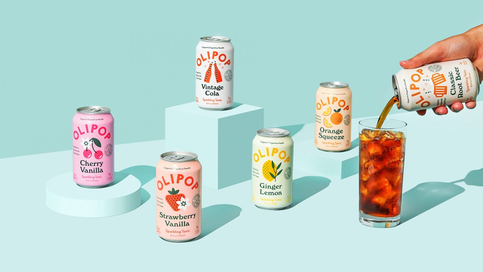
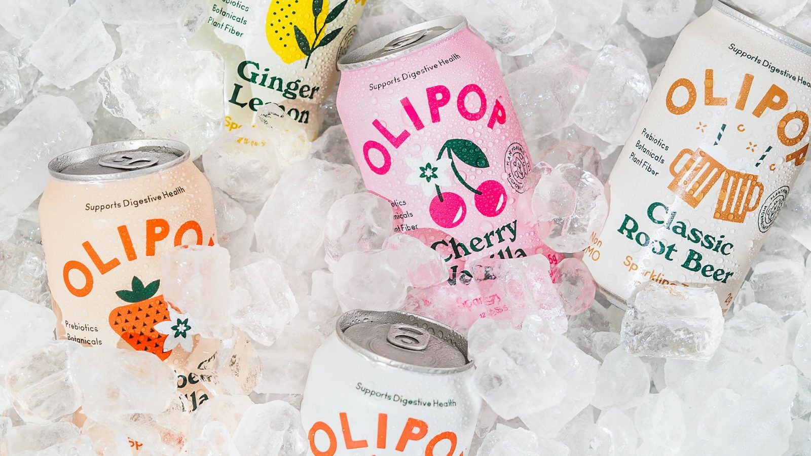
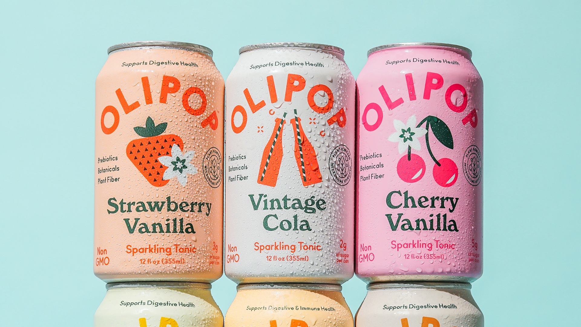
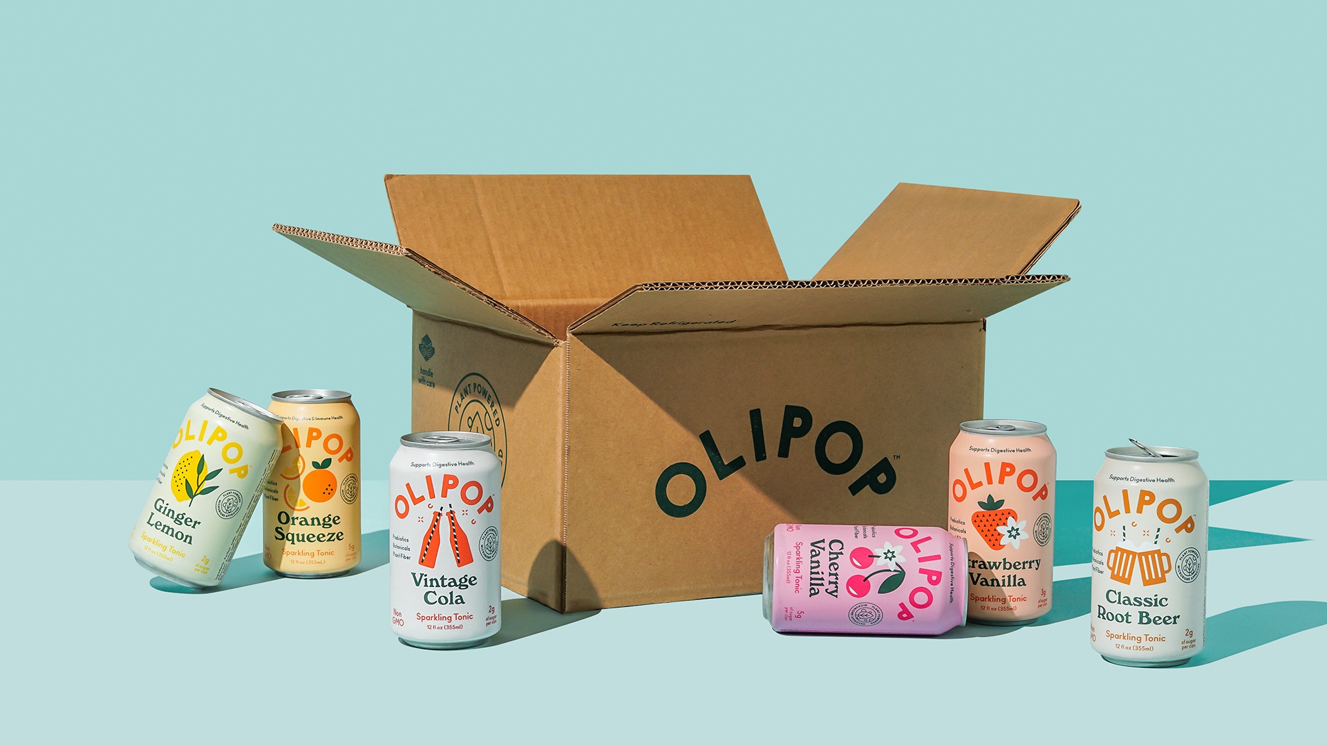
Olipop, the first clinically backed digestive health beverage, was desperately in need of a brand refresh. The identity and packaging design not only needed to appear refreshing, but it also needed to pack an informative punch to reflect the products benefits.
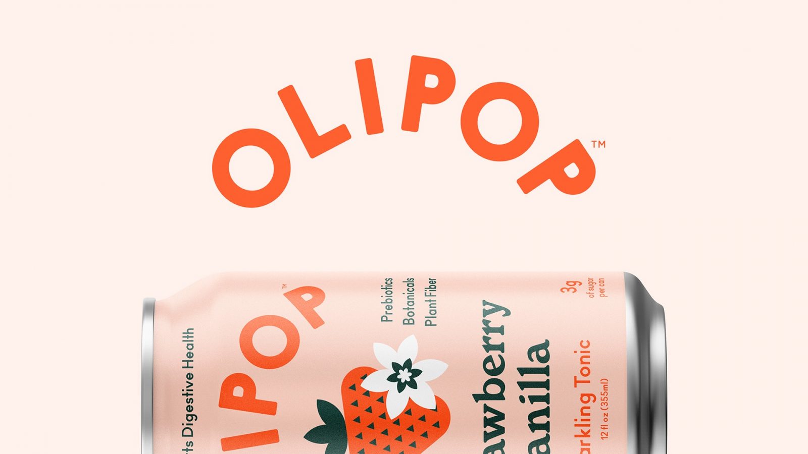
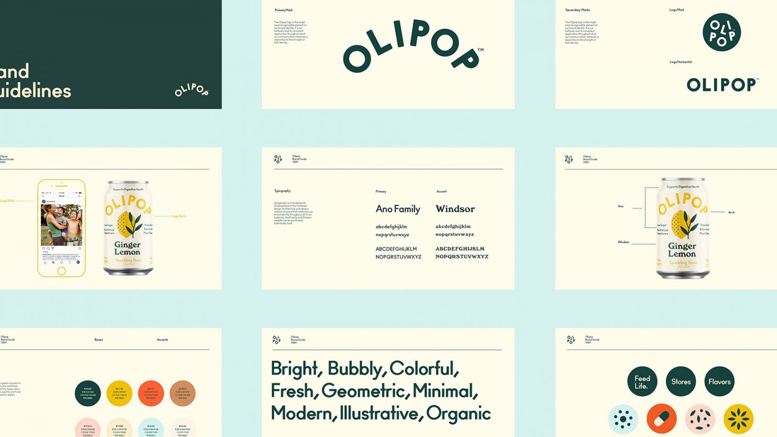
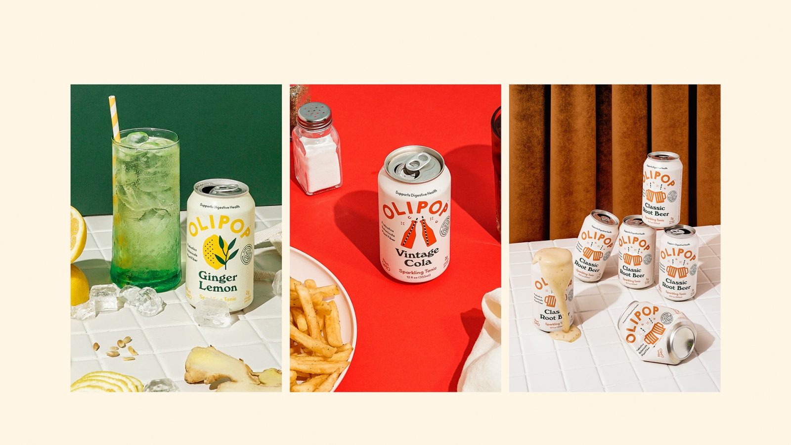
Our solution? Familiar and unique. The visual identity pairs contrasting typography and minimalistic illustration to create a sense of nostalgia to old style colas.
Working with the team at Olipop we created everything from the brand identity and visual style to packaging and collateral.


CREDIT
- Agency/Creative: Break Maiden
- Article Title: Packaging Design for Olipop Sparkling Tonics
- Organisation/Entity: Agency Commercial, Published
- Project Type: Packaging
- Project Status: Published
- Agency/Creative Country: United States America
- Market Region: North America
- Format: Can
- Substrate: Metal
FEEDBACK
Relevance: Solution/idea in relation to brand, product or service
Implementation: Attention, detailing and finishing of final solution
Presentation: Text, visualisation and quality of the presentation


