


This case study presents Agent Detail Inc. as a strong example of how branding and packaging design can create competitive value in a saturated automotive care market. Rather than relying solely on product claims or price positioning, the brand was built through a clear strategic narrative, a distinctive visual identity, and a packaging system designed to communicate both premium quality and usability.
One of the project’s greatest strengths is its authentic foundation. Agent Detail Inc. originated inside a paint and body shop, where the founders experienced firsthand the limitations of existing detailing products, including inconsistent performance and unreliable results. This operational background gave the brand a credible starting point and positioned the business around real expertise rather than manufactured marketing language.
From a strategic perspective, the branding work identified a valuable gap in the category. Many automotive care brands tend to fall into one of two extremes: either technically credible but visually conservative, or expressive and energetic but lacking premium perception. Agent Detail Inc. was positioned between these poles, occupying a more differentiated space where expressive branding and professional credibility could coexist.
The verbal concept built around the word “Agent” is especially effective because it creates both functional and symbolic meaning. The term suggests precision, mission, and technical execution, while also referencing the cleaning function of the products themselves. This gives the brand a clear narrative platform and transforms detailing from a routine maintenance task into a purposeful ritual, helping establish a more engaging relationship with the audience.
For a design-focused audience, the visual identity is one of the most relevant aspects of the project. The logo, centered on an eye surrounded by concentric circles, expresses surveillance, precision, and attention to detail in a simple and scalable way. The typography reinforces this positioning through a bold, italicized wordmark that conveys movement and intent, while the supporting type system ensures clarity across product labels, instructions, and digital applications.
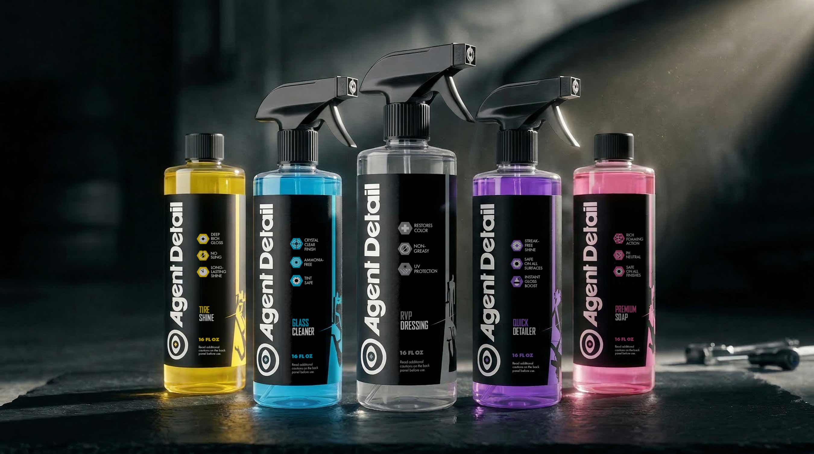
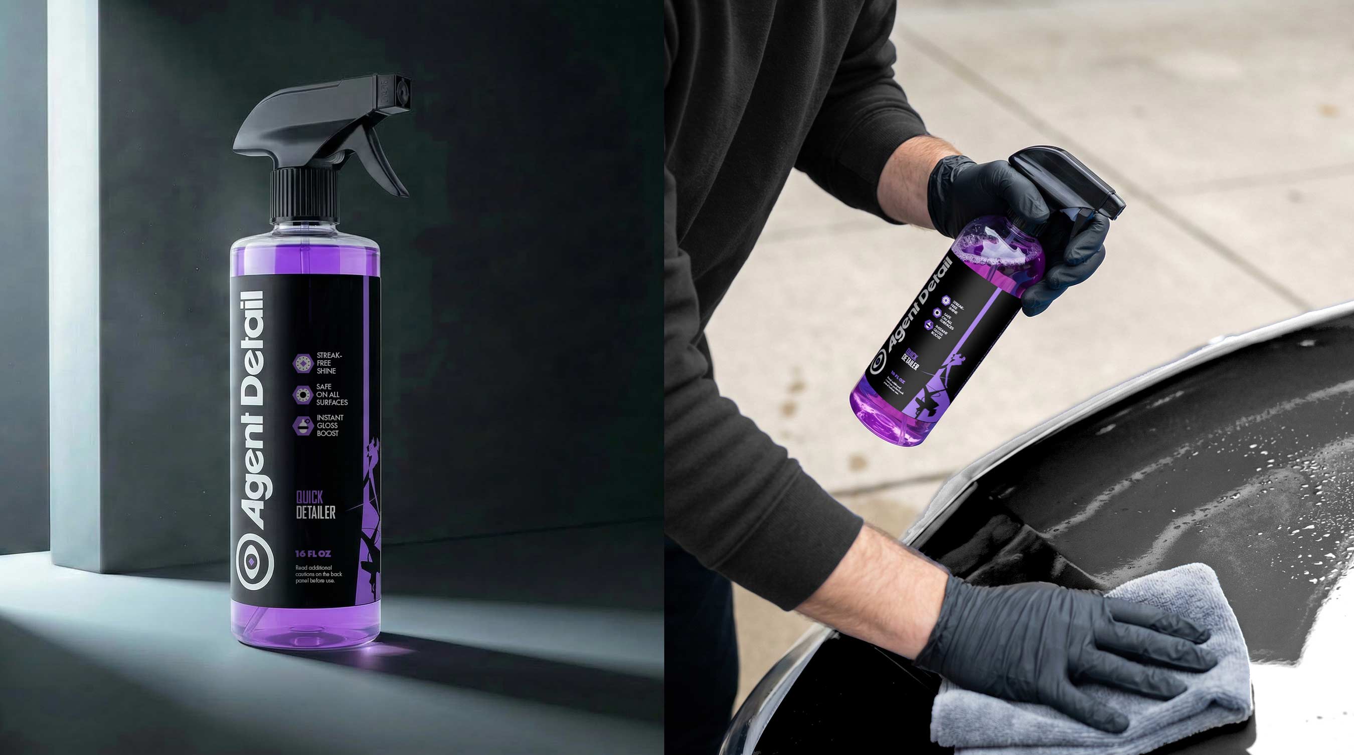
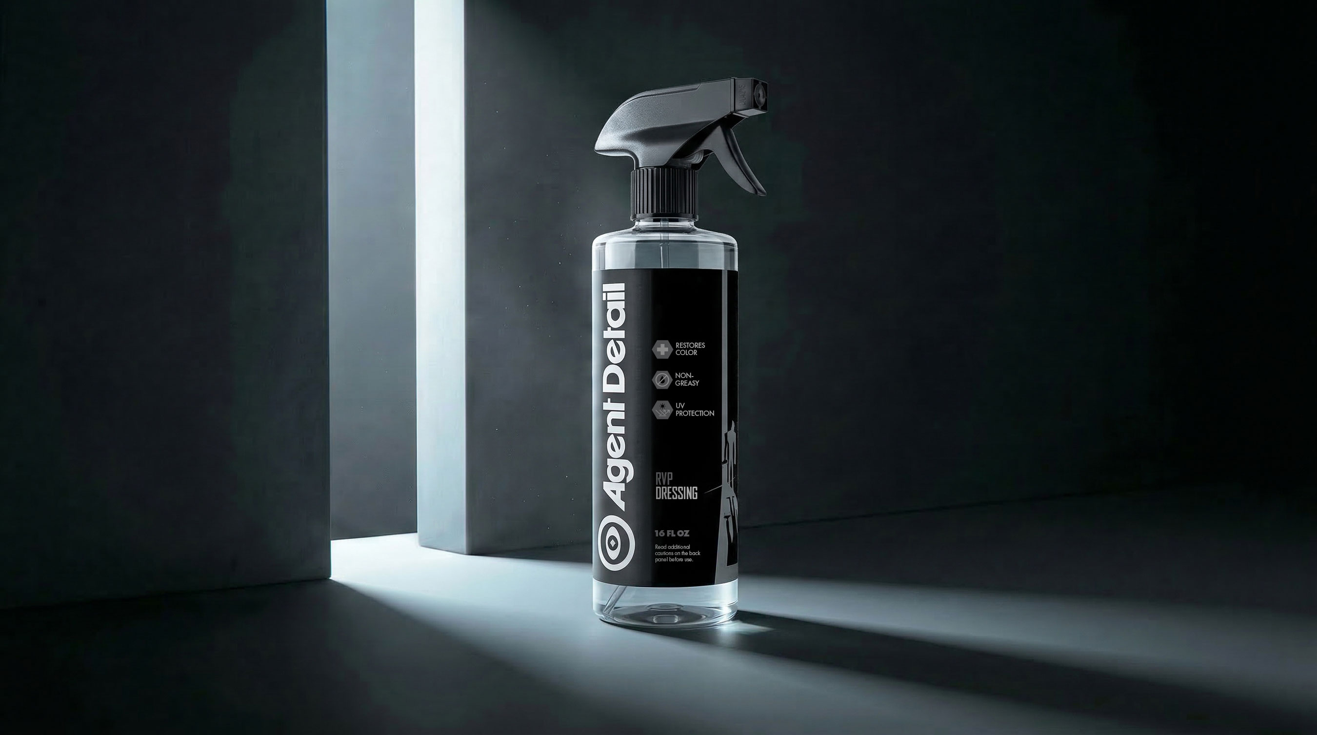
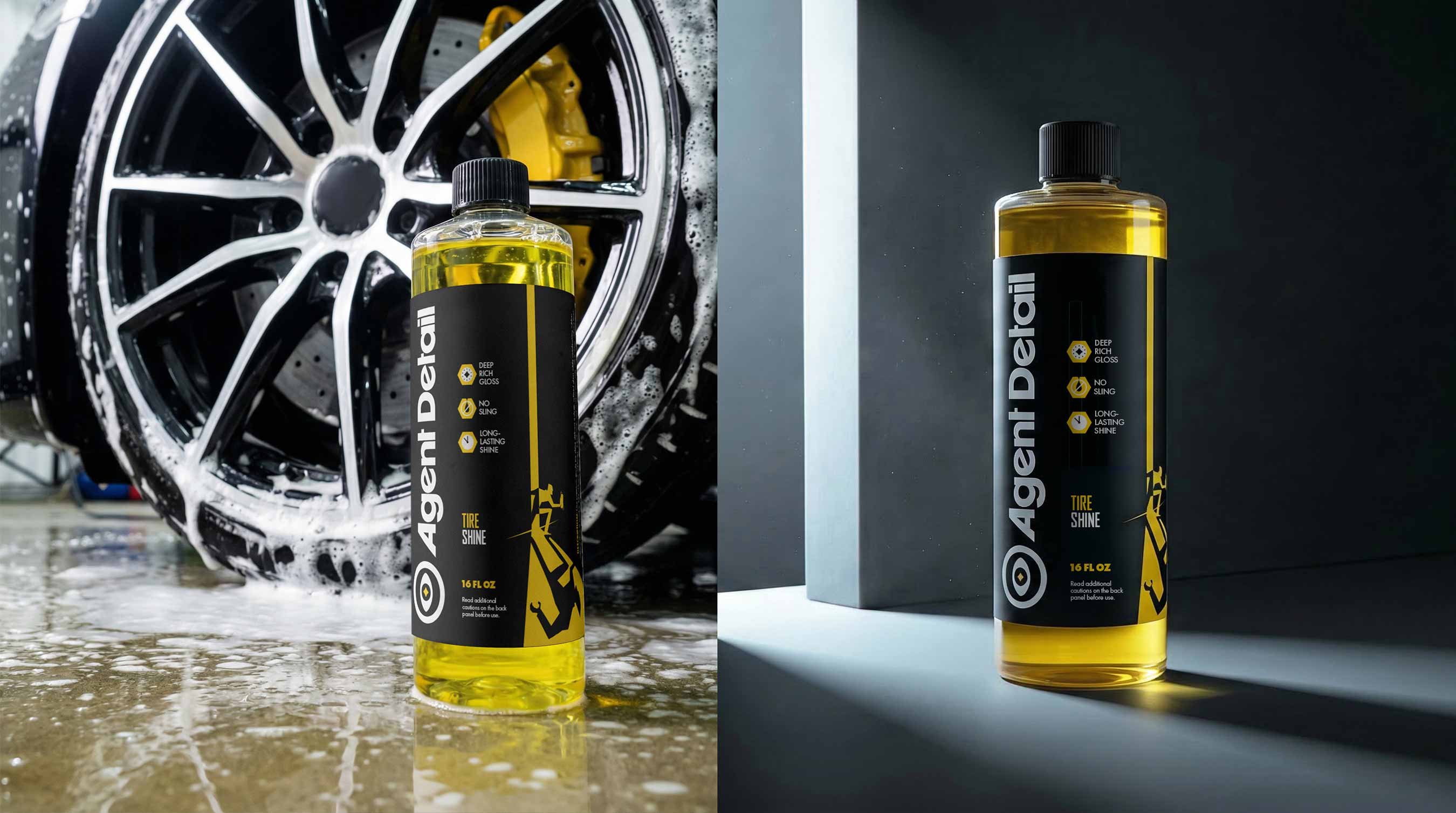
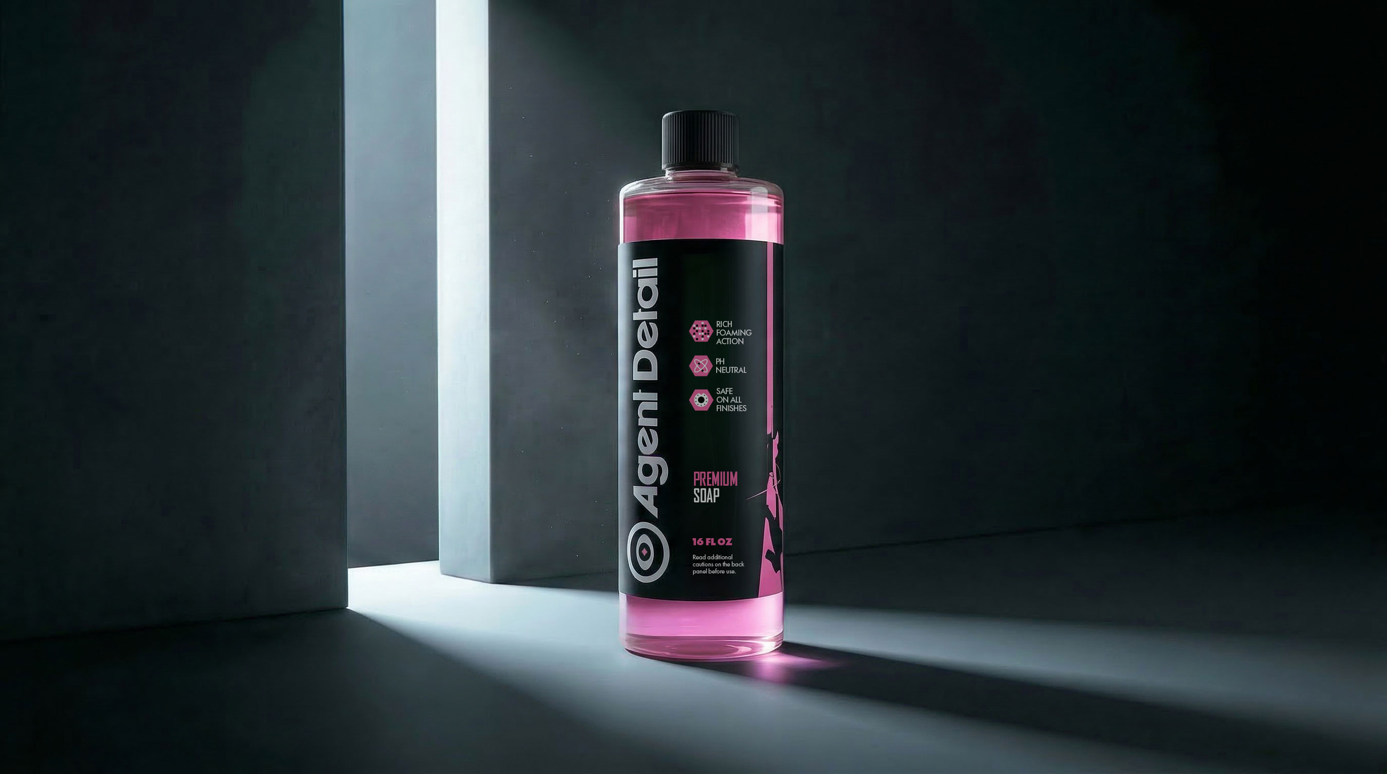
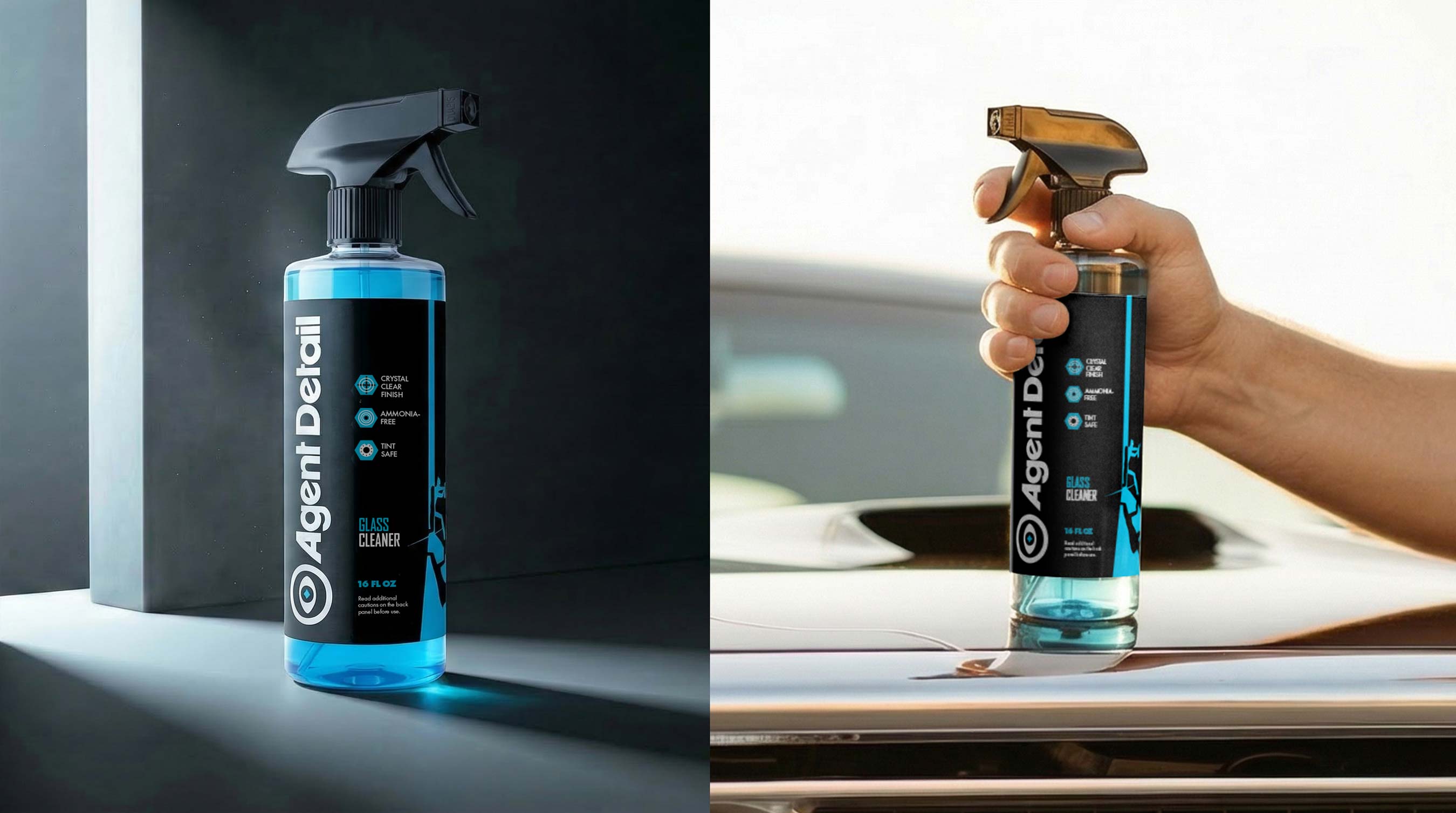
The color strategy is also particularly well resolved from a packaging design perspective. Black serves as the core structural color, reinforcing a premium aesthetic, while white provides contrast and improves legibility. Product-specific accent colors create immediate differentiation across the line, improving navigation within the portfolio and increasing shelf recognition without sacrificing visual cohesion.
Packaging plays a central role in the success of the brand system. The labels were designed not only to stand out visually but also to organize information in a way that supports both retail conversion and product usability. Bold typography, coded color cues, benefit icons, and clear instructions work together to create a packaging architecture that feels functional, intentional, and commercially strong.
Material and finish decisions further strengthen the perception of quality. Matte black labels with a soft-touch effect elevate the tactile experience, while UV-resistant printing responds to the practical conditions of garages and workshop environments. These choices demonstrate how packaging can operate simultaneously as a branding device, a usability tool, and a signal of value.
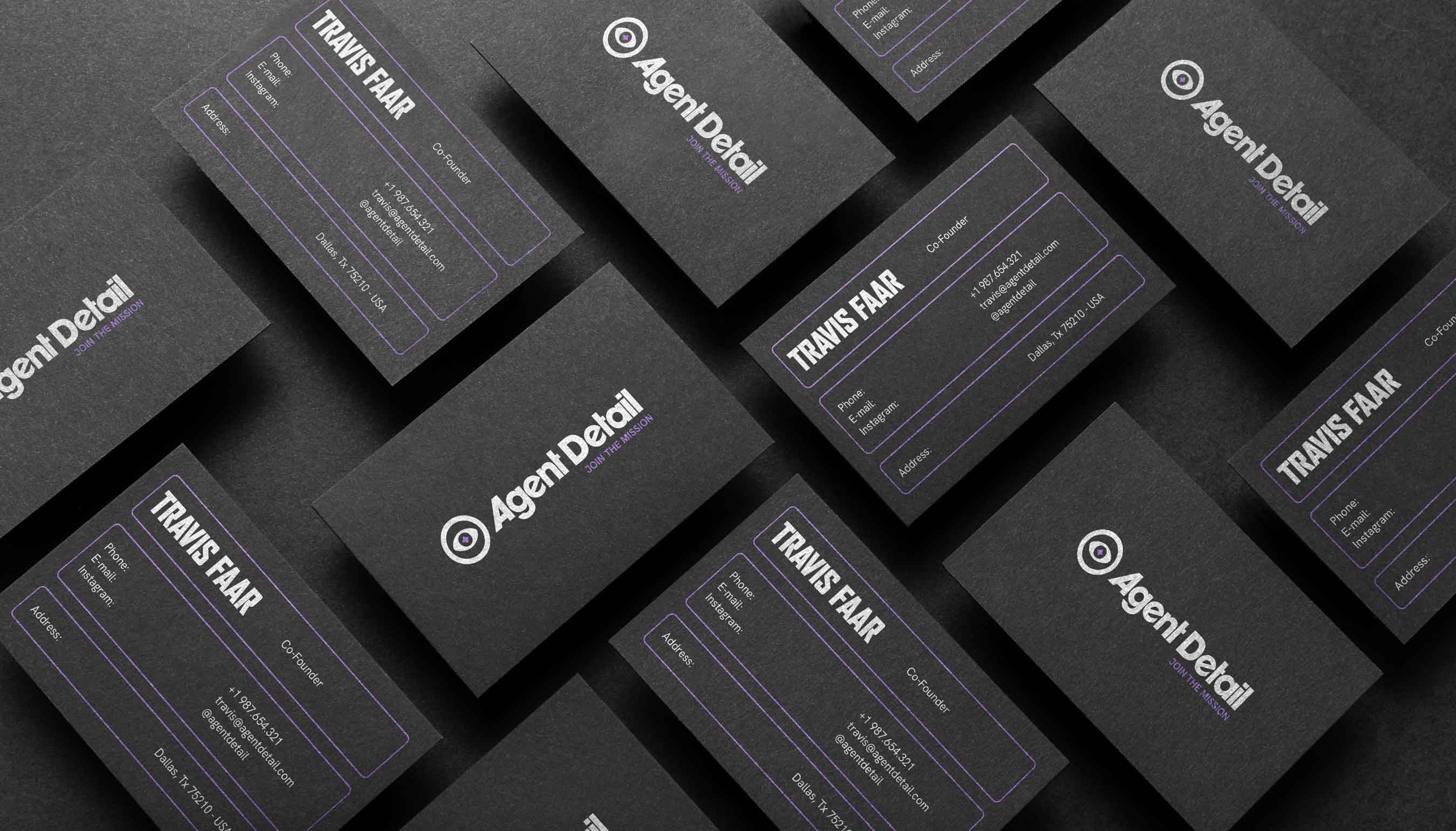
Another important aspect of the project is its ecosystem thinking. Merchandise, digital touchpoints, and community-oriented communication extend the brand beyond the product container and help build a recognizable world around it. For branding and packaging professionals, this is a valuable reminder that the most effective systems are rarely isolated artifacts; they are integrated experiences in which naming, identity, packaging, and audience participation all reinforce one another.
Overall, Agent Detail Inc. stands out as a well-structured case of strategic branding expressed through packaging design. It shows how a new brand can earn relevance in a crowded market by aligning positioning, visual language, materiality, and narrative into a cohesive system. For designers, the project offers a clear example of how packaging can move beyond decoration and become a central instrument of differentiation, perception, and brand meaning.


CREDIT
- Agency/Creative: HolmanDesign®
- Article Title: HolmanDesign Develops Agent Detail Inc Automotive Care Packaging as a Strategic Brand System Built on Precision and Performance
- Organisation/Entity: Agency
- Project Type: Identity
- Project Status: Published
- Agency/Creative Country: United States
- Agency/Creative City: Pelotas
- Market Region: North America
- Project Deliverables: Brand Design, Brand Guidelines, Brand Identity, Brand Strategy, Brand Tone of Voice, Branding, Graphic Design, Identity System, Label Design, Logo Design, Packaging Design
- Industry: Chemical
- Keywords: branding, packaging design, label design, automotive branding, car detailing branding
-
Credits:
Graphic Designer: Felipe Corrêa Holman


