


Independent brand design agency Hunt Hanson has partnered with Henkell Freixenet to redesign Henkell, the iconic sparkling wine brand that marries French cuvée artistry with German precision. The redesign marks a bold new chapter in Henkell’s 170-year story, reimagining its most recognisable brand elements to celebrate both heritage and modern luxury.
Building on its global reputation as a symbol of celebration, Henkell’s refreshed identity redefines the brand with renewed confidence, uniting the range in a cohesive world of modern elegance and distinctive presence.
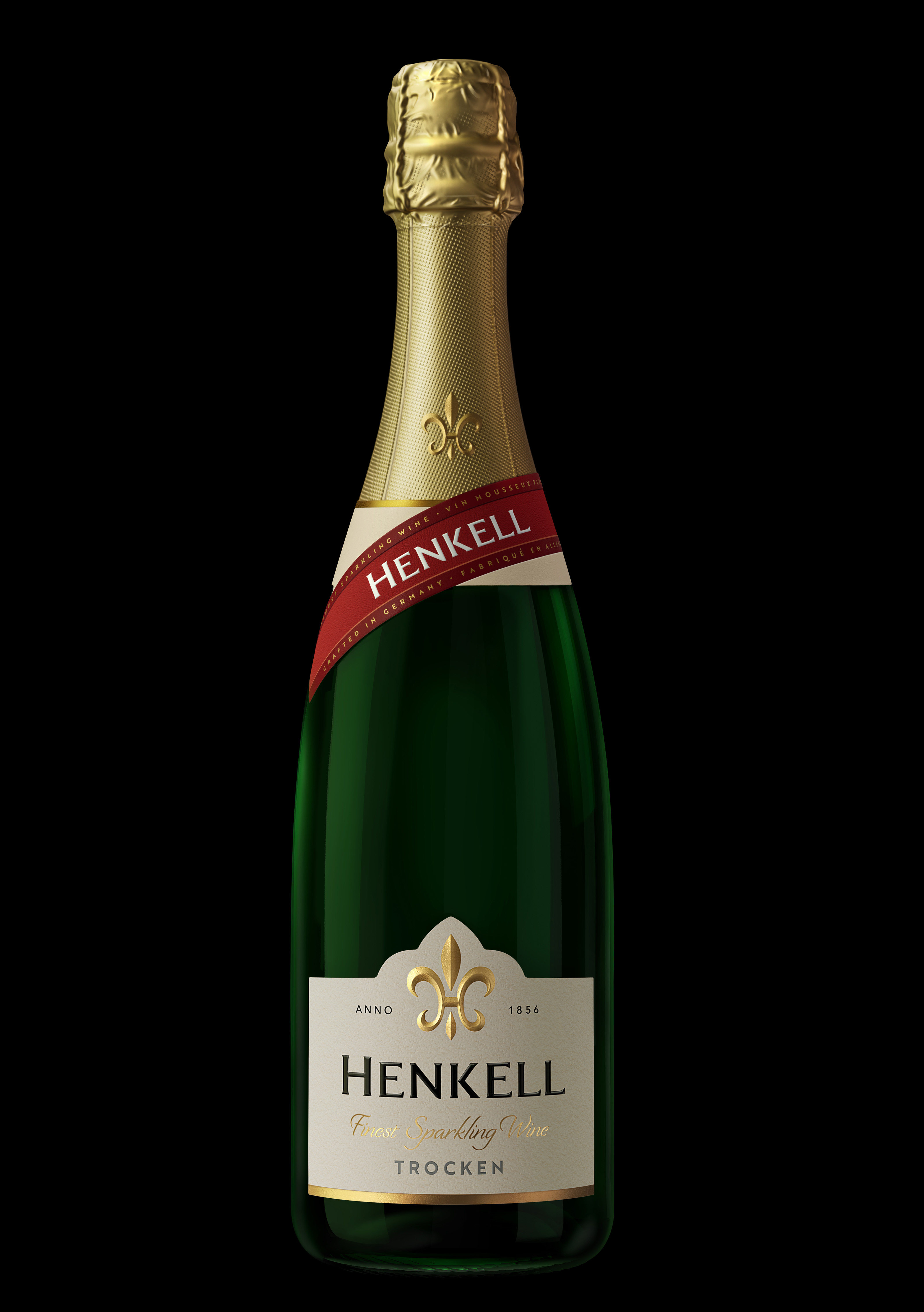
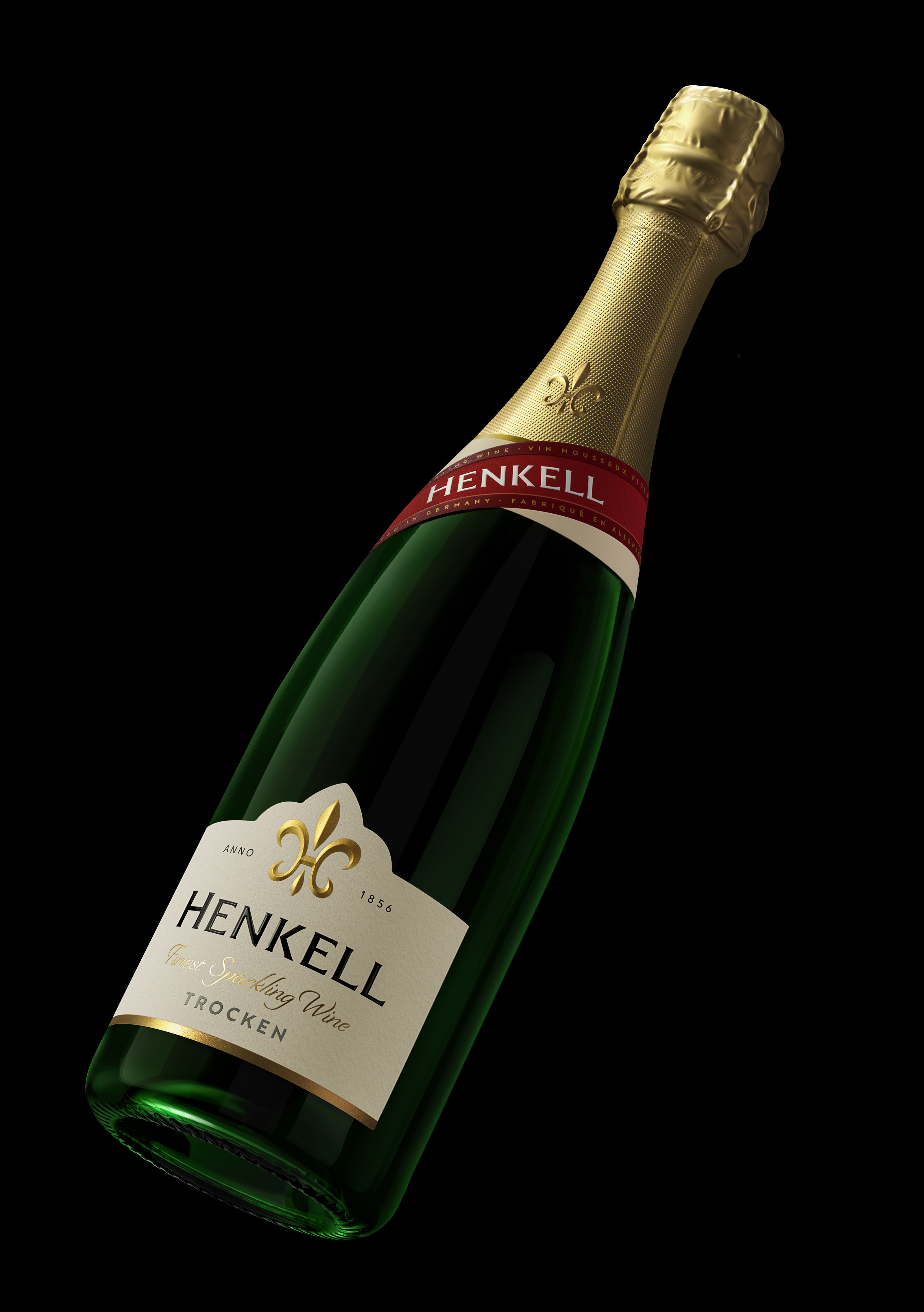
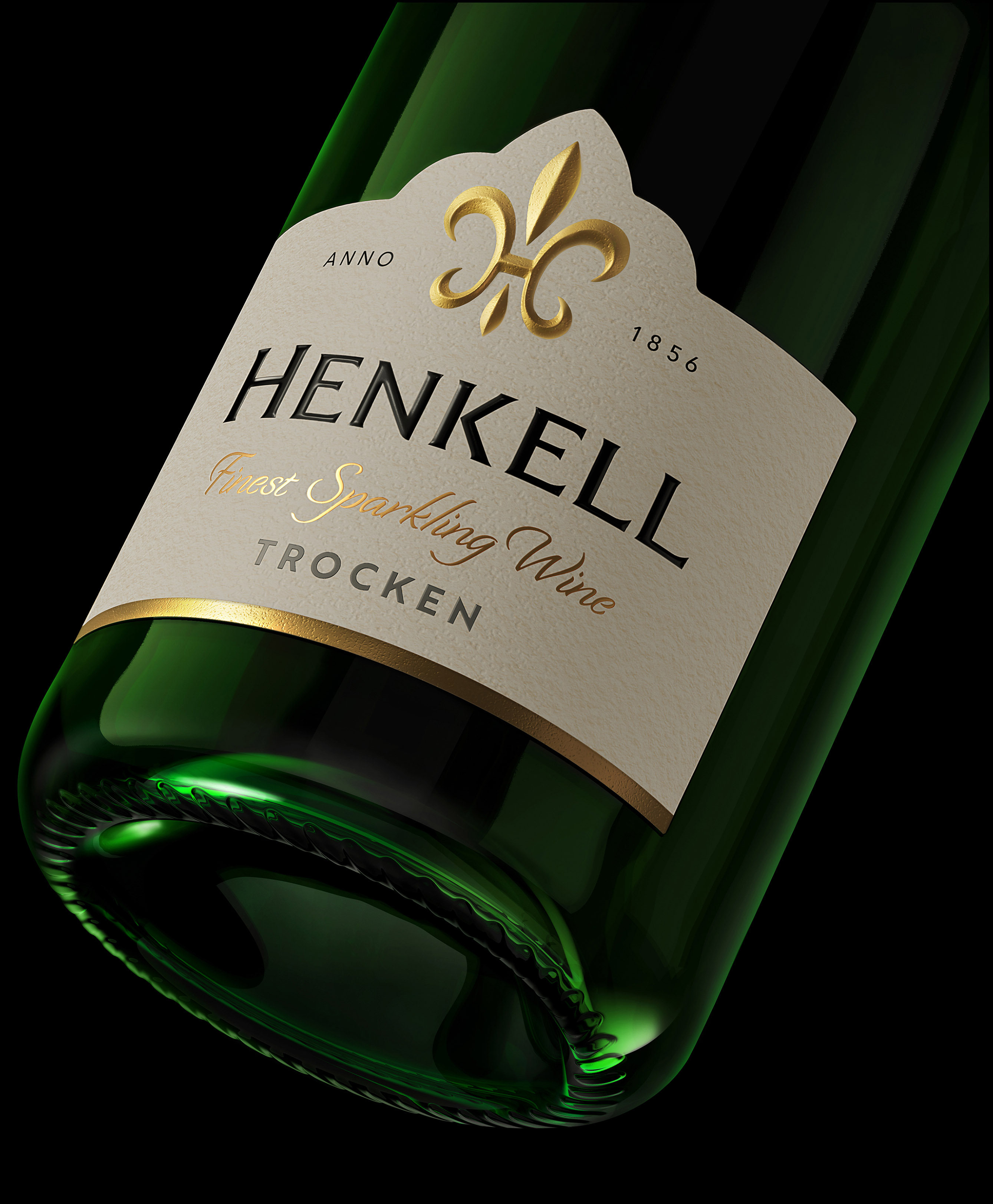
At the heart of this evolution is the brand’s fleur-de-lis. Once a generic motif, it has now been meticulously redrawn by Hunt Hanson to incorporate Henkell’s own ‘H’, transforming it into a distinctive and ownable monogram with a prominent position on the capsule. This integration gives the symbol deeper meaning and a timeless, unmistakable identity that now serves as the cornerstone of the brand. As a symbolic link between France and Wiesbaden, the lily forges a strong connection with the brand’s unique origins and references the brand’s roots. From this, Hunt Hanson developed an entire bespoke type, turning a single mark of distinction into the foundation of a design language.
The new Henkell font echoes the brand’s balance of heritage and precision with its refined serifs and carefully calibrated weights. Delivering greater legibility, presence, and premium appeal, it is a typeface designed to live confidently both on and off pack.
Henkell’s signature red ribbon, another hallmark of the brand, has also been reinterpreted. Once wrapped neatly around the neck, the red Henkell banderole now drapes across the bottle as a familiar communication symbol. This evolution celebrates the ribbon as a true heritage mark, amplifying its emotional resonance and making it an integral, rather than decorative, element of the design.
Nick Hanson, Creative Director at Hunt Hanson, explains, “Our ambition was to bring renewed meaning and modernity to Henkell’s iconic assets. By reimagining the fleur-de-lis as a monogram and crafting a font that echoes the logo’s design DNA, we’ve given the brand a stronger, more ownable voice. One that feels confidently classic yet distinctly contemporary.”
The transformation powerfully comes on a limited edition of Henkel Trocken, where the newly designed fleur-de-lis monogram is amplified into a striking, celebratory pattern that elevates the sense of occasion.
Maren Lahm, CMO at Henkell Freixenet, comments, “Hunt Hanson’s work for Henkell achieves something truly special – a design that feels both timeless and brand new. Every element has been reimagined with meaning, giving the brand greater clarity, elegance, and impact. It’s a transformation that strengthens Henkell’s presence in a competitive global market and sets us up for continued growth while staying true to everything consumers worldwide already love about the brand.”

CREDIT
- Agency/Creative: Hunt Hanson
- Article Title: Hunt Hanson Reimagines Henkell’s Heritage With a Modern Monogram and So Much More
- Organisation/Entity: Agency
- Project Type: Packaging
- Project Status: Published
- Agency/Creative Country: United Kingdom
- Agency/Creative City: London
- Market Region: Europe
- Project Deliverables: Brand Design, Brand Redesign, Packaging Design
- Format: Bottle
- Industry: Food/Beverage
- Keywords: Sparkling Wine, Germany, Redesign, Fleur-de-Lis, packaging, brand design,
-
Credits:
Creative Director: Nick Hanson


