


Ten years ago, women’s nutrition was barely a category of its own, with shelves either empty or filled with products built on outdated thinking. In 2017, Free Soul set out to change that, launching products designed specifically for women and quickly building momentum where others hadn’t.
Growth came fast. Certain products saw viral success on platforms like TikTok. But while individual products built loyal followings, the brand itself struggled to keep pace.
Wellbeing for being a woman
Market research Free Soul conducted with their community revealed a clear truth: women don’t want to be told how to live, but met where they are. This inspired the idea at the core of the brand – ‘Wellbeing for being a woman’ – an immediately accessible, ownable concept that celebrates the real, beautiful everyday lives of women everywhere.
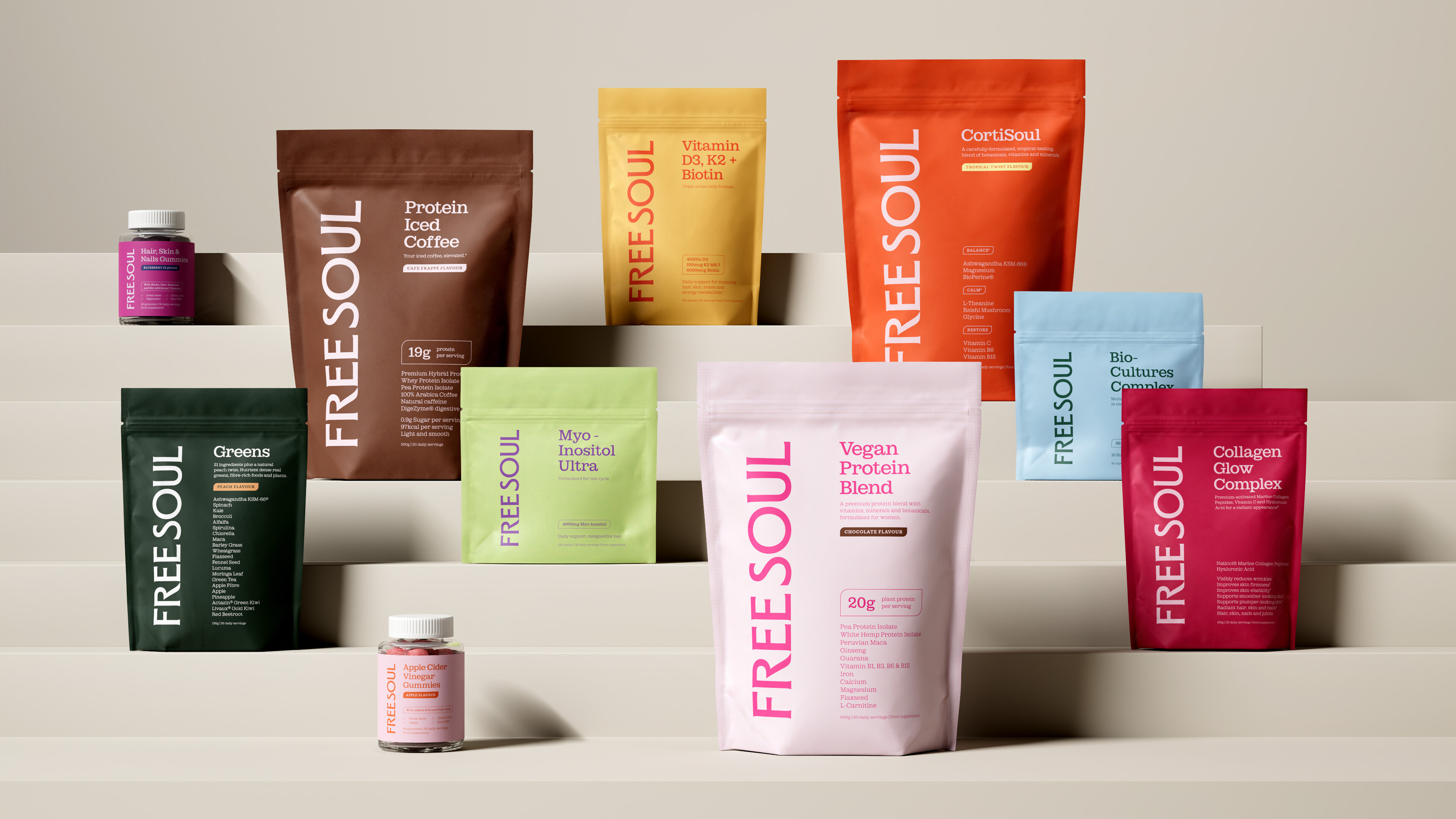
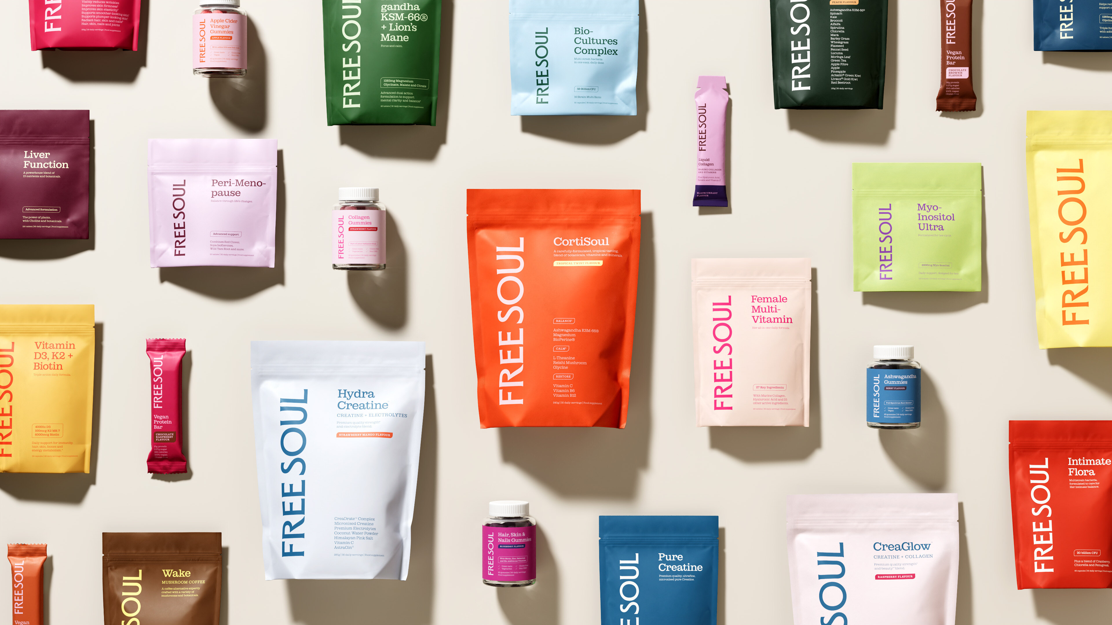
One of Free Soul’s biggest challenges was the need for a packaging system simple enough to unify a rapidly expanding range, while distinctive enough to cut through a crowded category and build both brand and product loyalty.
Ragged Edge’s solution was a structure that puts brand and product on equal footing, to make it easy to navigate across categories while keeping Free Soul recognisable at every touchpoint. It was designed to be simple in how it works, but built to handle complexity behind the scenes. The system can be managed day-to-day by a small team, without losing consistency as the range grows, acting as a true brand asset.
To help build on that success, and scale into new products and environments, Free Soul worked with branding company Ragged Edge to refresh its brand and create a system that could scale without losing the connection that made it resonate in the first place.
“From the beginning, we’ve focused on building products that genuinely support women, shaped by what they tell us and what they need,” says Arjun Sofat, CEO and co-founder at Free Soul. “This rebrand is about bringing that into sharper focus, and making sure the brand can grow with them.”
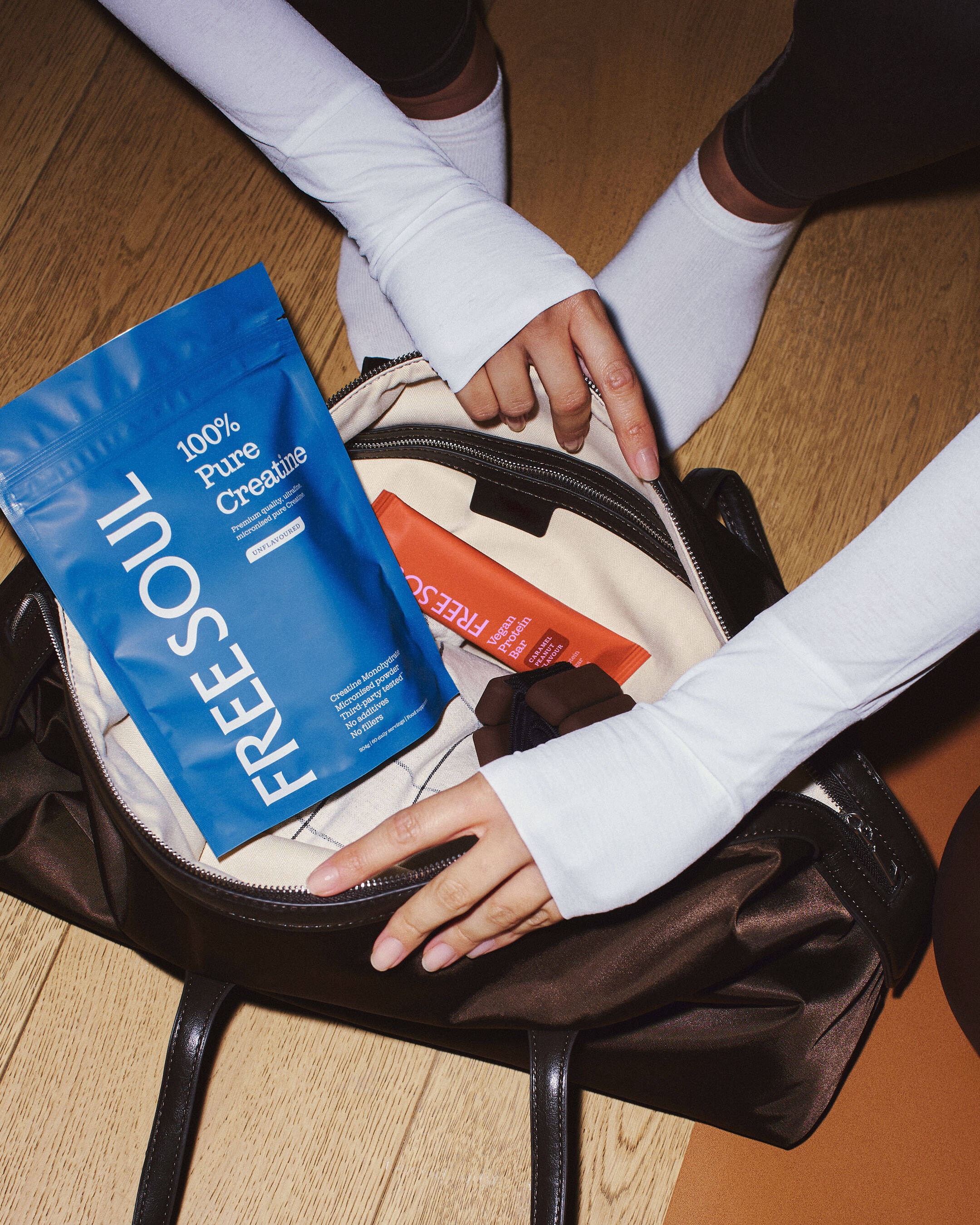
“It needed to work as hard in the real world as it did in principle,” says Andrew Kitchener, Creative Director at Ragged Edge. “Across TikTok, Shopify and the shelf, without breaking or needing to be rethought each time.”
A vertical logo anchors every pack, becoming a core brand code. A pared-back palette of Garnet and Soul White allows colour to differentiate across categories, with accents of pink referencing the brand’s origins. Typography balances editorial character with clarity, supporting both storytelling and product information.
The brand voice runs on empathy and accessibility. “So much wellness copy talks at women. We wanted Free Soul to feel like it actually knows them — the if-you-know-you-know stuff, the empathy that doesn’t tip into preachiness,” says Eloise Pates, Copywriter at Ragged Edge.
Set to scale
“We’d been talking about a rebrand for a long time, but it really clicked once we stepped back and listened to our community,” says Lucy Murray, brand director at Free Soul. “Our new brand brings everything into one place in a way that feels consistent, but still personal as we grow. Free Soul is helping define what women’s wellbeing looks like when it’s built around real lives, not passing moments.”
The new identity has been rolled out across Free Soul’s full product range, as well as its website, social channels and marketing, supporting its first ever move into retail with nationwide listings in Tesco and Boots. In-person events and collaborations continue to deepen their connection with an ever-expanding community.
CREDIT
- Agency/Creative: Ragged Edge
- Article Title: Ragged Edge Rebrands Free Soul as the Home of Women’s Wellbeing
- Organisation/Entity: Agency
- Project Type: Identity
- Project Status: Published
- Agency/Creative Country: United Kingdom
- Agency/Creative City: London
- Market Region: Global
- Project Deliverables: Brand Design, Brand Guidelines, Brand Identity, Brand Redesign, Brand Strategy, Brand Tone of Voice, Branding, Copywriting, Design, Identity System, Logo Design, Packaging Design, Rebranding
- Industry: Health Care
- Keywords: packaging redesign wellness free soul rebrand ragged edge women's wellbeing viral nutrition
-
Credits:
Executive Creative Director: Andrew Kitchener


