


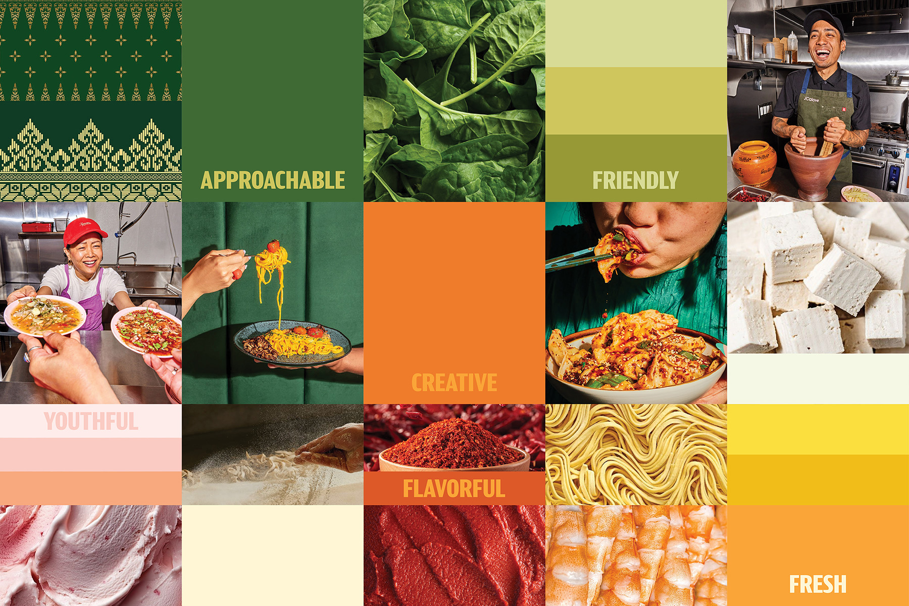
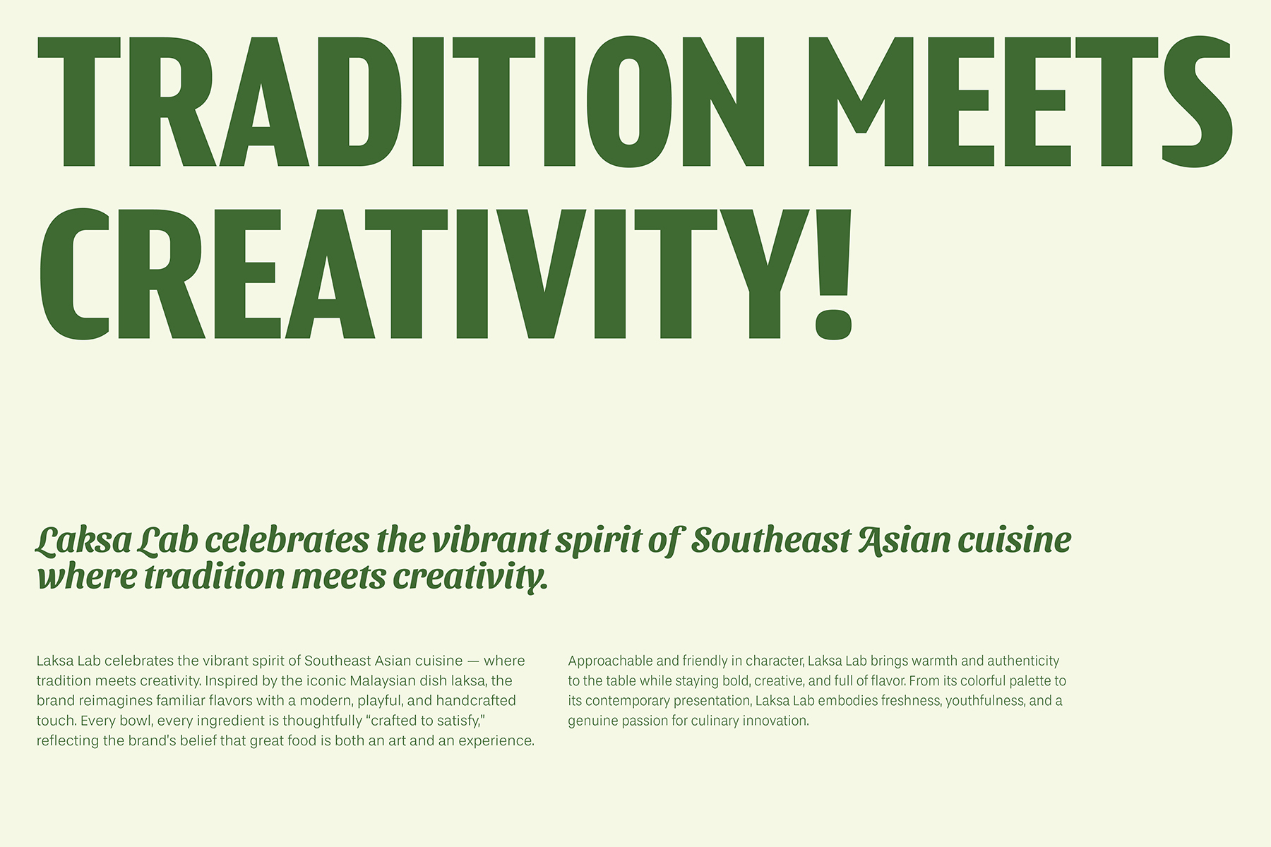
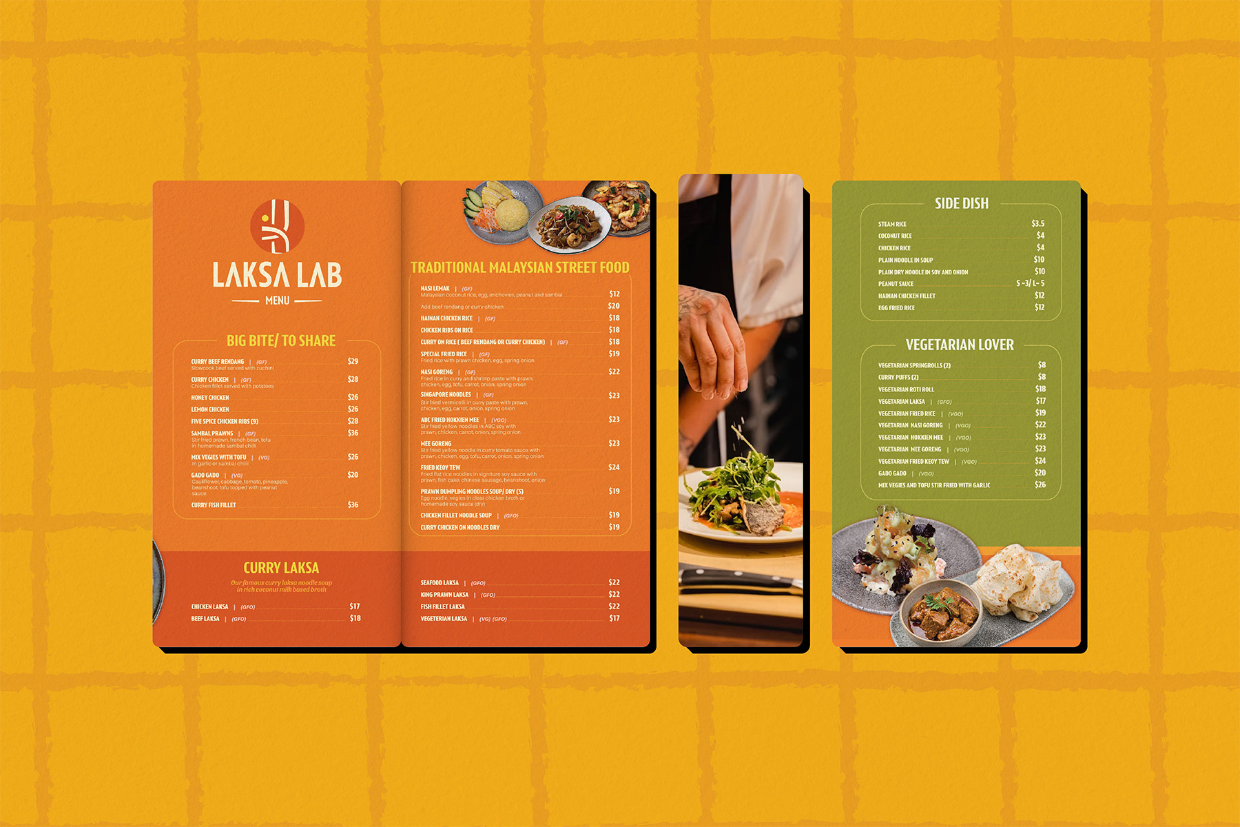
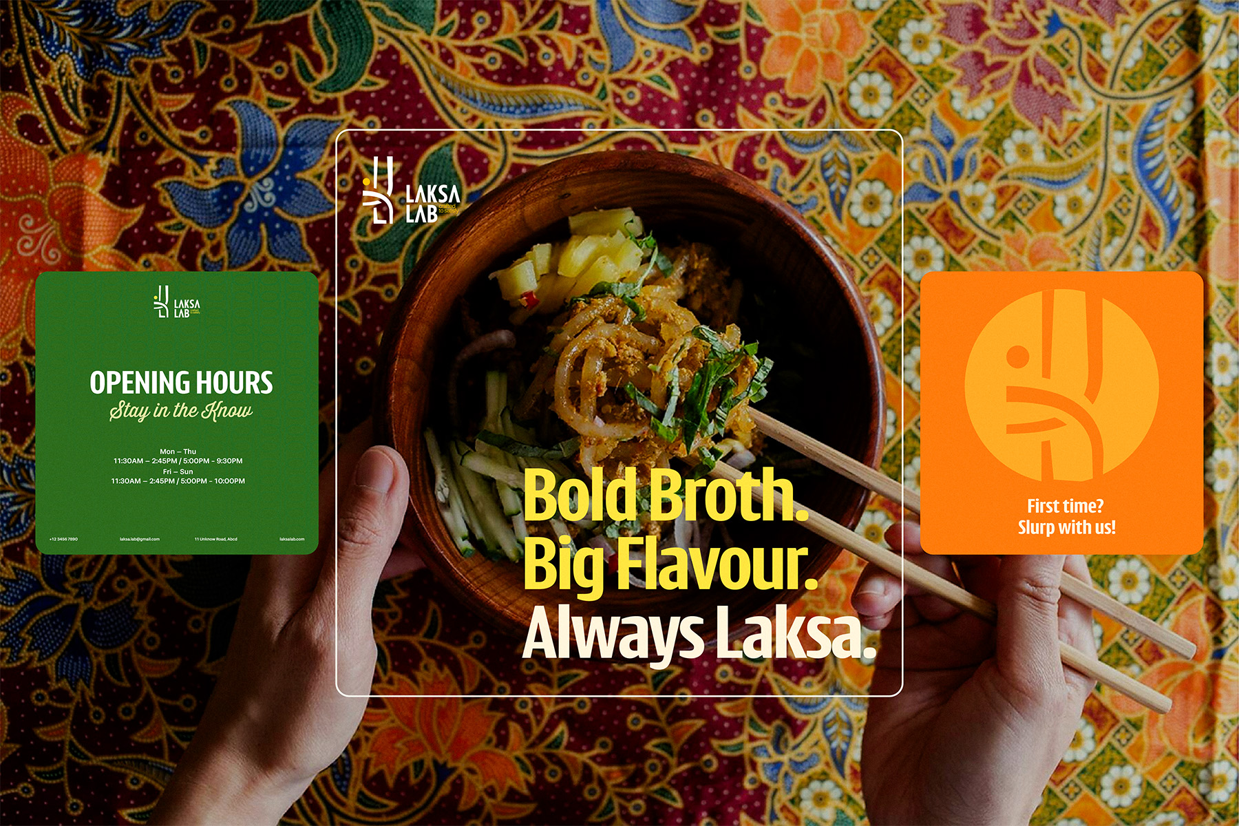
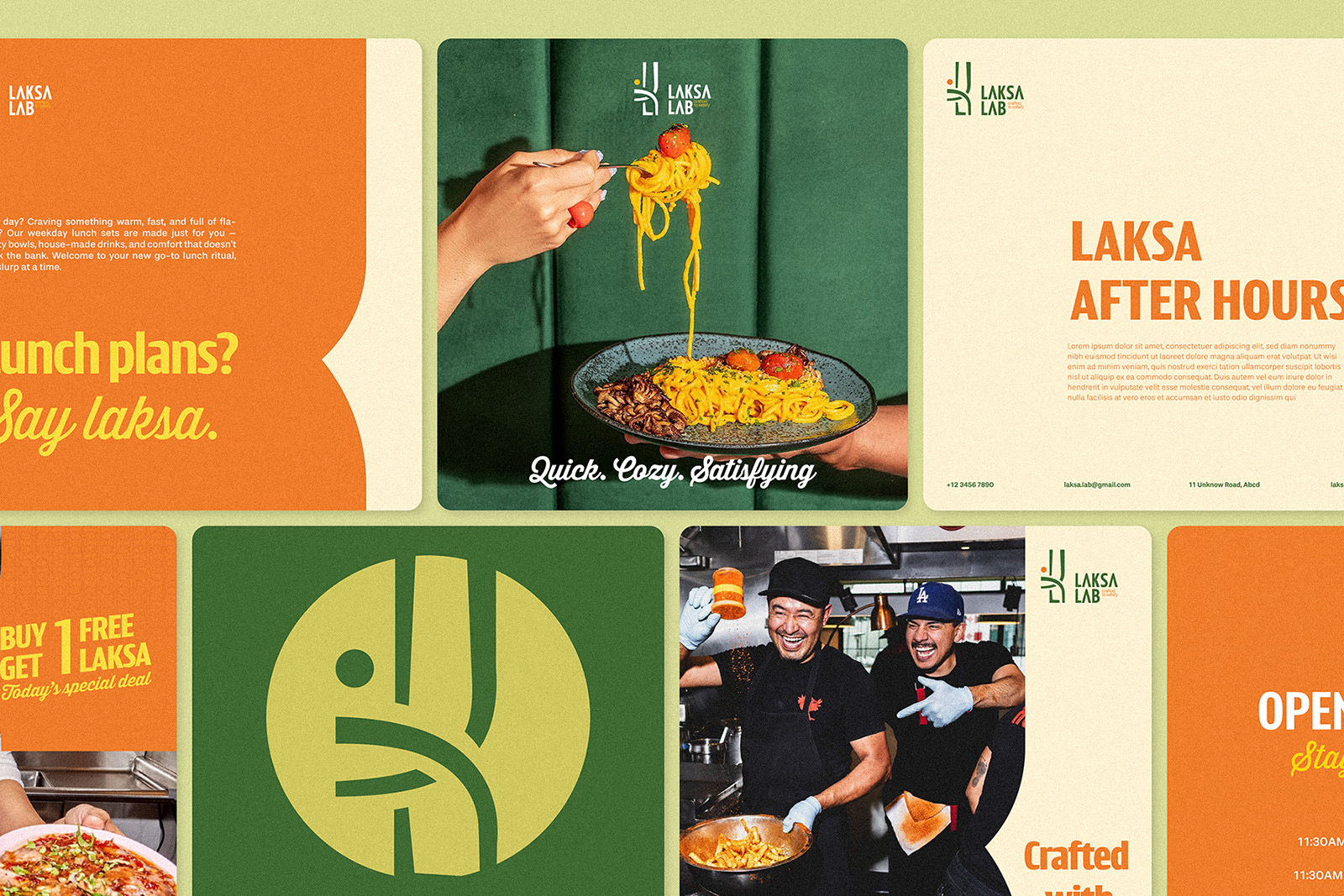
Laksa Lab celebrates the vibrant spirit of Southeast Asian cuisine, where tradition meets creativity. Inspired by the iconic Malaysian dish laksa, the brand reimagines familiar flavors with a modern, playful, and handcrafted touch. Every bowl, every ingredient is thoughtfully “crafted to satisfy,” reflecting the brand’s belief that great food is both an art and an experience. Approachable and friendly in character, Laksa Lab brings warmth and authenticity to the table while staying bold, creative, and full of flavor. From its colorful palette to its contemporary presentation, Laksa Lab embodies freshness, youthfulness, and a genuine passion for culinary innovation.
BRAND NAMING
– “Laksa” is the name of a signature Malaysian (and Singaporean) dish — a spicy noodle soup that embodies the essence of Malay cuisine, which the restaurant aims to highlight. Using the dish’s name as the brand immediately conveys the business’s field and its distinctive flavor identity.
– “Lab” (short for “laboratory”) represents creativity, experimentation, and culinary craftsmanship. It suggests that the restaurant doesn’t just serve traditional dishes but also innovates with modern or fusion styles, creating a unique and experiential dining journey.
– “Laksa Lab” preserves the cultural authenticity of Malay cuisine while evoking a sense of modernity, creativity, and originality — perfectly suited for boutique or experience-driven F&B concepts.
LOGO MEANING
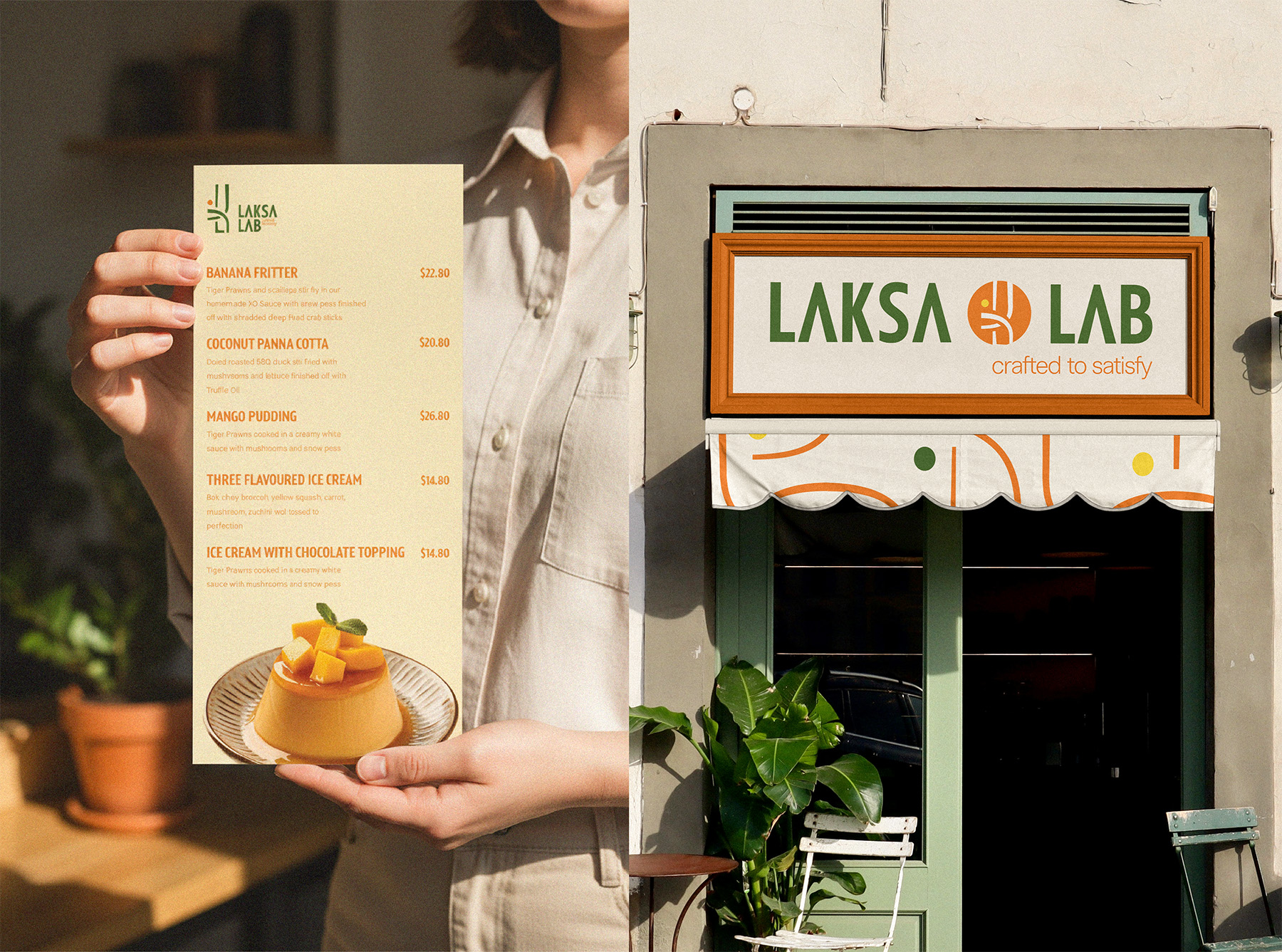
The Laksa Lab logo is derived from the stylized letters L, K, and A in the brand name, using fluid curves and abstract geometric forms to express the spirit of creativity, experimentation, and craftsmanship that defines the “Lab.” Inspired by Southeast Asian visual culture, the design blends modern geometry with traditional aesthetics, creating a mark that feels both contemporary and culturally grounded. Paired with the tagline “Crafted to Satisfy,” it reflects a distinctive culinary identity aimed at boutique, fusion, or experience-driven F&B models that seek to combine dining with artistic flair.
IDENTIFICATION PATTERN
The brand visual pattern is derived directly from the logo’s graphic elements. By deconstructing and extending the shapes within the logomark—curved lines, vertical strokes, and circular accents—the pattern creates a consistent visual language. This approach ensures coherence across applications, reinforces brand recognition, and allows flexible adaptation while maintaining a strong connection to the core identity.
Overall, Laksa Lab’s identity blends cultural authenticity with modern simplicity, creating a cohesive, memorable, and scalable brand system across packaging, retail, and digital platforms.


CREDIT
- Agency/Creative: Brio Creative
- Article Title: Laksa Lab Celebrates the Vibrant Spirit of Southest Asian Cuisine, Brand Identity by Brio Studio
- Organisation/Entity: Agency
- Project Type: Graphic
- Project Status: Published
- Agency/Creative Country: Vietnam
- Agency/Creative City: Hanoi
- Market Region: Oceania
- Project Deliverables: Art Direction, Brand Design, Brand Experience, Brand Naming, Logo Design
- Industry: Food/Beverage
- Keywords: branding, malaysian food, logo design, brand identity design
-
Credits:
Project Manager: Huong Vu
Graphic Designer: Ha Vy, Chi Linh, Tuan Phuong


