


**GlowMode: Performance Skincare Designed for Real Life**
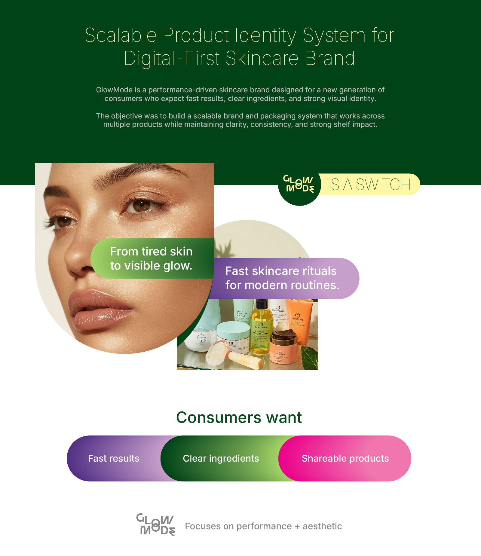
GlowMode is a skincare concept built on a clear insight. Self-care today is highly aesthetic, but results often feel secondary. This brand addresses that gap by focusing on visible outcomes, direct ingredient communication, and products that fit into fast everyday routines.
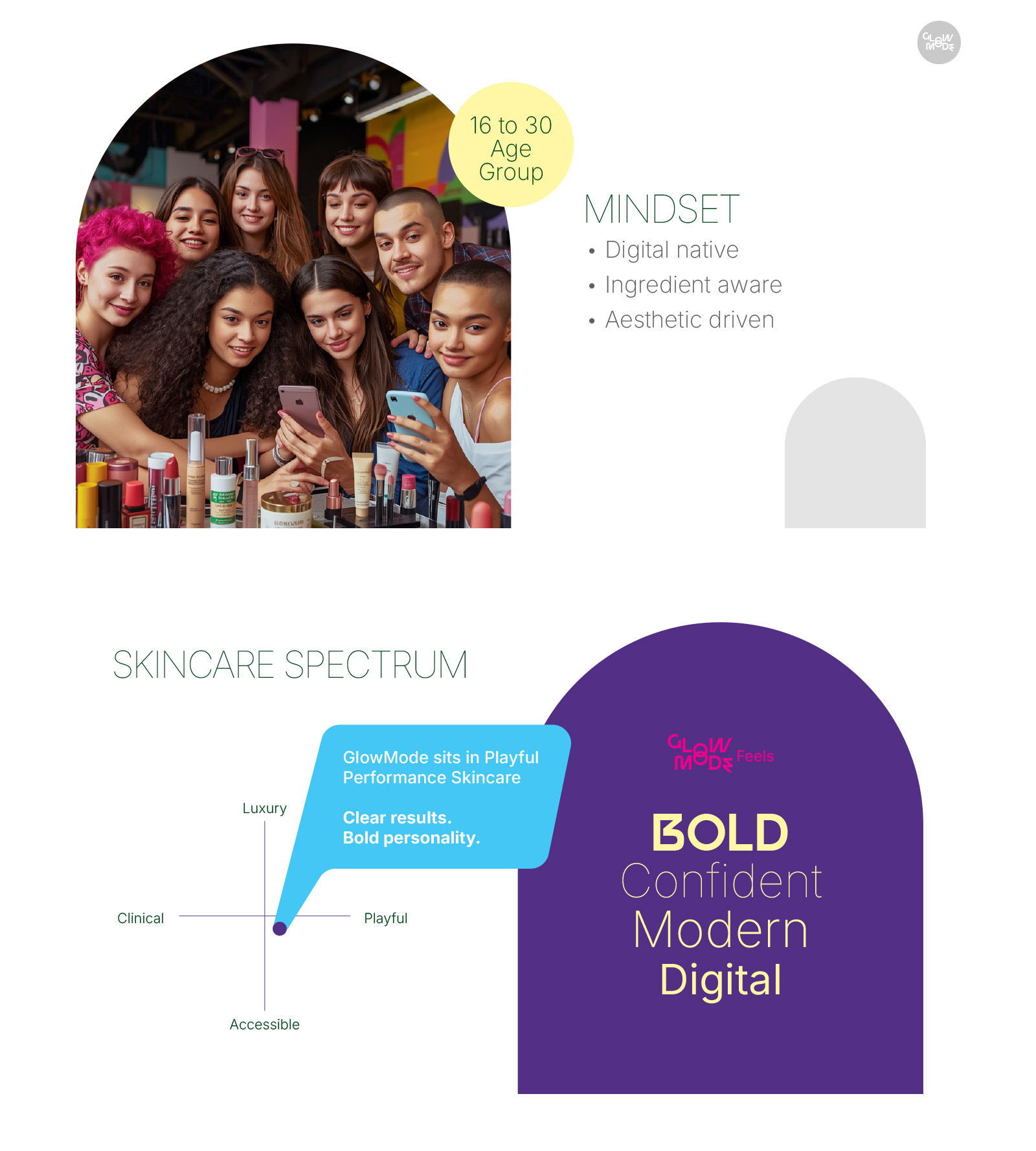
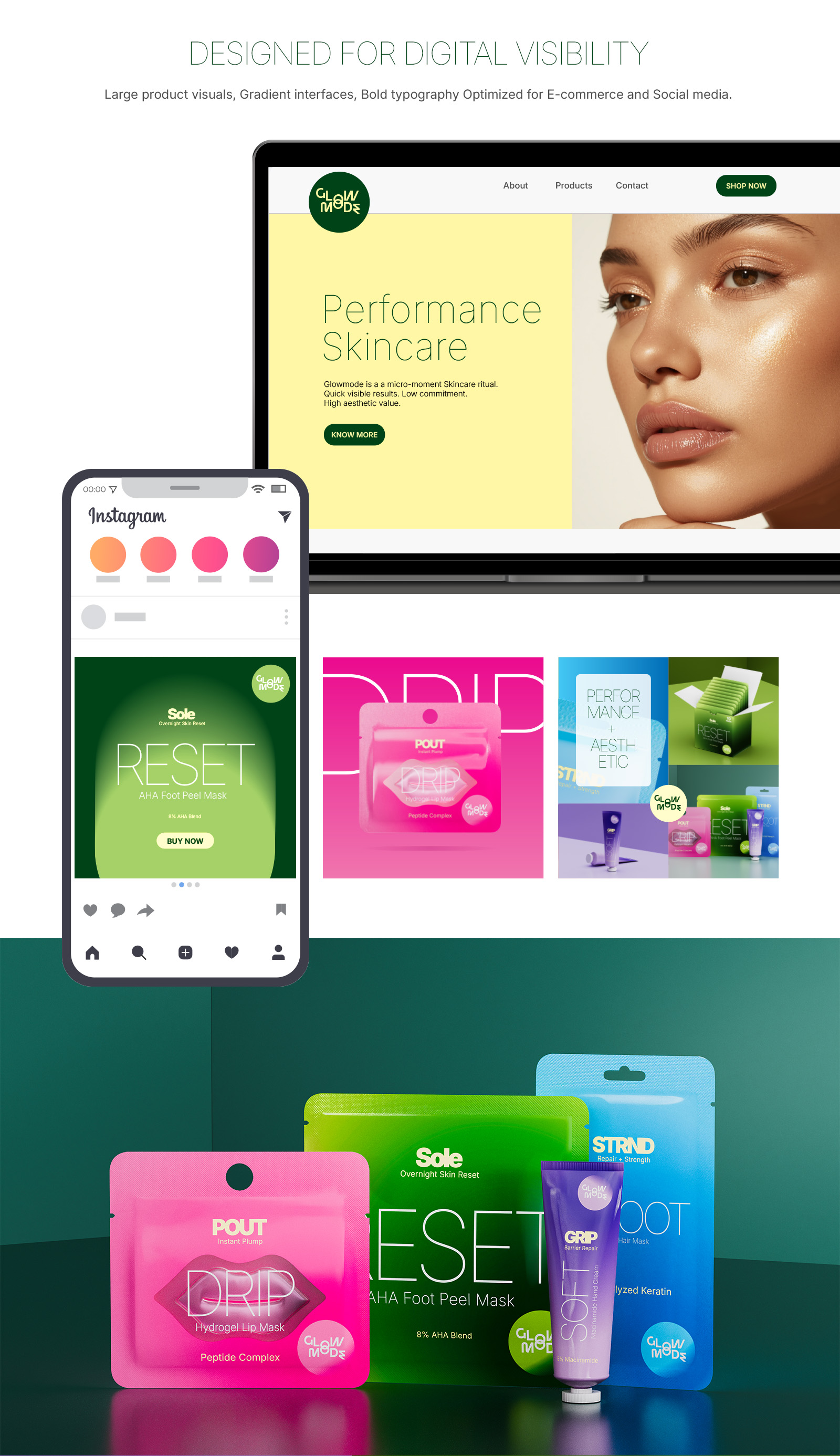
Designed for Gen Z consumers, GlowMode sits between clinical skincare and expressive beauty. It avoids the sterile look of pharmaceutical brands while also rejecting overly soft, botanical-driven visuals. The identity is built around clarity, speed, and strong visual presence.
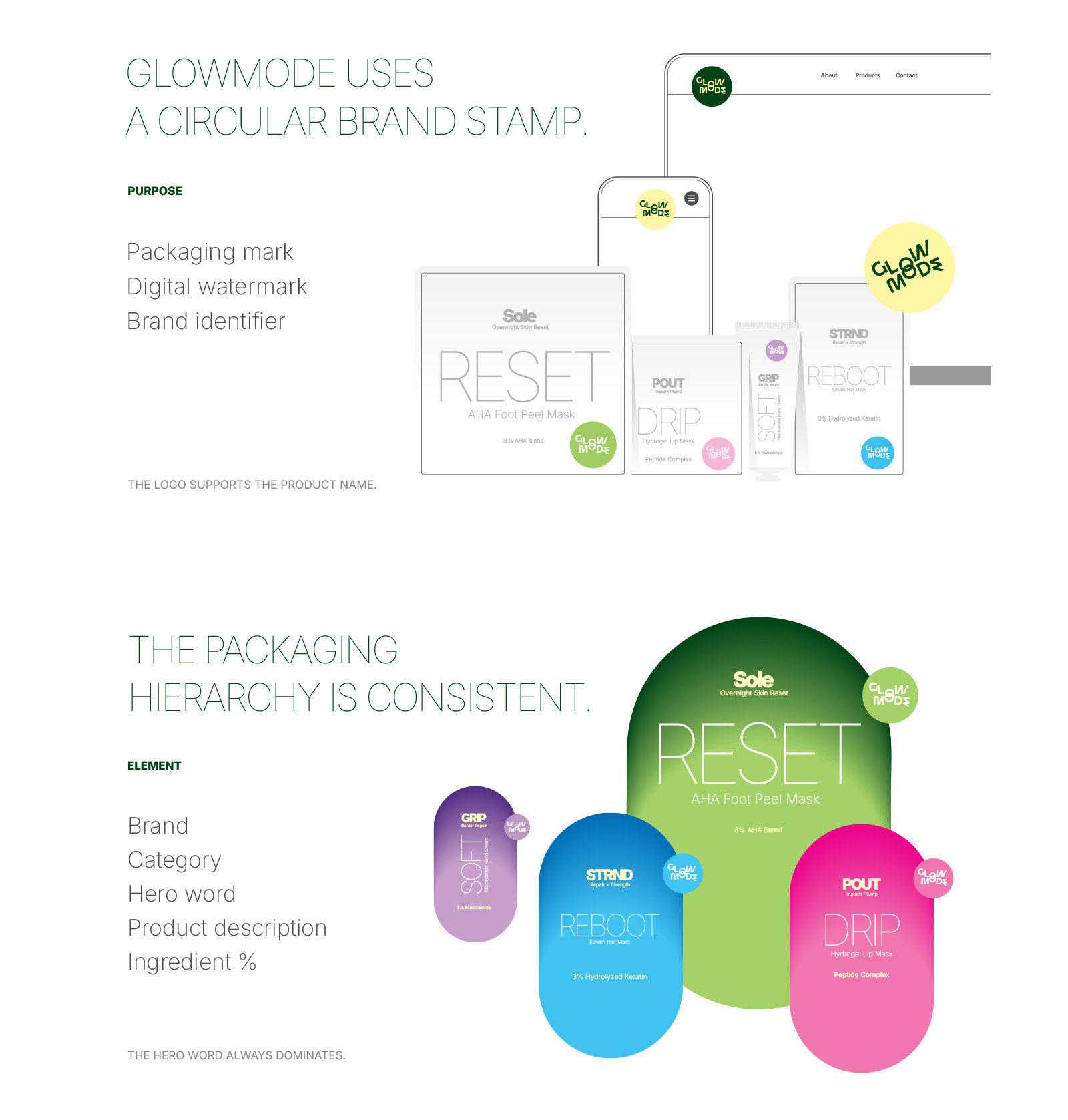
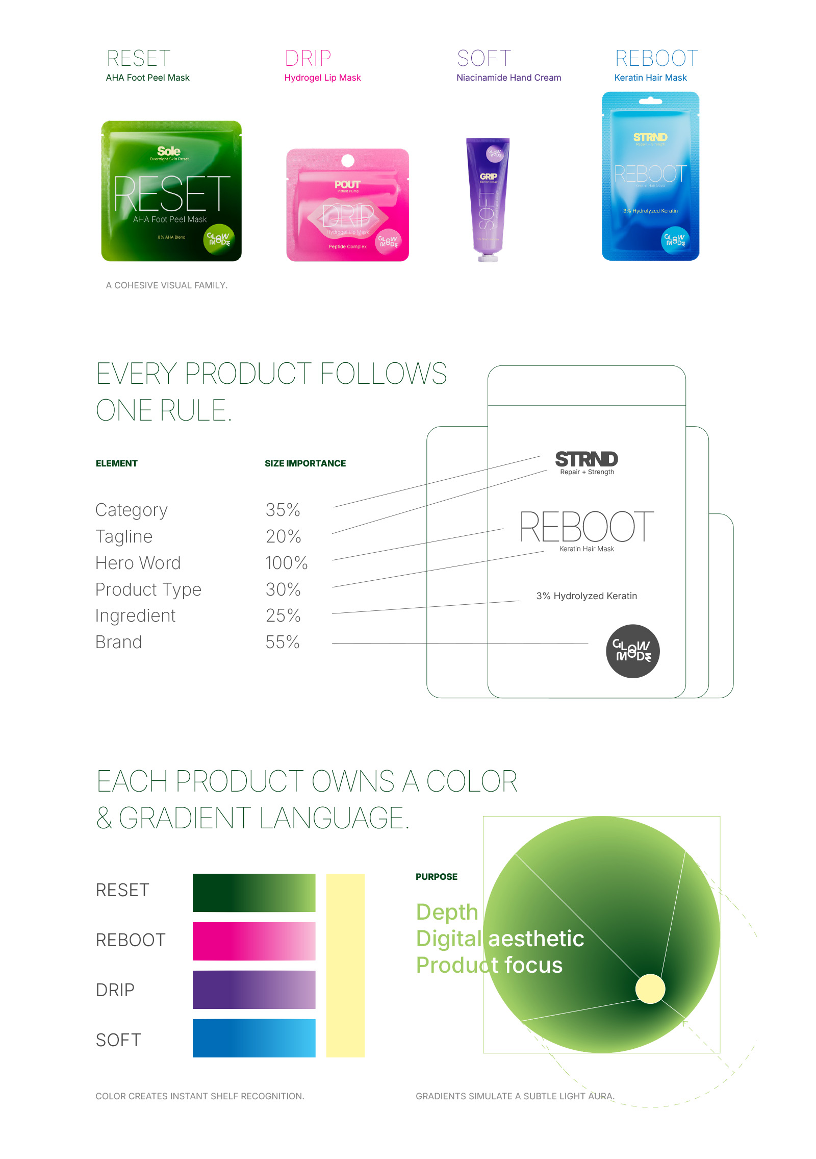
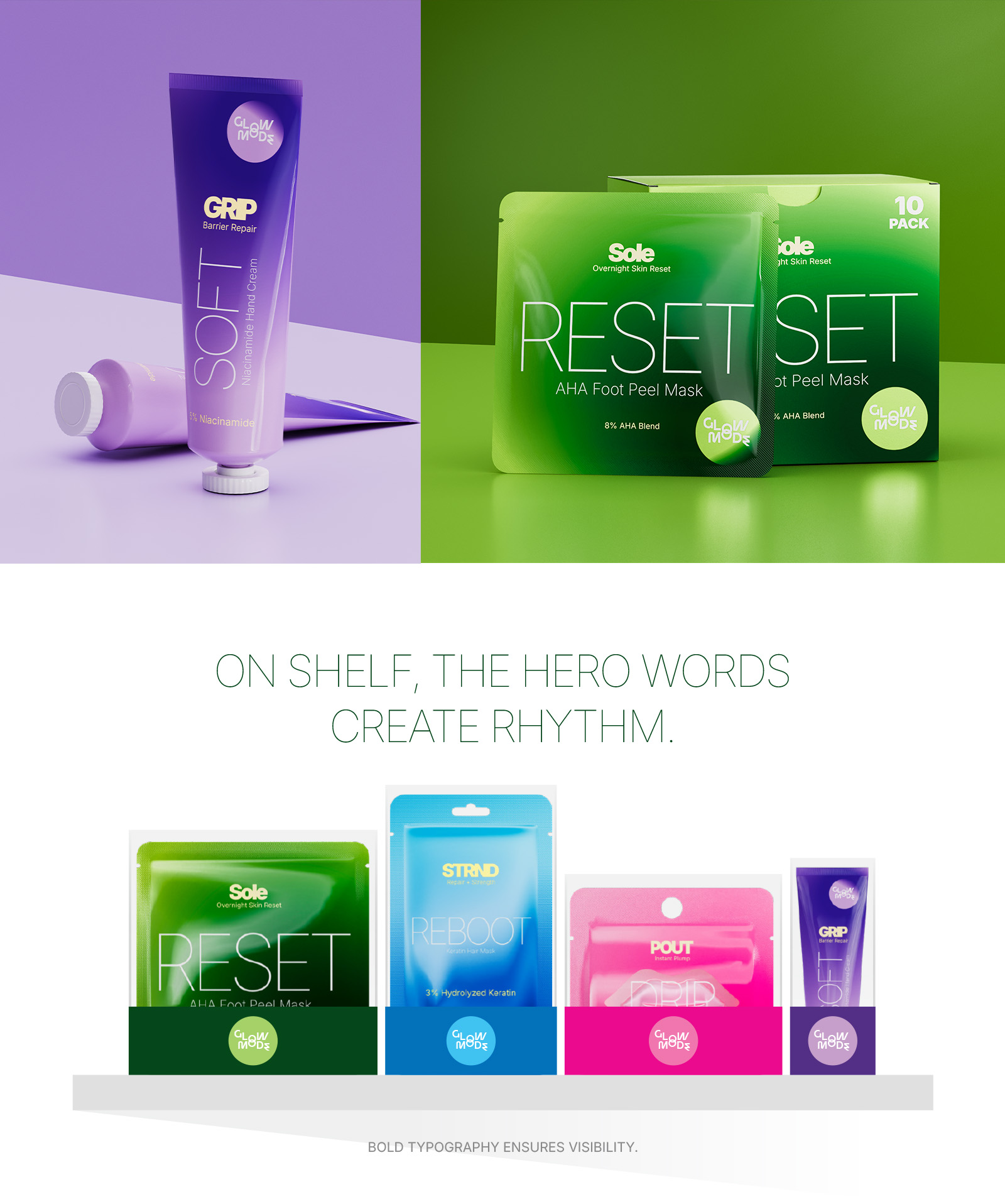
Each product is developed as a single-function solution. Instead of combining multiple claims, every SKU focuses on one core action such as exfoliating, repairing, hydrating, or restoring. This simplifies decision-making and improves recall. The naming system reinforces this logic. Products are defined by bold, single-word states like RESET, REBOOT, DRIP, and SOFT. These names are functional cues that communicate the outcome instantly rather than acting as decorative elements.
The visual identity relies heavily on typography and color. Oversized, lightweight letterforms dominate the front of the packaging, creating a clear hierarchy that prioritizes the product state. Each product is assigned a distinct digital color such as acid green, electric blue, hyper pink, or lilac. This ensures strong differentiation both on shelf and across digital platforms. Soft gradient transitions are used to add depth without introducing visual noise.
Packaging formats are kept simple and intentional. Single-use sachets are used for masks to support convenience and trial, while the hand cream is presented in a soft-touch tube suited for daily use. Material choices balance cost, tactility, and perceived quality without relying on excessive finishes.
Ingredient communication follows a structured approach. Each product highlights a primary active with a clear percentage, supported by a small number of complementary ingredients. This keeps the message focused while maintaining credibility. Claims are direct and measurable, centered on outcomes like smoother skin, stronger hair, or improved hydration.
GlowMode is designed as a digital-first brand. The packaging is optimized for thumbnails, short-form video, and social media environments. High-contrast colors, bold typography, and minimal layouts ensure the products remain clear and recognizable across platforms.
Overall, GlowMode is built as a modular identity system that can scale across categories without losing consistency. It is not driven by trends or seasonal styles but by a repeatable structure based on one function, one word, and one color. This allows the brand to grow while maintaining a strong and coherent visual identity.

CREDIT
- Agency/Creative: Kolam Creatives
- Article Title: GlowMode FMCG Branding System and Packaging Design by Kolam Creatives
- Organisation/Entity: In-House
- Project Type: Identity
- Project Status: Non Published
- Agency/Creative Country: India
- Agency/Creative City: Vadodara
- Market Region: Asia, Global
- Project Deliverables: 3D Design, Brand Design, Brand Guidelines, Brand Identity, Brand Naming, Packaging Design, Packaging Guidelines, Product Design, Product Naming, Product Photography
- Industry: Beauty/Cosmetics
- Keywords: Brnad Identity system, skincare packaging, cosmetic product renders
-
Credits:
Creative direction, 3d Product Visualizer: Umang Pandit


