


Objective
Biergarten opened in 2016 with a simple ambition — to bring the communal spirit of a traditional German biergarten to Bangalore. Eight years later, it had done exactly that. A loyal community had formed around it. The culture was vibrant, inclusive, and genuinely loved.
Despite a loyal customer base and strong local presence, the brand’s visual and verbal identity hadn’t kept pace with its vibrant culture. As Biergarten prepared to scale nationally, it needed a brand refresh that could express its fun, inclusive spirit and stand out in an increasingly crowded F&B landscape.
The Approach
We elevated the brand to better reflect its core idea – community. Here’s how we brought that to life.
Brand Strategy
We discovered the brand’s core truth, Biergarten as a familiar go-to space, and anchored the new identity around the idea of being “Always Familiar”.
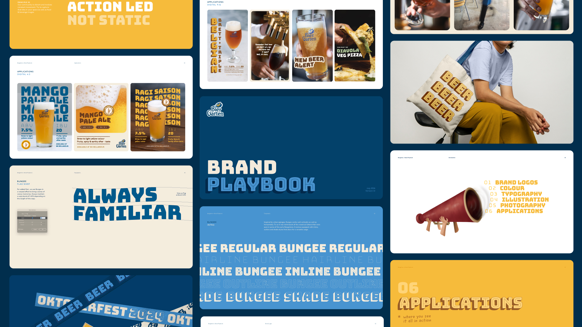
Logo Evolution
The new mark builds on Biergarten’s existing equity while sharpening its personality. Soft, rounded forms give it warmth. The social butterfly motif – a nod to the community spirit at the heart of the brand – carries over the leaf from the previous identity, creating continuity without nostalgia.
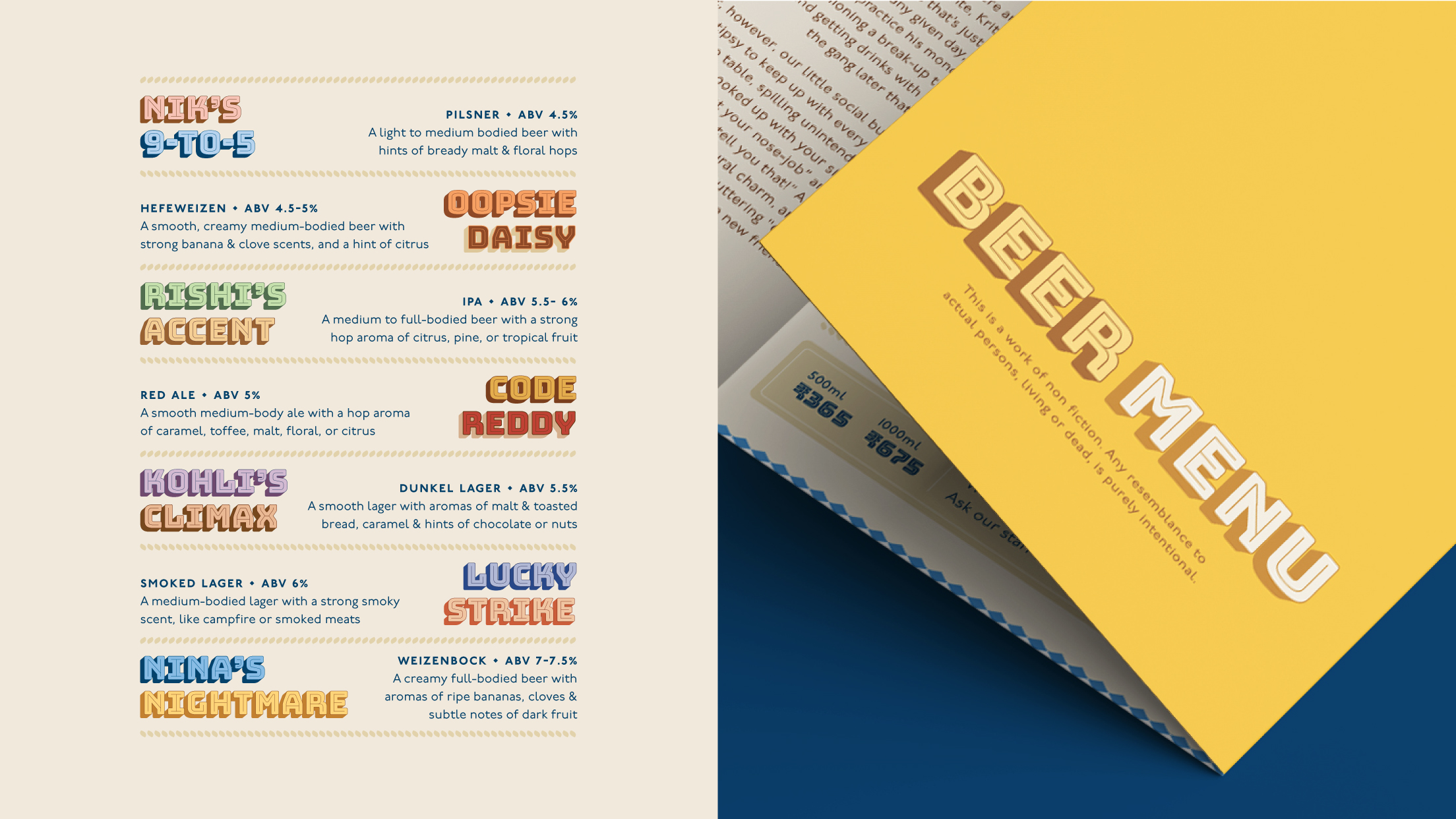
Beer Names
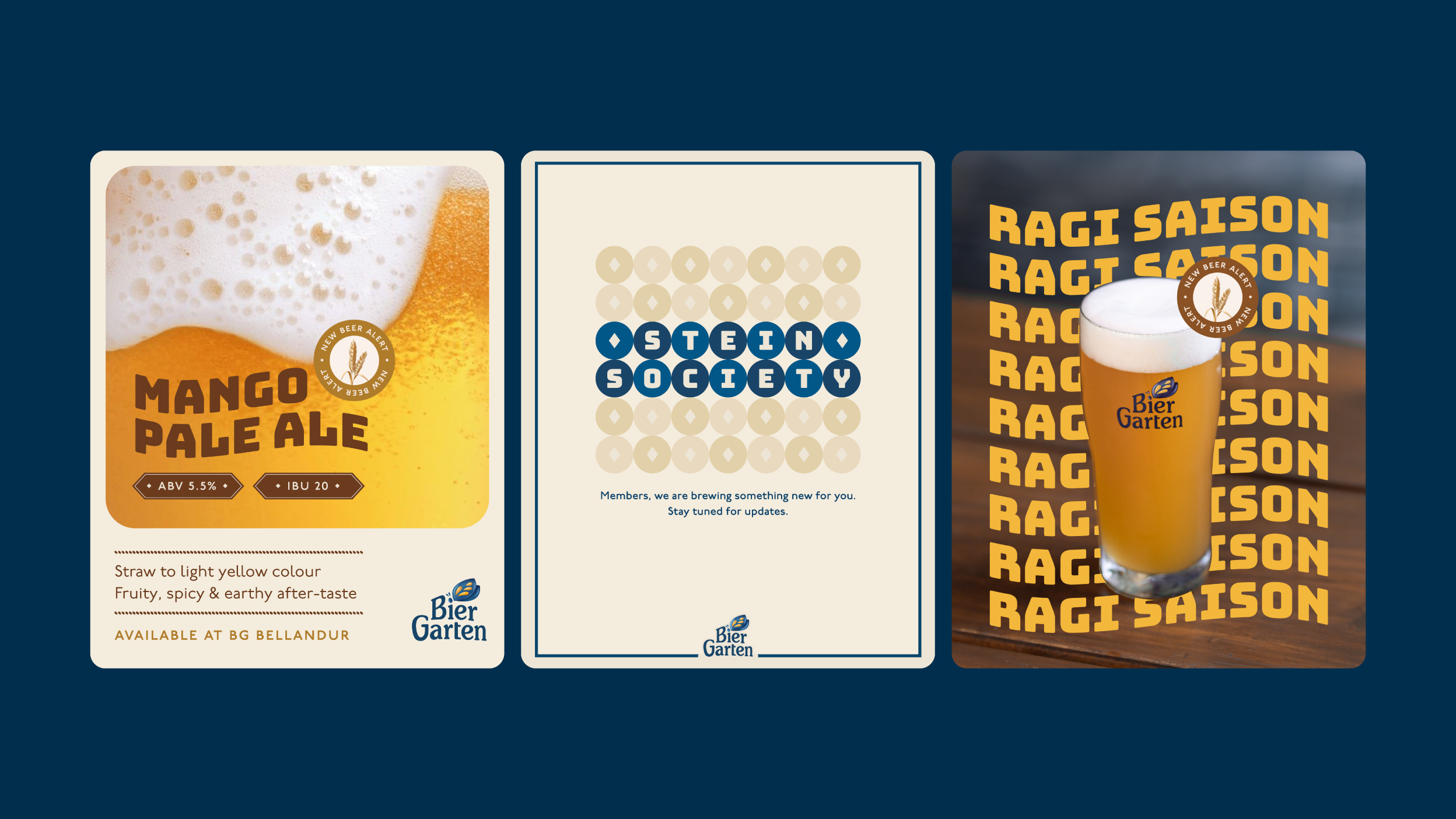
We coined names for the beers based on fictional characters inspired by real-life stories – some overheard, others drawn from actual Biergarten patrons – bringing to life a playful cast that felt both imagined and deeply familiar.
Illustration Language & Palette
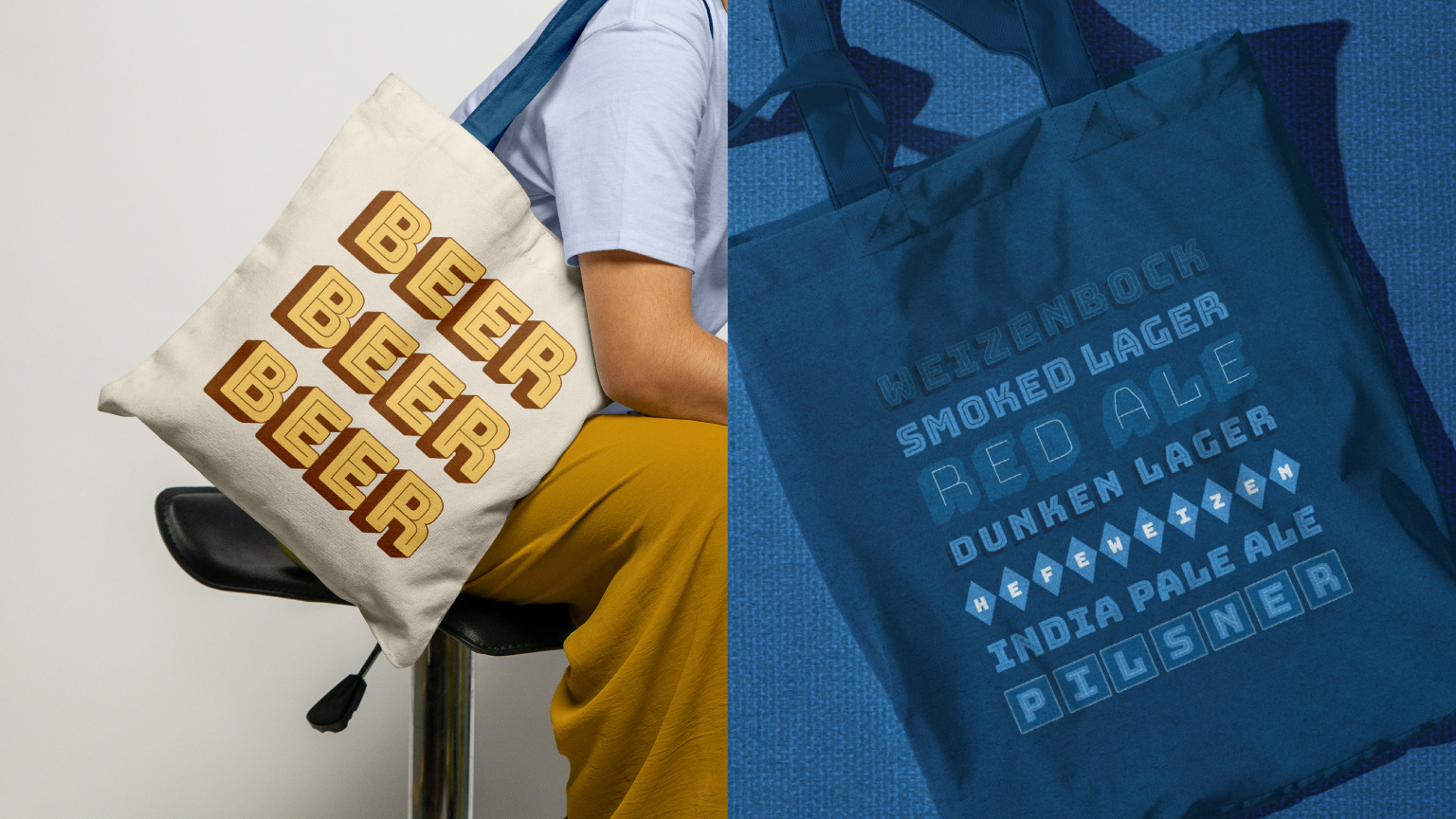
The brand palette draws from Germany’s Oktoberfest, pairing warm creams and mustards with playful light blues, all grounded by a unifying navy. Beer illustrations use smudged acrylic strokes to evoke blurry community memories. Each beer character is shaped by real stories overheard at Biergarten’s outlets, with small details that make them distinct and true to their backstories.
Typography
The brand’s type family is a reflection Biergarten heritage, familiar conversations, and functional needs. **Bungee** leads as the primary display face, reminiscent of the woodcut letters that were seen in some of the early Biergartens. It is paired with **P22 Underground,** a geometric humanist workhorse for clarity and function across menus, wayfinding, and body copy. **Good Dog** is used sparingly for handwritten, conversational moments that inject warmth and personality. Together, the three form a layered system that balances heritage, utility, and friendliness in a premium-yet-inviting voice.
The Result
Since the rebrand, Biergarten has opened its third and fourth locations in Bangalore. National expansion is underway – Pune, Hyderabad, and Goa are next. The brand built for a neighbourhood is now ready for the country.
CREDIT
- Agency/Creative: Small Town Folk
- Article Title: Brand Refresh for Biergarten by Small Town Folk
- Organisation/Entity: Agency
- Project Type: Identity
- Project Status: Published
- Agency/Creative Country: India
- Agency/Creative City: Bangalore
- Market Region: Asia
- Project Deliverables: Brand Design, Brand Guidelines, Brand Identity, Brand Mark, Brand Redesign, Brand Tone of Voice, Digital Art, Illustration, Poster Design, Web Design
- Industry: Food/Beverage
- Keywords: #brewerybranding #characterillustration #brandidentity #brandguidelines #beernames #beercharacters
-
Credits:
Brand Refresh: Small Town Folk


