


Amasya Et Gurme New Design Language
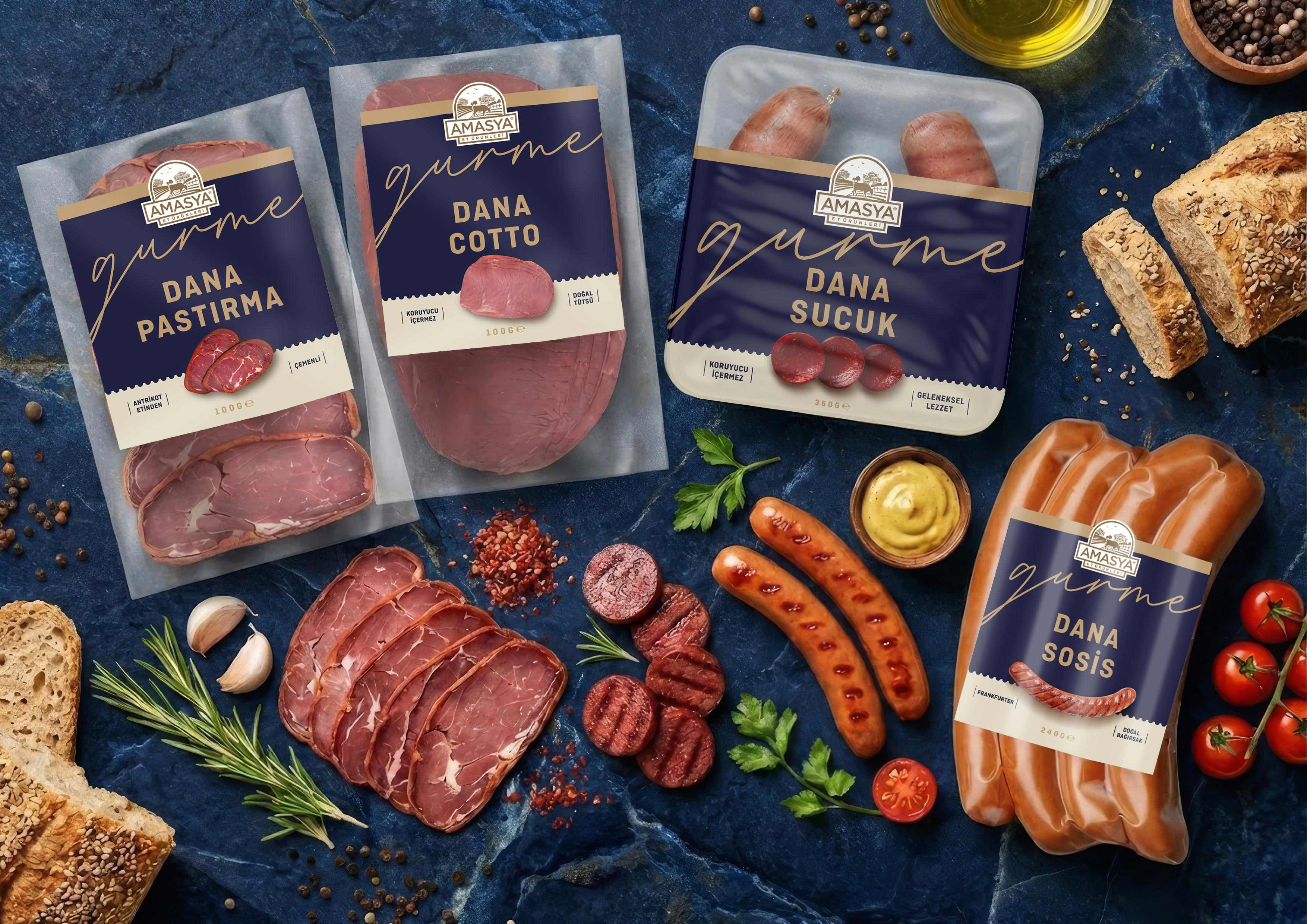
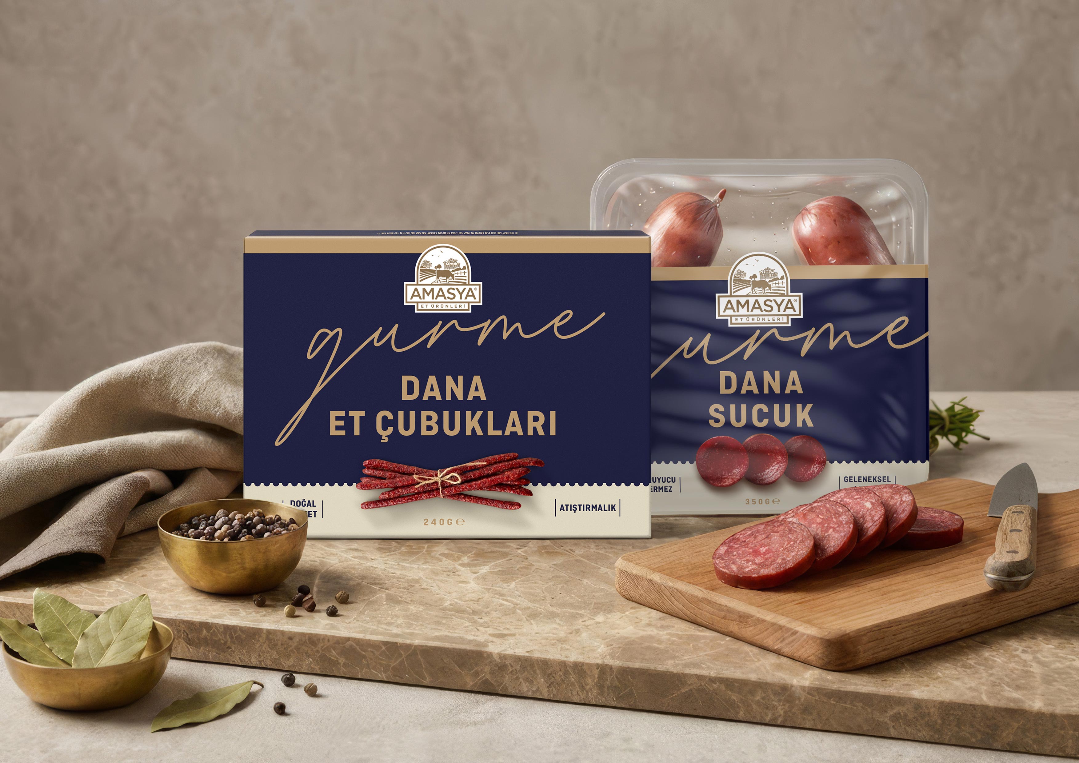
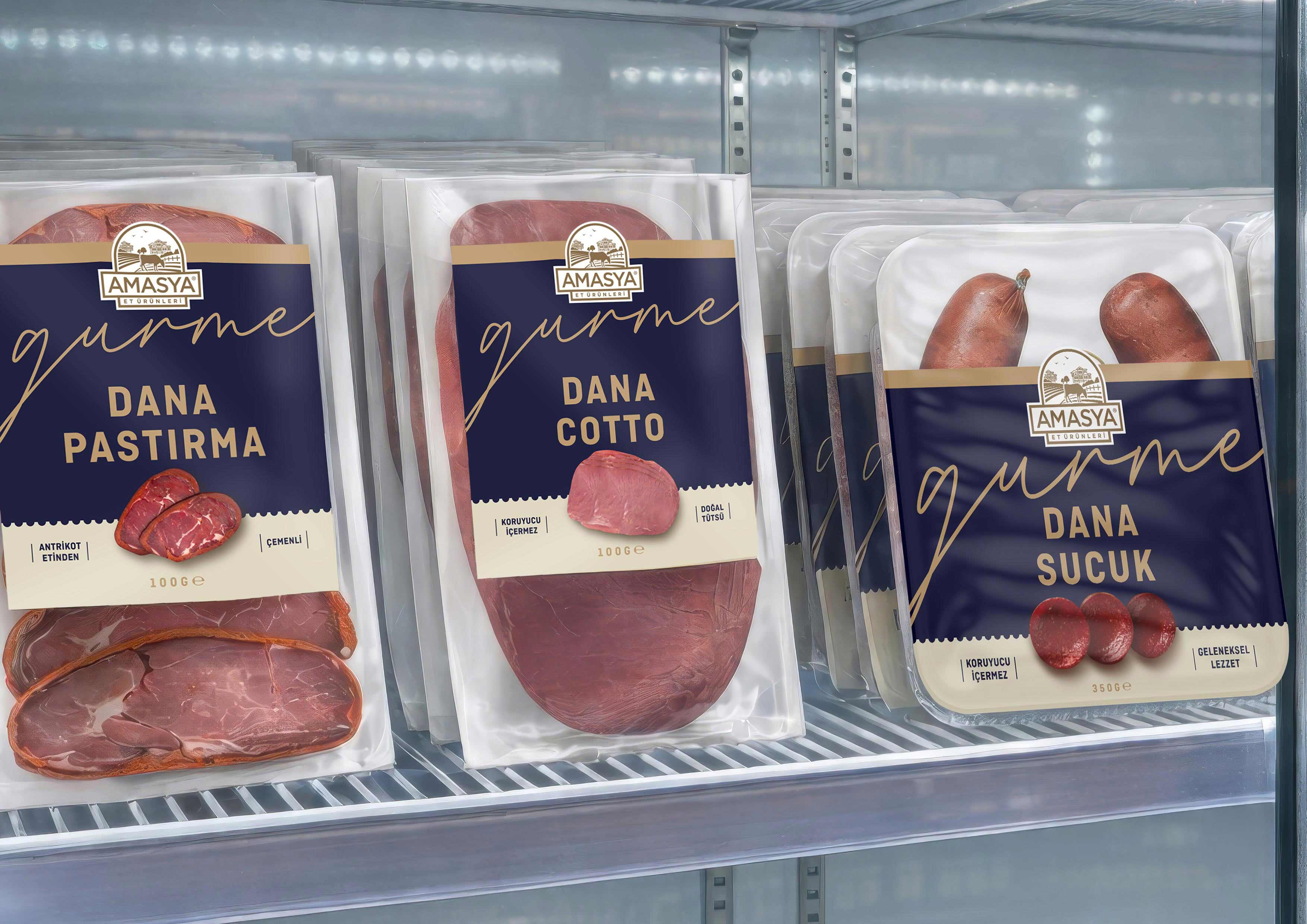
Our completely redesigned “Gourmet” series for Amasya Meat Products is now on the shelves, marking a significant shift not only in visual appearance but also in perceived brand value within the category.
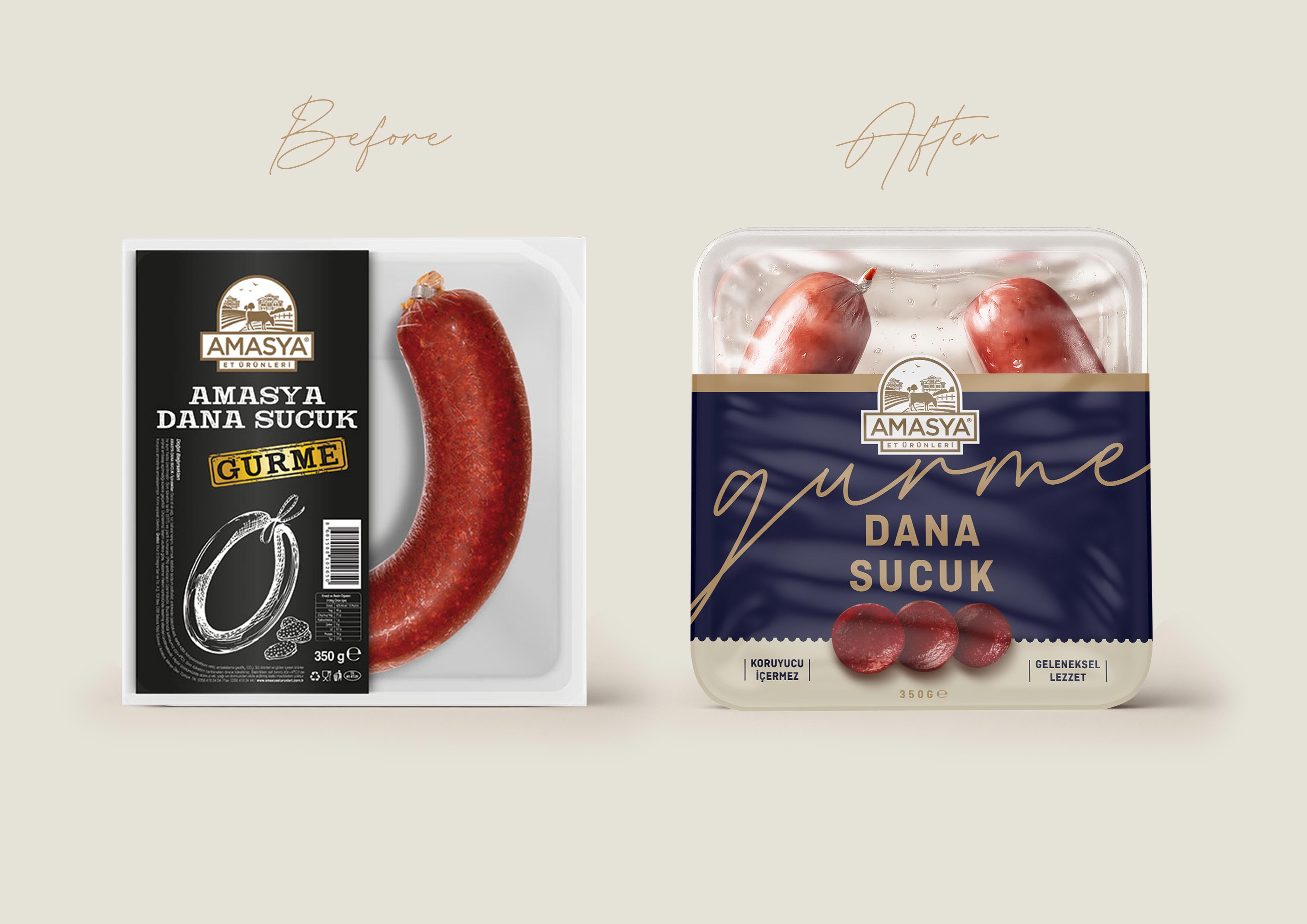
Contemporary consumer research clearly indicates that today’s consumers seek clarity rather than complexity. In an environment where shelves are increasingly crowded with visual noise, simplicity becomes more than an aesthetic preference—it evolves into a strategic necessity. Particularly within the premium segment, design value is often defined not by what is added, but by what is deliberately removed. This perspective guided every decision in the redesign process.
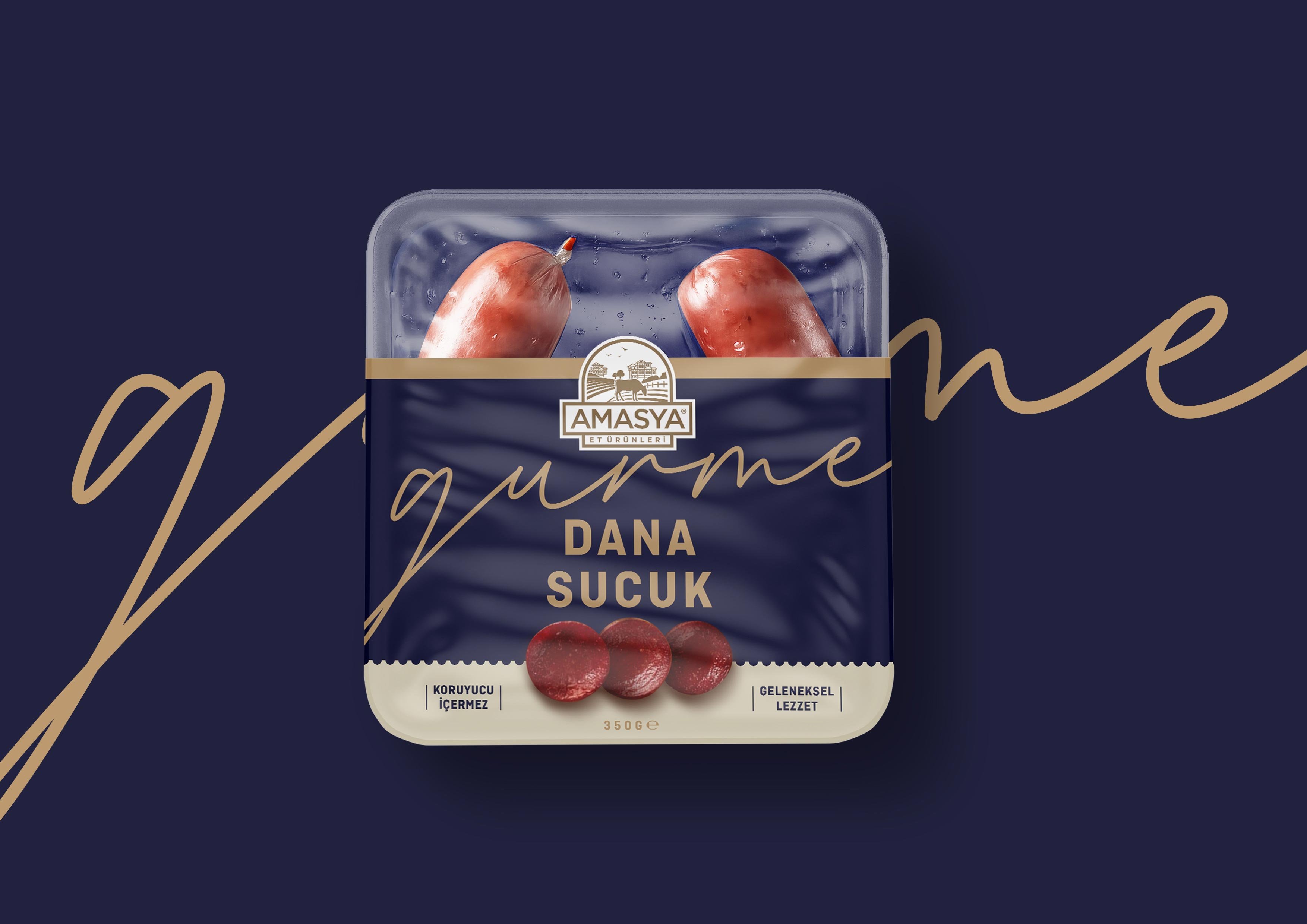
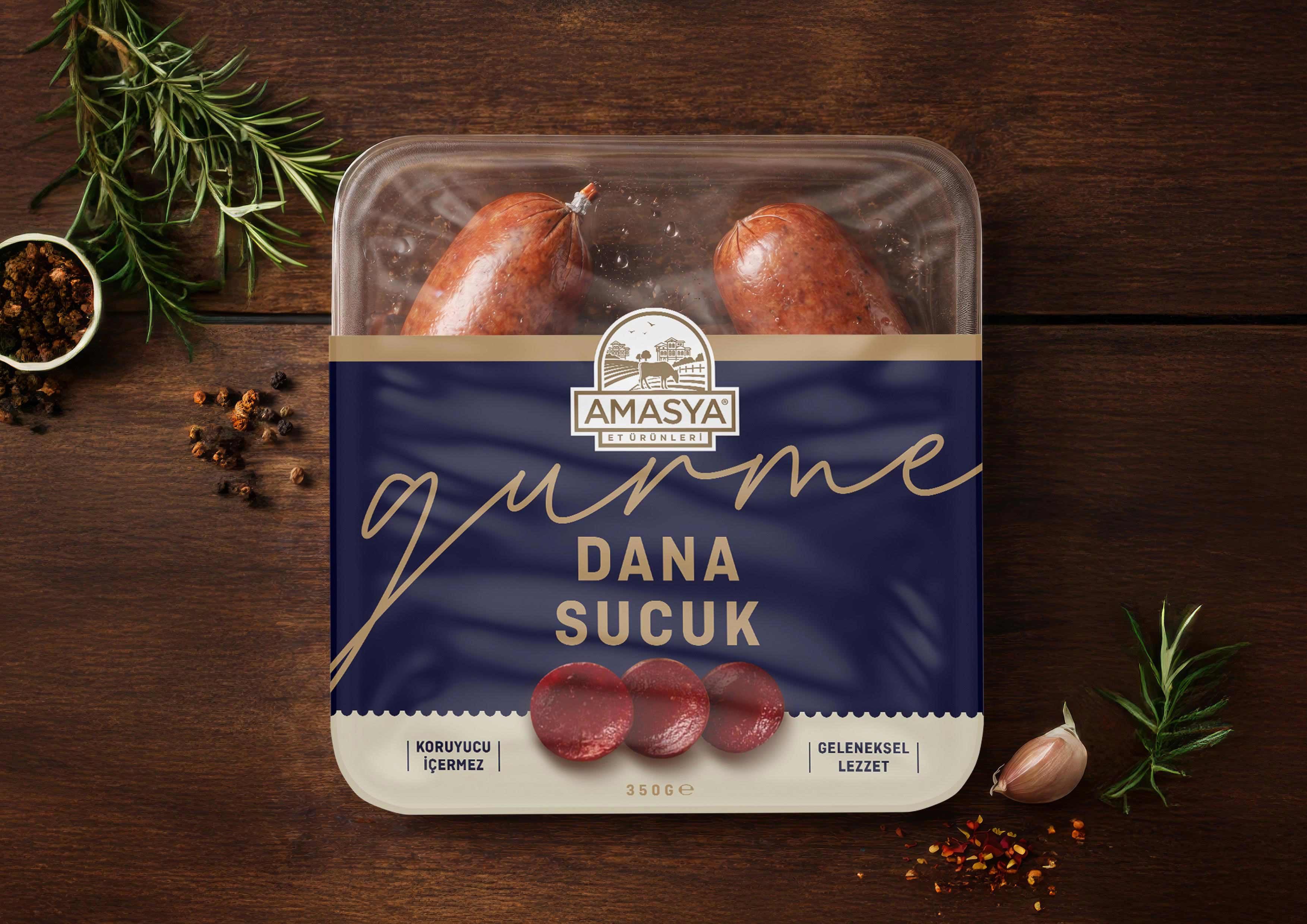
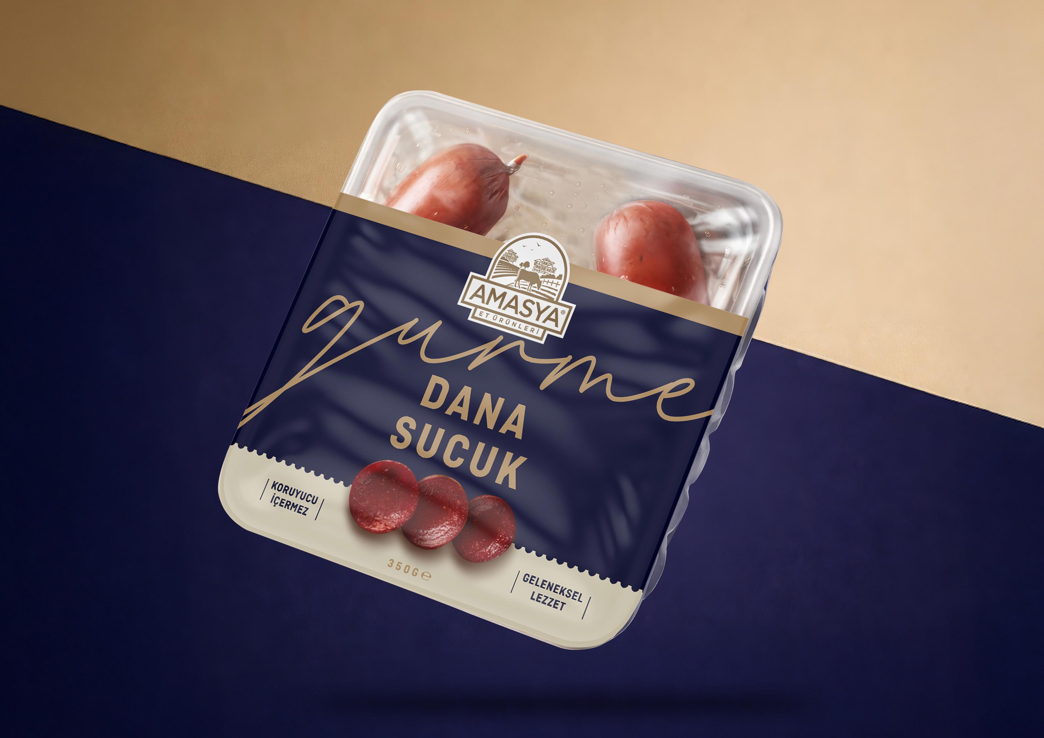
For the Amasya Meat Products “Gourmet” series, our approach was to strip away all non-essential elements and focus entirely on communicating the core promise of the product: quality, taste, and craftsmanship. The deep navy blue color serves as a strong and timeless foundation, evoking trust, depth, and sophistication. This is elevated with refined gold accents that subtly signal premium quality without overwhelming the composition. Together, these elements create a balanced yet powerful visual language that stands confidently on the shelf.
Typography was treated with equal precision. By establishing a clear and intuitive hierarchy, we ensured that key product information is immediately legible, even from a distance. The result is a design system that communicates efficiently, allowing consumers to navigate the product range effortlessly while reinforcing a sense of order and refinement.
This minimalist yet intentional approach enhances the visibility of the product’s inherent value. Rather than competing through excessive decoration, the design allows the product to speak for itself, elevating its presence and differentiation within the gourmet category. The outcome is not merely a cleaner aesthetic, but a measurable improvement in shelf impact and perceived quality.
At B12 Creative Branding, we consistently emphasize a core principle across all our rebranding projects: rebranding is not simply a visual update, but a strategic transformation. It is an opportunity to redefine how a brand is perceived, to strengthen its positioning, and ultimately to elevate its value in the eyes of the consumer.
CREDIT
- Agency/Creative: B12 Creative Branding
- Article Title: B12 Creative Branding Shapes Amasya Et Gurme Into a Contemporary Food Packaging Identity Driven by Simplicity and Strategic Reduction
- Organisation/Entity: Agency
- Project Type: Packaging
- Project Status: Published
- Agency/Creative Country: Turkey
- Agency/Creative City: Istanbul
- Market Region: Europe
- Project Deliverables: Brand Architecture, Brand Redesign, Brand Strategy, Food Styling, Label Design, Packaging Design, Packaging Guidelines
- Format: Tray
- Industry: Food/Beverage
- Keywords: packaging, b12creative, b12creativebranding, branding, logo design, brandbook, guideline, packaging design, meat, brand strategy, label design, packaging guidelines
-
Credits:
Design Director: Burkan Ciftciguzeli


