


The NasalFlo brand sells its products in the Philippines. Our client, seeing a gap in the market for nasal and oral strips for sleep aids, wanted to offer consumers an alternative with a different brand. When they contacted us, we discussed the entire design process in detail and outlined some strategies.
We were asked to design the logo and packaging for this mid-range brand.
Brief:
We are establishing a new health brand for consumers in the Philippines. Initially, this brand will launch with nasal and oral strips to aid sleep. Later, these strips will be diversified with patterned and colorful options for children and other consumer groups, creating a large family of products. However, we need a packaging concept design for the two main products. Simultaneously, the brand logo must be designed and its use on the packaging must be planned.
The logo should be modern and timeless. It should have sympathetic yet confident, strong lines to be attractive to the consumer. It should be highly legible and clear and understandable to ensure awareness.
The packaging design itself should be clean and easy to adapt to other variants.
Our Design Solution:
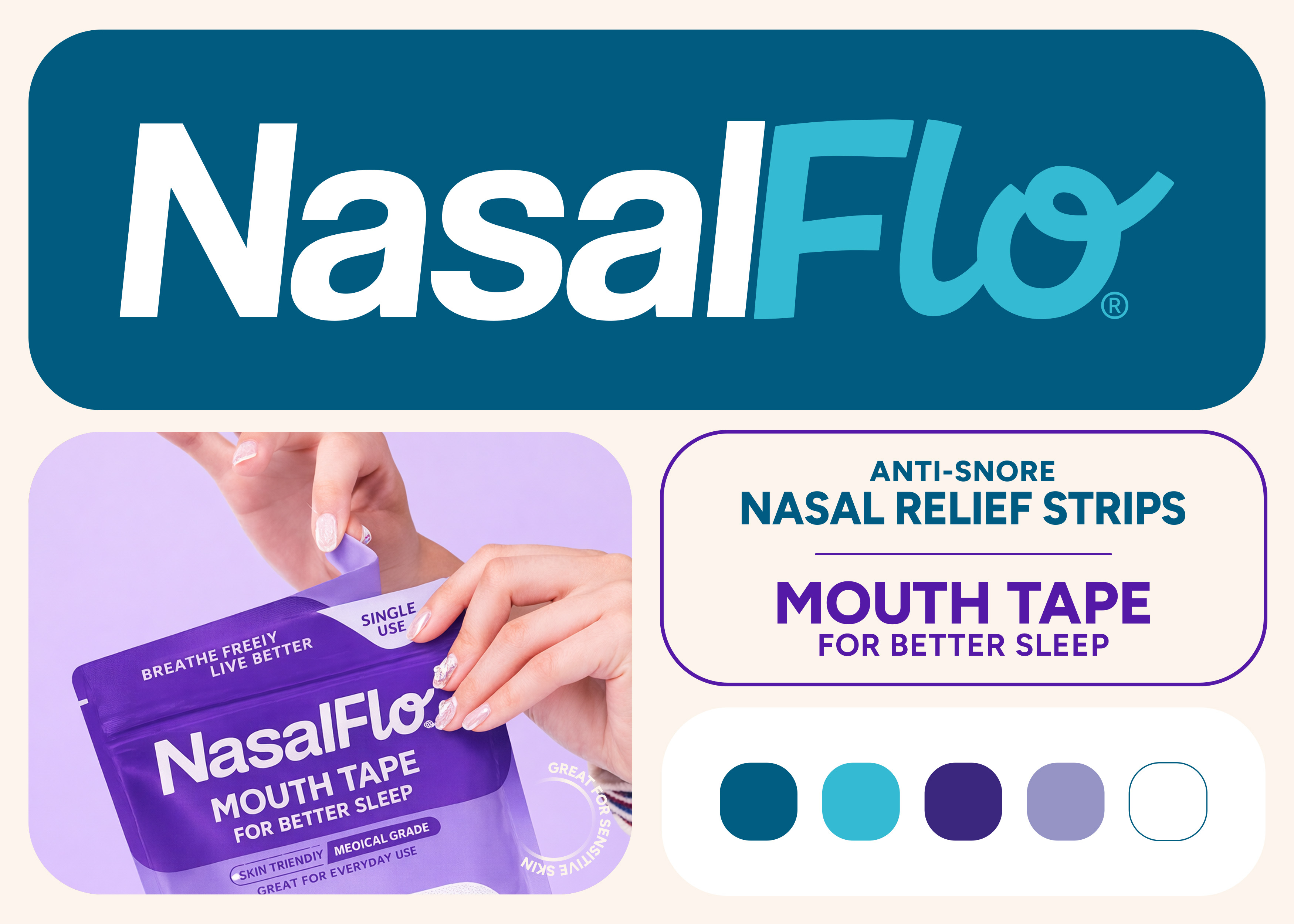
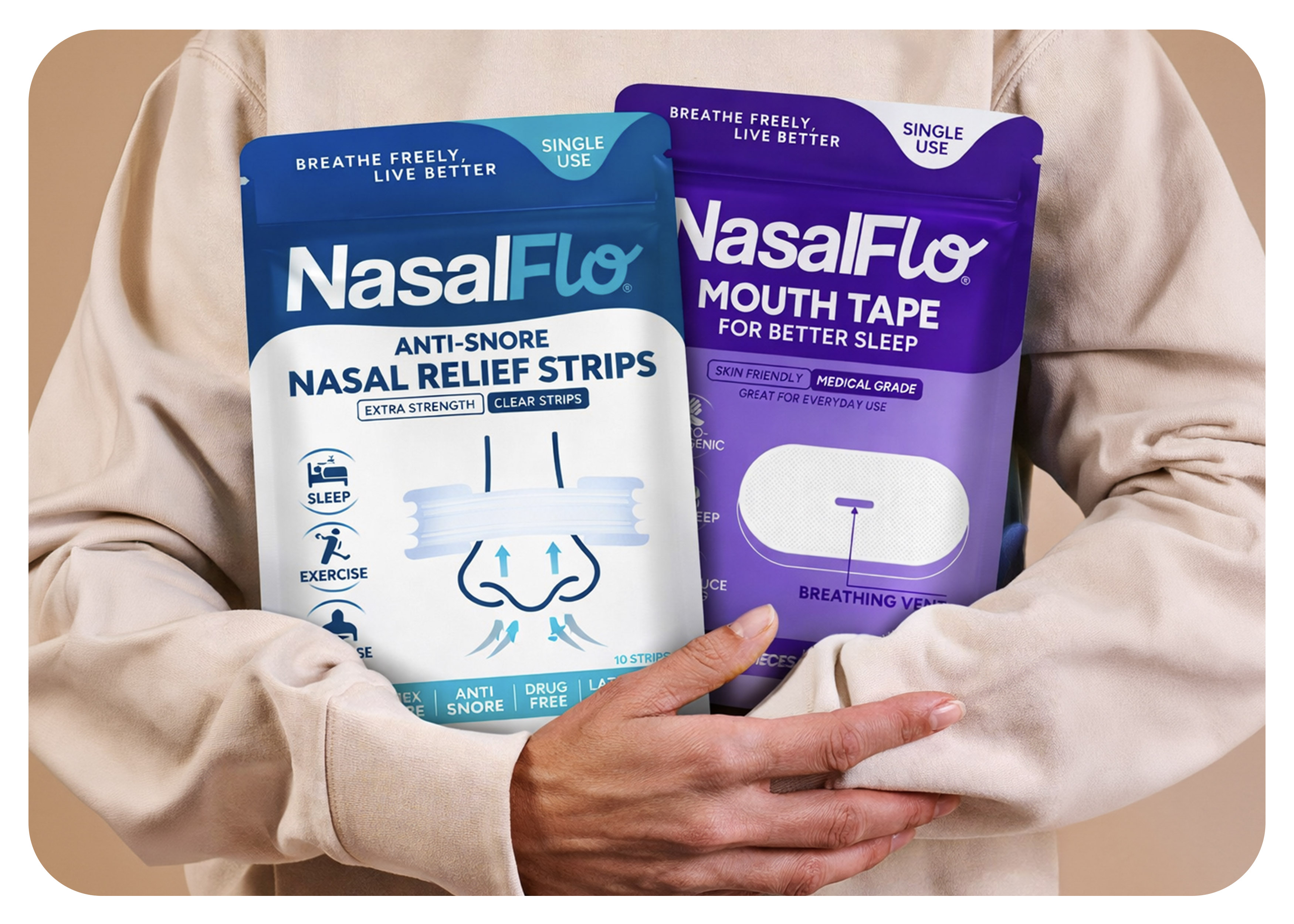
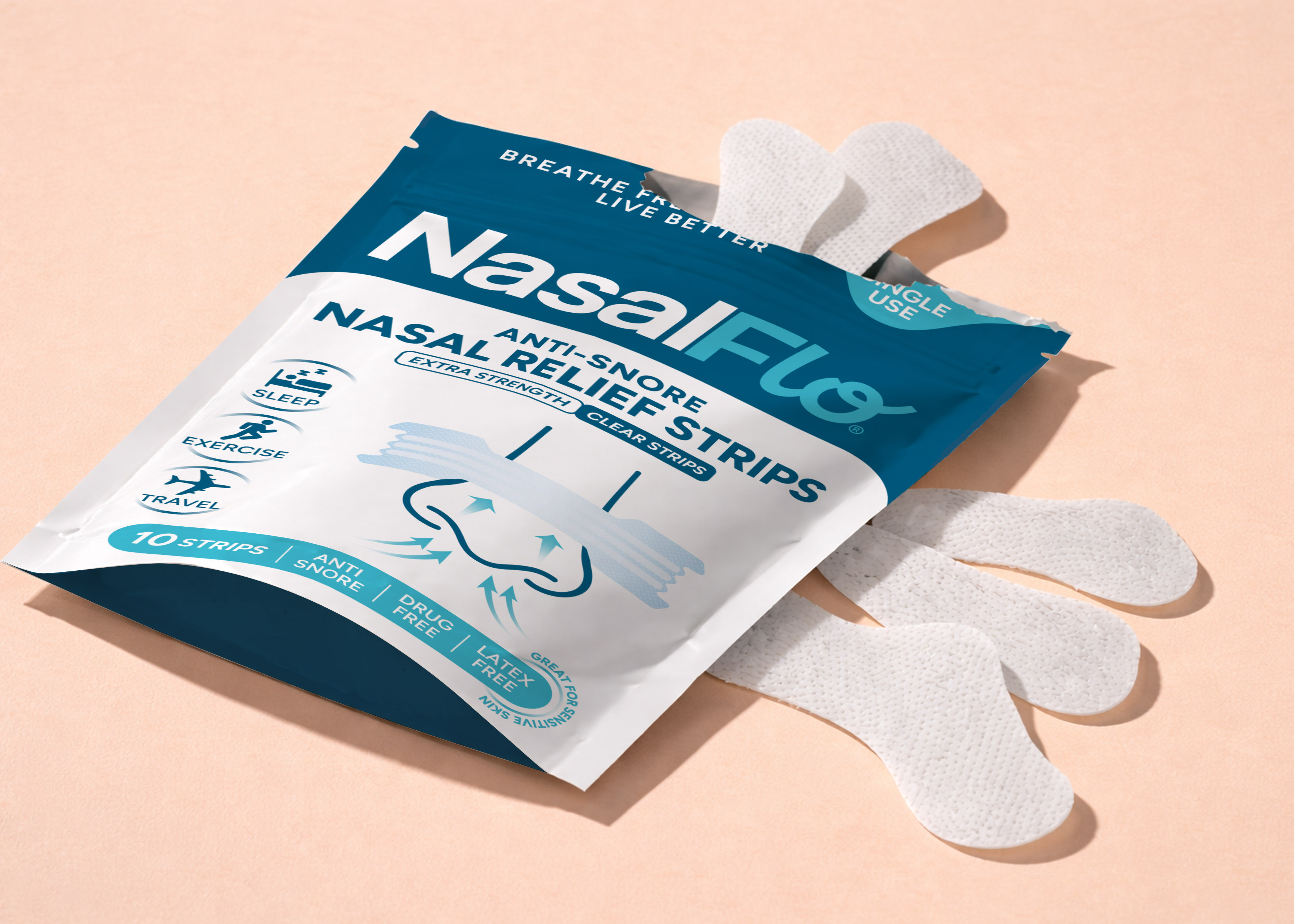
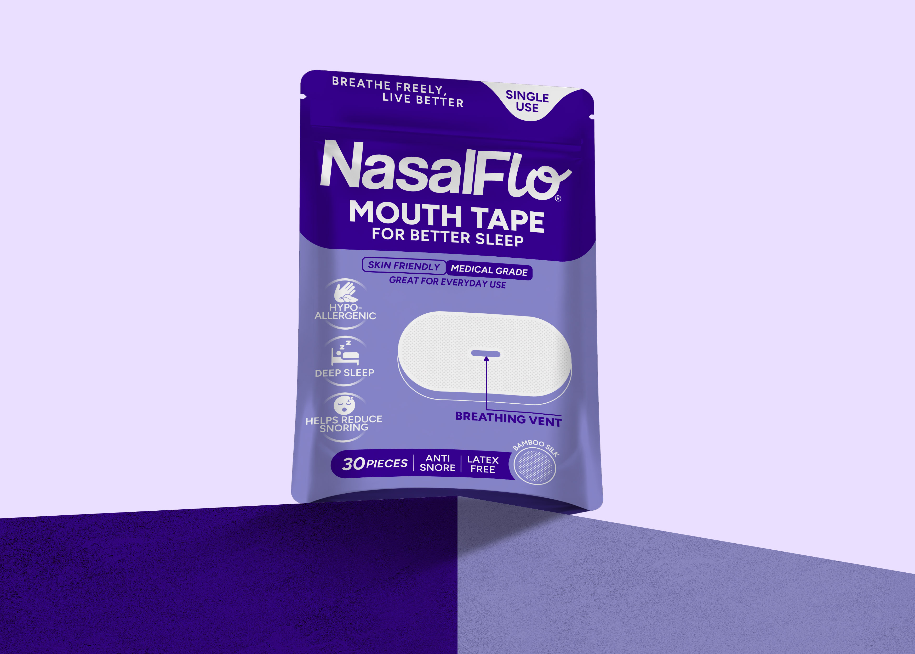
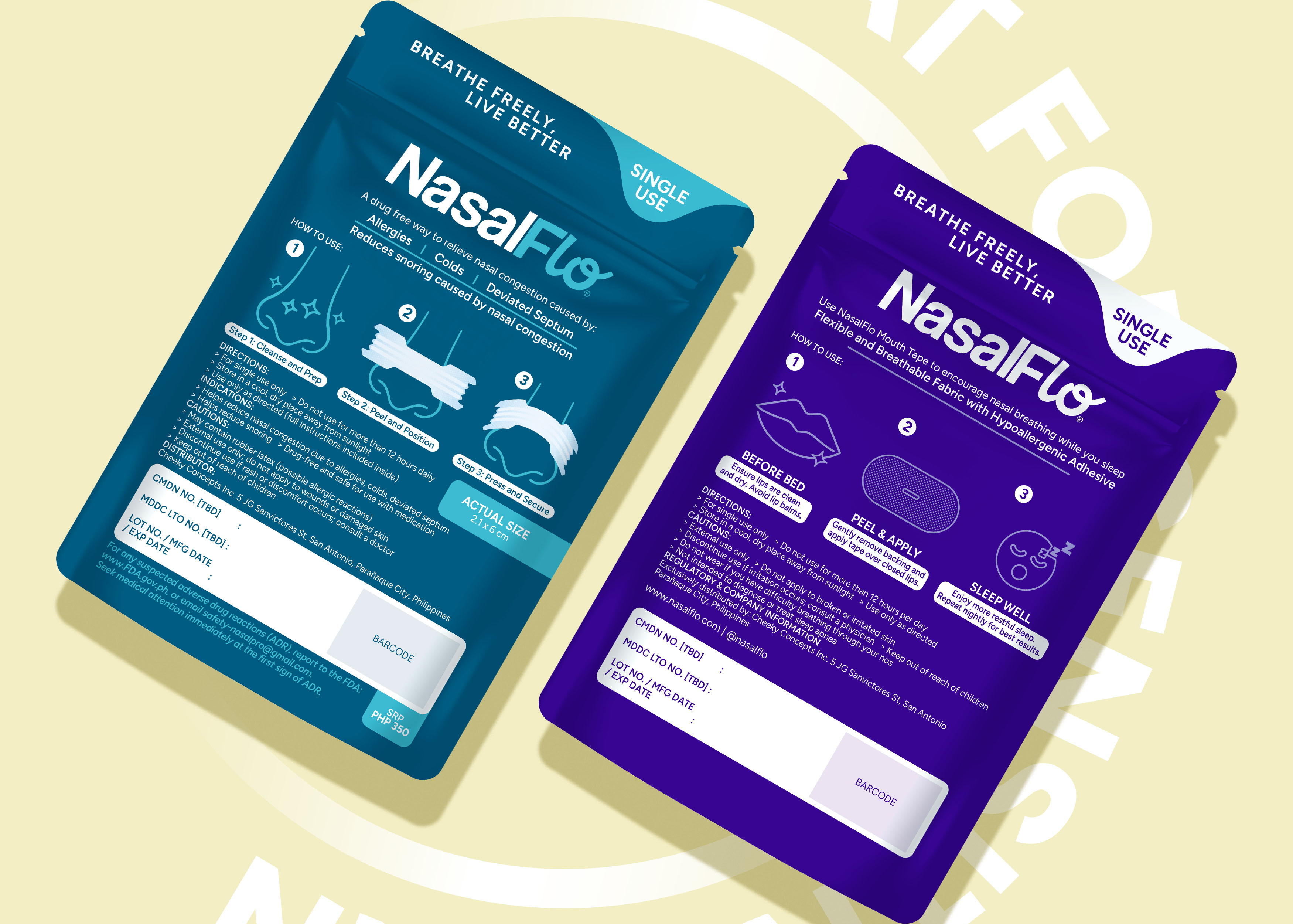
We divided the brand name into two parts, writing the “Nasal” part in a clear, sans-serif font. This solidified the brand’s trustworthy image and met our client’s request. The reason we only capitalized the first letters was to maintain this trust and break away from an overly rigid brand image. Secondly, we added a modern and fun touch to the “Flo” part. We also changed the color of this part in the basic packaging to create a dynamic perception. Overall, we used a dark background with a feminine color scheme for the two main products. In terms of size, we ensured that the customer could recognize the brand regardless of how far away they were from the shelf. Now that we’ve solved the brand visibility issue, the real key is the packaging concept design…
In the packaging designs, we opted for a colorful language and simple narratives, as suggested by our client. This broke the perception of the product as something sold on pharmacy shelves, creating a more eye-catching and youth-oriented look.
By slightly modifying our design architecture for the two main products, we built a design that is easily distinguishable for future product variants.
CREDIT
- Agency/Creative: Süleyman Bagdat
- Article Title: Nasal Strips & Mouth Tape Logo and Packaging Design by Süleyman Bagdat
- Organisation/Entity: Freelance
- Project Type: Packaging
- Project Status: Published
- Agency/Creative Country: Turkey
- Agency/Creative City: İstanbul
- Market Region: Asia, Europe, Global
- Project Deliverables: Brand Creation, Graphic Design, Label Design, Packaging Design
- Format: Bag, Blister-Pack
- Industry: Health Care
- Keywords: nasal strips, mouth tape, packaging design, logo design, health
-
Credits:
Art Director: Oguzhan Bagdat


