


A structural packaging redesign inspired by premium spirits aesthetics, restoring authority and clarity to a historic Italian olive oil brand.
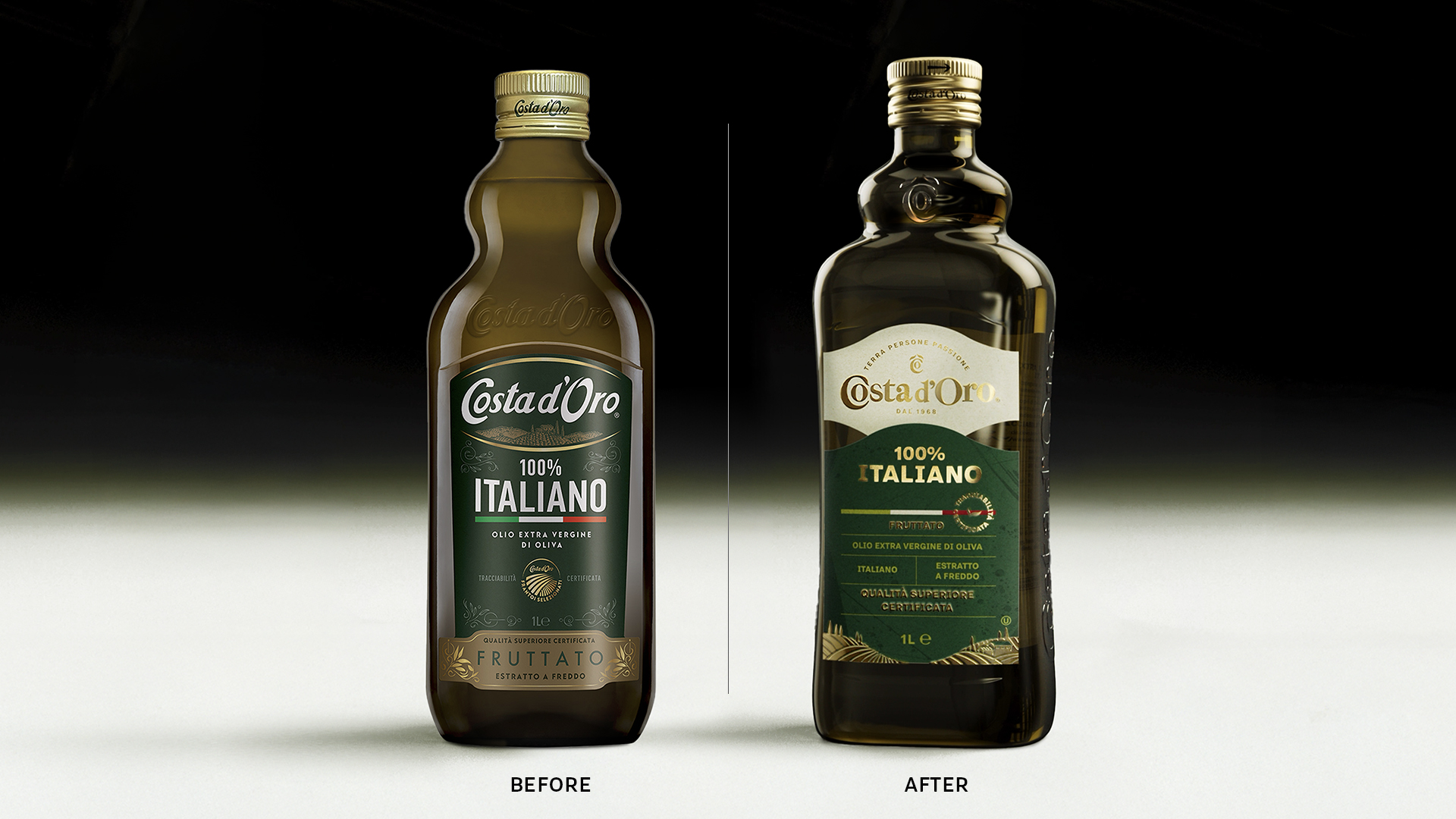
To make Costa d’Oro, a historic Italian olive oil brand rooted in Umbria, truly recognizable, a simple restyling was not enough. The brand needed a new character – contemporary, yet fluent in the classical language of the category. The challenge was clear: innovate without disrupting, transform without betraying.
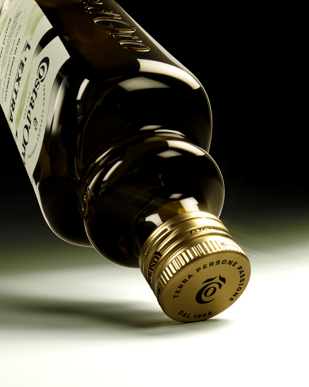
Every element was reconsidered with experience and restraint to build a coherent and finally assertive identity. The result is a bolder bottle that redefines the visual language of olive oil, drawing inspiration from the elegance and authority of premium spirits, while remaining rooted in its original world.
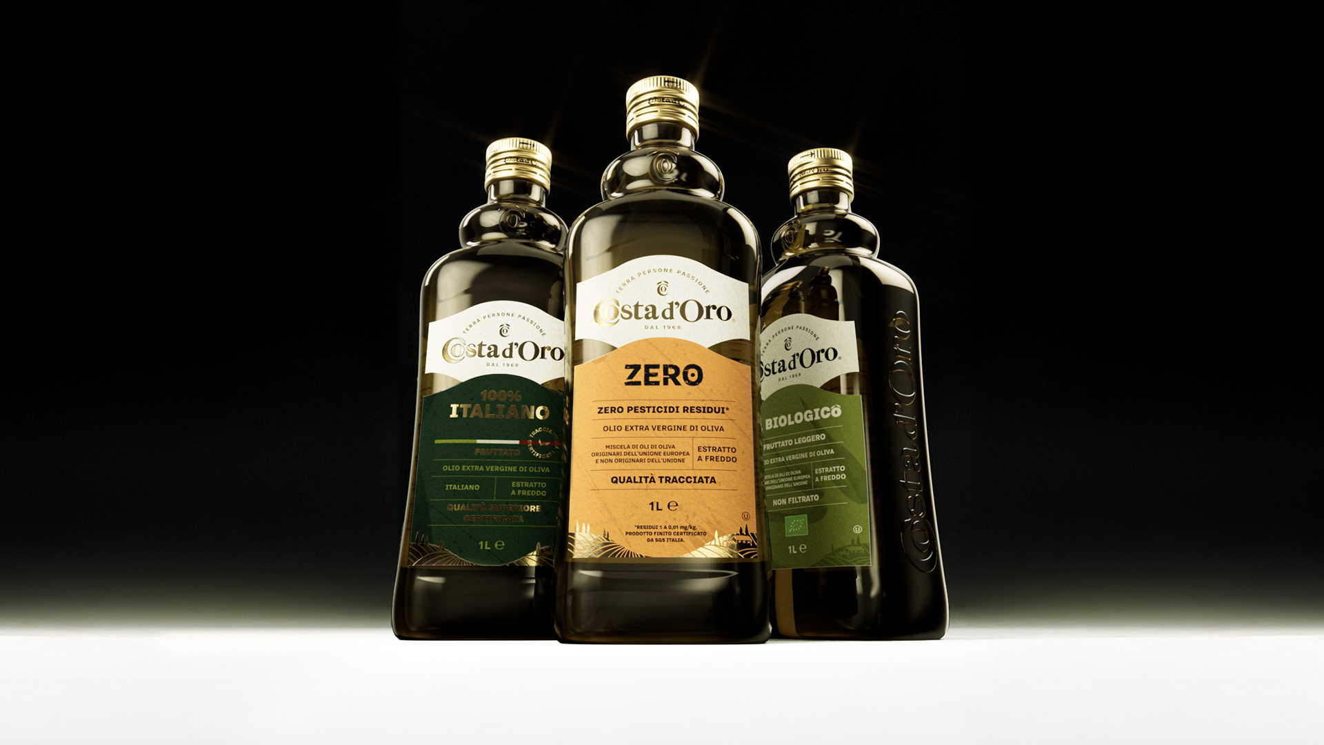
The label, inspired by the silhouette of the Umbrian hills, becomes the architectural foundation of the entire Costa d’Oro identity. Its curved upper profile creates a natural division between brand and product information: the logo sits in a defined, elevated space, while the lower section hosts product references with clarity and order. This subtle “cut”, echoing the rolling landscape, introduces a new visual rhythm and establishes a more intuitive reading path.
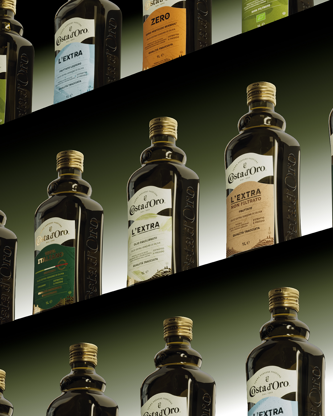
From this structural gesture emerges a cohesive and recognizable visual system: a redesigned logotype, a distilled monogram for maximum synthesis, a refined color palette, and textures that convey craftsmanship. Golden details enhance the sense of premiumness, restoring to the brand a clear, defined, and ultimately iconic identity.
CREDIT
- Agency/Creative: marimo
- Article Title: Costa d’Oro Olive Oil Packaging by Smarimo Redefines a Historic Brand Through a Premium Structural Design
- Organisation/Entity: Agency
- Project Type: Packaging
- Project Status: Published
- Agency/Creative Country: Italy
- Agency/Creative City: Roma
- Market Region: Europe
- Project Deliverables: Advertising, Brand Identity, Brand Redesign, Design, Graphic Design, Identity System
- Format: Bottle
- Industry: Food/Beverage
- Keywords: #marimo #design #visualidentity #rebrand #oliveoil #brandidentity
-
Credits:
Graphic Designer: Chiara Leone
Creative Director: Anna Di Cintio
Account Director: Michele Bonetta
Chief Creative Officer: Paola Manfroni
General Manager: Giovanna Ridenti


