


The Brief:
How do you capture the mist-covered peaks of the Western Ghats in a single bag of coffee? Copper Leaf approached us to create a packaging identity for their specialty coffee line that felt less like a commodity and more like a tribute to the soil of Karnataka. The objective was to move away from generic imagery and instead position the brand as a premium, single-origin experience. The design needed to appeal to the modern connoisseur while staying fiercely rooted in the heritage of South Indian coffee culture, balancing national pride with regional craftsmanship.
What We Crafted:
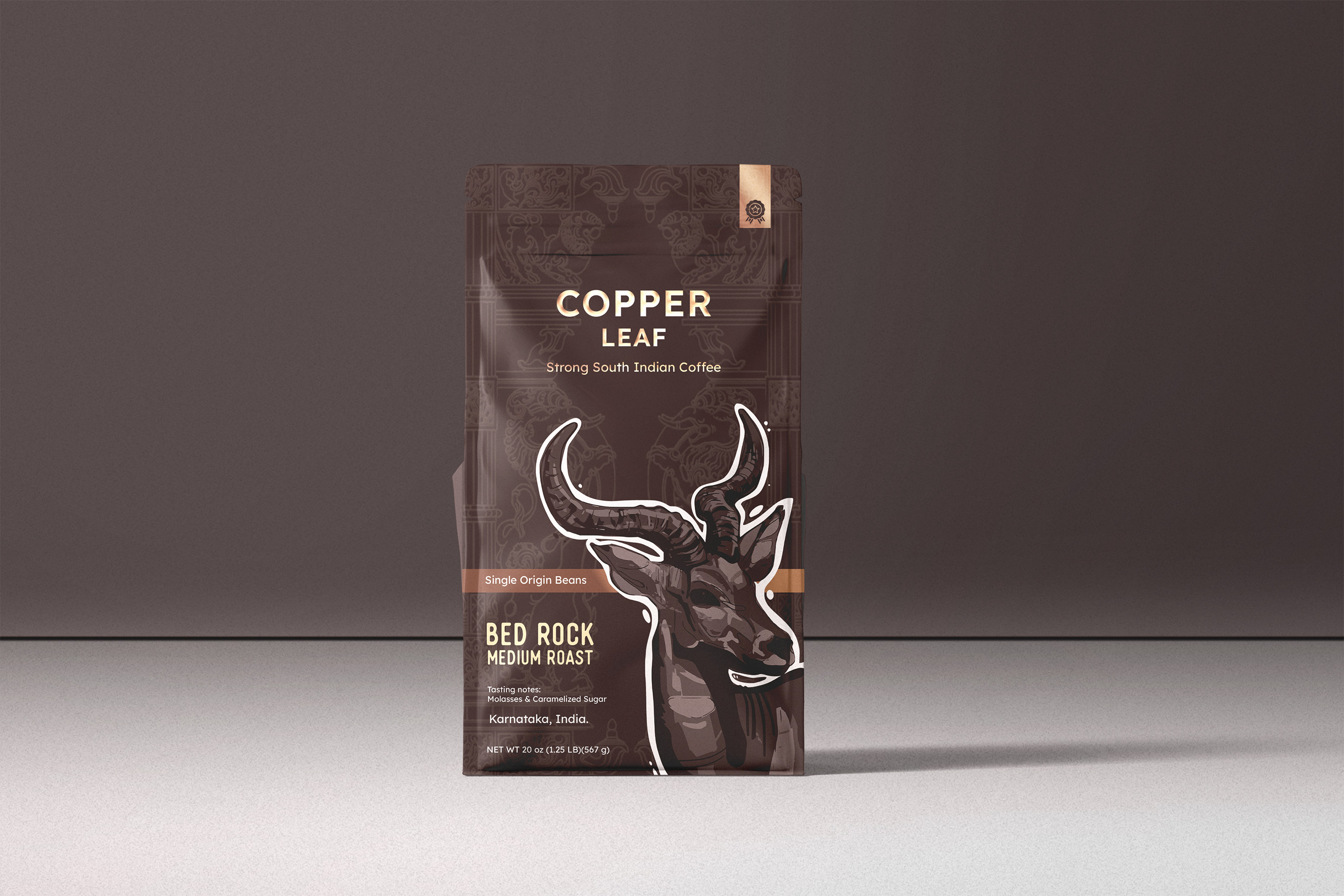
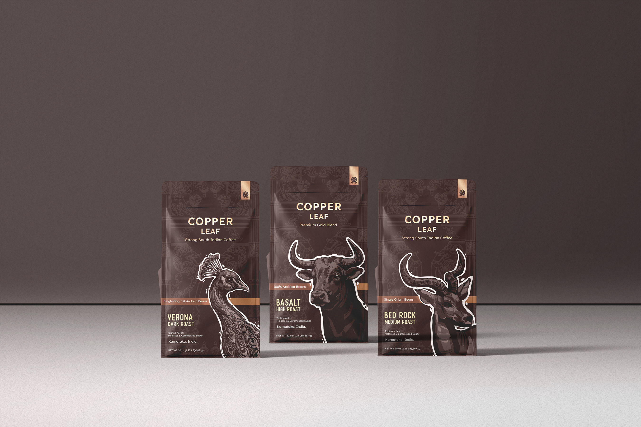
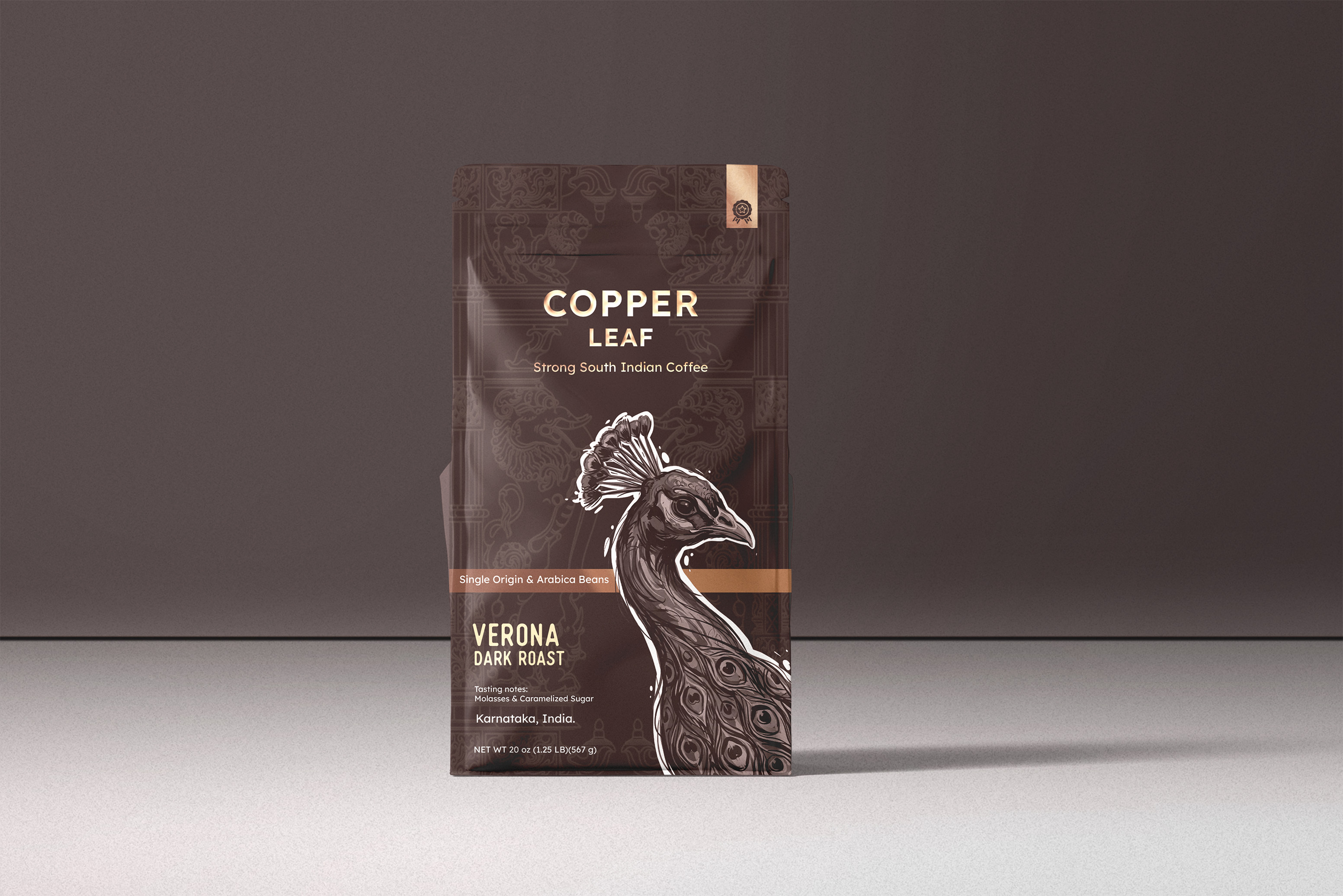
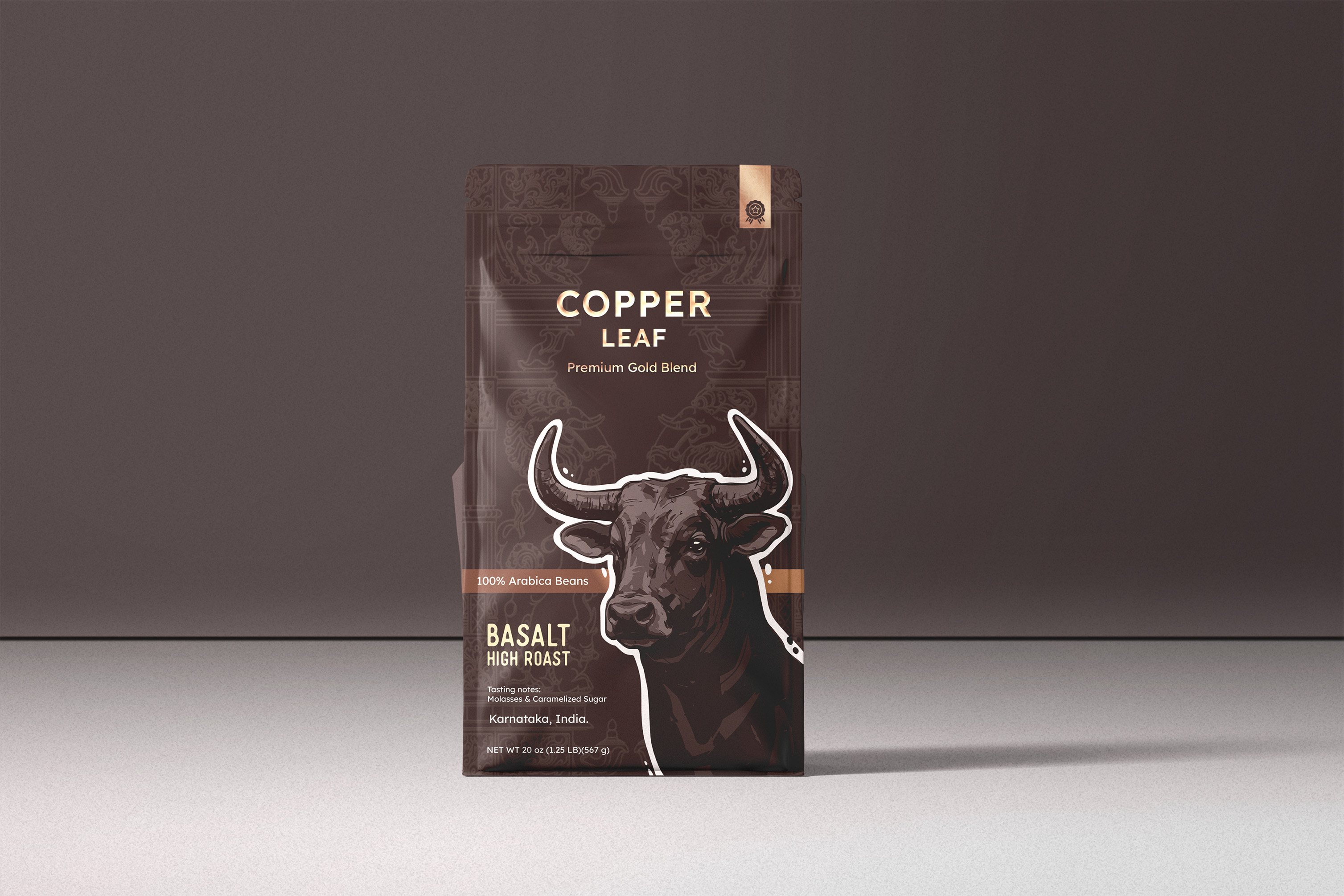
We designed a visual triptych that celebrates the “Guardians of the Ghats.” Each roast profile—Basalt (High), Bed Rock (Medium), and Verona (Dark)—is represented by a hand-drawn, majestic inhabitant of the Indian landscape.
The visual anchor for the entire series is the backdrop: a subtle, intricate tapestry of Yali motifs. These mythical creatures, synonymous with Hoysala architecture and temple carvings, ground the design in the historical heart of Karnataka.
The Basalt (High Roast): Represented by the powerful Bull, symbolizing the robust strength of a high-roast blend.
The Bed Rock (Medium Roast):** Represented by the agile Blackbuck, mirroring the balanced notes of a medium roast.
The Verona (Dark Roast): Represented by the Peacock, the National Bird of India. This choice was intentional—it elevates the product from a regional specialty to a representative of Indian excellence.
Storytelling Layer;
Each bag serves as a cultural map. By featuring the Peacock, we bridge the brand’s local origin with its identity as a premier Indian export, representing the elegance and vibrancy of the nation.
Parallel to this, the Yali and temple-inspired patterns speak of the Hoysala dynasty’s legacy, turning the packaging into a canvas of Karnataka’s artistic history. The technical data—like the “100% Arabica” and “Single Origin” markers—is structured into a clean layout that mimics a premium spirit label, while the storytelling on the back connects the “Copper Leaf” (the ripening coffee cherry) to the mineral-rich topography of the Malnad region.
Why It Works:
The Copper Leaf* identity works because it functions as both a “Global” and “Local” brand. By using the National Bird alongside Hoysala-inspired Yali designs, we created a narrative that resonates with the pride of Karnataka while appealing to a national and international audience.
The high-contrast, white-outlined illustrations against the dark, textured backgrounds ensure the product pops on a crowded shelf. It isn’t just a caffeine fix; it’s a sensory journey through the heart of India’s coffee heritage, designed to be kept long after the beans are gone.

CREDIT
- Agency/Creative: Trisaga.co
- Article Title: The Architecture of Flavor: How Ancient Stone Carvings and National Symbols Redefined Copper Leaf by Trisaga.co
- Organisation/Entity: Freelance
- Project Type: Packaging
- Project Status: Non Published
- Agency/Creative Country: India
- Agency/Creative City: Banglore
- Market Region: Asia
- Project Deliverables: Design, Packaging Design
- Format: Pouch
- Industry: Food/Beverage
- Keywords: WBDS Agency Design Awards 2026, Cofee, Cofee Packaging Design
-
Credits:
Design & Illustration: Darshan S


