


In brave seas, through winds that blow,
The HELMSMAN guides where wine must go.
HELMSMAN is more than a wine brand — it is a visual and narrative tribute to the spirit of exploration, leadership, and family heritage. The concept was inspired by the true tales of an entrepreneurial family whose journey began generations ago, when they crossed oceans and traveled through distant lands in search of opportunity. After years of exploration, their path finally led them to the remarkable Douro Valley in Portugal, a region known worldwide for its breathtaking landscapes and exceptional wines. This history of courage, navigation, and discovery became the foundation of the brand’s identity.
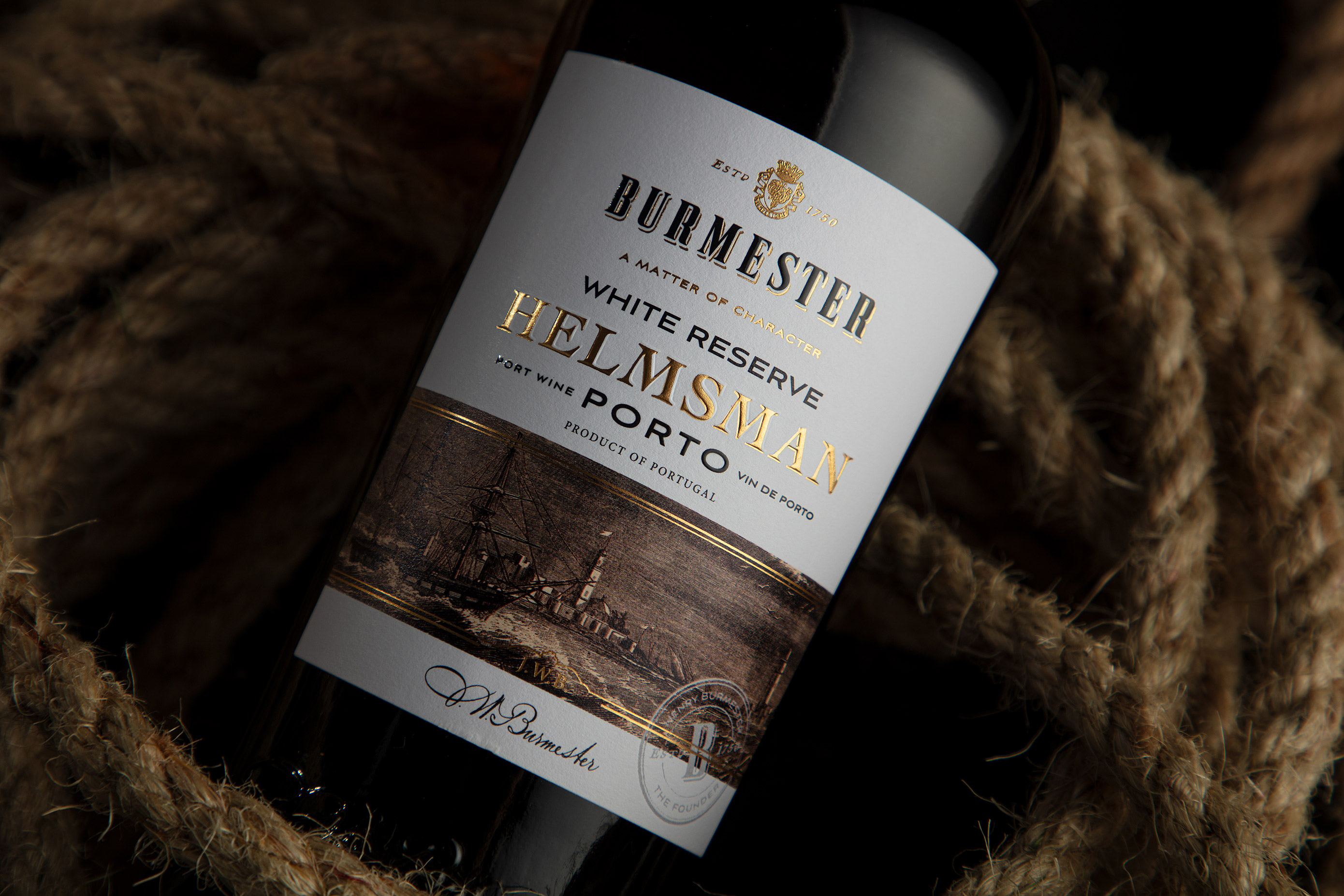
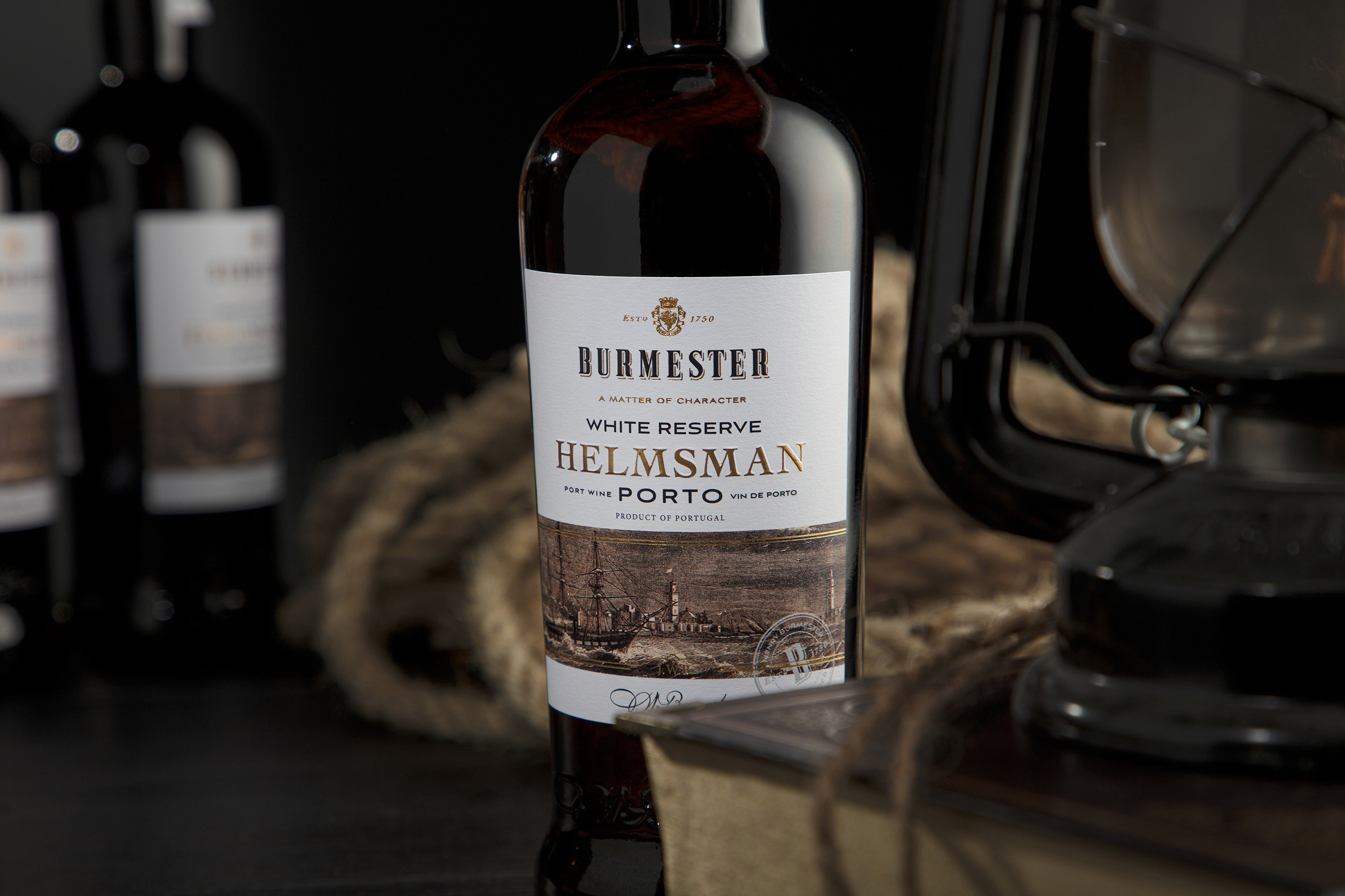
Our design approach was guided by the symbolism of the helmsman — the figure responsible for steering a ship through uncertain waters. This metaphor represents both the family’s journey and the winemaker’s role in guiding each harvest from vineyard to bottle. The branding therefore balances heritage and modernity, translating the story into a refined and memorable visual language.
The project involved the full development of the brand identity, including naming, packaging design, and photography direction. The name HELMSMAN was chosen to evoke leadership, navigation, and purpose — a strong and distinctive identity that reflects the brand’s origins and values. The packaging design reinforces this narrative through carefully considered typography, composition, and symbolic details that subtly reference maritime exploration and the pioneering spirit of the family.
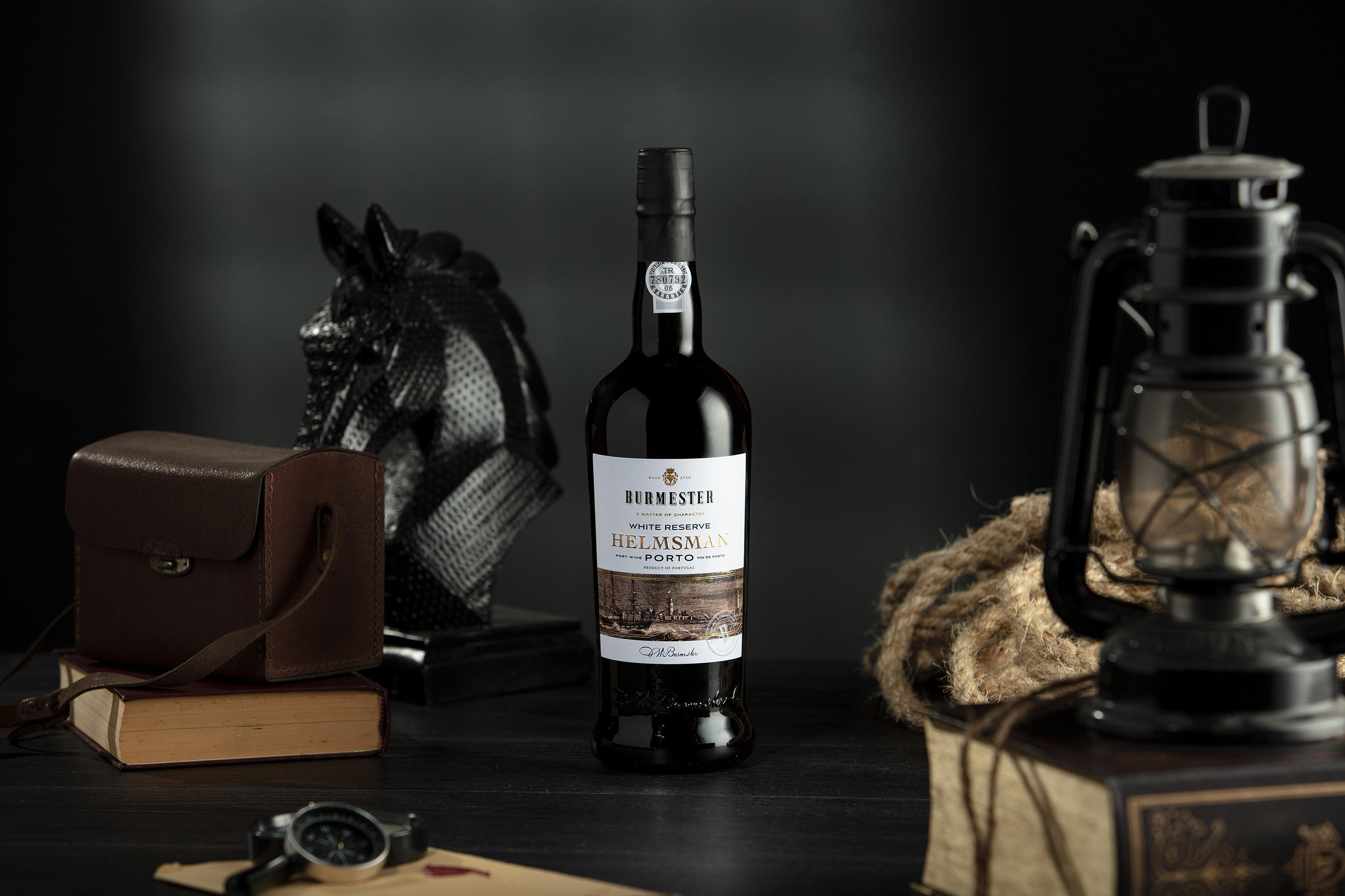
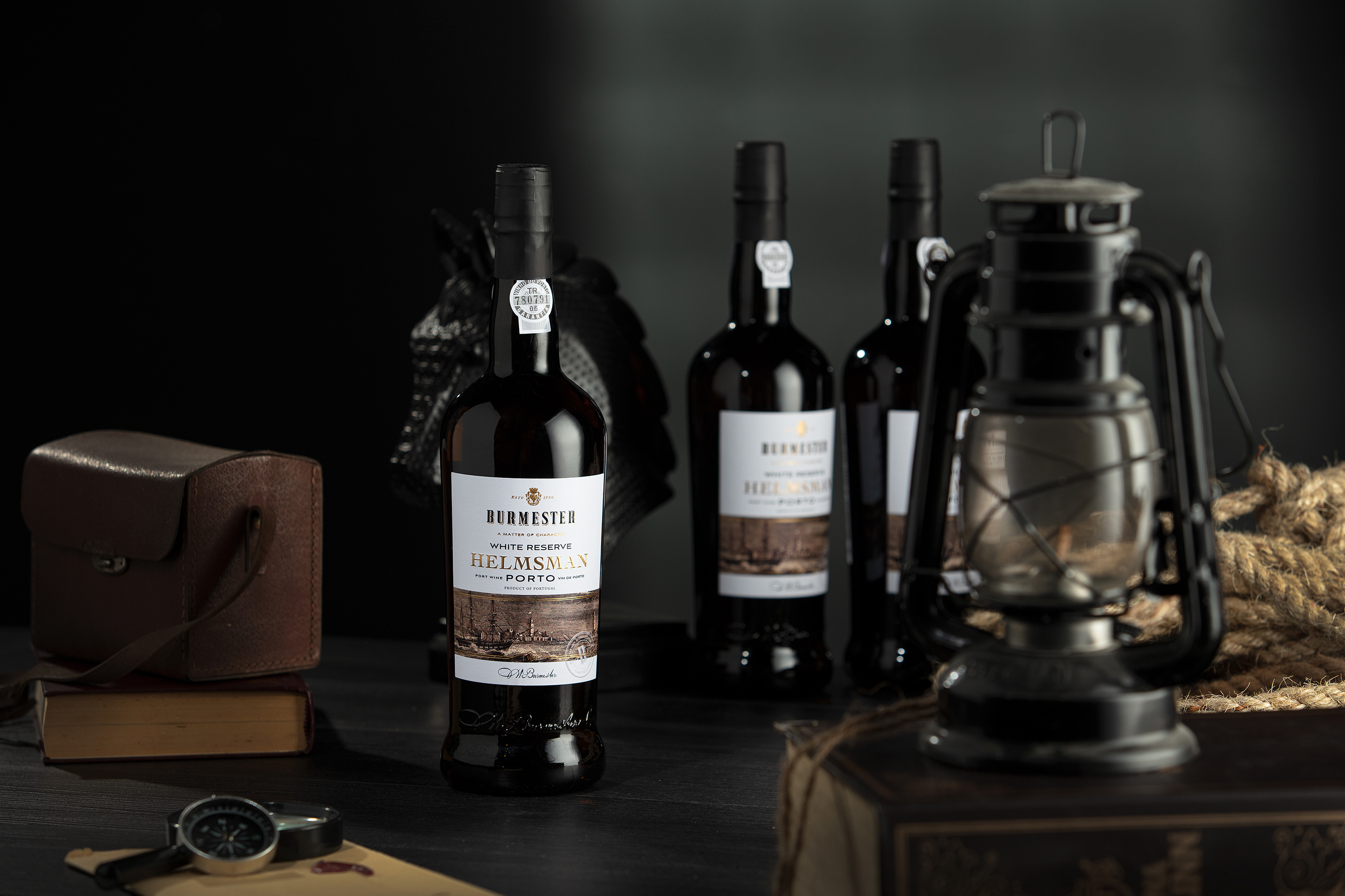
Materials, textures, and visual balance were selected to communicate both authenticity and sophistication. The label design aims to capture attention while maintaining elegance, allowing the story behind the wine to unfold naturally. Complementing the packaging, the photography was designed to highlight the bottle as an object of craftsmanship, while also reflecting the atmosphere and character of the Douro region.
Together, these elements create a cohesive visual identity that celebrates heritage, storytelling, and design. HELMSMAN becomes not only a wine, but a symbol of direction, legacy, and the enduring human desire to explore new horizons.
Enjoy the journey.
CREDIT
- Agency/Creative: M&A Creative Agency
- Article Title: Helmsman Wine Branding by M&A Creative Agency Navigates Heritage and Exploration Through Refined Packaging Design
- Organisation/Entity: Agency
- Project Type: Packaging
- Project Status: Published
- Agency/Creative Country: Portugal
- Agency/Creative City: Anadia - Lisbon
- Market Region: Global
- Project Deliverables: Label Design, Photography, Product Naming
- Format: Bottle
- Industry: Food/Beverage
- Keywords: Packaging Naming Alcohol Wine
-
Credits:
Design: M&A CREATIVE AGENCY
Photography: M&A CREATIVE AGENCY
Naming: M&A CREATIVE AGENCY
Video: M&A CREATIVE AGENCY


