


Solnuts Crunchers: The Architecture of the Visual System
With the launch of Crunchers, Solnuts evolves from its industrial foundations towards a contemporary language where design operates as a living system. The challenge was not merely to wrap a snack, but to project the Double Crunch experience—a sensory structure rooted in baking and gluten-free integrity—into a coherent visual and tactile asset.
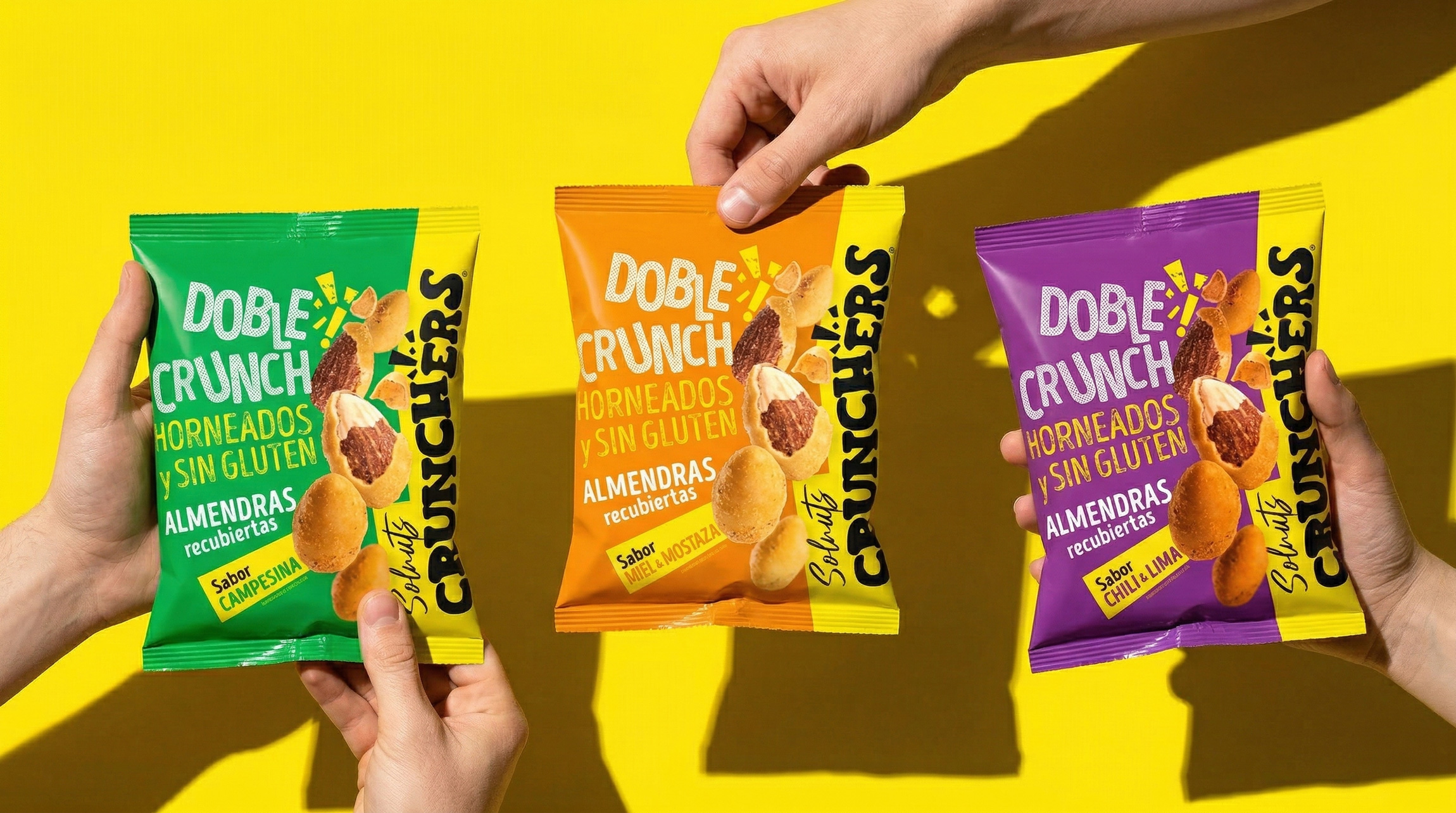
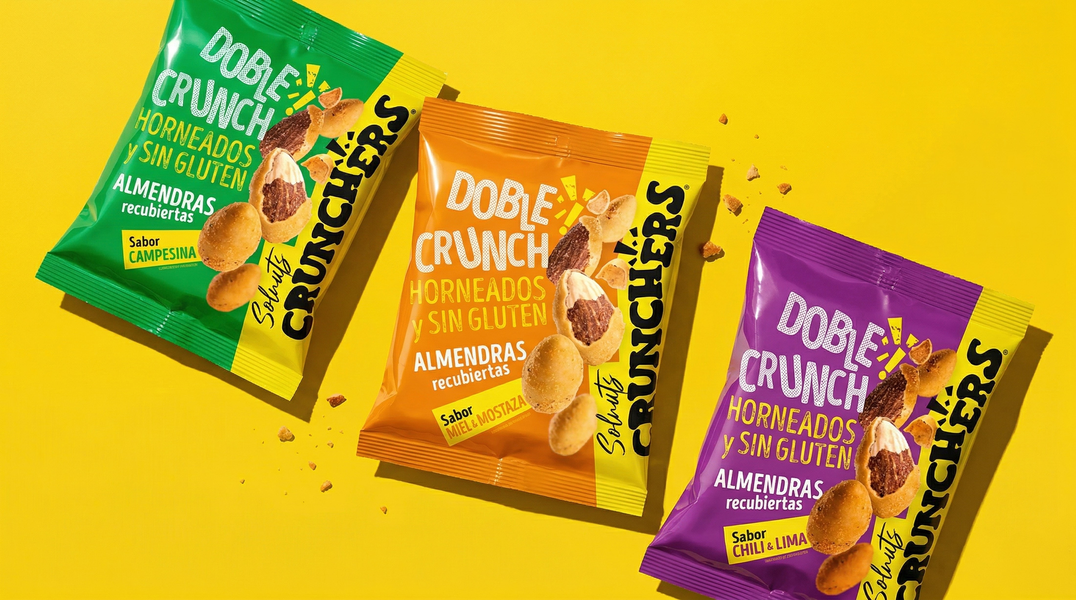
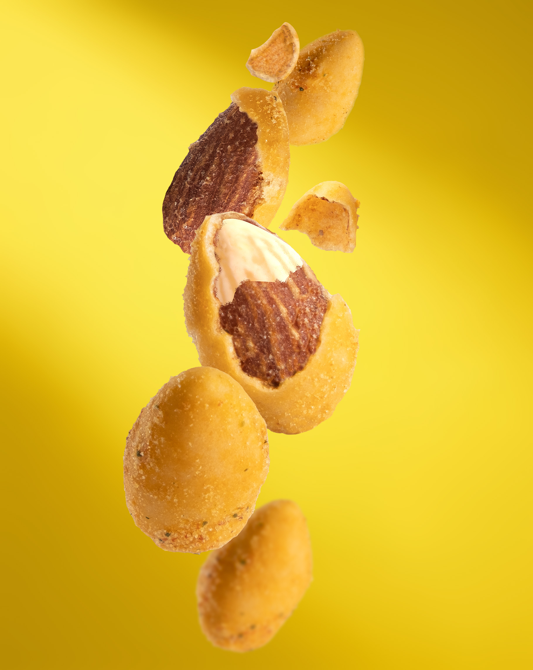
Yellow Disruption: A Spotlight on the Shelf
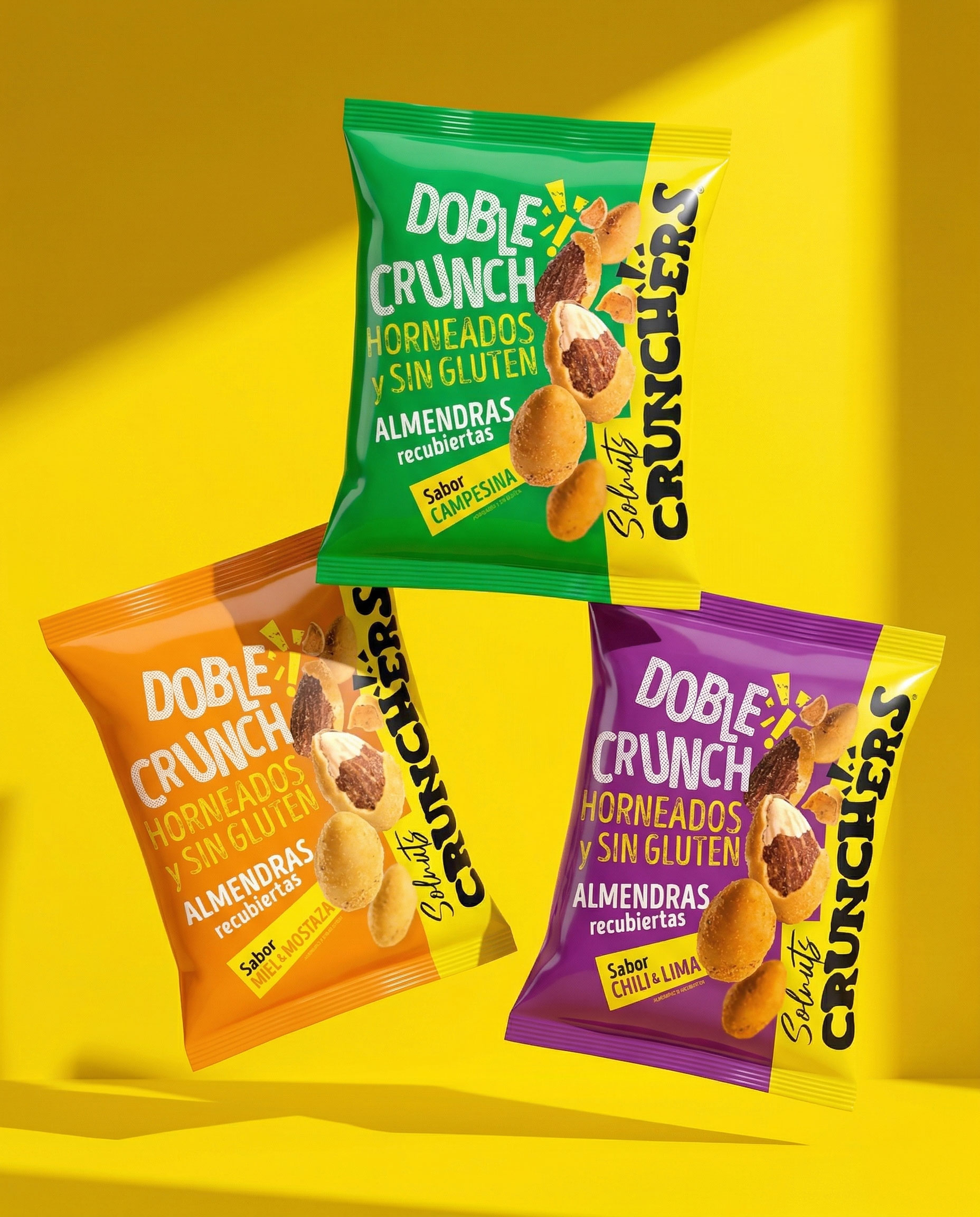
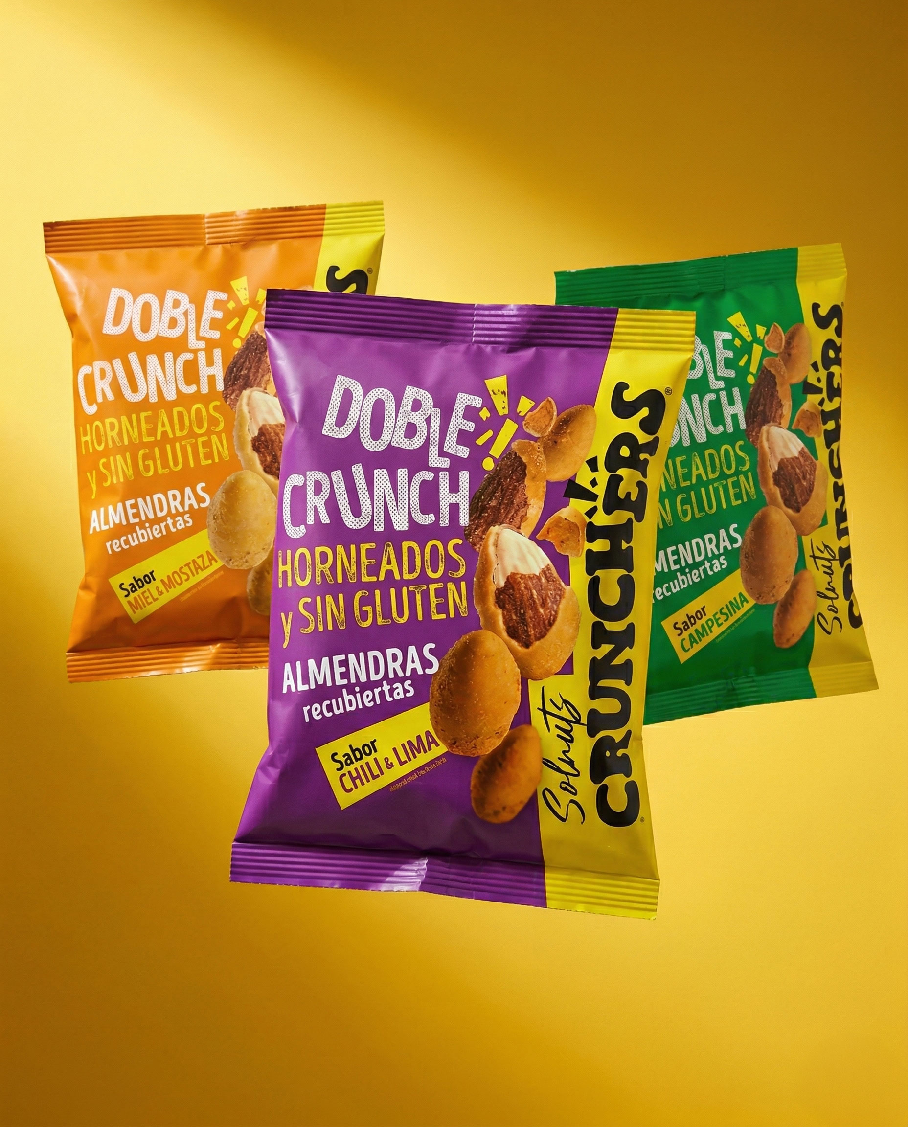
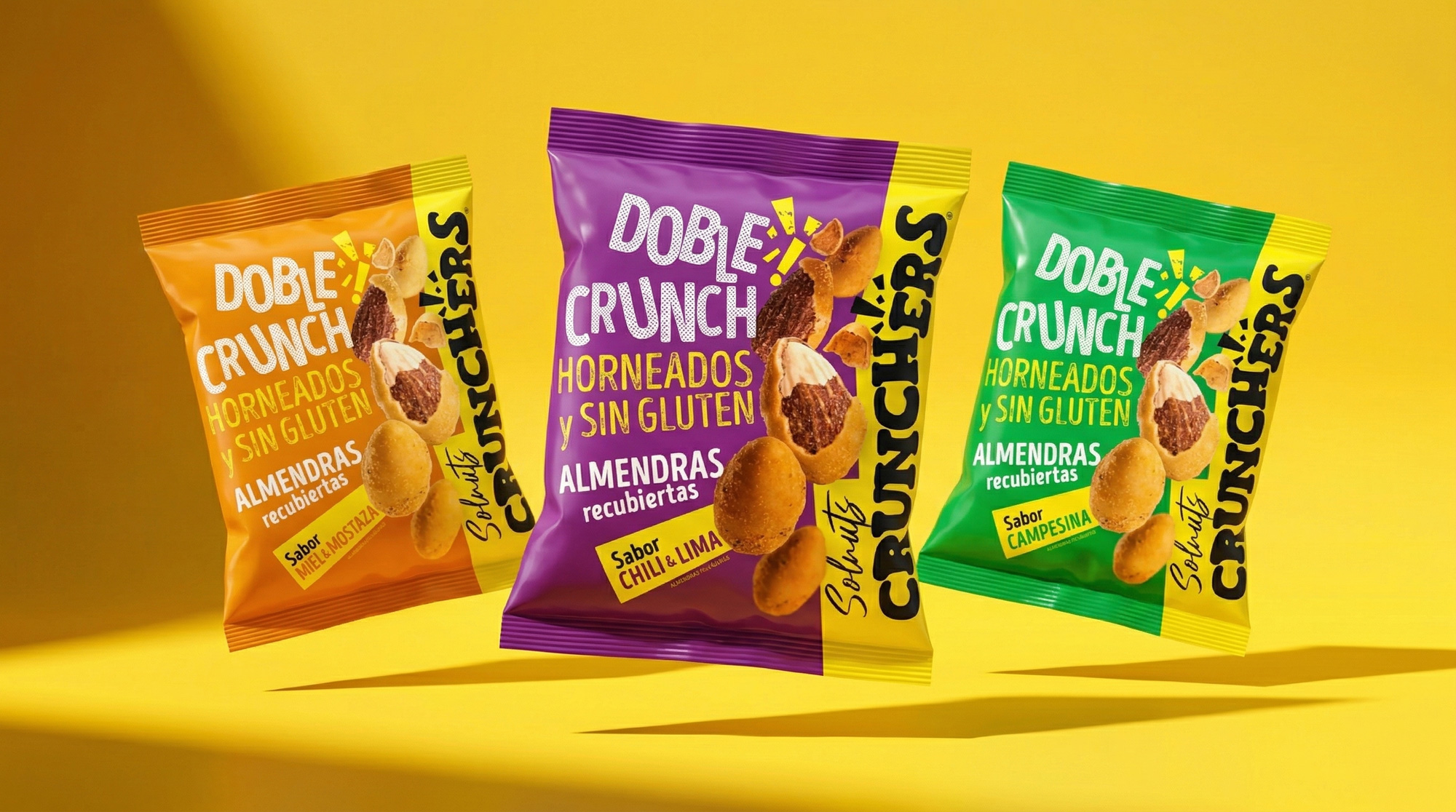
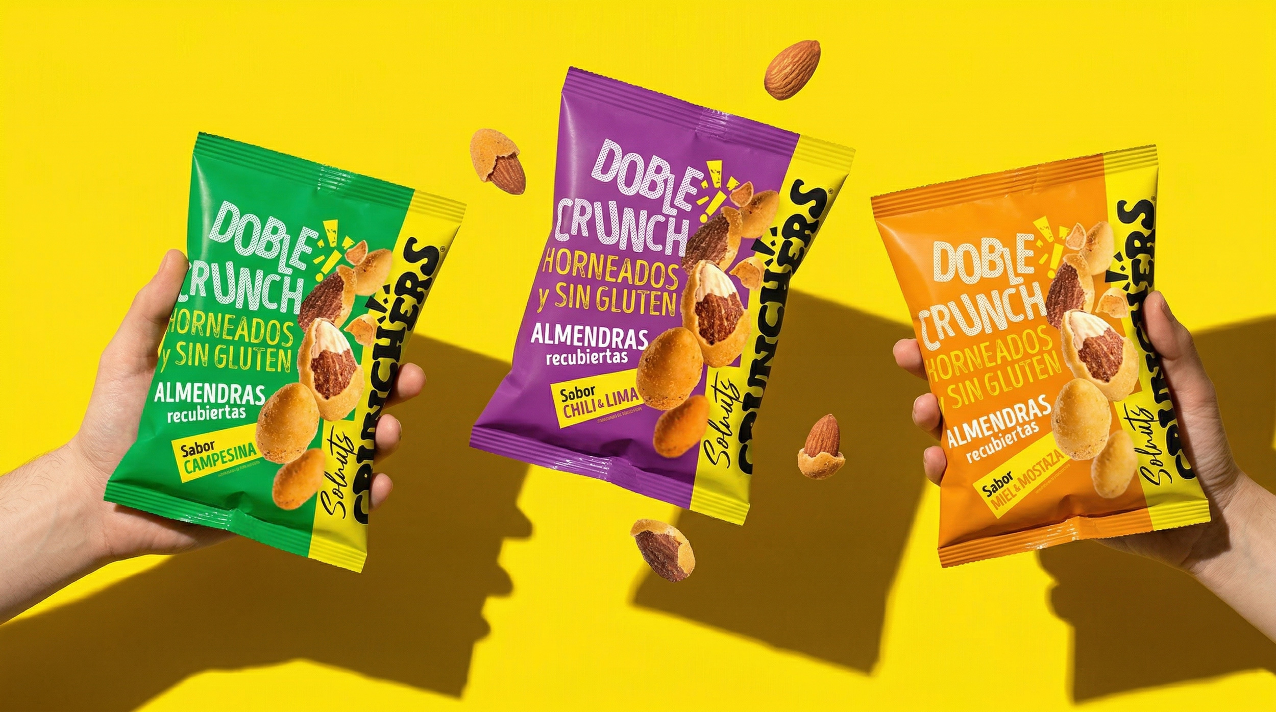
In a category where competitors systematically retreat into red, the snack aisle tends to become flat and predictable. Our commitment to strategic yellow is a tactical positioning decision: creating a “spotlight effect” that demands immediate consumer attention. This color not only bridges the chromatic identity with the brand’s roots (Sol de Alba), but also projects a level of energy and freshness unattainable for traditional saturated codes.
Typographic Heritage and Graphic Tension
The project is built upon vintage-inspired typography that serves as an anchor of trust and heritage. Far from being an exercise in passive nostalgia, the graphics introduce rhythm, tension, and fragmentation through halftone patterns and dynamic textures, functioning as a visual metaphor for the crunch itself.
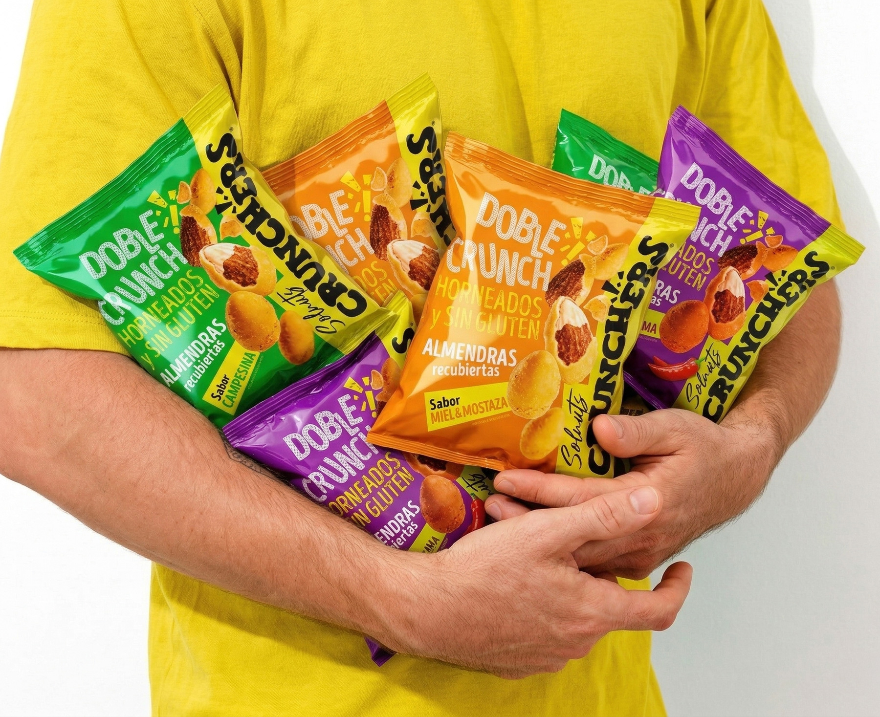
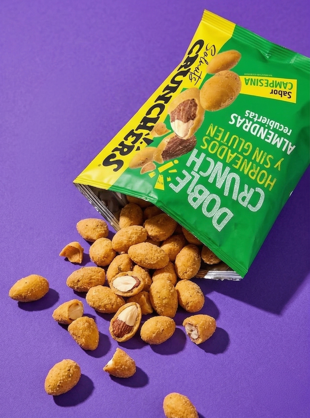
Selective finishes—where the contrast between matte and gloss varnishes takes center stage—reinforce the product’s sensory perception. Each variety is a study in specific nuances:
*
Honey & Mustard: A dialogue of contrasts between golden sweetness and the sharp, confident edge of mustard.
*
Savoury Tomato & Onion: Rustic depth evoking the comfort of traditional cooking through the warmth of rich tomato and the natural sweetness of onion.
*
Chili & Lime: An exercise in pure citrus energy balanced by a measured, persistent heat.
*
Cheese: The pursuit of intensity within a recognizable, comforting, and deeply satisfying flavor profile.
Redefining the Standard
Solnuts Crunchers does not merely follow CPG packaging rules; it redefines them to captivate the new consumer. Developed under the direction of Hugo Zapata’s team, this work positions the brand as a benchmark in breaking molds and elevating sophistication within the premium snack sector.
CREDIT
- Agency/Creative: hugo zapata
- Article Title: Solnuts Crunchers Packaging Design by Hugo Zapata Signals a New Visual System for Premium Snack Branding
- Organisation/Entity: Agency
- Project Type: Campaign
- Project Status: Published
- Agency/Creative Country: Spain
- Agency/Creative City: sevilla
- Market Region: Africa, Asia, Europe, North America
- Project Deliverables: 3D Design, Advertising Photography, Brand Architecture, Brand Design, Label Design, Packaging Design
- Industry: Food/Beverage
- Keywords: snacks, soldealba, crunchers, packaging, granada
-
Credits:
design and illustration: hugo zapata sánchez


