


Via Vinera Special Selection: Heritage as a Strategy
Heritage isn’t decoration. It’s the reason people reach for the bottle.
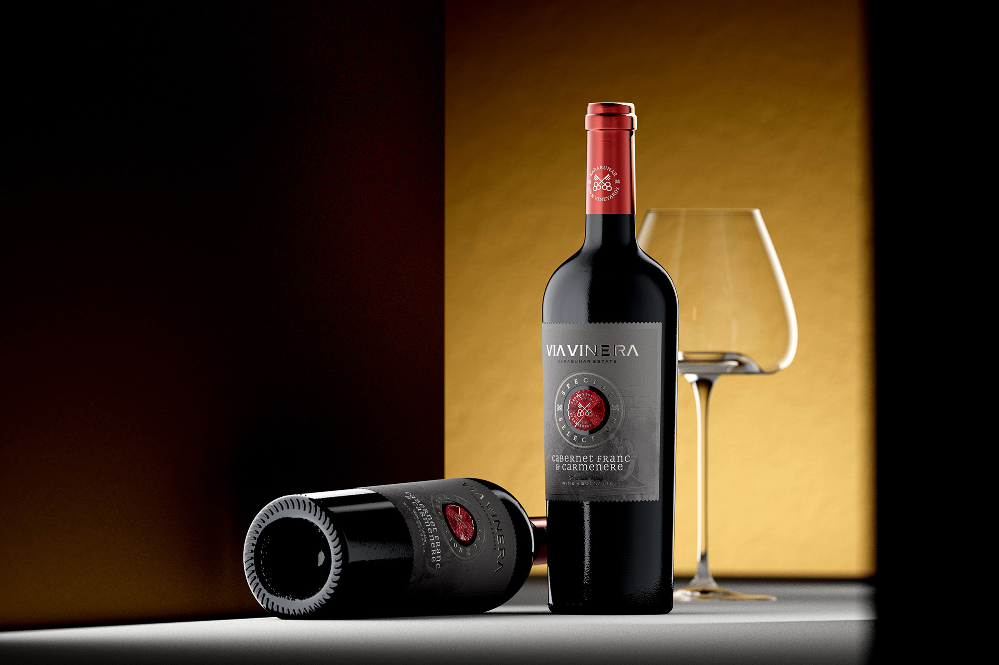
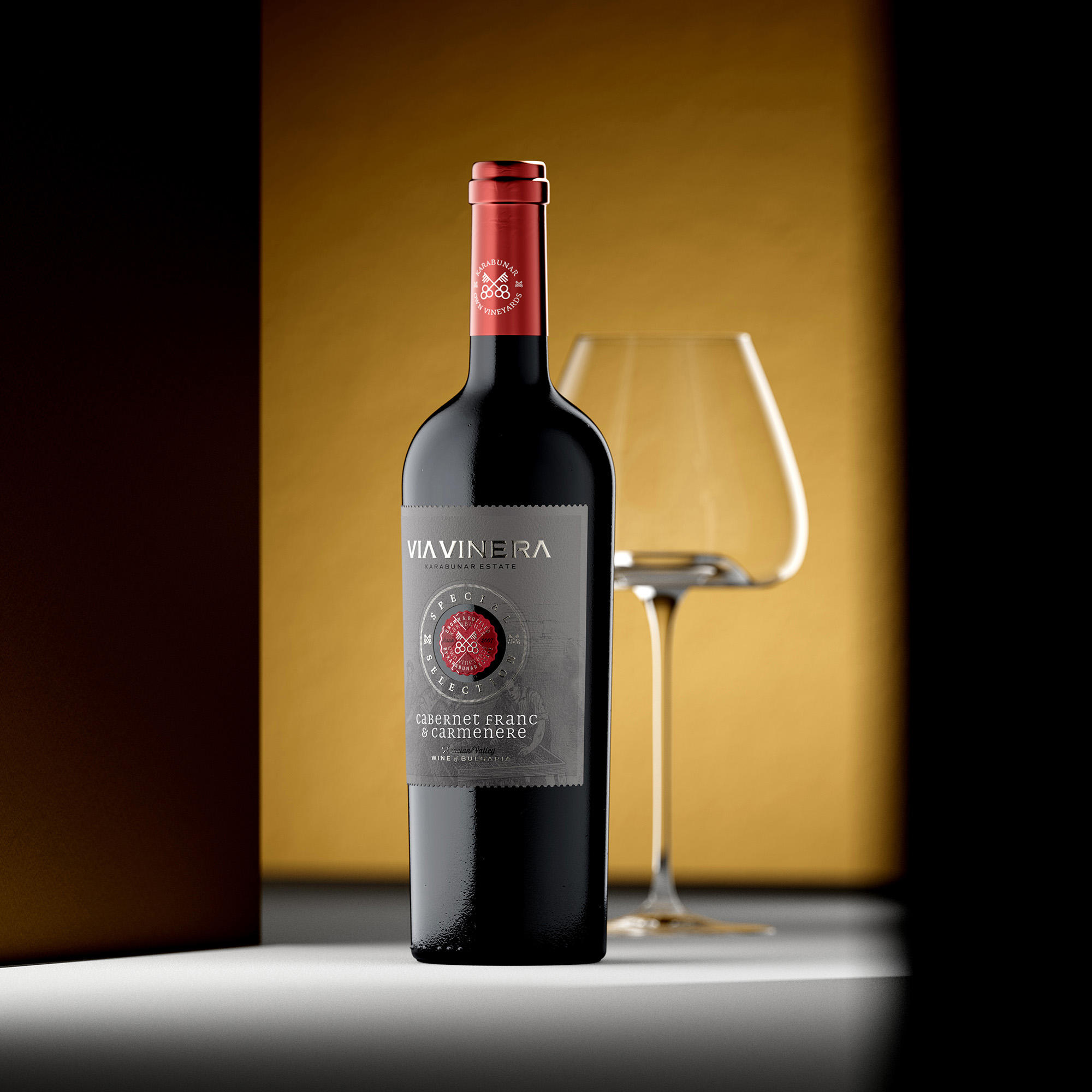
Via Vinera Special Selection is a heritage wine label design project for Karabunar Estate, Bulgaria — a winery that has been growing and bottling its own wines in the Thracian Valley since 2007. This case study examines how authentic heritage branding, tactile materials, and layered print techniques build consumer trust and drive long-term sales.
There is a particular kind of credibility that cannot be designed from scratch. It has to be earned — through years of work in the vineyard, through consistency in the cellar, through a relationship with a piece of land that deepens with every vintage. Karabunar Estate has that credibility. The Via Vinera Special Selection label was designed to make it visible. Not to invent a story, but to give an existing one the visual language it deserves.
Design at a Glance
A Label That Carries Real History
The postage stamp border, the engraving, the crossed keys – none of it was invented for this label. It was inherited, refined, and elevated to match a higher tier.
Cotton Paper That Rewards the Touch
Fasson Cotton by Avery Dennison – a structured, tactile substrate that communicates quality before the bottle is even opened.
A Medallion Built in Layers
The Special Selection centrepiece combines a see-through cut, Kurz foil, high-build raised varnish, and deep embossing – a level of print complexity rarely seen at this price point.
Two Keys, One Philosophy
One key for viticulture, one for winemaking. Karabunar Estate masters both – and the symbol says so without a single word of explanation.
A Capsule That Closes the Argument
Semi-metallic burgundy, embossed logo on the top disk – every touchpoint on this bottle speaks the same language.
Heritage as a Commercial Strategy
A label that communicates genuine history builds trust faster than any marketing campaign. Trust is what converts a first-time buyer into a loyal one.
1. A Winery With Something to Say
What does heritage wine label design actually mean when it works? It means the visual language of the label is earned, not borrowed. Karabunar Estate has been growing and bottling its own wines since 2007 – and that specific, unhurried relationship between land and producer is exactly what the Special Selection label was designed to communicate. This is not a brand that borrowed a heritage aesthetic because it tested well with focus groups. The history is real, the terroir is real, and the label’s job was simply to make that apparent at first glance.
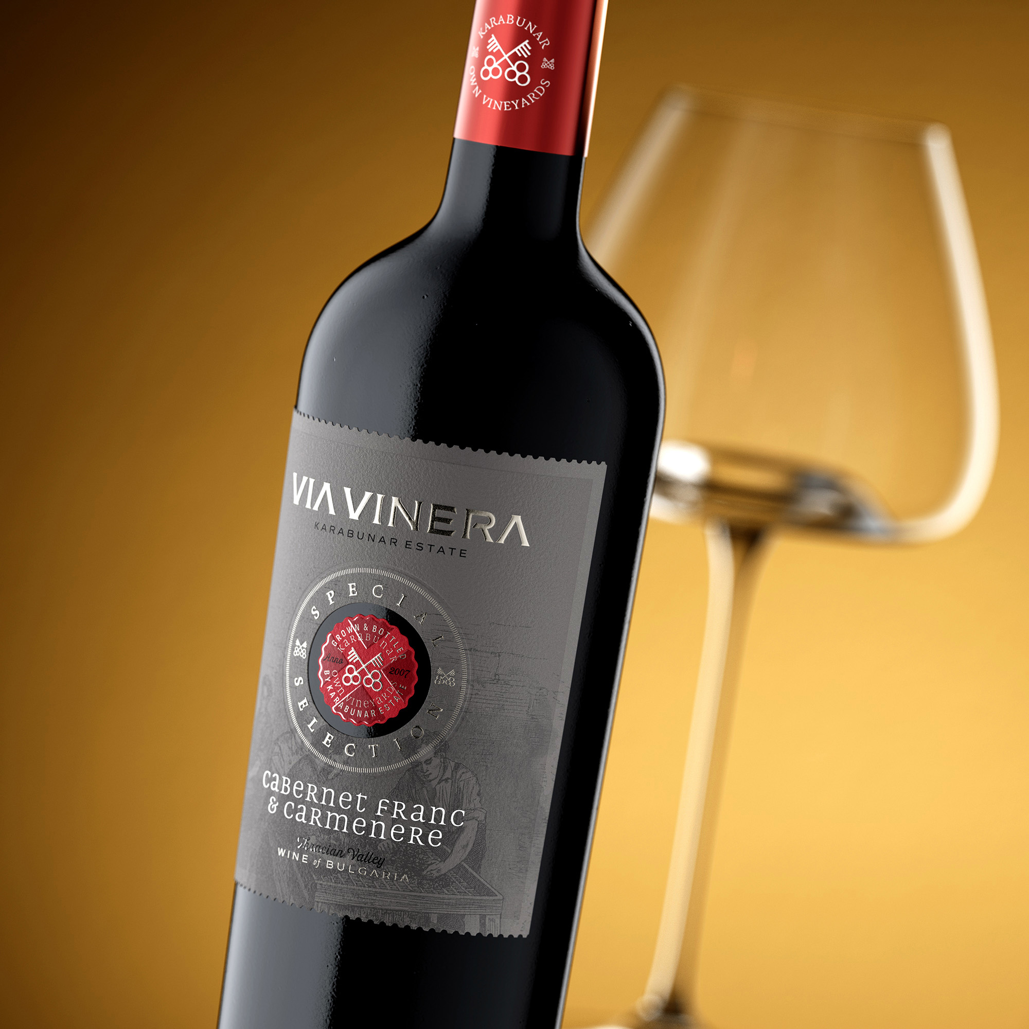
The Special Selection range sits above the existing Via Vinera series in both quality and price – and the design had to signal that elevation clearly, without abandoning the visual identity that Via Vinera’s existing audience already recognises and trusts. That is one of the more delicate briefs in heritage wine label design: how do you move a brand upward without leaving its history behind? The answer, in this case, was to deepen the same visual language rather than replace it.
The postage stamp border – one of the most distinctive and consistently loved elements of the Via Vinera identity – was carried forward into this new tier. In the context of Special Selection, it carries even more weight. That perforated edge is not a decorative choice. It is a direct reference to a tradition of meticulous, hand-verified quality – the kind of attention that was once applied to every printed document of value. On a wine label, it says the same thing it has always said: this was made carefully, and it matters.
The engraving on the background of the label is the same one used across the Via Vinera range – a scene of winemaking that captures the human element of the craft. People, grapes, the work of the cellar. It sits quietly behind the main composition, visible but not dominant – a reminder that behind every bottle there is a process, and behind the process there are people who take it seriously. In heritage wine branding, that kind of visual depth is what separates a label with a story from a label with a style.
2. The Paper, the Border, and the Art of the Deboss
The choice of substrate in heritage wine label design is never neutral. Paper communicates before the eye reads a single word – through weight, texture, and the way it responds to light. For the Special Selection, I chose Fasson Cotton by Avery Dennison – a structured, slightly rough material that has a quiet, authoritative presence in the hand. It does not try to impress. It simply feels considered.
The border of the label is finished in the style of a postage stamp – a perforated die-cut edge that is immediately recognisable to anyone who knows the Via Vinera brand. What changes here is the depth of execution. A strong debossing runs along the inner edge of that border, compressing the cotton fibres and creating a zone where the texture becomes noticeably smoother and denser. The contrast between that compressed margin and the natural texture of the label’s centre is subtle but continuous – the kind of detail that the hand registers before the eye fully processes it.
This is what I find most interesting about working with tactile materials at the premium tier: the consumer rarely articulates what they are responding to, but they respond nonetheless. A label that has been debossed along its border feels more substantial than one that has not. It feels like something that was made with intention. And in heritage wine branding, the perception of intention is exactly what builds the trust that drives the sale.
The centre of the label carries the natural cotton texture undisturbed – which makes the debossed frame around it feel even more deliberate. Two textures, one material, one seamless composition. No additional ink, no additional colour. Just the paper, shaped precisely, doing its work.
This approach answers a question many brand owners and marketing directors face when commissioning a premium wine label: how do you communicate quality without overstating it? The answer, here, is restraint executed with precision. The Cotton paper does not shout. It simply refuses to feel ordinary.
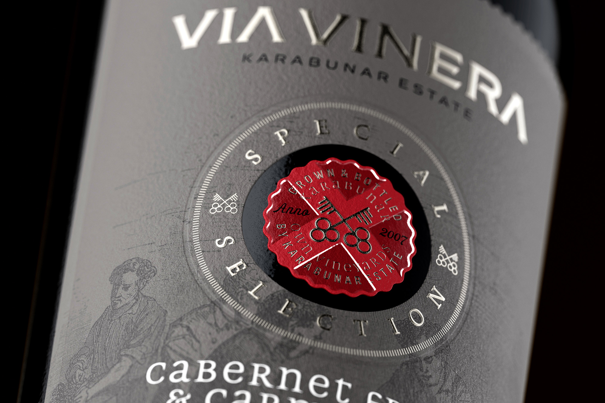
3. The Medallion: Where the Complexity Lives
The centrepiece of the Special Selection label is a medallion that required more print processes in a single element than most labels carry across their entire surface. It is where the heritage wine branding reaches its highest point of technical ambition – and where the consumer, whether they understand print or not, senses that something unusual is happening.
The medallion is cut through the grey Cotton paper entirely, so that the glass of the bottle itself forms the background. That see-through effect creates an immediate depth – the red printed element appears to float within a dark, circular void, framed by the label but belonging to the bottle. It is a technique that requires precise registration and a substrate stable enough to hold a clean edge around the aperture. The Cotton paper handles it without compromise.
Within that cut sits a printed element finished with unique silver Kurz foil – the same foil used for the Via Vinera wordmark at the top of the label, ensuring material consistency across the entire composition. The foil catches light differently depending on the angle, giving the medallion a quiet luminosity that changes as the bottle is handled. Laid over the foil is a high-build raised varnish – a thick, relief-forming coating that creates genuinely three-dimensional texture on the surface. Under direct light, it produces soft reflections that seem to move. It makes the label feel alive in a way that flat print simply cannot.
The words Special Selection are finished with Kurz foil and embossing, and the circular contour that frames them is debossed – pressing into the paper to create a recessed boundary that makes the raised elements inside it feel even more prominent. The result is a composition with five distinct levels of depth within an area no larger than a bottle cap. That density of craft, concentrated into a single focal point, is precisely what the consumer’s eye and hand are drawn to first.
For a winemaker or brand director considering a special selection or reserve tier within an existing range, this medallion approach is worth understanding as a strategy, not just as a print technique. It creates a visual anchor that immediately signals “this is different” – without breaking the brand continuity of the label around it. The bottle is recognisably Via Vinera. The medallion tells you it is something more.
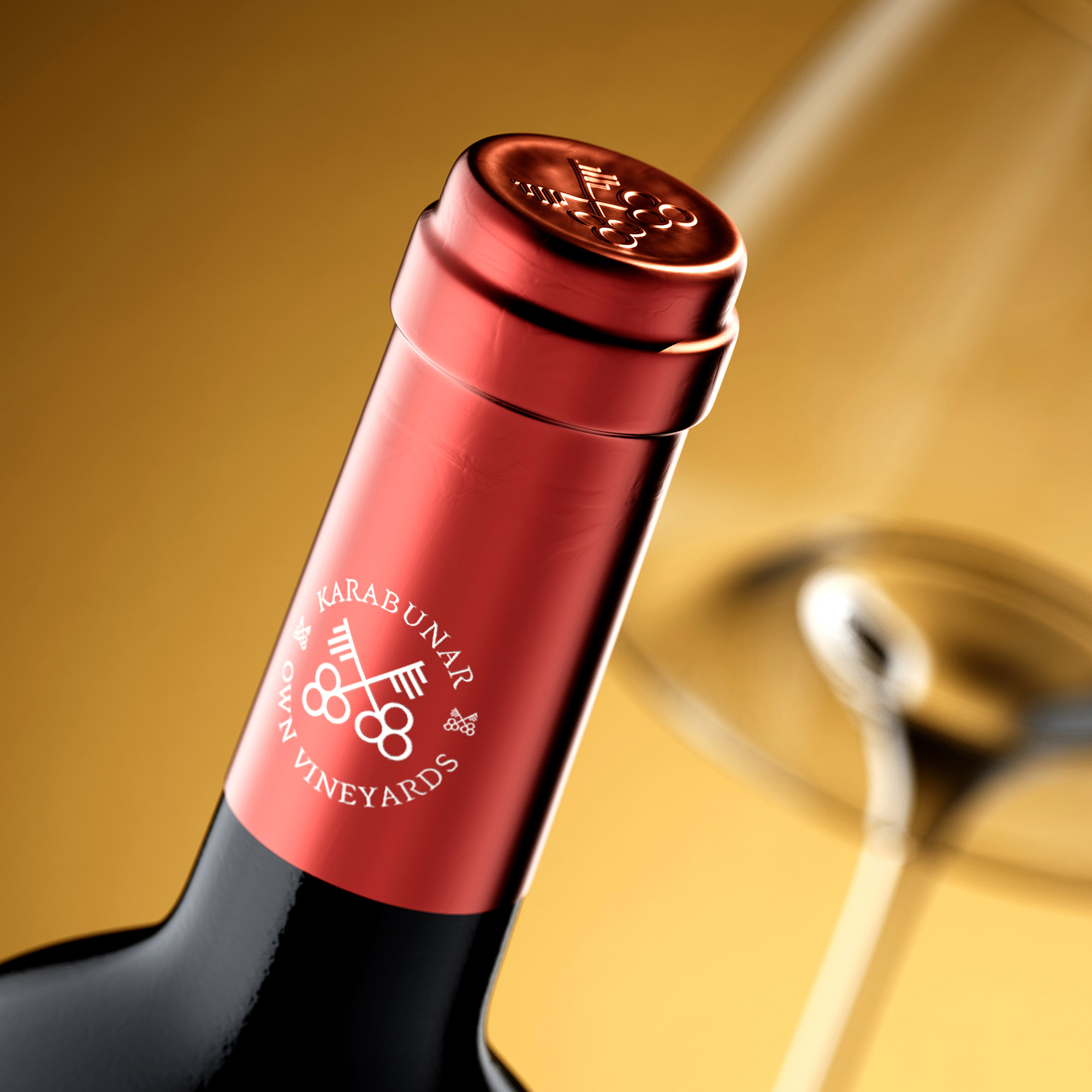
4. The Capsule and the Crossed Keys
A capsule is the first thing a person sees when a bottle is presented at the table. It is also, in most premium wine packaging, the most underdesigned element on the bottle. For the Special Selection, I wanted the capsule to be as deliberate as everything below it.
The material is semi-metallic burgundy – a colour chosen to complement the grey of the label while signalling the red wine character of the range. It is not a standard colour from a standard catalogue. The tone sits between metallic and matte, catching light without being reflective in a way that would compete with the foil work on the label. The two elements coexist rather than compete.
At the centre of the capsule sits the Karabunar Estate emblem – the two crossed keys that define the brand identity. One key represents viticulture, the other winemaking. Karabunar Estate practices both on its own land, from vine to bottle, and this symbol is the most economical possible expression of that philosophy. It requires no caption. It communicates mastery through form alone. On the top disk, the same two keys are executed in a strong embossing – the deepest relief on the entire bottle – so that even when the capsule is removed and set aside, it has already done its work.
This is the logic that runs through every element of this heritage wine label design: nothing is present merely to fill space, and nothing is left to chance. In heritage wine branding, that consistency of intention is what the consumer absorbs without being able to name it. They do not think “this capsule was designed with care.” They think “this wine feels serious.” The capsule is why.
5. Heritage as a Long-Term Brand Asset
Why does heritage wine branding sell? Not because it looks old. Because it communicates that the people behind the wine have been doing this long enough to know what they are doing – and that the consumer is not taking a risk by choosing it.
There is a version of heritage wine label design that is purely cosmetic – old typefaces, sepia tones, a vague suggestion of tradition assembled from stock elements. That version produces labels that look historical without being so, and consumers who have spent any time with wine can usually sense the difference. Authenticity is not a style that can be fully imitated.
What makes the Via Vinera Special Selection different is that the heritage it communicates is not invented. Karabunar Estate has been growing its own grapes and making its own wine on the same land since 2007. The crossed keys represent a genuine dual mastery. The engraving references a real winemaking tradition. The postage stamp border was not chosen because it tested well – it was carried forward from an existing brand identity because it belongs there. Every element has a reason that precedes the design brief.
This is why heritage wine branding works as a commercial strategy when it is done honestly. A consumer who picks up a bottle and senses that the story on the label is real responds differently from one who picks up a bottle dressed in borrowed tradition. The first response is trust. Trust is what brings someone back for a second bottle, and a third, and what makes them recommend the wine to someone else. It is the only form of marketing that compounds without additional investment.
The Special Selection range currently includes Cabernet Franc and Carmenere, with a Malbec joining the range shortly. Each wine is a different expression of the same philosophy – and the label is designed to carry that philosophy forward, variety by variety, vintage by vintage, without ever needing to reinvent itself. That kind of visual stability is itself a heritage asset. It is what a brand looks like when it is built to last.
For brand owners and marketing directors working on a premium or reserve tier within an established wine brand, the question worth asking is not “how do we make this look more premium?” It is “what is genuinely true about this wine and this winery – and how do we make that impossible to ignore?” The answer to that question is always a better brief than any trend board.
CREDIT
- Agency/Creative: the Labelmaker
- Article Title: Heritage Wine Label Design: Via Vinera Special Selection by the Labelmaker
- Organisation/Entity: Agency
- Project Type: Packaging
- Project Status: Published
- Agency/Creative Country: Bulgaria
- Agency/Creative City: Varna
- Market Region: Europe
- Project Deliverables: Brand Design, CGI, Graphic Design, Label Design, Packaging Design
- Format: Bottle
- Industry: Food/Beverage
- Keywords: heritage wine label design, heritage wine branding, heritage wine label, premium heritage wine label, embossed heritage label, vintage wine label design, traditional wine label design, heritage wine packaging, special selection wine label, authentic wine label design You are out of free messages until 7:00 PM Upgrade Claude is AI and can make mistakes. Please double-check responses.
-
Credits:
Design & CGI Photo: the Labelmaker


