


In 2025, the founders of Champion NGO approached AxelMondrian with the ambition of creating a youth football club brand that would stand apart, attract young people, and make football feel aspirational, distinctive, and culturally relevant.
Through in-depth research and long-term strategic development, Aratta was created — a brand built on a historically rooted name and an abstract visual identity expressing leadership, strength, and timeless relevance.
– Aratta Word Etymology: A Name of Heritage and Strength –
Aratta is regarded as one of the earliest known state formations in ancient tradition — remembered for its strength, resilience, prosperity, and perceived invincibility. More than a place of wealth, it symbolized endurance, power, and the ability to transform potential into lasting achievement.
This made the name deeply relevant to football. Like the legendary land itself, the game demands discipline, teamwork, determination, and the courage to overcome obstacles. Rooted in heritage yet directed toward the future, Aratta became a name that speaks not only of victory, but of character, identity, and legacy.
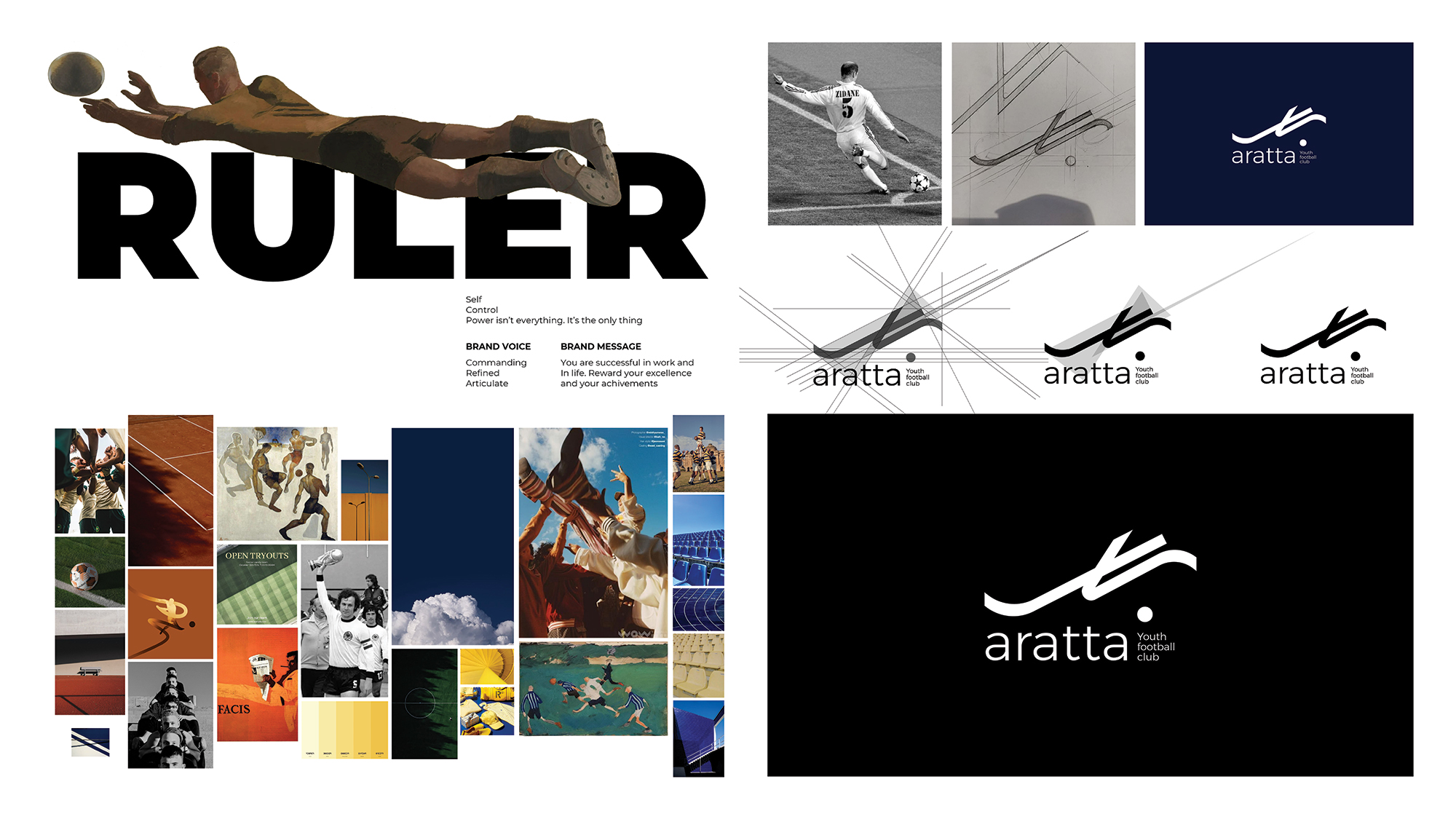
– Aratta is a Ruler by Design –
Aratta is built around the Ruler archetype — not as a symbol of authority for its own sake, but as a language of discipline, structure, and responsibility.
Its strength lies not in noise, but in presence. It leads through clarity, consistency, and high standards, shaping not only performance, but character. In this way, Aratta was designed to represent more than a football club — it was built to become a cultural and aspirational force for young people.
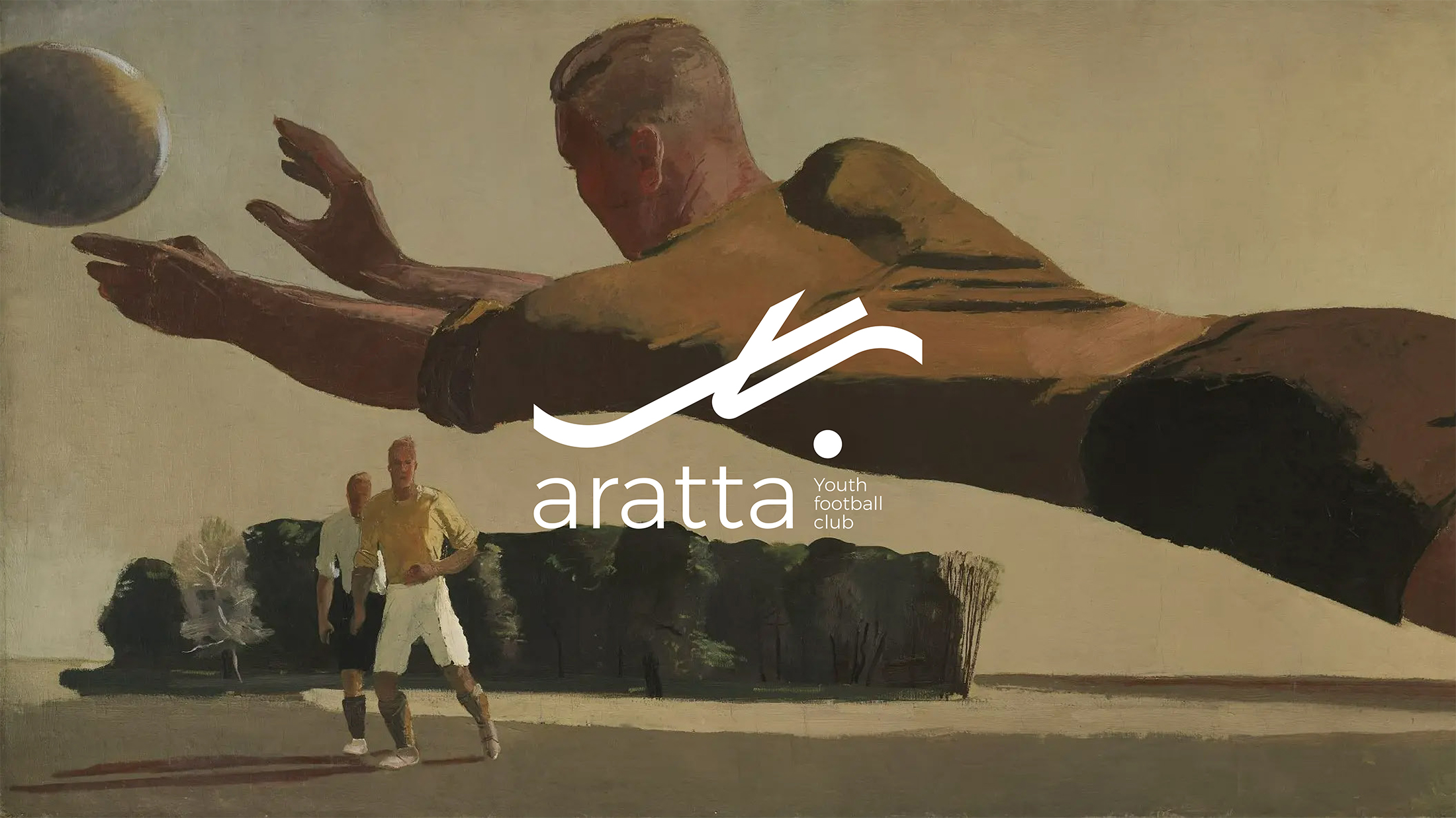
– Story Behind the Brand Logo –
The Aratta logo is inspired by the movement and precision of a football player striking the ball — a moment where balance, force, and direction come together in a single gesture.
This motion, famously associated with the physical elegance of Zinedine Zidane, became the foundation for the logo’s abstraction. Built from two lines and a dot, the mark captures the mechanics of the strike: grounding, momentum, and precision.
The result is a minimal symbol of power, agility, and intent — expressing both the spirit of football and the disciplined identity of the brand.


CREDIT
- Agency/Creative: AxelMondrian
- Article Title: Aratta – Youth Football Club Branding by AxelMondrian
- Organisation/Entity: Agency
- Project Type: Identity
- Project Status: Published
- Agency/Creative Country: Armenia
- Agency/Creative City: Yerevan
- Market Region: Europe, Global
- Project Deliverables: Art Direction, Brand Creation, Brand Naming
- Industry: Education
- Keywords: AxelMondrian, Branding, Armenia
-
Credits:
Art Direction: Shushan Harutyunyan
Concept & Lead Design: Eleonora Yavryan
Editorial & Copy Refinement: Milena Karapetyan
Project Management: Kristine Udumyan


